

KittSmith_95
-
Posts
1,830 -
Joined
-
Last visited
Posts posted by KittSmith_95
-
-
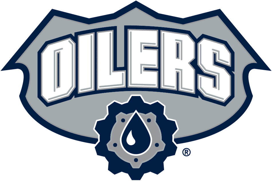
I don't care for this logo and am glad it's no longer being used:

-
 1
1
-
-
Everything under my name wasn't made by me (I've posted a grand total of 2 concepts, I think.)
Also, I was hoping to see if a poster of the Wyoming Marinerz logo @Lee. made existed. Sadly, I couldn't find it.
-
2
-
-
I like the update too, but why is the flag not the Canada Flag?
-
My fave Oilers jersey of all time:

I miss these. The steel drop logo. The shoulder patch (Which is in my top 15 all-time). The font, the colours, everything. I feel this jersey was very under-appreciated.
I also prefer Navy, Copper & Red to Blue & Orange. The colours now feel so light and don't work for me at all.
-
3
-
-
My fave Cannucks set is the Pre-Edge era.


I'll admit the colour balance wasn't perfect, but the jersey themselves were great. That shiny silver, the reddish marroon, all of it. It's a shame they dumped these to go back to Blue & Green when it wasn't needed.
-
6
-
-
I find these awesome.
I myself don't paint.... I'm more of a designer (Putting things together, colour schemes, etc.) than an actual artist.
It's my sister who draws & does paintings.
-
I really like this prototype jersey & logo for the Padres, and that cleanup looks quite sharp.
I wonder what a matching road jersey would look like?
-
Night Owls or Crawfish, thank you.
-
On 2016-06-09 at 10:56 PM, Cosmic said:
I'd be fine with either color scheme for the Oilers, but I'd love to see them come up with a new primary logo. The old oil rig worker is a great shoulder patch, but I don't even think that would be a good crest.
They have a perfect logo for a crest if it could be coloured right.
Remove the Oilers and the shield. Use just the Gear & Drop logo. It's simple, gets the message across & would work fine on a sweater.
-
6
-
-
10 minutes ago, the admiral said:
I was surprised when Winnipeg didn't go to the Central with Nashville sliding into Atlanta's NASCAR Division spot, especially considering all the overtures the Perds made to the alienated Atlanta faithful. I think the Jets ended up saying they liked being in the East those two years because it was, believe it or not, easier travel!
But you have to admit that transfer makes the most sense.
-
None of you see the easy move?
Put Nashville in the East, move Columbus and the 2 new teams to the West.
-
I'll admit, I hate the ads myself. This isn't the only site I use that has clickbaity
 , but at least those are on the top of the page and they're small and easy to ignore. I like scrolling down to read all posts in a thread and well, the bottom button to return to the next page is awesome. But these.... why?
-
1 hour ago, omnibus said:
Gasp! Im offended...
page 1 my man.
I've tried some of those out, and the NBA ones are out of date but can work a bit. The blank ones are awful.
-
Anyone have a good BASKETBALL template?
I haven't seen one for Paint at all.
-
I always liked purple and green too.... I always wanted to see another team use it (Kings or Jazz could work.).
-
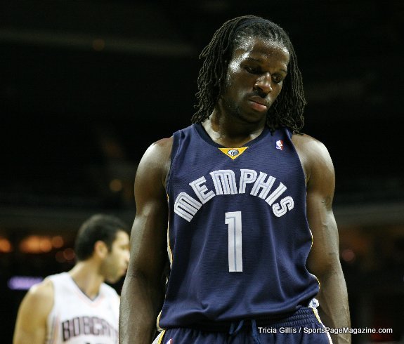
DeMarre Carroll.... as a Memphis Grizzly:
And a Denver Nugget:
Or How about a Dakota Wizard?:

I love journey men.
-
1
-
-
The middle left logo looks the most promising. 2-tone brown and blue would've been unique for the team too.
But yeah.... lots of leaks. It's a great thing.
-
The taco identity is too awesome..... I really want both hats.
-
4 hours ago, Cujo said:
Quite the find. Any idea what the logo would've looked like had they went that route?
I actually found these out via this concept thread:
-
Okay,
I just tried sending a person a Message on here and it's saying that person cannot receive messages.
-
Not sure if these were posted in here already, but here are some Indiana Pacers prototypes:

-
3
-
-
11 minutes ago, Gothamite said:
There's the "swinging" logo we expected from a minor-league rebrand.
I presume the fisherloon and winterloon logos are special event?
Yep, a "Summer" and "Winter" Loon.
But the swinging logo used here actually has ties to the team this time.... here's the old one:

-
Another way to do what infrared said is to click on the box the quote is in and press delete.
-
45 minutes ago, dsaline97 said:
In phone, when I click the "first unread post" button, it always takes me to the top of that page rather than the unread post, but only in phone, not on a desktop. Anyone else having this issue?
I get this issue on desktop.

 , but at least those are on the top of the page and they're small and easy to ignore. I like scrolling down to read all posts in a thread and well, the bottom button to return to the next page is awesome. But these.... why?

Ask A Moderator
in Forum Policies and Announcements
Posted
Time to ask an odd one:
Why is it that posted pictures can be resized on FireFox & not Chrome?