

KittSmith_95
-
Posts
1,830 -
Joined
-
Last visited
Posts posted by KittSmith_95
-
-
There had been rumblings the Yotes were going to do a new alternate jersey already.
-
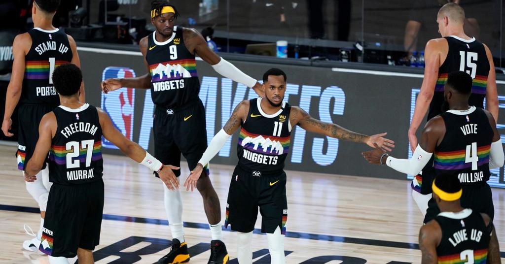
The Nuggets should’ve just promoted the Rainbow City jerseys & used those as their Home & Away.

-
 8
8
-
 2
2
-
 2
2
-
-
-
The truth is, the Nuggets have the basis for a great identity. Just use the Rainbow skyline City jerseys.
-
1
-
-
-
2 hours ago, FiddySicks said:
I only ask because it sounds like the most OITGDNHL thing possible, but was Fruit of the Loom actually at one point a uni supplier for the NHL?Pro Player, who supplied NHL teams jerseys for the 1999/2000 season, was then owned by FOTL.
-
2
-
 2
2
-
-
4 hours ago, pepis21 said:
It would be big return of Pro Player.
I said it as a joke, but sadly if it was to happen, it wouldn't be a return of the Pro Player brand. People forget FotL filed for Chapter 11 in 1999, right after they got the NHL license, and in 2000, Perry Ellis International bought the rights to the Pro Player name and logo.
But at the time, it made sense. Who knows thread count, stitching and comfort more than a underwear company?
-
You know what? I'd rather Fruit Of The Loom get the contract again over Fanatics.
-
6
-
-
3 Texas teams?
-
So…
Dare I say I like the Bears helmet? I do think the orange alternates need tweaks, but the helmet itself is clean. I think these will look better in action as well.
-
A few things:
1. The modernized WHL Johnny on that looks great if it’s legit.
2. New “Adidas” logo on the back.
3. The NHL “shield” is a nice touch. Old colours but current design.
-
1
-
5
-
 1
1
-
-
Put me in the "Navy Helmet looks good for the Giants" camp. It feels right for them.
-
2
-
4
-
-
Is it just the Cavs switching jerseys besides Utah?
-
1
-
-
On 6/27/2022 at 2:37 PM, Bruhammydude said:
Jazz need purple, green, and yellow. Simple as.
I'd argue that the Jazz could even use distinct shades or these three colours and make it work, with even the "Green" heading into more of a Teal/Jade/Turquoise colour and still having everything pop.
-
4
-
-
So.... that'd be the 2026-27 season the earliest they can scrap these? Woof.
-
2
-
 1
1
-
1
-
-
The purple jerseys are the only saving grace, and I really want to see that gradient remix they teased.
Everything else is boring, bland and hollow.-
4
-
-
Yeah, the Commanders new look doesn't work at all for me in that picture.
The white pants don't look awful, but the lack of striping does bring them down. Issue is, the jersey and helmet have two completely different stripings, so which do you go with for the pants? Then you have the issue of not being able to use Yellow on said pants unless Washington wanted to have two seperate pairs of white pants.
Also, the helmet. It feels like no teams anymore want to use white or contrasting coloured facemasks. Also, the yellow stripe is going to CLASH so much with the white jersey that by default, the dumb looking black helmet will be the better of the two to pair with it.
Ugh.
-
4
-
-
Be back soon... and a darker gold.
Are the Bron-era jerseys returning?-
1
-
-
For those wondering, this is what Bernie's old pawprint logo looks like:
I don't hate the idea of using something like this as the shoulder logo over the C-flag.-
4
-
-
I feel like they'd need to include a bit more black in the jersey too for balancing reasons if they did do black pants/black helmets.
-
A few things regarding the conversations in here:
1. PIT-BOS for a WC is lame, but maybe we finally get a new Navy Pens jersey?
2. Washington embracing the Screagle is fine in my books, even though I'll agree it's not the best logo. As for people clammoring for the Weagle as a font jersey logo, it was initially going to be according to this prototype, which I honestly like better than the current Weagle.
3. Vegas going gold full-time is dumb. I like the current look. It's a modern-day classic. Change for the sake of change this early into a indentity is dumb.4. I actually like the Jade, Eggplant & Orange concept @Ridleylash posted.
-
The only time black looked okay for the Leafs was with Felix Potvin's pads.
These are fashion jerseys masquerading as a third and I HATE THEM.
-
1
-
-
A cherry blossom uni inspired by the Homestead Greys?
Count me in! -
It's all going to come down to sizing and placement.
-
4
-


2022-23 NBA Logo & Jersey Changes
in Sports Logo News
Posted
The speculated T-Wolves jerseys seem to have been leaked too: