


WestCoastBias
-
Posts
589 -
Joined
-
Last visited
Posts posted by WestCoastBias
-
-
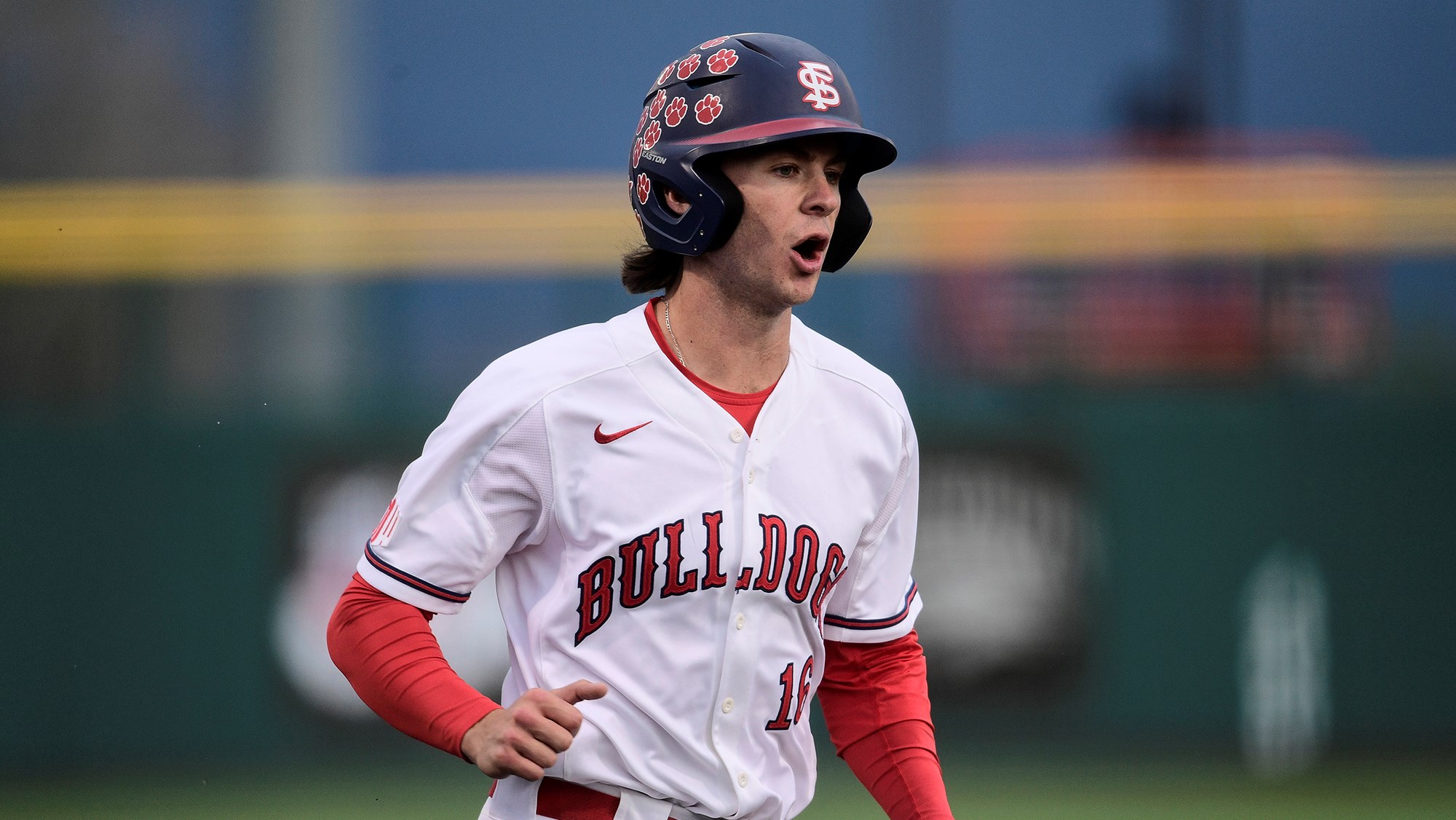
Fresno State with what looks like a new home uniform, although it could maybe be some type of alternate I guess.
It's the quite the departure from the typical home uniform which has basically been unchanged since the Dogs won the CWS in 2008, aside from wordmark/font changes when they switched to Adidas in 2020.

-
 1
1
-
-
New turf for Washington
-
No one seems to like the Red Bull or Austin kits...
Meanwhile, I think they're two of the best unveiled so far

-
2
-
-
3 hours ago, upperV03 said:
They couldn't get the green on the back to match the green on the front?
-
Looks great, love the simplicity.
Could maybe add some yellow on the maroon jersey, I don't think the pinstripes need it though.
-
3
-
-
All these hats suck.
It's weird to me that Japan, Korea, China, and Taiwan are in English letters.
-
I wouldn't care about these ads at all if they weren't so damn big
-
1
-
 1
1
-
-
2 hours ago, upperV03 said:
Best look yet at the new NYRB shirt:
I really don’t mind the color scheme at all, but I’m still not sold on the pattern (at least it’s original instead of a recycled graphic) and really hate the full color Red Bull logo on the chest since both the white and golden yellow clash with the pale yellow of the shirt. Doesn’t bother me as much on the crest, but the chest logo should’ve been monochrome blue or red.
I love this, it might be the best kit Red Bull has ever had.
-
-
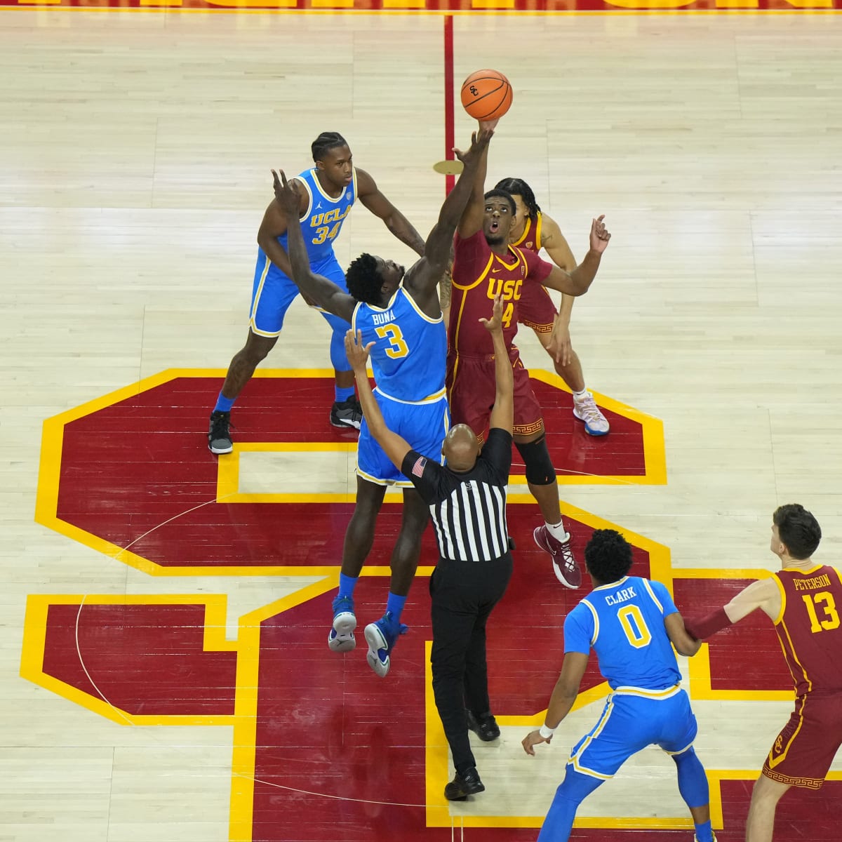
USC vs UCLA never disappoints uniform wise, even in basketball.
-
12
-
-
-
-
32 minutes ago, Sykotyk said:
Wasn't sure where to put this. But this looks like the best place for Fox Soccer's MLS tweet:
Black and gold is a such a boring color scheme for a sports team
-
5 hours ago, Sport said:
Rolen is a fringe guy that I could've gone either way on and I always tend to lean towards just putting the fringe guys in because who cares.
I agree Rolen is a fringe guy and in this current era of voting where the best players are tainted by steroid use a guy like Rolen gets in.
Looks like next year for sure will be Helton, Wagner, and newcomer Adrian Beltre. Andrew Jones and Gary Sheffield are getting pretty high up there too. Joe Mauer and Chase Utley are also newcomers.
-
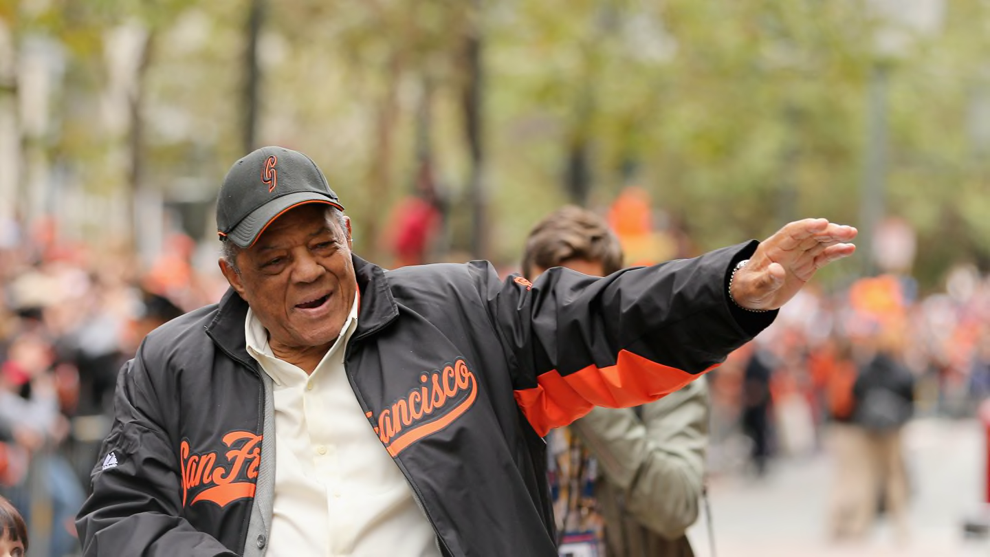
38 minutes ago, FiddySicks said:
White front panel caps for a team like the Giants, who wear cream. There hasn’t been a good Giants BP cap in so long, and the ones that have been good were just carbon copies of their primary and alt caps.
They need to bring back these.
It's awesome how Willie seems to have a lifetime supply of these hats too.
I loved a lot of the spring training hats from that style as a kid.
-
8
-
-
Can the NFL work some deal with the Titans and just give Houston the Oilers name and logo back?
-
1
-
-
7 hours ago, alexandre said:
BMO operates under the name BMO Harris in the States and appears to be in California. I know when I was in Chicago they were everywhere.
I've never seen a BMO in California and I've live here my entire life
-
14 hours ago, Dilbert said:
Two stadium name changes in three days.
Tuesday PNC Stadium in Houston has been renamed Shell Energy Stadium. Today, Banc of California Stadium in Los Angeles has been renamed BMO Stadium.
A stadium in Los Angeles changing its name from Banc of California to Bank of Montreal
Well that makes sense...
-
20 hours ago, FiddySicks said:
I’ve always had this bit of a crazy idea that has the Angels in white hats and helmets (as well as white socks and cleats) at home, at least as an alternate. I know white is a tough color for a baseball hat, but if any team is going to wear white head to toe, it might as well be a team called the Angels.
How about bring back the vest from the 2000's
And wear a white hat with a red brim. NC State already has a similar look.
-
16
-
 1
1
-
-
19 hours ago, upperV03 said:
Here’s confirmation of the Timbers’ new primary kit:
Really can’t wait to see the close-up shots and to see what the jocktag and other little details look like. Also can’t wait to see the kit with white shorts.
With white shorts this is going to look great. The Timbers needed to bring some white back onto their green kits imo
-
1
-
-
54 minutes ago, TreyEight said:
I believe Hawaii is getting new uniforms. They always bring out heat
Their last set with Under Armour were fantastic and great updates to the Colt Brennan era uniforms. Adidas went super basic when they took over, hopefully they can get back to something similar to the last Under Armour ones.
Under Armour:
Adidas:
-
2
-
-
28 minutes ago, djam2410 said:
I've returned to the forum to just say FINALLY!!!!!!!!!!!
Getting any type of new gear for the past few years has been a serious PITA due to this deal being in flux. I was very surprised to see the special Big Game jerseys as well as the road version of the Joe Roth throwback since there had been no updates on the status or end date of the current partnership.
Cal doesn't need any type of flashy uniform as long as they stick to the same options as this past season: blue/gold/white options for uniforms/pants (throwback alternates) and blue/throwback yellow/yellow options for helmets
24 minutes ago, Germanshepherd said:I really liked the California stripe uniforms Under Armour rolled out for them. PRAYING Nike actually does something unique with them instead of just putting yellow numbers on a navy jersey.
I thought the Sather Stripe was incredibly boring and got old really quick, it forced every uniform in their entire athletic department into a dull corner. A couple teams were able to get away from it towards the end, notably baseball which looked great last season. The best uniforms during Under Armor's run were mostly throwbacks though. However, Under Armour did do an amazing job with the bear inside the block C logo and with the wordmarks/fonts.
I really hope they go back to glossy helmets too.
-
5
-
-
On 12/30/2022 at 9:50 AM, Ridleylash said:
Sun Devils introduce another new uniform to their assortment, and it looks really friggin' cool;
Now that is exactly how an Arizona State hockey uniform should look.
-
On 12/14/2022 at 10:05 AM, Digby said:
I'm just glad we won't have to see the terrible white shirts in another major tournament. Using gold feels like a risky flex. I've actually thought about the WNT getting gold trim before for one of these extra Cup shirts but always imagined it would be on a navy/red shirt... gold on white seems potentially a legibility nightmare but might work nicely with navy trim.
The men used gold on their 2006 WC kits and it looked great. If they can do it with no WC titles then the women can do it with 4 and as the reigning champ. France also used gold on their kits in Qatar.
-
 1
1
-


/cdn.vox-cdn.com/uploads/chorus_image/image/65882657/628190874.jpg.0.jpg)


/cdn.vox-cdn.com/uploads/chorus_asset/file/23976284/1242769309.jpg)


North American Pro Soccer 2023
in Sports In General
Posted
Notre Dame already uses Soldier Field for the Shamrock Series (2012 and 2021). Northwestern though plays games occasionally at Wrigley (2010, 2021, and 2023) and will also need a temporary home when they tear down Ryan Field and build a new stadium on the same site.