


Bruhammydude
-
Posts
728 -
Joined
-
Last visited
-
Days Won
1
Posts posted by Bruhammydude
-
-
I would've swore these were dropping later, but here's my take
Pros:Design is not as out there as I thought
The usage of colors pops really well and is balanced (although the road uniform is a little navy heavy)
Any design these days that uses fairly traditional pants striping + contrasting socks gives it a big upgrade
Cons:Why do we need two different designs? You're a franchise that's twenty years old, it doesn't make any sense to not just color swap (especially because I do think the shoulders horns work)
There's pictures of it, but the last names are HUGE! Derek Stingley Jr's nameplate goes the entire length of the jerseyThe uniform is more flashy than it needs too, especially with the all red + chrome; that uniform is not gonna be fun to watch
Just like Denver went all in on mountains, Houston went all in on "candy paint", which is gonna make every single combo of theirs extremely flashy (frankly too flashy)
Other comments:
I won't lie, I actually dig the H-Town set quite a bit. It's annoying that the logo is mostly light blue when the uniform elements are red, but it should look good as a twice-a-year set.
Seems like so much of the uniform is built to look fantastic under the NRG stadium lights, but when the Texan will only be having 2-3 home night games. the candy gloss won't look nearly as good. Frankly, I'm waiting to see what the uniform looks like in normal outdoor sunshine.
Overall, it does work well, but I'm always gonna be pissed off that they didn't just match the home and road uniforms. It's definitely one of the most eye-catching sets in the league now, but that's not necessarily a good thing. Having mostly traditional striping bumps it up, but I still think it's a fairly slight downgrade to the old ones. It could've been a hell of a lot worse, though.
-
 1
1
-
-
Crazy just how much they look like a recolored Chargers from this angle:

Why not just fill in the whole sleeve cap? Now it just looks like a lightning bolt.
-
9
-
 1
1
-
 1
1
-
-
I feel like it's an improvement, but not as much as it may seem.
Pros:Finally got rid of the stripes they had
Colors are more balanced, and it pops better
Pants are more interchangeable
Cons:
Way too reliant on the mountain imagery, like everything about this uniform has something to do with a mountain
Triangles triangles triangles!!!
Stripes could be a little better
Overall, I like the change, but I don't think it moves up too many spots in the uniform ranking. It's an improvement to offer more traditional stripe placement compared to the dated 90's design, but the new stripes are a little clunky. Changes were made in the name of "mountains and peaks" and some of them look a lot better than others. Also don't know why the white helmet was paired with the navy jersey; if I had to guess, they'll wear white/navy/white once, all-navy, and the throwback. in the end, this uniform does not seem to be enough to put it over most of the uniforms it was behind, but it's still a nice change.
-
6
-
-
Is no one going to mention that Antonio Brown under CTESPN of all people might've just leaked two uniforms???? Lmao
-
 9
9
-
-
Fitting that Fanatics would *censor* this up after the incredible year they've been having.
Regardless, I love that they've gone back to a more traditional look. The new stripes remind me of racing stripes, and bringing white back just looks so much better. Of course, it isn't a Nike uniform these days without the perforated numbers, but the overall look is much better. Pray to God that the pants have stripes too

-
1
-
-
The Lions are releasing brand new uniforms tomorrow and we know absolutely nothing of them outside of what's been deliberately given to us. Even a few years ago, it seemed that everything would get leaked in advance, but it's clear that the NFL and Nike have cleaned up their act.
-
11
-
-
This is just the Mariners uniform with an edgier font. Really revolutionary stuff by Nike
-
1
-
-
Not terrible. I hope the other uniforms are very similar, although this football league desperately needs more red dominant teams (just Kansas City, Washington, Tampa Bay, Arizona, and San Francisco at the moment)
-
God, that's a lot of cameras. Technology is nuts
-
New Super Bowl Graphics?
-
1
-
 1
1
-
-
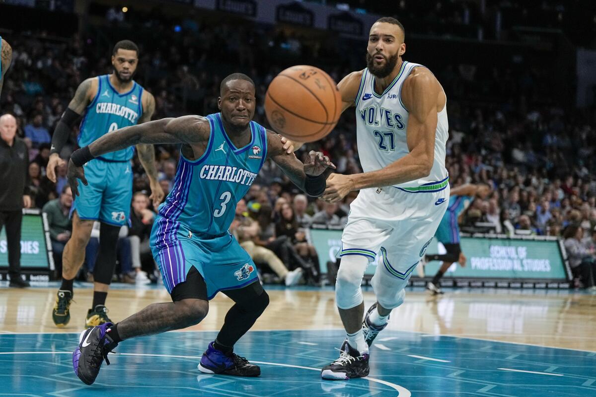
Blue and red court is certainly something.
With my Bucks in white and the Pacers stuck in yellow, what happens if we get a Bucks-Pelicans finals? Both the Pacers and Lakers can play a white vs yellow matchup against whoever, but can you have the Bucks wear green or the Pelicans wear navy? The league already disallowed both the Bucks and the Lakers from their their city jerseys because of contrast, so what do you do if both teams can only contrast with white?
-
19 minutes ago, Kirill_The_Thrill97 said:
Wolves and Hornets in their throwbacks give us a rare good looking modern NBA uni matchup.
Is it really modern looking if both teams are wearing throwbacks?
-
1
-
4
-
-
They're pretty good, but not really special either. I think they'd look better with the colors being more balanced throughout the uniforms. Ultimately, it'll be hard to top the purple and teal uniforms
-
1
-
-
Detroit vs. Kansas City (made this before the game, ended up being wrong lol)
Cincinnati vs. Cleveland
Houston vs. Baltimore
Tampa Bay vs. Minnesota
Carolina vs. Atlanta
Arizona vs. Washington
Jacksonville vs. Indianapolis
San Francisco vs. Pittsburgh
Tennessee vs. New Orleans
Las Vegas vs. Denver
Philadelphia vs. New England
LA Rams vs. Seattle
Miami vs. LA Chargers
Green Bay vs. Chicago
Dallas vs. NY Giants
Buffalo vs. NY Jets -
1 hour ago, Brave-Bird 08 said:
The Packers need to update off the mesh jerseys, if they went to the new template all they would need to do is go with a solid collar and make the sleeve stripes bigger in scale, which would be welcomed anyways.
As a Packers fan, I really do believe that the mesh jerseys make us play better. We've had the most consistent successful results outside of maybe the Patriots for the last 30 years
-
1
-
1
-
 1
1
-
 1
1
-
1
-
-
On 4/12/2023 at 1:23 PM, raysox said:
Baseball rebrands are cyclical
Here's a massively unpopular opinion: Phase 3 is the best looking out of these 4 styles
-
4
-
 1
1
-
1
-
-
I just simply don't see the point of these uniforms. The whole colts brand since 2020 just feels like change-for-change sake. It's very odd to me.
-
2
-
-
Why does this site still have a search limit in 2023? You have to wait ~15-30 seconds between every search you make, which I feel has been ongoing for forever on this site.
-
 2
2
-
-
My nomination goes to Lions vs Falcons in 2020

-
5
-
-
47 minutes ago, HOOVER said:
I feel like this complaint was overblown. It was improved on the Vapor Untouchable template, which the Colts only wore with their Color Rush set:
Not sure how anyone could complain about that.
[dodges incoming complaints)Colts should really run with that shade of blue across the board instead of their almost navy they use for their logos
-
3
-
-
Congrats on winning!
-
2
-
2
-
-
22 hours ago, JustABallCoach said:
I think Texans will be announcing JJ Watt as a 1 day contract and ring of honor guy.
My thoughts too, but I'll be happily surprised if they announce something bigger
-
On 5/2/2023 at 10:51 PM, Cujo said:
How Pepsi debuted their new logo 30 years ago (I believe might've been during Super Bowl 27)
I wish they could still run commercials like this today, its sad that we can't do that anymore as a society
-
3
-
1
-
3
-
2
-
-
Assuming we've been lead on and this is actually a fan concept, I wonder how that fan is feeling about his plan coming to fruition and fooling almost everyone


2024 NFL Changes
in Sports Logo News
Posted
The shoulder stripes and the helmet stripes on the red uniform and helmet are facing opposite ways lol