


sky1324
-
Posts
2,428 -
Joined
-
Last visited
-
Days Won
4
Posts posted by sky1324
-
-
Thank you for those O's updates! Their orange jersey is my favorite in all of baseball. Adding white to the black set makes it actually a good jersey. I'm not really feeling the number font on these unfortunately, maybe it's just because I'm not used to it but it feels too thin and the curves and fancy serifs don't seem to fit the brand.
-
 1
1
-
-
41 minutes ago, tigerslionspistonshabs said:
What do you guys make of the expansion (Seattle and Vegas) rumblings?
Silver's denying it of course, but I'd say those 2 should be ear-marked if and when they expand.
I always though the NBA would be the first sport in Vegas TBH.
I'm sure it's true. Seattle was a given since the Sonics first left and Vegas only makes sense given its rapid rise in sporting circles (earned or not). I'm sure we'll see expansion announced soon (after the next media deal is when I heard) and Seattle and Vegas will be fast-tracked to the top. I don't see them starting play until like 27/28, especially if expansion does wait until after the media deal.
-
1
-
-
Big fan of what you've done for Arizona and Atlanta. I really like the sand and off-white jerseys for the D-Backs and I'm a big fan of swapping the tomahawk for a firefighter's axe. I think swapping navy for black is a lateral move, but it's a positive in terms of reducing the amount of RWB teams in MLB. Great work as always, definitely looking forward to the rest!
-
3
-
-
I like the Permablue initiative but the jerseys are ugly every year. Surely there's a way to use that material to make a normal-looking jersey for each team - perhaps the default color but with blue highlights?
-
2
-
-
2 minutes ago, Digby said:
The people mover looks more OAK than SFO. far as I’m concerned it’s a bus on tracks until proven otherwise!It's a people mover system, like what you'd find at Disney World. Specifically, it's a Bombardier Innovia APM 300 - an upgraded model of what you'd see at DFW or indeed SFO. In fact, it's the first 300 series installed in the US. I'm looking forward to it, taking the bus to the bus center or the C Line was kind of a pain.

(A 300 series in Bangkok)
-
4 hours ago, MEANS said:
The Bears uniforms have never impressed me the way some fan slobber over them.
Most old football uniforms are not as good as they are made out to be. Giants, Raiders, Steelers, Packers, all fine-to-good uniforms that are lauded as some of the best. The Cowboys' mismatched nightmare is the biggest offender of this in my book.
-
1
-
-
For all the sabotage it endured, LA's public transit is actually pretty solid. I can get pretty much anywhere I need to within a couple hours from USC. Certainly better than the one straight line Charlotte offers. LA's issue is that it's been built off of the idea of everyone owning cars, making it a nightmare to drive in or walk in. The suburban single-family neighborhoods that dominate land outside of urban centers are nightmares for building public transit and connecting different parts of the metro.
-
1
-
-
15 minutes ago, swilson160 said:
that's because it is.
https://www.ebay.com/itm/115128685916
that was a joke tweet, i assume. but may well be the inspiration for the cap.
11 minutes ago, DarthBrett said:LOL Ahhh! Okay. I thought the trucker cap was the actual Angels cap Hahaha. Thanks for clarifying. It made sense though since the rumors point to their sets being about surf culture.
That's Ash Ketchum's hat.
-
4
-
 1
1
-
-
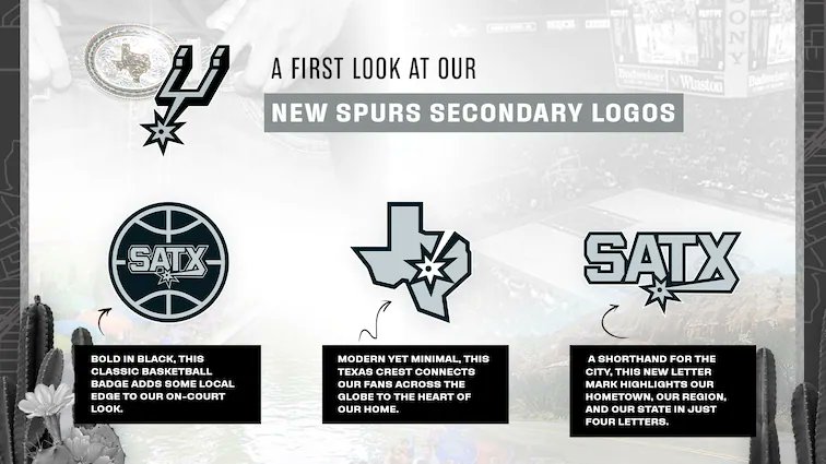
2 hours ago, bowld said:
The SATX logos are ultimately kinda pointless but that Texas logo is actually pretty good. I like it a lot more than the SA ball they had been using.
-
4
-
-
46 minutes ago, tp49 said:
Not a fan of it when Nashville and Tampa do/did it either. It's a bush league move for sure.
Every team does this - the Yankees literally just did the same thing for a game against the O's, which isn't even a playoff game. It only goes viral when a Southern hockey team does it because "oh southern teams need to block out opposing fans to get a full arena of their fans".
-
5
-
-
31 minutes ago, Conrad. said:
first look at the Draft hats:
Looks pretty good, and also confirms those 5 teams to not change logos for next season (damn you, Thunder, and to a lesser degree Magic!). Everyone keep eyes peeled for 2 specific hats

I see they're using PDX for Portland, maybe this means we see CLT for Charlotte? I don't hate the design, certainly seen worse from the NBA.
-
1
-
-
Related to the current NBA discussion thread - the Heat's only good look is Vice. I'd rather have the "Vice Versa" Trix jersey than any of their current set with the exception of the red jersey, which is actually solid.
Related - if the Heat won't switch to Vice full-time, at the very least make the red jersey the road. It has so much more character than the black one.
Related related - The mashup jersey somehow isn't the worst Heat jersey - the military ones from 2015-17 are. Unrelated to the team, greens that don't mix with the actual Heat colors, stupid chest number, discolored nameplates on a basketball jersey, all in all a nightmare. The mashups are bad, the military greens are way worse.
-
3
-
-
1 hour ago, Digby said:
The Heat are, at worst, a top-five franchise in the entire NBA this century, since they've had this brand. How on earth is that "mid"?
My opinion, personally, is that the Heat brand - logos, jerseys, etc - isn't that good. I don't like it. Obviously with championships and whatever it's probably too good to change. I want it to change, though.
52 minutes ago, LA Fakers+ LA Snippers said:Do you just like the vice colors, or the uniform style itself?
For me, it's both the combination of the colors and jersey style. The default style wasn't built for the blue and pink, and the jersey style wasn't built for red and orange. Everything about the Vice jerseys - the blue and pink, the Miami script, the aesthetics that go along with it - is uniquely Miami in a way that the current Heat brand doesn't come anywhere close to capturing. You could plug that in in any relatively hot city and you'd get the same result. Vice is unique to Miami.
I suppose, though, it's the same argument as Red Rocks - both are brands born from the "City" program, so they're more inclined to be representative of the city/state than the team nickname. Your feelings on how appropriate that is and how much one or the other should be represented in the team's brand is subjective. I'm more likely to lean towards repping the city as opposed to the nickname, which is probably why I prefer Vice and Red Rocks as brands compared to what those teams currently wear.
-
2
-
-
I've never really liked the Heat's brand, so I'm all for them switching to Vice full-time. Of course, that would be replacing those 30 years of brand equity, but when the brand equity is mid at best, I think it's ok for them to make the switch.
-
I've been a proponent of colored tops being road jerseys ever since I discovered that's how some NPB teams do it. Teams like the Orioles, A's, Rays, Marlins, Padres, and plenty more should absolutely be using colored tops as their primary road uniform. More classic teams, like the Yankees or Dodgers. shouldn't. In my perfect world, colored road jerseys would be paired with white pants, but that's dependent on the home team wearing all-white jerseys which will never happen. More color in baseball is a good thing!
-
4
-
 1
1
-
-
13 minutes ago, DustDevil61 said:
I’d personally love to see the Flames send their AHL affiliate go to either Salt Lake or Boise (with another team—maybe Bakersfield or Charlotte—going to the other city), but I guess that kind of move makes too much sense these days.Not to be "that person" but this seems very much like a "no hockey in the south" suggestion and not a logical one. The Checkers are a good team close to their affiliate that draws pretty well for a minor league team (6th in the AHL last season, by the way).
Most teams seem to be aiming for the proximity advantage of their AHL team, so I don't know how likely a SLC or Boise team is. Then again, Miami is a few hundred miles from Charlotte so clearly not every team follows that philosophy.
-
1
-
-
Yeah, that's really nice. I think it does a good job of keeping the shape of the D as recognizable while also portraying the tiger eye. Nice stuff!
-
 1
1
-
-
Loving the updates! The classic font for Philly works super well and SA's new badge is rad. That SA interlock in particular rules. The helmet really shines with that deep red. Awesome stuff as always, excited to see you wrap this up!
-
I think you're losing too much of the D here, the shape of your original sketch was better in my opinion. Super awesome concept though, excellent and unique take on a classic team.
-
1
-
1
-
-
3 hours ago, Silver_Star said:
No, they just need a pure overhaul. A redone.
No need to scrap everything from nearly 30 years of history. Changes? Sure. An overhaul using "claw scratches" or "whisker stripes"? Dear god no.
-
3
-
-
13 minutes ago, LA Fakers+ LA Snippers said:
This is the best Broncos uniform in their history:
With the exception of the helmet, I agree. Mix an orange Orange Crush helmet with those jerseys and that's the best Broncos set.
-
2
-
-
Loving Kentucky Tech! The colors remind me of the Vancouver Grizzlies in a good way and I really love the T/horseshoe logo. Nice stuff as always!
-
1
-
-
I like the gold jersey more than most but I'm not sure how I feel about the switch. I loved how they used the dark gray as opposed to black and I'm afraid that uniqueness will get lost with the swap. The gold jersey is certainly Vegas but it clashes with the brand they seem to have built. Oh well.
-
3
-
-
11 minutes ago, oldschoolvikings said:
Um... Okay?
I guess I kinda got it when Kevin Durant was there, and it seemed unfair when the best player joined the best team. I get why that would make someone dislike them. But that does seem to be how the NBA works now. Everybody just seems to try to recruit a super team and take their shot. It's pretty much what the Lakers did when they won the exhibition covid tournament championship. At least the Warriors actually drafted their superstars.
That's the entire answer? They won a lot?
Yeah. They won a lot and people generally don't like it when one team wins a lot and it's not their team. The hate definitely peaked during the Durant years.
-
1
-
 1
1
-


The Rite of Spring: 2022 Stanley Cup Playoffs Thread
in Sports In General
Posted
An American team won the Grey Cup more recently than a Canadian team won the Stanley Cup.