


Gothamite
-
Posts
36,227 -
Joined
-
Last visited
-
Days Won
277
Posts posted by Gothamite
-
-
This is... not good
-
 2
2
-
-
2 hours ago, See Red said:
I don't know how people struggle to understand why people won't drive to a dumpy stadium that's a pain in the ass to get to to watch players they barely know because they all get traded as they hit their prime just to line the pockets of an owner they despise.
We’re talking about one of the best teams in baseball, though. First place from Opening Day to the very day they clinched a pennant.
And still, could only draw flies.
-
7 hours ago, Sport said:
I just don’t understand the quickness to dismiss this enormous factor.
And I don’t understand the insistence on pretending that’s the only possible factor.
Ah, well. To each their own.
-
2 hours ago, Sport said:
I don’t think the market has ever been given a truly fair test.
Before 2008 and 2009, I would absolutely have agreed with you.
-
1
-
-
The Expansion Committee should never have let MLB be bullied into placing a team in Tampa Bay.
-
1
-
-
1 hour ago, Sport said:
I don't know why everyone keeps searching for other reasons when this very large, very valid reason explains the entirety of the problem.
The very large, very valid reason is that the Rays are the third most popular MLB team in their own market. Even when they're winning.
That's not the stadium's fault. It's the expansion committee's.
-
3
-
-
20 hours ago, SFGiants58 said:
I'm not saying you're wrong, but I'm curious about the evidence of the ratings breakdown per team. I doubt the Rays or their network affiliate want to make it public. What would the 38 Yankees and Red Sox games draw in comparison to the other 124 games?
I hear the Yankees-Red Sox sound bite often enough that I want some evidentiary proof. Again, I'm not totally disputing it, I'm just wondering about the statistical validity.
I don’t think we’ll ever get a television breakdown by opponent. But that would be interesting.I was going off the polls from a couple years back that put the Rays as the third favorite team. Among baseball fans. In their own market.
Which would explain the discrepancy between their decent television ratings and their pathetic attendance, which not even winning has been able to improve. “Stadium location” is often cited by the team’s apologists, but I’m offering an alternate explanation that would fit the facts.
-
4
-
-
1 hour ago, Ridleylash said:
Honestly, though, I feel like this whole thing does more to discredit the location for the Trop over the actual support the region has for baseball. The Rays do well for a smaller-market team locally when it comes to viewership, so I don't think it's the overall region that's the problem here, necessarily.
The television ratings are helped by a disproportionate number of games against the Yankees and the Red Sox, the Tampa Bay area's two favorite teams.
-
2
-
-
Downgrade all around. The blue doesn’t have as much contrast with the black as red, and neither does the metallic gold over the athletic gold.
-
3
-
-
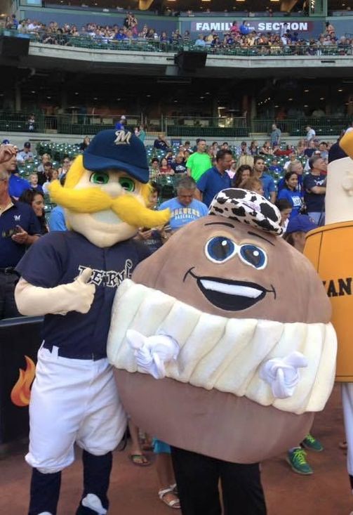
Looks like they’re borrowing and slightly adapting the Wisconsin Bakers’ Association “Original Cream Puffs” logo for the uniforms.

I like it. Very local. Everyone who has been to the State Fair will recognize that logo. And this is an improvement on it.
They will also be using the group’s mascot, Craven D. Creampuff. Here she is with Milwaukee’s second-best costumed baseball mascot.
EDIT: Looks like we have a sneak peek at the jerseys. These I'm much less enthusiastic about.
-
1
-
-
I love this one. The little cap and everything.
-
4
-
-
Good point.
I also understand that different designers within a studio can create very different work. Especially if sports isn’t a focus, they might not have a house style.
-
14 hours ago, NicDB said:
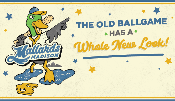
This is almost as cringe when the Milwaukee AA team chose that goofy Milkmen identity. Essentially, "Hey, we're a baseball team in Wisconsin" which makes even less sense when the Mallards play in a league with 9 other in-state rivals. The only thing inherently Madison about this is the capitol skyline in the back. Even the puddles don't look like the lakes surrounding the isthmus.
Also, the old colors tied the Mallards back to the Madison Muskies, the Oakland A's affiliate that broke in the nucleus of their pennant winning clubs from 1988-90. THAT'S what says Madison baseball to me. The fact that it had to be pointed out that the new colors (allegedly) came from the city flag tells me they really missed the mark on a local-based identity.I call BS on this claim. It's not in any of the promotional materials I can find, and after the wildly successful Forward Madison branding I would expect that to be front and center if true.
I did learn a little bit more about the process from this Madison.com article, including this peek at rough drafts:
I like that one on top a lot. That would have been a better starting point.
We also learned that they considered changing the name too, creating a new mascot called "the Muskellard", a muskie/mallard hybrid.
Finally, there was this WTF moment from team president Vern Stenman:
QuoteUltimately, the team and designers stayed with the Mallards and built a new look for the team as it enters its 21st year at Warner Park. This duck will be the third logo used by the team, representing to Stenman a desire to strengthen the connection between the team and the city, specifically the north side.
“Kind of a fun little reference in here that you might not see right away is that he's calling his shot, like Babe Ruth. But he's also pointing to the north side of Madison, which is home,” Stenman said. “And there's a lot of interesting things happening — good and bad — on the north side of Madison."Good and bad, man? Seriously? Way to rep your town.
-
2
-
-
2 hours ago, DMadSport said:
- The rebrand comes from the same design group (Planet Propaganda) who designed the identity for Forward Madison FC; that team shares ownership with the Mallards, and their branding, IMHO, incorporates the Madison touches in a much classier way. (Soccer is perhaps more discriminating in terms of visual brands than baseball, but you get the idea.)
I don't believe that. Not that I doubt the facts, but it seems inconceivable that the best brand in lower-level American soccer came from the same firm that gave us this mess.
Seems like the teams may share ownership, but they sure as hell don't share staff.
2 hours ago, DMadSport said:- The rebrand originated with an off-the-agenda remark from the team president during a staff meeting about whether coming out of the COVID lockdown was the right time for the Mallards to rebrand; the staff thought it was. That meeting took place last September -- only eight months ago!
Now that I believe.
-
56 minutes ago, Sec19Row53 said:
Not to nitpick, but they aren't professional -- they're a collegiate wood bat league. Decidedly NOT professional.
Where I agree with you is that, like the team, the logo isn't professional either

Point well taken.
-
1
-
-
1 hour ago, Gothamite said:
Soft unsaturated pastel colors don’t feel particularly “Madison” to me. Nor do they work for a baseball team.
48 minutes ago, tBBP said:Not even when they're pulled straight from the city's flag??
But they’re not pulled straight from the city’s flag. The city uses a very bold gold and saturated sky blue, as seen on their voter drop boxes:
QuoteAnd as for their use on a baseball uniform, well...Boston just put it that on blast with those City joints
Boston also used a pretty standard gold and sky blue. Not these unsaturated, muted wall paint colors.
The cream really doesn’t help. Maybe if the blue was more sky and less slate, it would be better. -
Yeah, this is... not good.
This is the home cap. The winged-M has promise, but they ruin it with the tail, extra outlines and a drop-shadow. Ugh.
and this is the road cap. The “cheese home plate” is fine in the context of a batting-mascot logo, I guess, but is pretty stupid on its own.
I mean, that is the cap for a professional baseball team. Ugh.Soft unsaturated pastel colors don’t feel particularly “Madison” to me. Nor do they work for a baseball team.
-
2
-
-
White.
-
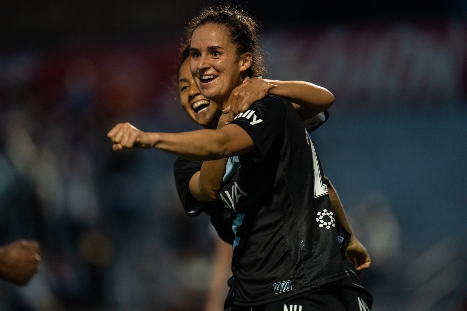
And if you look at the team's website, they're really leaning into it.
They use the three letters for game stats:
QuoteStats Summary: NJY / NCC
Shots: 15 / 15
Shots on Goal: 6 / 5
Saves: 2 / 2
Corner Kicks: 5 / 7
Fouls: 7 / 13
Offside: 5 / 0
Misconduct Summary:
NJY – Jennifer Cudjoe (caution) 86’So no, I'm not sure we can say they're ditching the place identifiers.
-
And yet, this was last night.
Looks like the only thing they've chopped off is the slash.
-
On 4/3/2021 at 11:07 AM, Lights Out said:
That script is very hard to read on the home jersey. They probably should have gone with a double outline.
Double outlines never improve legibility.
They probably should have gone with a better script.
-
On 4/8/2021 at 9:42 PM, Digby said:
Not a super thrilling rebrand but the logo and now the jerseys at least have a solid color scheme and don’t look cheapo. And doing the photo shoots on that one instagrammable block in DUMBO. An overnight shift to actual professionalism for this team.
New Jersey/New York New York FC will look pretty good this year.
-
1
-
-
“Feelings”?

-
9
-
-
1 minute ago, Dilbert said:
Valpo Kernels! Valparaiso is where Orville Redenbacher created his popcorn and the city has a statue of him and a popcorn festival every year
That’s worth changing even a non-offensive nickname to.-
9
-


Stadium/Arena Saga Omnibus
in Sports In General
Posted
MLS does not have a SSS requirement.
It has a “control your stadium” requirement, to ensure that its teams aren’t tenants in somebody else’s park, without access to the revenue streams that a primary tenant controls even when someone else is using the stadium.
So when MLS teams share ownership with the primary tenant of a stadium (like in Seattle or New York City), MLS can write the contract guaranteeing the soccer club a measure of most-favored status in the stadium, they’re plenty happy to put its club in a non-SSS.