


GrayJ12
-
Posts
593 -
Joined
-
Last visited
Posts posted by GrayJ12
-
-
On 9/13/2022 at 11:04 AM, sitboaf said:
True, but... a basketball team named "the Court" with some kind of royalty theme wouldn't be the weirdest nickname the NBA ever had...
This just reminds me of teams naming their courts "The Palace" or "The Forum"...
That and Indy's minor league hockey team was named the Ice...very creative and groundbreaking.
-
 2
2
-
-
I love the stripes! Looking great
-
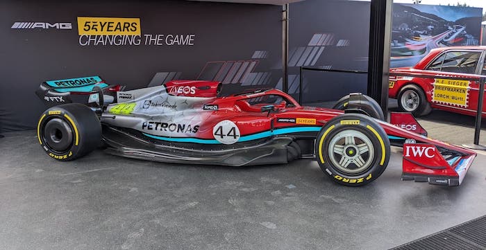
On 9/5/2022 at 9:48 PM, pepis21 said:
Technically is not an uniform but actually it is kinda like uniform depends how we gonna looking at that. Unused Mercedes F1 AMG 55 years anniversary livery from 2022 Belgium Grand Prix at Spa:

Here is article about why they unused it: https://i-itm.com/mercedes-explains-why-it-didnt-run-red-pig-livery-on-f1-car-2/
Holy cursed...never would had thought I would see a red Mercedes...
-
53 minutes ago, LA Fakers+ LA Snippers said:
They already do:
The air traffic peeps need to sue for copyright infringement.
-
 1
1
-
-
2 hours ago, Pleepleus75 said:
More pics from Chiefs field
Yes please. Glad to see retro fields coming back in style. I'd love for the Steelers to bring back the steel logo pattern for their end zone:
-
4
-
-
Those Seahawks unis are an all-out assault on the retinas. Someone needs to wear that on the airport runway trying to land an airplane.
-
2 hours ago, DCarp1231 said:
Noah Gragson was announced a few weeks ago as the driver of the 42 in 2023.
We now know his replacement in the 9 at Jr Motorsports
Brandon Jones, the eternal Xfinity driver.
It looks like JHN just might take over the 19 then (or the 54 if Ty moves up to take over the 18 in Cup)
-
-
11 hours ago, Djruggs said:
Unis are great, but you're def in the minority when it comes to the logo preference lol
I actually don't mind the new logo. Fun fact, my school (Ball State) plays UConn this year. Should be fun to get to see them in action.
Anyway...I like what you did to clean up the logo, that odd color on the eyes always bugged me. However, I feel like the Husky logo shouldn't be on the helmet - something about it just feels off, and I can't place my finger on it. I also like the stripe that you added from the basketball jersey!
-
1
-
-
I love what you did for the stripes for the Jags! I'm surprised they haven't capitalized on that with their designs IRL! Also YES to the rejected '95 design! I love it, keep up the good work.
-
On 8/31/2022 at 7:29 PM, raysox said:
Oh I adore these stadiums. GREAT work, man.
I agree. The level of dedication with creating these stadiums and these units is amazing. I love this.
-
Well, that was an interesting race.
Usually, I would be over the moon about my guy AD3 winning. But it just doesn't seem fair. The only reason why he won was because NASCAR did not have the wherewithal to throw the yellow before the '01 All Star Race Part 2: Electric Boogaloo took place. The fact that almost half of the field was yelling that it was raining in one and two makes it worse.
That and the darn playoff format. I'll be the first to say that AD3 doesn't deserve to be in the playoffs this year. Sure, he's had 3 or 4 chances to win this year, but he hasn't even been the best driver in his organization. He's just been very inconsistent. In a perfect world, the win-and-get-in format doesn't exist and we still put people in the playoffs based on points and consistency, or even better, we just get rid of the playoffs in general.
But what I have learned as a NASCAR fan is that they never choose the common sense path.
-
2
-
-
On 8/16/2022 at 7:31 PM, neo_prankster said:
I think it might have to do with being able to reproduce on mobile app icons.
I feel like Apple's big UI rebrand with iOS 8 back in 2014 is a big inspiration with this "debranding" and shutting towards more basic branding features...the philosophy of this branding style (Corporate Memphis) is very interesting to read up on.
-
The Indianapolis Colts jersey pants of the 1980's had a nice feature that I'd wish would make a comeback:
Yeah, I don't think silver works for the Colts, but the horseshoe on the pants stripe with the number of the player is such a nice and neat feature in a history of a team that has had one of the most consistent looks in sports.
-
3
-
-
Pittsburgh's jersey is one that I could very well see making it onto a major league field. I love the whole "blackout" look.
-
1
-
-
This gives me small town Little League vibes and I love it. Interesting and unique concept.
-
1
-
-
On 7/30/2022 at 10:45 PM, Cujo said:
It's amazing to see what brands that are common in my area have different names in other parts of the country, i.e Hellman's/Best Foods, Dreyer's/Edy's, Checkers/Rally's..some very interesting stories.
-
On 8/20/2022 at 8:10 AM, johne9109 said:
Carolina Panthers
One thing that's always bothered me about the Panthers is that they have this beautiful color in their blue, but it's always been a secondary color. I get the reasoning is that panthers are black so that's why they wear black mainly, but it's such a great shade of blue that I made it the primary color for the home and away uniforms. There is still a black uniform in the form of the alternate home and we also get a silver uniform in the alternate away. The throwback uniforms are from the 00's; I went with these over their original uniforms as I felt the sleeve striping was more unique.
I get what you're going for with the Carolina blue on the helmet, but something about it just doesn't add up...maybe it reminds me too much of the Lions. I personally think that black would look better with the home and away to distinguish themselves from the Lions - the alt's look great too!
-
1
-
-
I really love the Bucs look and the backstory behind it. I have never heard that story before. I feel like adding the old Jolly Rodger onto the helmet might help it look more like a pirate ship, IMO. The pattern on Atlanta's jersey reminds me of the pattern on the old Bears jersey (that they brought back in 1994). Really good stuff here!
-
23 minutes ago, MJD7 said:
Detroit Tigers Cooperstown Collection
This jersey is an amalgamation of one Detroit wore in 1929 and the one-year jersey that read "Tigers" in 1960, allowing for the occasional use of orange at home.
Yes, yes and yes. I am all for Detroit to embrace more of the orange in their identity, and this uniform is a great starting spot for this.
-
2
-
-
On 8/8/2022 at 10:06 PM, Crabcake said:
That Cubs hat is great but MLB is off their rocker if they think I'm paying $44 for it.
That's what I am thinking. I love that old-timey Cubs logo, but unfortunately the money its just too much.
-
The only team that I can see this working for is Vegas (besides Vancouver)...however very interesting concepts so far. I'd like to see you do some with some team's older color schemes (such as the Islanders' 90's fishstick look).
-
1
-
-
14 hours ago, BBTV said:
It really is a shame. It would have been a million times worse had they won it in home in those tops. That would have been a true disgrace.
This is a joke right? While their current road unis aren't flashy, they're miles ahead of the "Cuba" uniforms that featured 1) an unnecessary red-brimmed cap, and 2) a 4-letter script which is entirely too short of a word to look even a little bit professional on a baseball uniform.
A) That would had been the worst timeline to live in. It's like a deal with the devil. "Your team will finally win the WS, but they will win it with the most disliked alternate uniform in baseball".
B)You're right, the red-brimmed cap was awful, but ANY road uni that the Cubs have had before '97 is better than what they have right now.
-
 1
1
-
-
1 hour ago, MJWalker45 said:
They did that with the alternate black uniform and I dislike it vehemently. The team hats with the camo patterns this preseason are horrible looking as well.
The alternate uniform was a half-formed attempt, and they need to build that identity on their main uniforms, not the uniforms that they are going to wear once or twice a year.
-
1
-


NASCAR 2022
in Sports In General
Posted
Yesterday was this generation's Indy 2008...because of all the tire failures.