


GrayJ12
-
Posts
593 -
Joined
-
Last visited
Posts posted by GrayJ12
-
-
1 hour ago, CS85 said:
The Max thing feels very much like a "shell company just in case we have to file for bankruptcy due to lawsuits/etc" situation.
Now introducing the next streaming service...STEVE
-
 1
1
-
 2
2
-
-
26 minutes ago, WestCoastBias said:
Add Salt Lake City to the list of possible expansion/relocation cities (Las Vegas, Portland, Nashville, Montreal).
I know SLC has had a boom over the past few decades due to the 02 Olympics and their tourist industry, but I feel like they are in a weak position - they would be probably the smallest market in MLB.
-
On 3/31/2023 at 12:27 AM, Cujo said:
The Astros' best-ever look:

The Astros' second-best look:
I agree with the top photo...criminally underrated; Randy Johnson in that uniform in 98 looked good. But I'm split between Tequila Sunrise and the current unis for the second-best sets...
-
19 hours ago, 29texan said:
They could have gone with a better font... but it's an improvement for sure.
The font for this new logo feels like a combination between the 1950 and the 1987 logo, in my opinion. I don't think it works, it feels clunky and too loud.
-
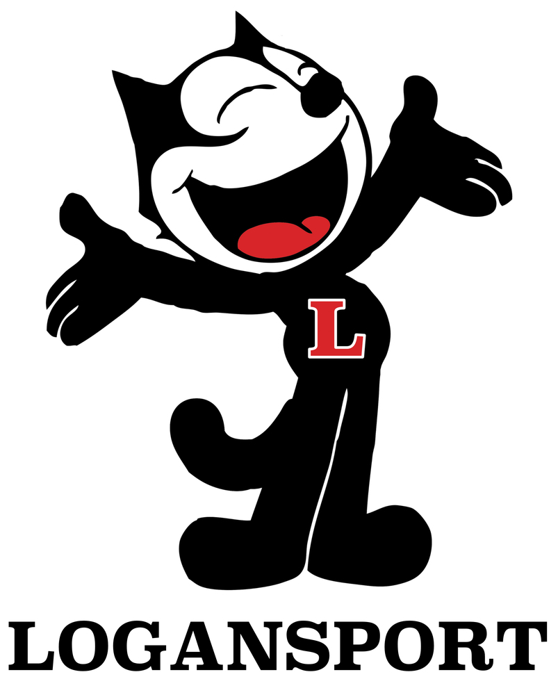
Over here in the Hoosier State, my high school (thankfully) didn't copy from a college/professional team, however a good amount of our rivals do.
A unique one is Logansport, whose teams are called is the Berries, however their mascot is Felix the Cat - and it is considered to be the oldest mascot in Indiana, dating back to 1926:
-
19 hours ago, Ferdinand Cesarano said:
I previously said that that I dislike the black more than the font itself. But I have changed my mind on that.
The company states that black ties the logo to the new flagship product Pepsi Zero. OK, fine. But if they fixed the font to straighten out the bottom part of the loop on the P, the whole thing would look a lot better.
Looks like somebody in Pepsi's marketing department is stuck in 2006 with the BFBS trend.
-
Oh my goodness, that is great. The green and the blue mesh together really well - it reminds me a lot of the original T-Wolves logo. The Nordic Cross touch is unique in this as well.
-
 1
1
-
-
You're forgetting the T falling off of the jersey.

But in all seriousness, great stuff. I feel like if you center align the text in the road jersey, it will be better on the eyes.
-
1
-
-
I've never liked the national baseball logo. It looks too much like a junior-college athletics logo.
-
1
-
-
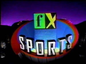
18 hours ago, Cujo said:
Yup. It's been a while
Now that's cursed. The old FX logo was odd, to say the least.
-
10 hours ago, Old School Fool said:
How about ESPN on FX? Yes, this is what a lot of the XFL games will be on this year.
FX is airing sports (not counting UFC) for the first time since MLB in the early 2000's.
FX also aired some NASCAR too in the early 2000s before Speed came into existence.
I don't know why they put the favorite on the scoreboard, it just feels like an unnecessary thing to add to the scoreboard already littered with info.
Also, ESPN on FX is going to take a while to get used to. Reminds me of Nick on CBS back in the 2000s for "weird TV channel crossovers".
-
1
-
-
53 minutes ago, Luigi74 said:
One of the Buccos minor league teams should do this.
I'm all for Indianapolis to change their identity to this.
Another unique idea executed great. The Parrot fits into the Pirate's aesthetic really well. Can't wait for the rest of this!
-
2
-
-
I never would have even thought of the Chiefs keeping their name but changing their mascot/visual identity, but you made it fit in so seamlessly. The logo gives me strong Washington Huskies vibes, which I love. The font also gives a classy "retro futuristic" feel to it, which I love. Great stuff, and keep up the good work!
-
1
-
-
I love that subtle D shape in the hat.
-
I don't know how to explain it, but this just FEELS like a Fox graphic. I was disliking it when the game started, but it's been growing on me all game.
-
5
-
-
We've got a new team in the fold:
Now since this tweet, the team has decided to forgo the 500 and debut at the Phoenix race...but it's always nice to see new teams join the sport.
https://twitter.com/bobpockrass/status/1624429616512352258?s=20&t=Mi-Dwk9
-
On 2/7/2023 at 6:16 PM, Discrim said:
Yeah, they kinda fluctuated between "we're red and white" "no, we're red and gold," and "no, no, no, we're red and silver" for most of their first two decades.
I always assumed they had the gold base on the helmet when the first introduced the logo on the helmet...
-
I would be surprised if they did. They switched from Tempe to Pasadena two years before Super Bowl XXVII, so they might have begun discussions about a logo by then, but I don't think they would have been a completed logo.
-
On 2/5/2023 at 10:36 PM, pepis21 said:
According to logopedia this is a secondary logo since last year.
I thought I remember seeing it during the Vikings/Colts game last year...
-
I was going through the Gridiron Uniform Database last night and I noticed the 49ers wore their logo on silver helmets in 1962 and 1963 before switching to gold helmets for 1964 and beyond:
-
The yokes are a really nice touch for WSSU. Great stuff.
-
This is going to be interesting too since the Clash for NASCAR will be this weekend. They just switched to the post-Super Bowl LIV graphics last year, and the last time FOX had a graphics package that lasted only one year was the 2006 design package.
So who knows? It could be a soft launch for the Clash or the NASCAR package won't change.
-
10 hours ago, Jer15 said:
Not that it's a surprise but....No major changes for Red Bull
This might be an unpopular opinion, but I don't get the fuss about Red Bull not changing its scheme. Sure, every other team is switching up its looks, but if it ain't broke, don't fix it. This scheme is still a very strong design to this day (though I am glad they will be running some special designs for the US races).
-
1
-
-
2 minutes ago, JQK said:
This is gonna look good on the field/as a patch
Interesting that they would arch the Roman numerals; I would assume they did it to make the numerals legible?


:format(jpeg)/cdn.vox-cdn.com/uploads/chorus_image/image/14852443/gyi0060614193.0.jpg)


Warner Bros. Discovery Logo
in General Design
Posted
Catch the wave...