


FCMacbeth
-
Posts
377 -
Joined
-
Last visited
Posts posted by FCMacbeth
-
-
Well, I'm going to step in and have a say in this post.
Because everything (sans the jerseys) you created is AI, technically you didn't create everything from scratch. The only thing you did is giving every team's home stadium and mascot a name and leave AI to fill in the lore . Apart from that, it's hard to comment about your concept series when the quality of the logos itself are depends on how good a machine can draw and create them. It is possible that AI might turn people off because in a sub forum about showing off your creativity and artistic skills, yours is "soulless", to put it bluntly.
On the other hand, I appreciate your honesty and make an attempt to get yourself involved in the creative process, even went as far as creating jerseys yourself. You didn't lie to everyone and say you made everything from scratch, and yet you made some modifications to those AI-created logos so it doesn't look weird and janky (especially when it comes to putting words in the picture). When AI can take you so far, you went to extend the distance and go ahead as usual.
Though, if there's one thing I can leave you here, would you be able to take a picture from the game itself rather than using your phone? It might help you if the quality of your jerseys.
-
 5
5
-
 1
1
-
-
4 hours ago, ruttep said:
Previous Twitter link died, hopefully this one stays up
Even for a supposed Stadium Series jersey, I find it hard to think it passed through the design phase. The sleeve stripes are too much and too thin, and the whole thing feels like separate projects mashed into one, with no connection whatsoever.
-
11 hours ago, officeglenn said:
Three new jerseys for the ECHL's Norfolk Admirals:

The old logo's better. Also wish they picked a better template than the one the Knights use.
The gold alt is better, though, and they could've use it as a basis for their new duds instead.
-
15 hours ago, the admiral said:
When you have a classic logo, you should make sure not to wear it 15% of the time and replace it with a flaming-snot horse from when the team really sucked and everyone wore unnecessary black.
Because darker = tougher? That's the only explanation why they kept it.
-
8 hours ago, ruttep said:
Please, Rangers, PLEASE keep your jerseys ad-free. With the layout of the diagonal letters, the ad would look way, way worse than it does on any other team.
By the way, does anyone know why the nhluniforms.com site is down?
That's an interesting case. Where would they put the ads on the jersey that doesn't have a traditional crest? Obviously, it would look cluttered if it's just the normal placement, but would putting it at the shoulder area work?
I'm only saying this because inevitably the Rangers will get an ad patch somewhere done the line. Really, we just don't know when.
-
9 hours ago, VampyrRabbit said:
Thanks!
I tried a more lopsided I logo.
I would probably still go with the inline i.
This is basically the lion from the current logo (with a few modifications) in a shield shaped like a gas lamp, as with the runner up in the recent fan vote. The yellow lion on light blue doesn't give the best contrast, so now the lion is claret, and claret and light blue are the only two colours on the crest. Aston Villa were the team that popularized that colour combination in English football, so it's only fitting that those are the only two colours on the crest. The inner outline is broken to create a V for Villa.
C+C would be cool.Would you be able to fit in the club's initials and the word Prepared inside the gas lamp shield crest?
-
7 hours ago, Blindsay said:
What in beef Bergeron did I just look at? What have you done to the Spoked-B? What did it do you to, man?
-
6 hours ago, spartacat_12 said:
Some awful placement of the captains patches on the Ducks jerseys now that there's an ad & anniversary patch.
They really should've just swapped out one of the shoulder patches for the anniversary logo.
Least we know how screwed up it is.
-
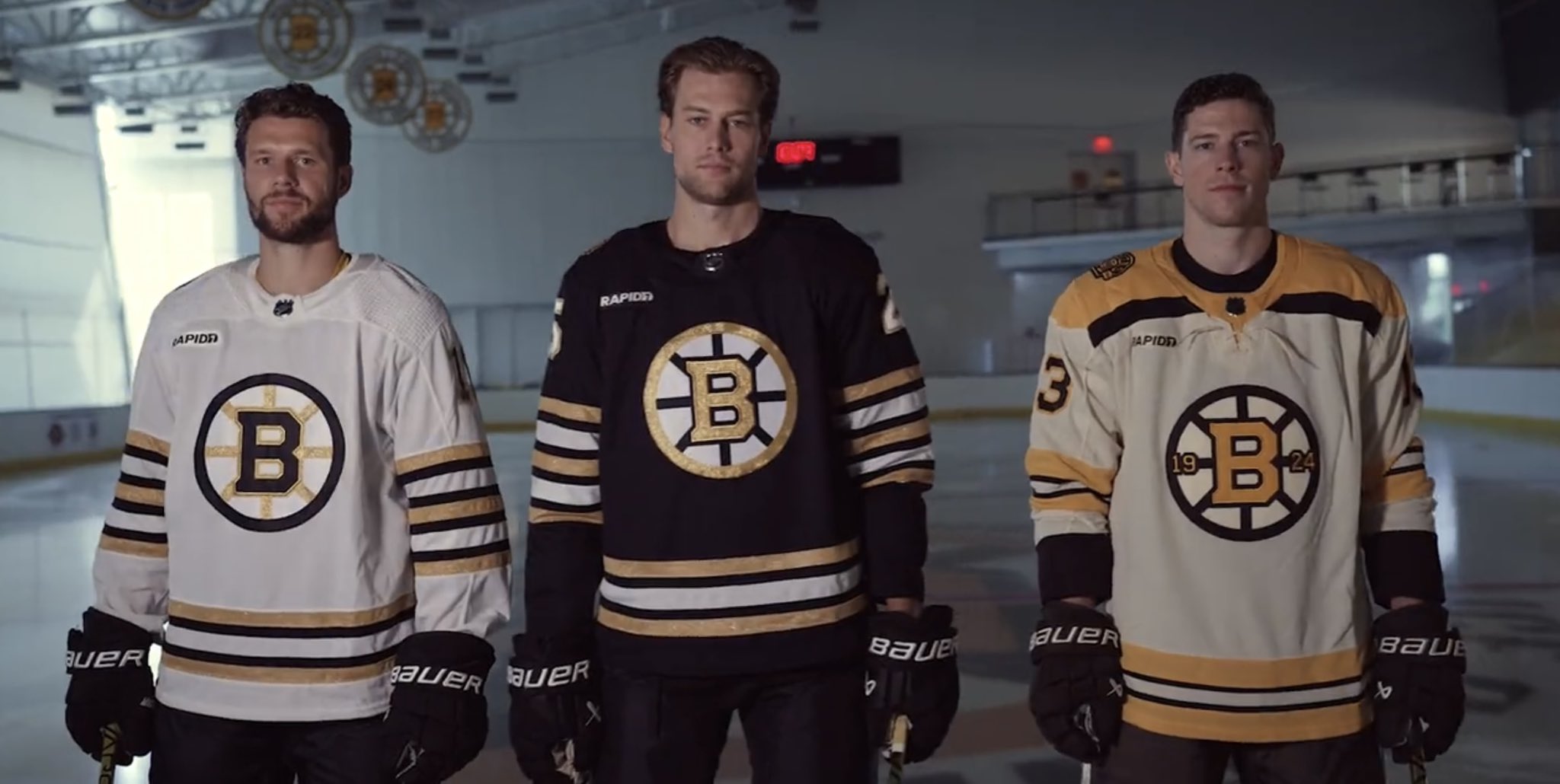
On 9/17/2023 at 9:48 AM, JohnnyCowboy5 said:
For a jersey set that's meant to celebrate a century worth of their history, it's the mildest design I've seen. It's not the most offensive thing I ever seen (ad patch aside), but I think it could've been so much better.
For example, why isn't the yoke from the home and away jersey shiny gold from their stripping? Without it, you would think it's a knock-off jersey made by someone straddling the copywrite line so the lawyers won't catch him for plagiarism. And while you're at it, do the same with the cuffs as well.
Again, it's not a bad jersey. It missed the opportunity to pay a proper tribute to the Bruins history by being halfway between generic and unique.
-
17 hours ago, CaptainBuzKill said:
ROSEMONT WOLVES
For the team that blocked me on Twitter because I called them out on their stupid "We Are Chicago's Team" when A. No that's the Blackhawks and B. You aren't even affiliated with them... I decided not to do too much with them.
I mean, Rosemont is in the same county as Chicago (Cook County, for those of you wondering). And it's not that far either. So, therefore, not stupid. Just weird.
Other than that little quip, your series of AHL concepts are visually pleasing to my eye, especially the heritage ones.
-
 1
1
-
-
3 hours ago, johne9109 said:
What if the Pittsburgh Penguins relocated to Kansas CIty?
In 2006 the Penguins were dangerously close to being relocated. One of those placed was Kansas City. With the move comes a slight rebrand; they switch their name from Penguins to Emperors. This allows them to keep the Penguin branding, but has them tie into the Chiefs and Royals branding of their new sister teams
That's just like what the actual Pens wore before their 2016 jersey redesign. You need to find a way to tie into the identities of KC's other teams, because it's virtually the same thing. Though it's understandable that this whole thread is just a "what-if" situation where the relocated team's identity only change where they're needed.
-
On 5/25/2023 at 4:01 PM, PascalHugo said:
Thanks mate!!! Not the time for Turin yet

Thanks, thanks, thanks and thanks!!!
I appreciate a lot!!

There are still 4 clubs left until the end of Lega 1, and then we will fly to the USA.

I can only tell you that I have already started working on American clubs.

Keep following!!
Any hint for the last 5 clubs in this league before we move on to America.
-
I'll take option B. The rose is far too good not to be used as the primary logo.
-
2
-
-
2 hours ago, Cujo said:
Found some real gems on here. Most of their screw ups (coincidently
 ) are on NHL swag.
That 10-year deal is going to fall apart quicker than what the NHL thinks. If this keeps up, they're done for.
Still, if Fanatics defied all odds and actually make an effort to improve quality control, within those 10 years that hatedom will be gone. But until then, oh lord......
-
1 hour ago, M4One said:
Fanatics will become the official NHL jersey supplier beginning in 2024-25, with the deal running for 10 years. The on ice jerseys will be made in the same factories as the current ones in Quebec and the specs will be the same. There will be some differences in the fabrics and materials.
The NHL says the first significant changes to the jerseys could come in 2026-27 when different fabric options and player safety innovations like protection against skate lacerations might be introduced.
I don't know what their jersey templates will look like, but y'know. Fanatics being Fanatics, their quality control absolutely needs a significant overhaul. To have the monumental task of manufacturing all 32 teams while being notorious for how terrible their quality is, to begin with, is immensely hard. To win those fans is even harder than that since we've already heard stories of misspelled player names and nameplates falling off. Fanatics has a year left to deal with this problem but I doubt they would take those criticisms from the fans seriously.
-
1
-
-
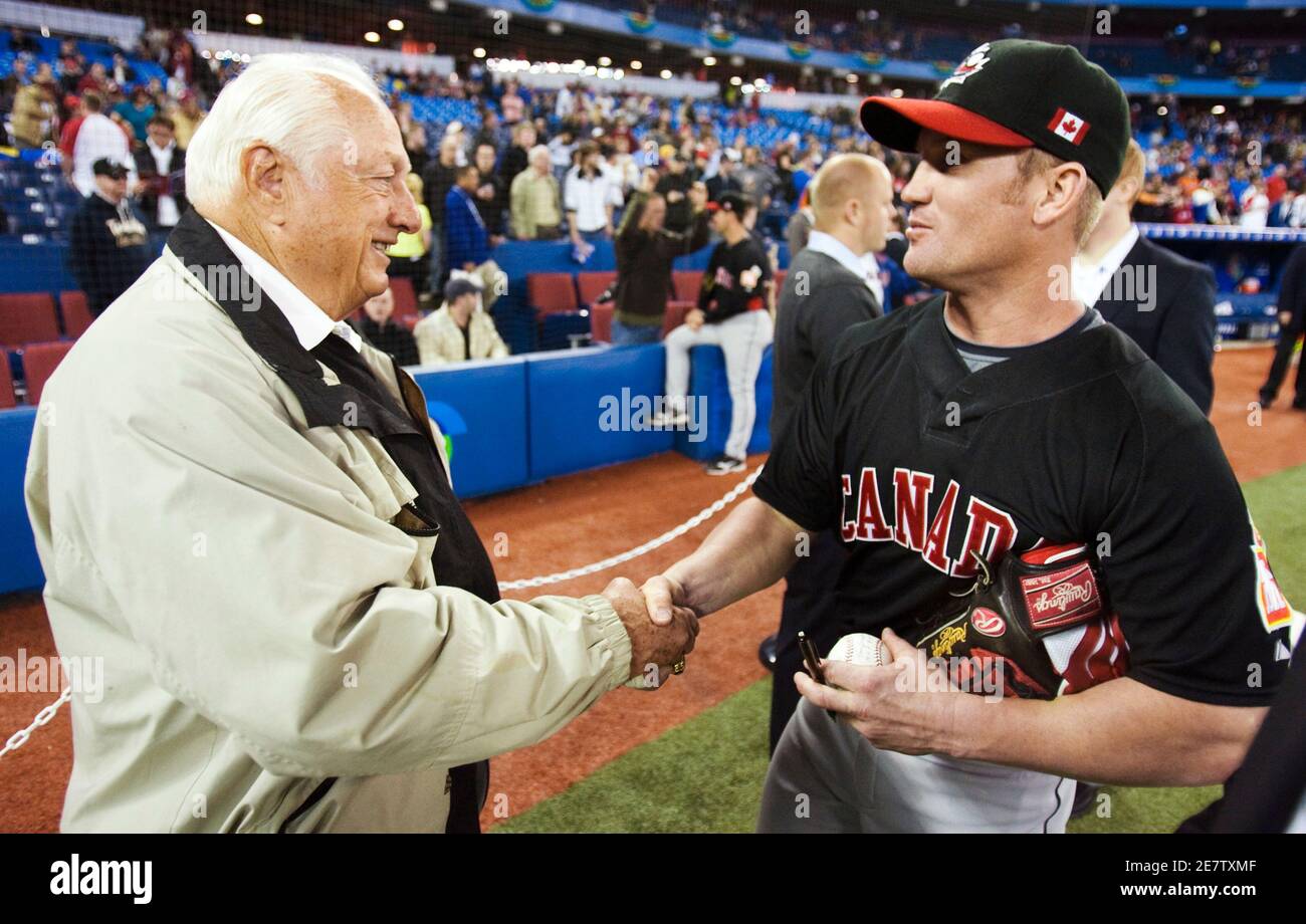
43 minutes ago, Victormrey said:
Well, given it's a baseball set, white and grey are taking for granted for the home and road jersey, respectively. So, no chance of using red as main colour for either of them.
Regarding the black alt, since the design was finished around October, I'm not sure what do you mean with "last-minute-choice", specially when Canada have used black jerseys before.
Anyway, here's a red version of the alternate jersey:
Honestly, I like the result. What do you guys think?
I always think of Canada as a red-and-white team due to the flag design being just that. They could handle well without the need for tertiary colours like black. Therefore, having a black Canada jersey made me think that the design department needed to find a 3rd jersey that isn't red or white, so in a rush, they grabbed the black one as the first thing they picked up at a store.
It might just be me, though. Your Canada set can live without either the grey or the black (though I leaned on the black more since at least grey has a good amount of historical precedence).
-
1 hour ago, Victormrey said:
Thanks a bunch!
Apart from working, I think adding black to the wordmark helps to create a more cohesive look, since the cap/helmet and the maple leaf logo use it.
Here's the alt design with the piping from the home and road jerseys:
So, you're tasked with creating a decent-looking Canada baseball jersey, and none of them have red as a primary colour. Instead, all you give them is a choice of clean white, typical grey, and last-minute-choice black.
I know you want to separate countries that use red as their primary home, but I'm sorry. It's not really complete if there's no red jersey.
-
51 minutes ago, IceCap said:
I remember back in the day a few old timers here consistently said Winnipeg, Quebec City, and Hartford shouldn't get teams again because those cities failed to hold onto their teams.
But here we are after two failed Atlanta runs and the league wants to go back before Quebec City?
Maybe the people who advocate for this idiocy should just come out and admit their own biases/issues and stop pretending there's anything high minded about their stances.
Well, had the Thrashers been able to build up as much success as the Stars, the Knights, and the Bolts, then we wouldn't have thought of that in the first place because it proved the NHL was right about giving cities down the Mason-Dixon line a franchise to start a team.
Speaking of Atlanta's 3rd attempt, I wouldn't be surprised if it ended up with reviving the Nords. And nobody should be if you know how Calgary and Winnipeg (on their 2nd attempt) got their teams.
-
So, I've been wondering for the longest time about the CCM Quicklite template that every minor league team uses.
Is it just a Reebok Edge template with a new collar, or is the jersey stitching from the Quicklite different from Edge and Adizero? Is there a difference between Edge, Adizero, and Quicklite at all aside from the collar designs?
I'm just wondering.
-
4 hours ago, VancouverFan69 said:
The Wild name needs to go, even at the expense of one of the most creative logos in sports. Going with a far more suitable major pro sports name, if not the North Stars v.2, while using some form of green and yellow/gold(without black) should be the order of the day in Minny. I still love the "Northern Lights" with the updated N.
Losing a beloved name and brand is one thing. Replacing it with a horrible name and with colours fighting for primary status is an insult to injury, no matter how creative the primary logo is.
Tell that to Dallas and see if they would accept having another team call the Stars, because they're sure as hell won't.
Also, they could keep the Wild name and go back to their old North Stars colour scheme if they want to, since these two identities are not mutually exclusive.
20 hours ago, AFirestormToPurify said:This is why vintage white away uniforms will never work
It would just remind me of dingy old appliances yellowed by years of grease and cigarette smoke.
Screw you, son. Vintage white jersey rocks just as well as regular white jersey. I'm a sucker for them.
-
3
-
 1
1
-
-
That 1994 logo looks way better than their current one, though in fairness the shield shape is too similar to that of Palermo FC. Also that 1983 logo simply reeks 80s design (mainly because the Eagle design came straight from the Lazio kits of the early 80s).
-
10 hours ago, WSU151 said:
The second leak today...adidas should skip the lame teasers and just unveil all of them.
Strangely good? In fact, reversing the black and blue to the main jersey and full-length yoke somehow made the jersey good, alongside removing red from added cleanliness (because the original jersey made red itself throwaway colour despite being part of Columbus' colour palette.
Otherwise, I'll go for the double blue colour scheme that worked well with their branding, as evidence by their current fauxback.
-
8 hours ago, Ricky_Roby said:
I can't even see the Senators text. For legibility sakes, white would be a better choice.
Also, Ottawa missed an opportunity to bring back the
CivicsNationals jersey from the WHA, and re-apply their colour scheme to boot.-
2
-
-
On 10/15/2022 at 3:56 AM, coco1997 said:
- Although this one clearly breaks my "no corporate names" rule, "The Trop" nickname sounds a lot better than "Tropicana" and lends itself better to a jersey design.
Thanks to you, I think the Rays have missed an opportunity to call their field 'The Trop Park'.
-
1
-


2023-24 NHL Jersey Changes
in Sports Logo News
Posted
Well, at least the color fits on the jersey. And that's the only positive I can give.