


FCMacbeth
-
Posts
377 -
Joined
-
Last visited
Posts posted by FCMacbeth
-
-
42 minutes ago, Nordiks_19 said:
Because the new owners have no tastes in hockey jerseys, wich is why they made the black alternate their new home jerseys.
Probably having their mindset stuck in the early 2000s era of jersey aesthetics.
-
18 minutes ago, TenaciousG said:
I’m so grateful to have the Kraken in Seattle, but I also think it’s messed up we have an NHL team and Quebec City doesn’t. Hartford too (our home TV announcer even called the last Whalers game). The NHL’s lust for Southern US markets sucks and I think really is a driver behind waning nationwide interest.
Well, outside of hockey, they pretty much a small market compared to other Southern cities. Quebec City has a diehard fanbase, and I think the same could be said for Hartford (mainly for the nostalgia factor). But when you compare both of them to places like Houston, Atlanta, Kansas City, and Miami, they all dwarf them in terms of marketability. Unless you can convince Bettman and his members to not expand teams down south, or at least give them a 1000 reasons why Quebec and Hartford should be brought back, the NHL would be on a lookout for another big market somewhere down the Mason-Dixon line.
-
It wouldn't hurt to recolour the RBC logo to match the Habs colours. Not that it would change much.
-
3 hours ago, aawagner011 said:
This looks like the highest resolution leak yet of the US kit. It looks like a men’s replica cut of the women’s 4 star design but the men’s team will be identical sans stars.
These photos were doing the rounds a few days ago, but these are 100% knockoffs. Same design, yes, but not a genuine Nike article.
I'm glad to say the home jersey is the only good thing about this set, though the middle blue collar thingy needs to be removed.
But if there's 1 thing we can all agree, the less said about their away jersey, the better.
-
43 minutes ago, spartacat_12 said:
Ooof, how hard would it have been for them to go with one of the dozen or so Scottish-themed nicknames that were suggested in this thread?
Red Leafs is an awful choice. I'm sure there were trademark issues around "Maple Leafs", but Red Leafs sounds like something a person who's never heard of Canada would say when describing the flag.
It's been a bad couple of weeks for Canadian universities rebranding their sports teams.
I rather they call themselves the Unicorns and utilised that identity. Besides, if you look at a certain, a unicorn charging at you with its horns at full force is pretty horrifying.
-
 2
2
-
-
3 hours ago, KittSmith_95 said:
And it took a decade for the Sharks to realize that removing the hem stripe and shoulder yoke to make the jersey """lighter""" is the most braindead logic in the entire galaxy.
-
1
-
-
On 9/1/2022 at 4:10 AM, VampyrRabbitDesign said:
Its not a new idea, Fiorentina tried it in the 1980s, but it doesn't look that elegant.

Hey, look on the bright side. It's better than what Fiorentina currently have right now, and I'm speaking this as someone who liked the redesign but would prefer to have the previous one back if possible.
-
8 hours ago, uniformity said:
The cardinal rule that should apply to any NHL team is that they aren't allowed to appropriate the elements that another team took years to build into their brand. It also works in reverse. Uniform manufacturers and new team owners should not be allowed to ditch elements that franchises have built up pr decades or codified with Cup wins.
Lightning enough with this Leafs dress up.
Well, the Bolts won two Stanley Cups while cosplaying as the Leafs. And 1 more than in their inaugural uniforms with their victory stripes.
That's a hard pass by me. A crappy uniform associated with cup wins is still a crappy uniform (e.g. the Caps' 2018 Stanley Cup Win with their Reebok-turned-Adidas jersey set). The cup-winning uniforms that everyone sees just happened to be good, and that's why people start associating with them.
-
I bet the Whalers are going to be next if it it's going to become a series.
-
2
-
-
10 minutes ago, CreamSoda said:
I can’t see the NHL going with a hockey only company like CCM.
They will want a name the average fan recognizes. Like Nike….
I don't know much about the popularity of CCM outside of hockey, but with Nike it seems more likely.
I also wonder if the NHL is not as popular as the other leagues within the Big 4 sports of America, and going with Nike would boost its recognition by a mile.
-
1
-
-
Well, Nike's latest outing at that the uniforms in this year's IIHF World Cup of Hockey proves me that they wouldn't screw up so bad (with exception with the USA and Canada jerseys, whose set is more geared to towards being trendy and unique). But even then, when they design jerseys, it's always trend over tradition. And a lot of hockey fans don't want them.
Meanwhile, how much are you willing to be that CCM would offer a lot of money to the NHL and say they want to be the ones to supply all jerseys to all teams?
And also, what's with the hate with Fanatics?
Anyway, I spoken too much.
-
6 hours ago, MJWalker45 said:
It's Lancashire colors. That's why no one's freaking out about them.
And besides, this black-red striping pattern is made iconic for the fact they won 3 titles in the very late 60s, including the European Cup Winners Cup. Malcolm Allison chose the kit design as an inspiration from AC Milan's success from achieving a double from both their own league and said ECWC.
It's been introduced for no less than 60 years, but it remains an iconic design choice and several occasions, with the last time when City did have the red-black striped shirt as a clash kit is back in 2011.
-
2
-
-
10 hours ago, spartacat_12 said:
Say what you want about these uniforms, but this is probably the best balance of blue, burgundy, and white that the Avs have ever had. Removing black & silver from the equation makes things a lot simpler.
I can't imagine the Avs donning this bat- :censored: crazy jersey and turned it into their main set, even if they replaced the triangles inside the A-mountain with the C from the Colorado state flag. When the best jersey ever in your entire franchise is the SS jersey people lambasted it for being such a coherent mess, you've got a problem you need to fix.
But hey, ever since blue pants have replaced black pants from a year ago, it's a step in the right direction. All they need is to take all the black and silver out (as some people suggested), and I'll complain less.
-
1
-
-
10 hours ago, ssj_homeslice said:
the newcastle third kit being a literal reproduction of the saudi national kit is so cynical it's hilarious
I rather they turn up in long robes and a cap instead, and every time they scored a goal they should stop and pray 5 times before resuming again.
12 hours ago, plobrien said:It's crazy how a lot of these ads ruin otherwise good looking jerseys, just by being different colors or ugly wordmarks
One of the biggest advantages of monochrome sponsor logos is the ability to recolour them to fit in the aesthetics of the jersey.
-
12 hours ago, VampyrRabbitDesign said:
Long overdue. As it stands, the yellow lion doesn't stand out well against the blue background and many fans have wanted a return to a roundel shape.
I personally prefer the 2000s logo with the shield and stripe combo on it. It's a favourite childhood logo of him, in the days where I saw it in one of those modified, pirated, and patched-up PES discs back in my childhood days. No need for the roundel, really.
-
1
-
-
2 hours ago, JerseyJimmy said:
this all feels like a very similar arc to the Islanders' uniform history, though that might just be because I'm an Isles fan. still, these all look great! the '13-'16 black alt is a sleeper pick for my favorite of the bunch.
Also the one to hate as well for obvious reasons.
-
1
-
-
4 hours ago, Ridleylash said:
Eh, I disagree; the old logo didn't work in the modern day with all the small-sized text in it, and the white text on light blue wasn't a great design choice either. This cleans the whole thing up and makes all the elements more well-defined while keeping the necessary elements intact; the way the S is shaped even looks like a flowing river, like the one that the city itself is right on.
Besides, you're giving modern Create-A-Team logos way too much credit lmao
It does miss one thing though: the team name itself. Other than that, I like how it cleans up the look while maintaining what made the previous logo works.
53 minutes ago, AFirestormToPurify said:a hockey jersey logo is 12"x12", it looks GOOD when there's lots and lots of details
I would disagree on that. Having too many details in the logo turns it into a cluttered mess. I get why taking away details would make the design overall flat (or 'soulless', as you put it), but I can tell you the reason why some people favour simplicity over over-detailing; it's easy on the eyes without getting too overbearing. Though, I'm sure there are people who do agree that the new logo didn't have the same spirit as previous one.
And before you said anything about Blackhawks and Red Wings logo, yes they have details. Yes, they are beautifully designed. And yes, no one would call for a full redesign on their main logos because of how iconic they are. But, if you think that more details = good, by that logic (using the Blackhawks logo as an example), its hair would show strands of hair and the feathers would be more quilt-like. And it's already been detailed enough. We wouldn't want it to go overboard, would we?
-
2
-
-
5 hours ago, Kevin W. said:
Nearly 8 months later, this series is still alive. However, it's about to take a fairly serious change in artistic direction.
After seeing the 2022 Nike template IIHF jerseys in the IIHF thread, I've decided to move to an updated template. Fortunately, that thread contains images that are fairly easy to convert over to a raster template, which I've included the front view of above. I believe that this will allow me to make a more Nike-accurate version of the jerseys. I have to test out how a few teams' looks will be on the new template and maybe fiddle around with it a bit here and there, but I'm definitely excited to see how it turns out. Accordingly, everything on the original template will be marked as "Original Template" on the first post and a new section listed as "New Template" will be added. I may update some teams' looks. Most will stay the same, however.
Also, due to the fact that I got tired of updating teams' NNOB when captains changed, every jersey will have a captain's C, the name "PLAYER" and a number corresponding to when the franchise was founded or when it made its most recent relocation move.
Is there a straight sleeve version?
-
6 hours ago, MDTrey4 said:
We're gonna need a European Champions League after all is said and done. Maybe even a FIFA/FM mod with all of these clubs. These designs are too good to just live on the boards
I'd kill to see a mod conversion on one of those PES games (not eFootball, though, because I don't know if it's possible to mod there).
-
1
-
 1
1
-
-
On 3/4/2022 at 8:23 AM, Red Comet said:
This proves it. Not even sex appeal can make an alternative football league work.
And sex appeals don't always the league itself work. Yeah, it's popular with the "boys" who like to have a feel what it means to pop in the tent but I never shed a tear or made a rant about it when they made switch from padded lingerie to something that resembles an actual uniform.
-
11 hours ago, MJWalker45 said:
New Serbia badge, will be on the World Cup kits as well.
Someone comment on that badge and say it looked more like a graffiti than a proper football one. I say the updated Cyrillic font and the edition of a stylised double-headed eagle is a huge plus over a decently simple one from the previous World Cups. One of the few new badges where it got more detailed than before.
-
1
-
-
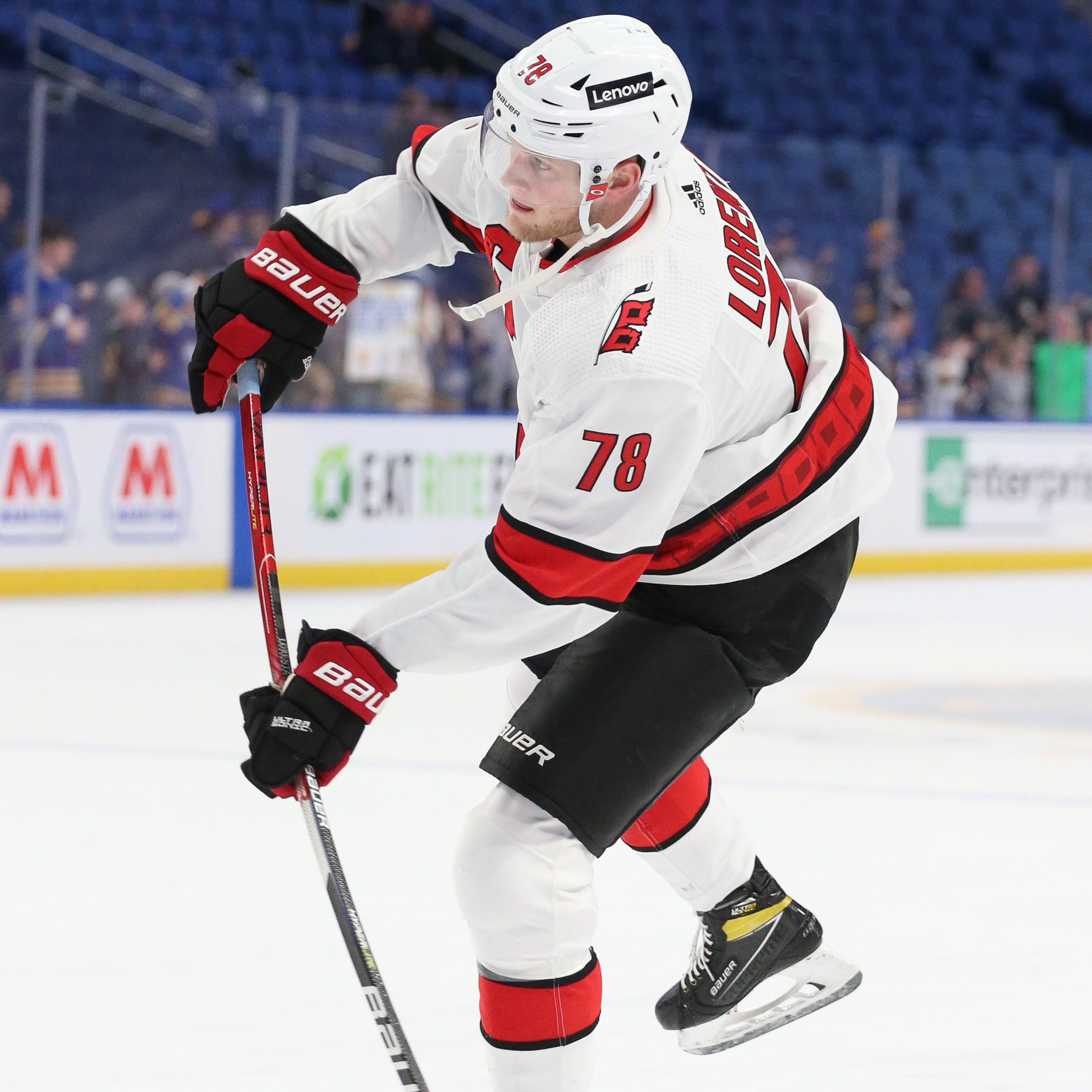
4 hours ago, Glover said:
Hurricanes with white jerseys and black pants tonight. Would certainly look better if the jersey had more black.
Or, you know, have a red yoke to make the white jersey more fuller than it is?
-
On 4/4/2022 at 8:11 AM, monkeypower said:
Not College Hockey but University Hockey, as I watch the championship game today, my alma mater Alberta Golden Bears probably hold the record for most usage of a single logo on a single uniform set and I can't recall if I've ever posted it on the boards yet.
There's eight, count 'em, eight GUBA's (the name of the mascot/logo).
The green jersey and the gold jersey are slightly better as neither use GUBA as the front crest and the golds also don't use it as the shoulder patch, but they're still rocking seven and six GUBA's respectively.
Never saw the socks like this before. Safe to say, never want to see that again.
-
8 hours ago, kiwi_canadian said:
I still don't get all this hate about the ads on jerseys. Yes I agree that it sucks that they have to appear on the jerseys, but the size of these ads are so tiny, that we won't see them during in game action. Only time we will see them is when they zoom in on players during breaks of play or during replays. I really don't see the big deal. Lets just be happy they aren't like the European jersey that are covered in them. On top of that, when people go to purchase these jerseys, the ads won't be on them. They only way you'll get them is if you buy a game used jersey... although I'm not sure if Adidas is doing that anymore if I recall.
Look up close and personal and you'll see why nobody wants that.


2022-2023 NHL Jersey Changes
in Sports Logo News
Posted
There's a little space between the collar laces and the logo itself. Why can't they put the ad on that space instead?