


FCMacbeth
-
Posts
376 -
Joined
-
Last visited
Posts posted by FCMacbeth
-
-
1 minute ago, ZapRowsdower8 said:
Whatever terrible name they pick, I’m just hoping for a unique color scheme. Let’s get a primary purple uni back in the league! No red and black or double (triple) blues.
Easy. Green, brown, light grey, and white. Bam, unique colour scheme that ties into Utah's state geography.
In other words, just copy what the Utah Grizzlies have and call it a day. You just have to ask permission, though.
-
 1
1
-
-
22 hours ago, edjb93 said:
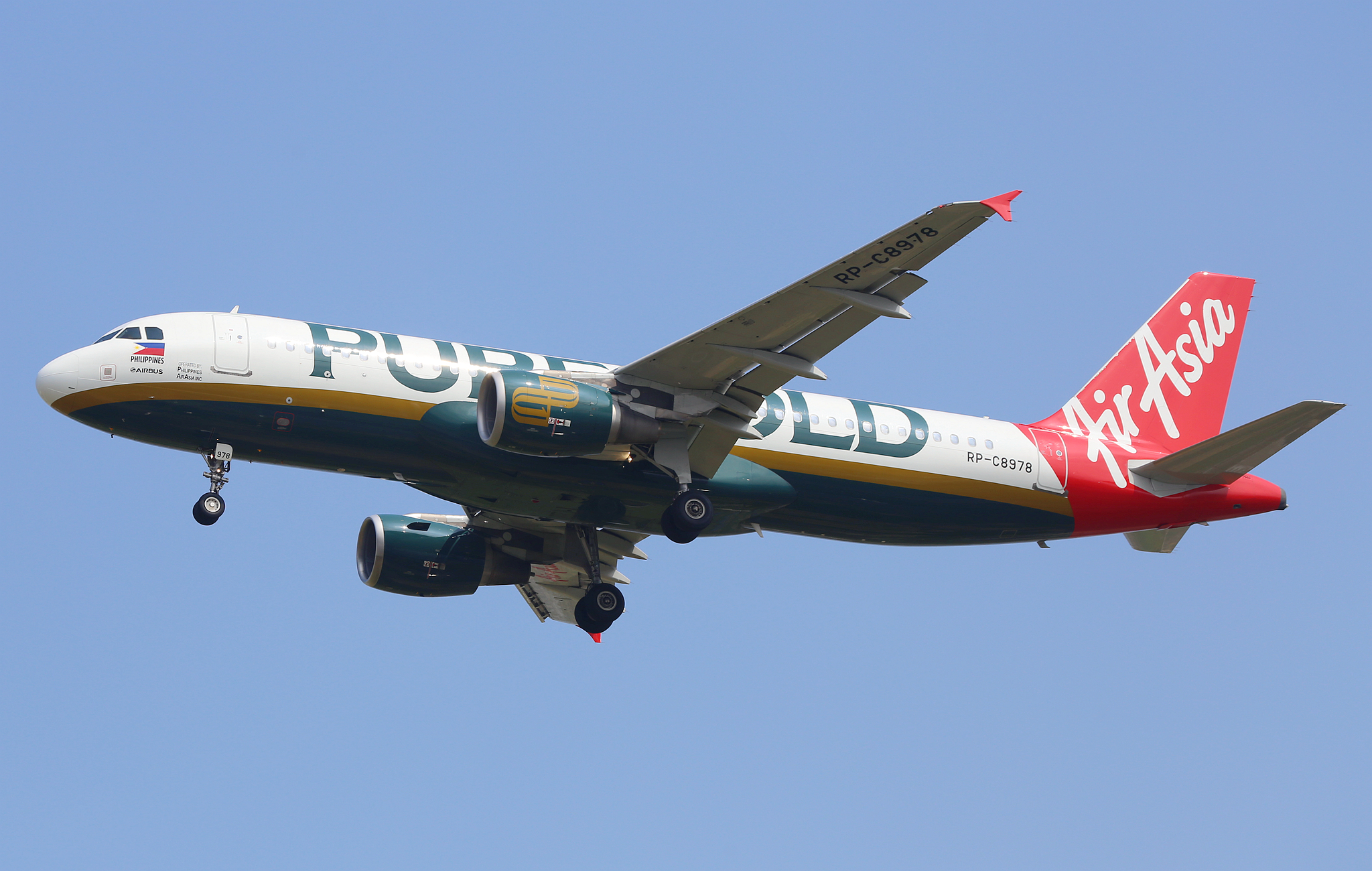
AIRASIA
This is a request by @FCMacbeth, along with Malaysia Airlines—which I already made. Before the whole AirAsia X deal is fully implemented, this is the perfect time to do an AirAsia concept, and since the airline has many subsidiaries across Asia—my home country Philippines included—I'll focus on the main brand from Malaysia.
For the home and road uniforms, I went with a New York Jets-styled design but "in steroids", because I based it from the airline's livery since 2012. You might wonder why I implied "in steroids". That's because the shoulder striping is enlarged, and the same jersey design can be found on the hem of the pants.
The alternate uniform takes us back to the 1990s, when AirAsia was a full-service airline owned by the Malaysian government. Before red took over, blue was the primary color used by the airline, and its corresponding livery back then did not scream "low-cost airline".

Yup, I predicted that it would come eventually as soon as you reached the low-budget airline section.
Though, I might ask just how different is it from AirAsia MY to AirAsia Phillippines.
-
Oh, I can smell AirAsia down the horizon. Well, the Malaysia one that is.
-
1
-
-
3 hours ago, DTConcepts said:
The Milwaukee Admirals unveiled a warmup jersey that looks an awful lot like the Fanatics template Icethetics reported.
If this is the final-look jersey template that Fanatics is going to outfit the whole league with, it's a tough sell. Especially with that Nike-esque collar used here. It's a bad downgrade from the Adizero collar.
I guarantee this jersey is going to have ghost strings when it arrives, and it's going to look cheap and tacky. Hey, kinda like what Fanatics does to their fan gear!
-
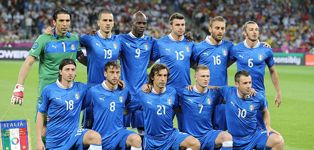
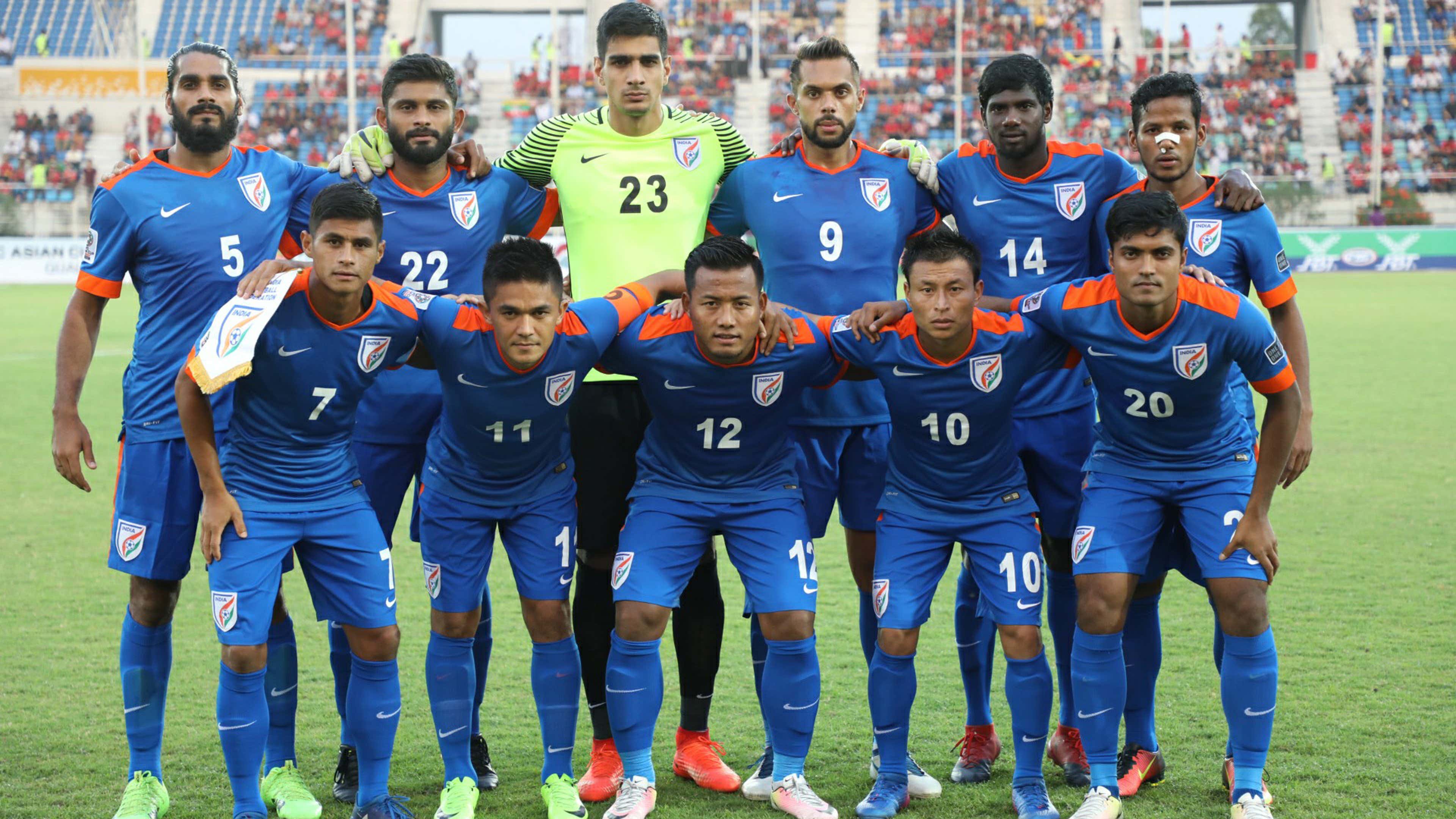
10 hours ago, TrueYankee26 said:
Lol I always wondered what is with countries that have green and red/orange in their flag also using blue. Seems like a theme with Italy national teams, India soccer and now Sri Lankan Airlines
Don't forget Japan, too. You can thank Tokyo University for their colour choice.
-
2
-
-
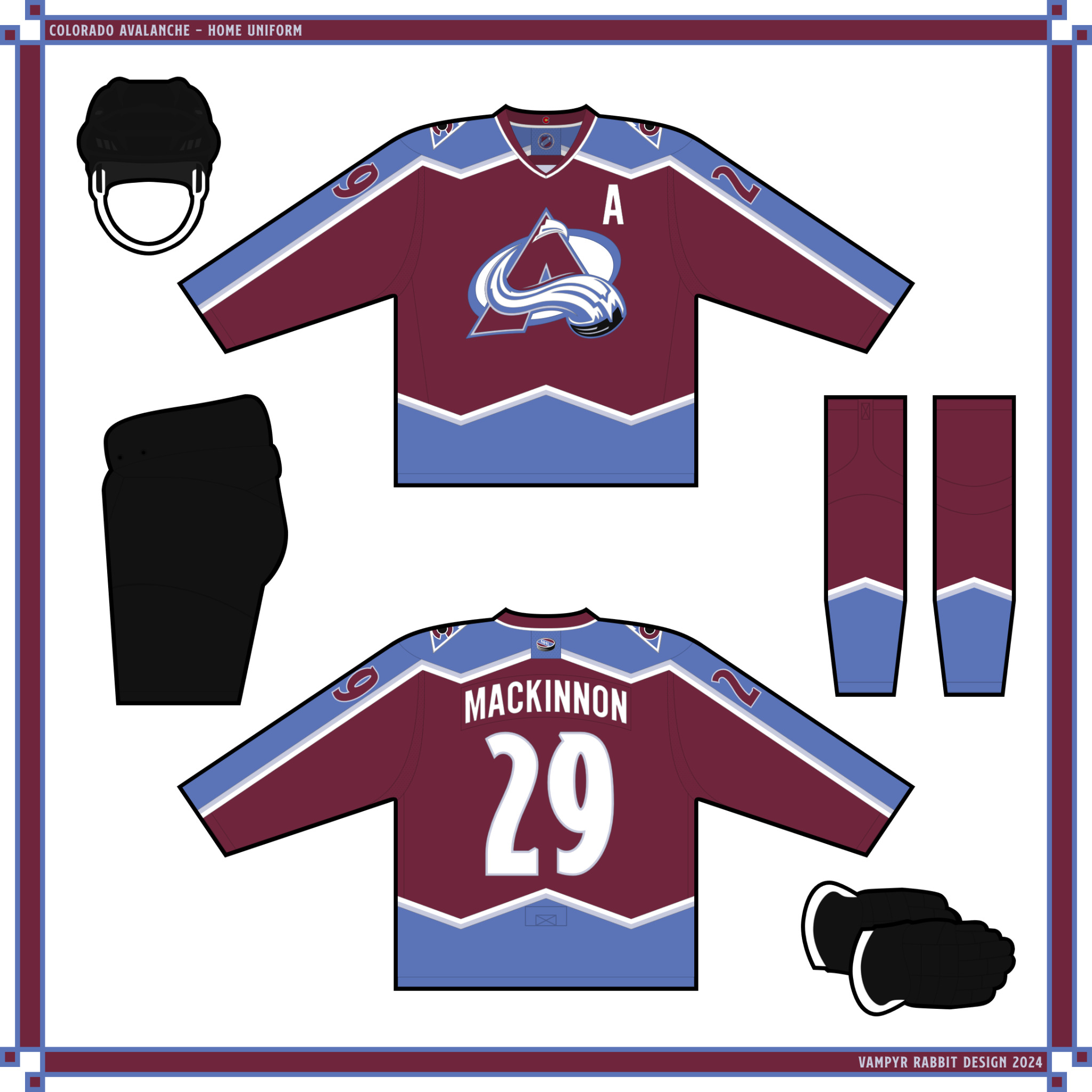
4 hours ago, VampyrRabbit said:
Colorado Avalanche
Home and road for the Avs aren't too far from the original design the team used and won two Stanley Cups with. The black breezers and mitts along with the deeper burgundy introduced in 1999 are all here, but the blue is a new shade to contrast better with the burgundy, and a light shade of blue is introduced as an accent colour. On the shoulders is the mountain logo, and on the inside of the collar is the C from the Colorado state flag.
The alt pairs navy with blue.
C+C would be cool.I'm no fan of the Avs having black gear in their main set. Feels like they couldn't get any burgundy gears before their debut, so black got used instead as a placeholder. I get the steel blue and burgundy didn't get enough contrast when you look on the main set, but in my mind I felt navy blue would work well for the main gear instead of black.
Nevertheless, you make a good call on bringing back the extra trim on the mountain striping, as a way to bring in more balance to an unbalance colour scheme.
-
Well, since everyone is discussing about the Avs current set, I come to agree that their colour scheme is not good atm. What it needs is to make the burgundy darker and make the blue lighter, as a way to improve contrast if only by a bit. Also, switch the equipment to burgundy so that both jerseys don't look unbalanced when looking it as a whole. Finally, add the second trim to the mountain striping like what the Avs have from their first season. Why they didn't bring that trim back in the Adizero redesign is anyone's guess.
Really, any effort not to bring black back into their scheme is preferable to me. The BFBS-era of early to mid 2000s has sullied the colour to infamy (though in recent years the hatred isn't so prominent).
-
2
-
 1
1
-
-
I thought hem stripes also get the victory stripes motif, so I'm kinda disappointed that it's just one big white stripe on the new black alternates.
Though, if Tampa are to do a redesign of their current set, then this would be a good starting point.
-
I'll take Columbus.
-
1
-
-
4 hours ago, spartacat_12 said:
EA Sports has given us the first look at the full ASG uniforms.
I'd have preferred black pants for the red & blue uniforms
Nice to see they're continuing the 3 stripes, 90s-esque stars motif for the pants. I mean, why fix it when you can embrace it?
-
16 minutes ago, heavybass said:
Pack mentality, that is all.
Yeah. pretty much.
-
On 1/28/2024 at 11:51 AM, ruttep said:
Honestly I wish more teams would do what the Devils did in 2014 and say screw your gimmick, we're just gonna wear a throwback in our Stadium Series game.
That's the whole point of Stadium Series jerseys, right? Exaggerated and loud jerseys designs that are worn by players for one night only, as a contrast to the more traditional aesthetics of Winter Classic designs. Whilst I understood why the Devils would want to wear their throwbacks, I still say it looks out of place.
11 hours ago, Morgan33 said:I can't stand the Stadium Series... Drove the whole Outdoor Game concept right into the ground. There should just be a Winter Classic and Heritage Classic.
I guess that's a good way to say "I prefer more throwback and fauxback jerseys over something that's meant to be designed in the future". To each it's own, I suppose.
As for this year's design, I agree that the Flyers are the best out of the four. The 2nd goes to the Rangers, followed by the Devils in the 3rd, and the last one being the Isles. Maybe they could a use throwback treatment as well just like the Devils did 10 years ago. I stared at that jersey and I got a sleepy feeling from it.
-
1
-
 1
1
-
-
Would love to see Warbirds as a winner here.
-
Looking forward to seeing what DC has in store. Yeah, I vote for that city.
-
5 hours ago, ruttep said:
Why (Orlando Solar Bears)
Wait, that's an actual jersey?! No way, this cannot be real. Who in god's name did approve this, and why? So many different questions for the textbook example of a practice jersey.
-
5 hours ago, Morgan33 said:
And speaking of the Skyline... Their original black jersey did a far better job of representing how the Dallas skyline looks at night... They can refer to that gaudy neon colour as "Skyline Green" all they want, I'm not buying it.
I don't know what's going on in your thought process, but neither did the original black jersey nor their current alts represent the Dallas skyline. You may as well just include the silhouette of said skyline if that's what the designers of the latter want to go for, rather than just taking their primaries, colour them black, and increase the brightness of neon green to 100%.
-
 1
1
-
-
10 hours ago, ruttep said:
Not a fan
I didn't think someone like JB and his crew to take an All-Star Game jersey and go balls to the walls, but here we are. The craziest, ugliest, and most ball-busting sets to ever grace the NHL (and the hockey world in general). The loud freestyle NHL shield with the giant star behind, the Adidas three stripes that came loose from their 2016 national team jerseys, the most eye-catching, eye-bleach-worthy colours that they chose.
There's never a single inch of micro-sized, smaller than an atom :censored: throughout the whole design process. There's no regret, comeuppance, remorse, or even forgiveness found in these suckers. The fire department had to be called in because the kitchen that they used was now burning to the ground. If JB and Drew House are war criminals, their work of art is a mass genocide against every hockey fan on the whole internet.
But you know what? This is their purpose. Their intention. Their entire objective is to create a jersey so loud and offensive that everybody got suckered in talking about it for hours on end. We all be yelling about how butt ugly it is, and how much pain we take to our eyes just by taking a glance at it.
Well done, Justin Bieber. You made Buffalo's turdburger look like Venus de Milo in comparison. Well done.
On a serious note, though, I can appreciate how crazy these jerseys are despite what everybody is saying right now. This has the potential to be the Guilty Pleasure moment of 2024. I can't help but to admit that I dig it, despite all the flaws present here that people mentioned here.
-
1
-
 2
2
-
5
-
-
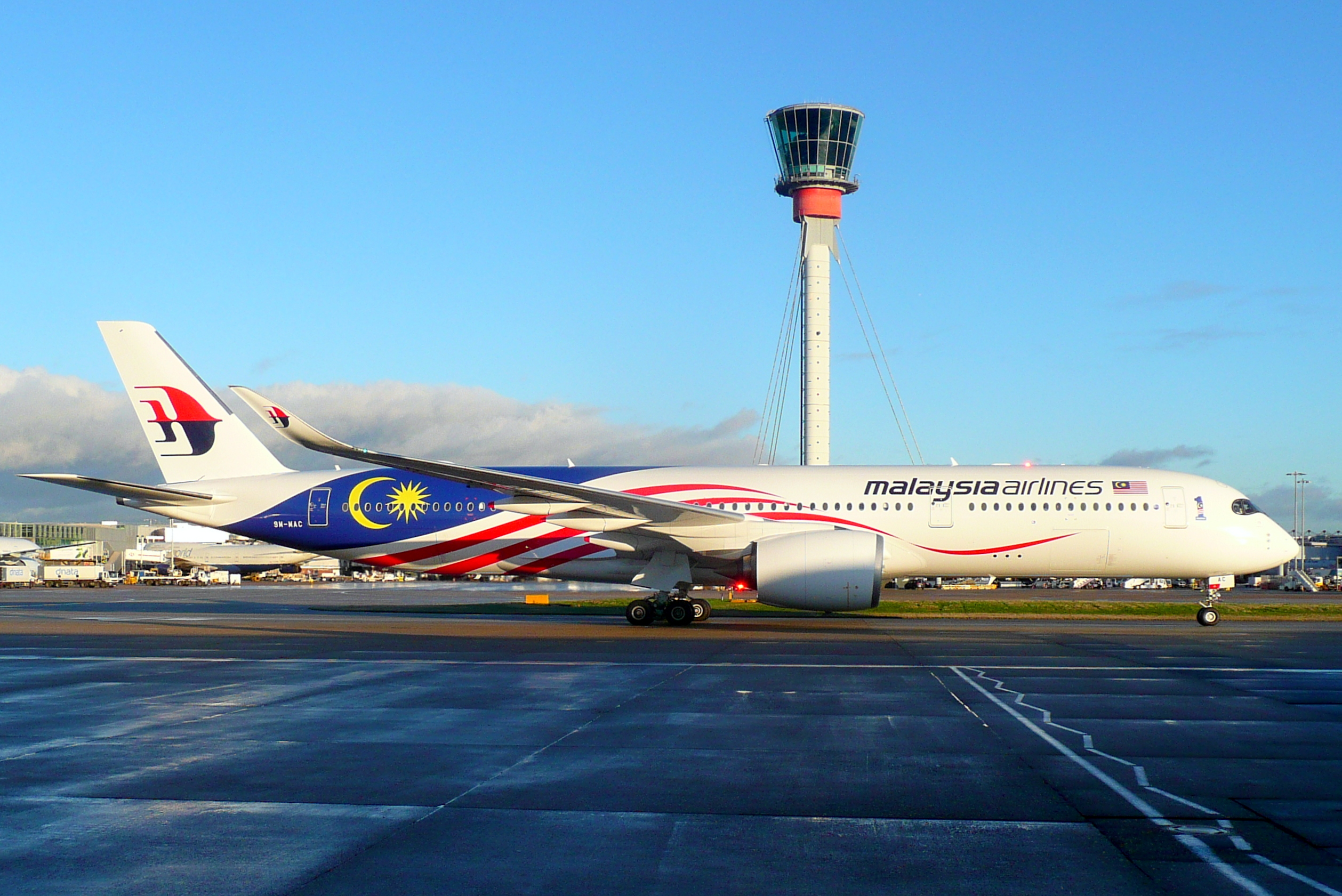
19 hours ago, edjb93 said:
MALAYSIA AIRLINES
Malaysia Airlines has recently put an emphasis on Malaysia's national flag with its Negaraku livery, which was initially a special livery but eventually made its way to become the primary livery for the entire fleet. And since it would be difficult to put up a great dark uniform design while integrating the national flag, I decided to make this set the second ever to possess the primary-clash-alternate designation.
The primary uniform features an abstract version of the country's national flag on the sleeves. I chose an all-white combo for the primary as an homage to the new livery, but it won't be a "stormtrooper" look due to the socks with a design inspired from the stars-and-stripes of the flag.
The clash uniform, meanwhile, features the songket pattern found on the airline's promo materials and the tail logo on its Boeing 737 MAX 8 fleet. Both the primary and clash uniforms are partnered with a white helmet containing an oversized logo, done to mimic the way it is designed on the tail.
When it comes to the alternate, it's back to MAS. Back then, Malaysian Airlines System (as it was called during those days) used red as its primary color, and I applied a similar motif from its livery to the uniform. Since the full name won't fit on the jersey, I just reduced the front script to read simply "Malaysian", while the full name is relegated to the helmet's back bumper. I went with silver pants since the aircraft belly at the time was bare metal.
I love everything about your design! It took me a minute to find the songket pattern on the clash before I realised you have to zoom in to clearly look at it, but I love the subtlety of it.
-
1
-
-
Alright, after a few more adjustments, I now present you all an updated version of my blog site logo.
I've modified my colour scheme and, going by @VampyrRabbit's suggestion, added the third colour so now I have a double blue colour scheme (a personal favourite palette of mine). Also, I added borders on both the logo and wordmark. I have to say, it's much better than the first version. So thanks again to @VampyrRabbit for advice. I still couldn't figure out how to thicken the wordmark as I made all of this from Paint.net, though.
As a bit of fun, I also made some colour variations with the double blue. Each one of them look satisfying to look at no matter what order they go in and I'm really happy how it turn out. Don't mind the black spaces. They're, unfortunately, a result of me using Imgur to store all my images.
As always, C&C is appreciated!
-
21 hours ago, VampyrRabbit said:
Not bad. Considering its CPCP, how about thickening the letters of the lockup slightly, adding a third colour, then adding outlines to the lockup while keeping the separation, so its CP CP?
What do you mean by that? Are you referring to the wordmark?
-
Hello, everyone. It's been a long, long time since I last posted a concept before. But now, it's time for me to bring in a new identity. I present to you Charles Pius's Creative Palace.
Here is my new logo, now featuring a new name. To give you a little bit of context, I created a new blog dedicated to all my creations. So I've gone with using my real name instead of my username. Don't worry, I'm still known as FC Macbeth on the internet (which is what I should've done instead of going with the ridiculous name of Friedrich Stuart Macbeth).
Anyways, my new logo is just your typical monogram using my initials. I went though revisions with the CP logo until I got what I have now. As for the wordmark, I used the Quantico font as it's simply pleasing to look at. I discovered it while I was fiddling around the font choice on my logo-creating app on my phone.
As always, C&C is appreciated!
Oh, and do drop by my new blog! It's got two pages at the beginning as of this posting, but I'll nonetheless post there.
-
I wonder what will you when you get to Malaysia Airlines and AirAsia. Maybe the former if you're doing major airlines first before delving into budget-friendly ones.
-
1
-
-
2 hours ago, M4One said:
Kings should take the white jersey, get rid of the piping on the sleeves and make a black version. Use the modern crown as the logo. I would even be okay with them keeping the current logo, though changing the font on the LA. And, never wear chrome helmets and white gloves ever again.
White gloves are nothing. Chrome helmets, though, would be more of special thing than part of a regular set.
-
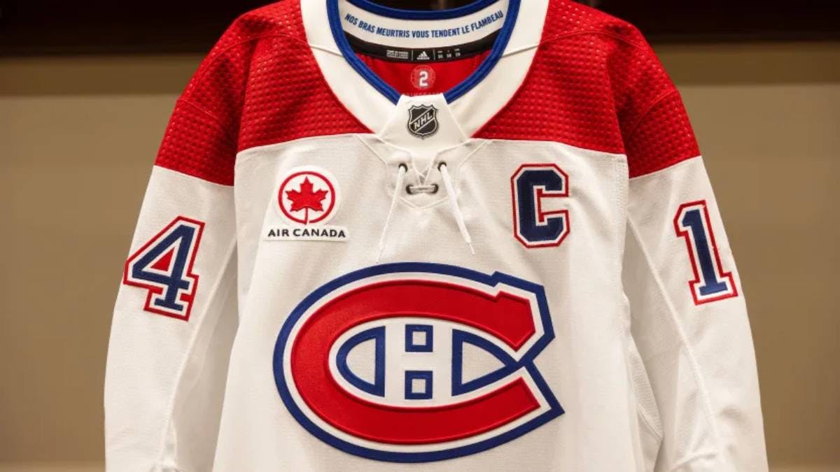
3 hours ago, AFirestormToPurify said:
One of the 3 richest teams in the league disgracing BOTH jerseys now with stupid sponsor patches. One that looks like our oldest rival's logo at that! I hope Geoff Molson wakes up tomorrow morning with ingrown nails. Greedy bastard
Well, at least the color fits on the jersey. And that's the only positive I can give.


Redesigning the Redesign of the Redesign of Aston Villa's Crest
in Concepts
Posted
https://www.footballkitarchive.com/static/logos/3oYvAxwjC1IWeV0/aston-villa-2000-2007-logo.png
This logo>>>>>>>all the other logos. If they kept the stripes in the logo (which you kind of did), the backlash wouldn't be severe.
That being said, you did a better job than the previous three attempts.