


walkerws
-
Posts
8,865 -
Joined
-
Last visited
Posts posted by walkerws
-
-
whats the base font for this word mark?
-
On 9/13/2017 at 10:39 AM, mmatschi said:
Looking for the Font of St.Pauli. it's not Puma Gaffa
thx
It's a newer UA font. They may not have released it yet
-
How do you report them. Maybe I'm being simple, but I don't see it
-
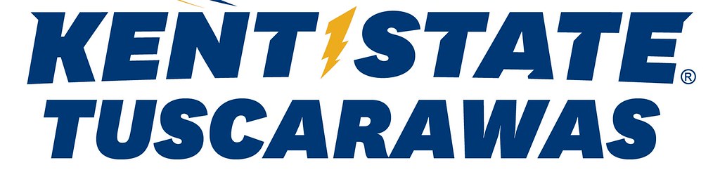
Kent State has updated their primary logo. They updated the word ark font and added the lightning bolt

-
 1
1
-
-
If he'd sold it, likely they subbed one in for the promo. It's a good question though.
-
Conrad made it but it's no longer available. It was called NDSU Bison I think
-
The NFL is the top league so no issues. The NBA is the same in that respect.
-
Eric jaffe (sp)had a font pack with the Ravens numbers you're looking for
-
BC looks like the bear attack from Conrad.
-
Peroni looks like Batesina but the E is modified
-
1
-
-
Nevermind
-
One every 30 seconds
-
Well unless the NCAA paid, it's on the schools. I'd rather have a Gator Bowl rin f
-
Not sure what is "wrong " here but that's a unique sports physique
-
I'd always wear gold
-
Yeah it is.
-
Looks like Colles or Armada
-
Mighty Friars or Plumbers Gothic on dafont.com
-
If you need fonts go to Conrad's font download. The template for this is around here somewhere.
-
It looks close to Pieces of Eight
-
Yeah that's bad. Everything is bad. It'd look better without the Pulaski thrown in as an afterthought. The hat logo would be better with the pyramid done like NY logo.
-
ummm..... Wow. The newts are probably the best rendered animal.The independent minor-pro East Coast Baseball League has released the logos for its first three member-franchises.


-
A= to Rawlings UCONN from Conrad.
B= to the agency gothic I think from that same set
-
4th and inches is the "Windsor" font. It's free at dafont.com
-
1
-


Name That Font!
in General Design
Posted
Maybe but the peaks in that font aren't the same