


walkerws
-
Posts
8,865 -
Joined
-
Last visited
Posts posted by walkerws
-
-
All Lang Stadium COULD be a potential site if temporary seating is available.
-
16 hours ago, GDAWG said:
Tampa also has no options.
Tampa could play at USF after they get their own stadium. If it is small enough, they could get it done on a year.
-
 1
1
-
-
On 6/19/2022 at 9:05 AM, Hawkeye15 said:

- Main design element is the addition of the yellow piping which shows up flourescent yellow on yellow elements and as the primary gold color on blue elements.
- The piping includes the lightning flash in the pants stripe, sleeve stripe, and at the bottom of the jersey numbers.
The K by itself isn’t a strong enough identity in my opinion. The uniforms are progressive but are kind of unfinished
-
1
-
15 hours ago, burgundy said:
Are you certain that it didn't become a stock font after being designed for Toledo, like the Maryland and Texas Tech fonts? The earliest catalog I can find is from 2013, which shows this exact group of fonts.
https://issuu.com/kollegetown/docs/kollege_town_under_armour_2013_football/78
Toledo didn't have it first. They always have been a stock uniform team since that became a thing. It's kind of strange that Russell and Champion haven't pushed bac in, but they may think it isn't worth the costs still.
-
The home and away are nice. The alternates are too many different things all together.
-
3
-
-
I think the next year they got rid of the circle.
-
9 minutes ago, VDizzle12 said:
The script Akron was bad for many reasons. Mainly the fact that it was a stock Nike font taken directly out of a catalog, slapped on the basketball jerseys and someone liked it so much they made it the primary logo. It seems like the President and AD both like generic/boring logos, because they were involved in the UW Green Bay rebrand a few years ago.
Obviously I like the Z logo above all. But, based on the past few years I'd assume the people in charge only want to be know as Akron and ignore the nickname/mascot.
That may make sense, given all of the infrastructure and capital improvements they have been making. Are they going the current route of making the athletics and university brands the same?
-
On 5/6/2022 at 10:04 AM, kmccarthy27 said:
I really really really hope she did not lean into the military theme with the marching band uniforms
I am sure she will since that is the emphasis of the ir new name. It won't look good. I doubt it is very unique.
-
14 minutes ago, Germanshepherd said:
Yeah that is awful. Only slightly better than the “Z” logo and way worse than the Kangaroo-A, Akron script and vintage A.
The Zips’ branding has kinda been a mess for years now and this does nothing to remedy it.
I personally like the old Akron and Zips custom logos they had in the early 2000s. 1) It was unique nad unique can sometimes get over bad. 2) It was really good branding for a really interesting mascot.
-
When you look at all of the logos that Akron had before, nothing was so bland as this. The only way it would be more bland is if it was the Arial A.
-
5
-
-
1 hour ago, VDizzle12 said:
At least it's better than the garbage they have been using the past few years.
That's debatable. They are both awful though.
-
I like #2. If the pants are going to be cream, then the bottom of the jersey should be cream.
-
3 hours ago, gosioux76 said:
Is this the norm? I mean, do NFL and college teams do this, too? Or do you think this is just because that Panther logo is a pain in the ass to put on that helmet in the first place?

Lots of big colleges do this
-
14 minutes ago, Glover said:
Sorry if this has already been discussed, but it looks like someone may have talked some sense into the Guardians with the fonts of the NOB. This looks so much better than using the custom font used in the second picture.
Thaat may just be spring training gear that doesn't have the updated fonts available. Either way is fine to me. The standard MLB Block does have a slight edge though with some odder naming conventions
-
1
-
-
On 3/11/2022 at 3:15 PM, CreamSoda said:
Oh great. So more blue/red/yellow Colorado C/flag gear.Actually it seems it will be purple, green, and maybe silver
-
2 minutes ago, MJWalker45 said:
I'd say if you can't dress the field up it takes away your credibility. Other than being next to abuilding that has some of their history in it, what else does it give them?
The Hall offers credibility because it is the Hall. They should have made the field able to be changed and customized, but I think they just cut corners. Probably because of the one game they had to cancel because they stupidly used the wrong paint and had to reorder the field.
-
2
-
-
On 2/16/2022 at 2:56 PM, MJWalker45 said:
I mentioned this in the uniform discussion area, but the USFL has announced that they will play the playoffs in Canton, Ohio after playing the regular season in Birmingham, Alabama. Obviously dodging the hottest part of the year makes sense but moving it to Canton is not the best decision in my opinion. They may as well have used San Antonio where they could have dressed the field properly instead of a field where they can't do more than maybe slap the league logos on the 25 yard lines.
Canton gives them some credibility, but the field doesn't get changed for anything anymore. Even when the Stagg Bowl was here, nada.
-
#2 is closer to the 90s but #1 is clearer
-
I'm surprised no one is talking about the Hall of Fame getting the two playoff rounds for the USFL this season. It will be interesting because the USFL, WFA, and then the Pro Bowl makes for like 4- 5 straight weeks of football at Fawcett Stadium.
-
4 hours ago, NH4 said:
Thank you! Updating the stripes on Florida's orange jersey was priority number 1, so I'm glad you like it.
For Akron, here's the updated look on all the uniforms:
My favorite subtraction is that nonsensical cursive font. For the Zips, it's very placid and stagnant.
-
1
-
-
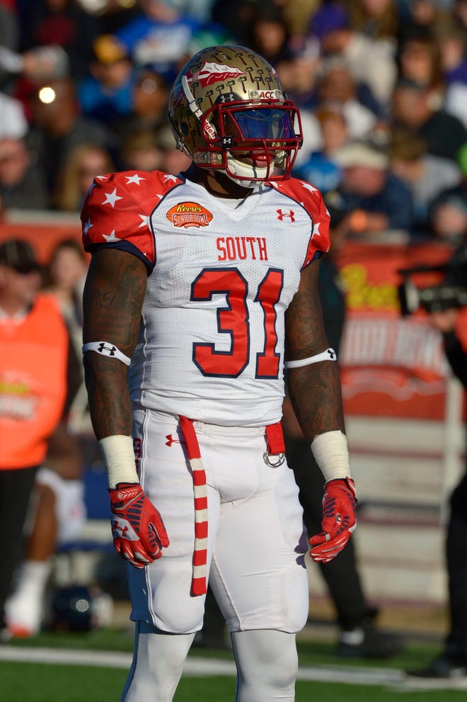
1 hour ago, MJWalker45 said:
It's a shame too, because the Senior Bowl didn't use stock uniforms for a few years.
It was a standard template, but it had a design instead of just being the proper colors for the game at that time.
I think that was a stock uniform, they just did a little alteration when they ordered.
-
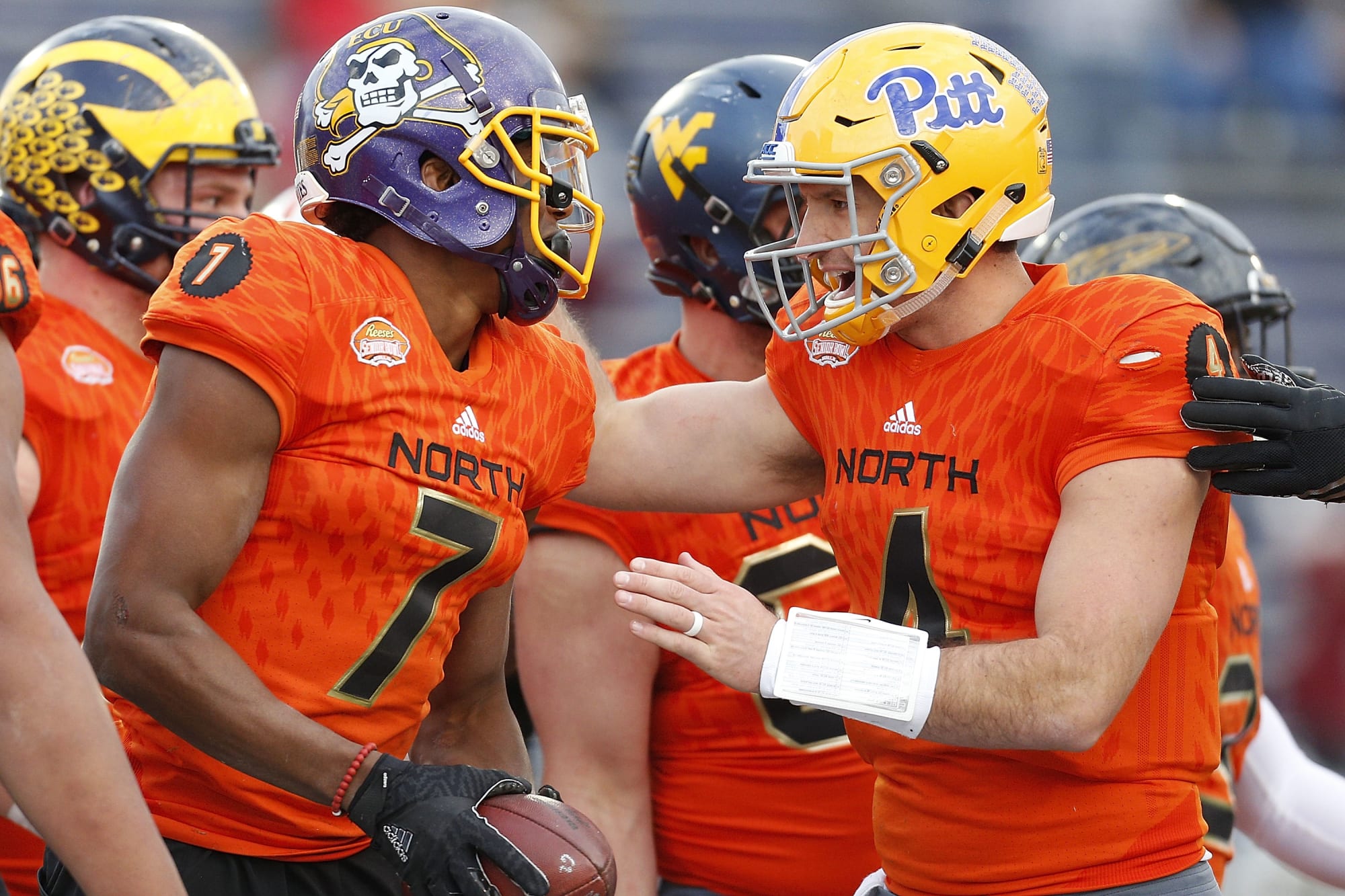
4 hours ago, SSmith48 said:
Is this the right place to put this? Ah, whatever.
I have a proposition to the Reese's Senior Bowl: Y'all already have some great college themed branding with the new Fighting Cuppies stuff. THROW CUPPIE ON THOSE JERSEYS! It would at least liven up the cookie-cutter Nike stock you dress in now (although they could do much worse).
Adidas also did a bit of better job leaning into the Reese's branding, even if it was subtle. I mean, look at the cup on the sleeves!
This years actually look like there is a cup on the collars. All of these all star games use stock uniforms, but the cup numbers were pretty nice.
-
On 1/25/2022 at 5:43 PM, cajunaggie08 said:
Maybe it will cause the oversized helmet logo trend to finally die off.
Definitely will be a consideration for smaller schools! Imagine having to do a special hand paint job on one of those!
-
That Rugby New York shirt is the best in my opinion.
-
1
-


/cdn.vox-cdn.com/uploads/chorus_asset/file/23220783/usa_today_17623227.jpg)

MLFB Announces 4 teams
in Sports Logo News
Posted
I smell lawsuits!