


walkerws
-
Posts
8,865 -
Joined
-
Last visited
Posts posted by walkerws
-
-
It would've been better if Texas was a little more inspired
-
1 minute ago, VDizzle12 said:
I'm assuming Notre Dame will be the next UA casualty? Hopefully all 3 teams go with Nike and not Adidas.
I’d almost guarantee that Notre Dame is profitable for them.
-
 3
3
-
-
I think this new look is pretty lifeless. The 49ers logos is unique enough, but the rest is blocky and plain. The C with the pickaxes are blah and the C looks closer to an O.
-
8
-
-
It looks like they updated the Huskies face to very slightly resemble a leaf.
-
The stealth jet is lost in the letters of the logo. I’m not sure how to incorporate both unless you put it on the tail fins.
-
46 minutes ago, in_a_rush said:
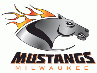
I hope to get some C&C on the Does, but in the meantime I'm going to move forward with my next team in the series and resurrect both the Arena Football League and the Milwaukee Mustangs!
I wanted this logo to reference the history of the Mustang name in Milwaukee as far as Arena Football is considered, while also still making it feel like part of the same larger organization that would own the Bucks, etc. I used the general design of the original Mustangs logo as the base, but changed the horse to something that isn't the same, but has some similar notes to their first revival logo. Of course I used the Bucks' color pallette and font. Simce I'm referencing old logos in the design, I posted the real-life Mustangs logos below my logo for comparison.

The mane is lost in the letter firm. I'd render it in a different color or put. Alone around the horses frame inside the letter. It looks like a greyhound as it's currently rendered
-
On 4/30/2020 at 1:24 PM, CaliforniaGlowin said:
Baseball meets traffic safety! I love this!
It’s even more apt since their stadium, on Main Street, is literally a big open hole right now!
-
1
-
-
I like the secondary better as the primary. I’d take it out of the ball and give the wave flow to his cape. His helmets don’t seem to match up either, but both logos are great.
-
1
-
-
10 hours ago, WideRight said:
Yet another 1988 team, one of my all time favorites, the New England Steamrollers. With this team I decided to do the following:
1. Retain the main logo but add some grey to the orange & black and modify a few details.
2. Change the helmet to grey (and the pants as well). I have always loved orange, black and grey (old BC Lions uni turned me on to it.)
3. Retain the black asphalt line to the back of the helmet, but incorporate an orange line and then link to a standard central helmet stripe.
4. Use the very tiny secondary NE shape logo as the sleeve logo (see it below the main logo).
5. Use a relatively simple stripe pattern on the orange jersey, but use a sleeve top orange block to add something a bit newer to the white.
Eventually I may add wilder alternate uniforms, in which case a black helmet may happen.
But for now, a standard home/away uni for the Steamrollers.
That’s a gorgeous uniform. The helmet strip would be difficult, but it’s easy to match that ridge stripe with the steam rollers.
-
25 minutes ago, Maroon said:
New BattleHawks secondary logo announced:
Nice. A clever nod to Air Force chevrons
-
They probably preferred it .i think it’s fine.
-
2
-
-
I'm getting an add that scrolls up from the bottom. Those insomnia adds pop up as well on my laptop.
-
On 7/10/2019 at 6:33 AM, monkeypower said:
The Canmore Eagles of the AJHL unveiled a new logo.
This was their old one for reference.
Easily an upgrade but it seems a little too busy to me.
-
2
-
-
Kent State University (word mark Update)
-
16 hours ago, Volt said:
Winston Moss to be named HC of the LA team this afternoon. 7 down, 1 to go (Houston).
Worth noting that only 3 of 32 NFL Head Coaches are African-American, and 1 is Latino, while 3/4 of the league is African-American. With Pep Hamilton, Jonathan Hayes, and now Winston Moss, 3/7 new XFL coaches are African-American. Worth keeping an eye on as they attempt to recruit players away from the NFL in the long run.
They'd doom themselves if they tried this, I think. They're going to try to complement at worst. For all the "hate" the NFL gets, no one is taking that spot in the next 10-15 years.
-
2
-
-
This is akin to Norfolk State that does this two heads as well. It's ok. Much better than the old logos.
-
I thought they were well thought out.
-
eBay. NHL.com?
-
Fill the shape and bring that shape to the front.
-
Since this is supporting the SPCA, I can let that go.
-
With the Bengals, I think a tonal striping pattern would be better than the two "random" color stripes in there. It will balance out the colors better. a dark/ light tone with a secondary color trim.
-
It's likely pad tape. It's designed to hold down the jersey and it'll leave some goo that likely picks up field dirt.
-

Of course having a semipro basketball team, the wingfoot would be a great mark.
-
9
-
-
Columbus has both the Triple-A All Star Game and National Title Game. Pretty cool in my opinion.


College Football 2020
in Sports Logo News
Posted
That’s the difference between Power 5 and the G5. You’d think teams with simple custom serifs could get something close but nope. The only Kent State uniforms that use a school specific number font was a one off jersey for basketball