

Bayne
-
Posts
1,908 -
Joined
-
Last visited
Posts posted by Bayne
-
-
4 hours ago, Chromatic said:
You have to do both. You need a colour scheme that matches your identity, but the whole point of having an "identity" is that it is identifiable as yours.
Yes, and you can do that without needing to pick a colour that isn't in use. There are many different ways you can combine different colour schemes and create a unique identity.
Look, Utah will probably go with a colour that isn't used primarily by another team, I won't be surprised. But them doing that isn't going to automatically get me excited for their identity.
-
 1
1
-
 3
3
-
-
11 hours ago, Nordiks_19 said:
The last thing this league needs in term of aesthetic is yet another red & black team
13 hours ago, McCall said:So something overplayed (red and black) as opposed to a color not currently in use that actually has relevancy to the geographic region and sports history of said region?
9 hours ago, mcj882000 said:
No thanks, we've got plenty of those already.5 hours ago, Morgan33 said:Hard no to red and black.
4 hours ago, Chromatic said:No red and black.
How about red and blue? That hasn’t been done before.
Lol I was exaggerating for effect. Who would want another red and black team? That's why I continued on by suggesting brown or blues or yellows, whatever. My point stands. Come up with colour scheme that suits your team identity, not this 'pick-a-colour-that-isn't-used' mentality.
-
 1
1
-
3
-
-
I hope they go red and black.
I really don't like this whole "the league needs a purple team, so they should be purple" thing. It's like a playschool activity where a bunch of children are figuring out what colour crayons they have so they can draw a rainbow.
I'd actually love to see brown, or tan or something. But yeah, I don't need to see a colour just because its not been used by any other team and they can "own it". I'd be more than okay if they came up with a cool way to use a shade of blue or yellow or something.
-
 1
1
-
 2
2
-
 4
4
-
1
-
-
On 3/29/2024 at 4:12 PM, ruttep said:
Those are the same bland numbers. The original uniforms' italicized font fits the Hurricanes so much better.
Yes I overlooked that.
-
On 3/28/2024 at 1:48 AM, Nordiks_19 said:
I remember seeing this concept on the nhluniforms Facebook page and was really hoping it would be that instead of the lame and ugly one they ended up with
Even though it might not be the most original design, that is one clean looking road jersey. The slight pattern is enough for me to think that it has enough uniqueness. I like it. The black gives it some weight. Never liked the red heavy and white look (with the bland numbers) they went with with those jerseys in the early to mid 2010s.
-
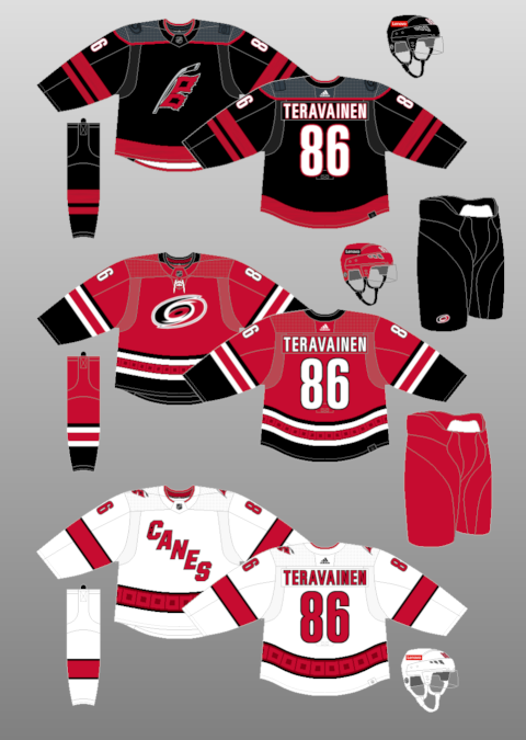
Par for the course from the Hurricanes organisation.
I find all the primary concepts to be an unnecessary downgrade from their current logo (which has always been underrated imo, and has stanley cup history). But at least this might meant they'll actually commit to an identity instead of constantly being all over the place.
-
12 hours ago, DTConcepts said:
Because the mascot it was designed for assaulted a woman, and the Colorado flag represents the state much better than a hairy foot.
The Colorado flag symbol is so boring though. The Colorado's identity is caught between trying retain some of its personality, and everything around it suffering from being blanded down and 'cleaned up'. As a result, it feels like a uniform and an identity that doesn't look like it has a very well thought-out plan. The uniforms look like a terrible compromise between old and new.
They should either embrace their cool history, or start again and re-design everything to work with their black-less, flat, geometric, minimal aesthetic that they seem to want to try and go with lately.
-
1
-
-
It's kind of a miss from me on the Lightning third. There are some decent ideas and some nice details, but the overall design and impact of the jersey is pretty drab. Such a shame considering what they have to work with - there's some solid history and with a name like the lightning these thirds should be a lot more fun. I never thought that shoulder patch would make a good primary and even though they have dressed it up a little, I feel validated.
-
The Wild's green and yellow jerseys are decet (I don't love them as hard as a lot of people seem to) but I think their red and green jerseys are beautiful and they should just continue to own that look. I find it to be far superior to the North Stars re-colouring, and it's their history as the Wild. By doing this they are yet another team succumbing to an alternate history that shouldn't dilute their already unique and strong identity.
-
1
-
-
8 hours ago, ruttep said:
My vote for best uniform matchup of the season
I think I identified this a little while ago as what I consider to be the best uniform matchup for me. Agreed. I think it's pretty much flawless.
-
 2
2
-
-
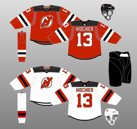
Love the Devils with green. A nice permanent dark green would be lovely.
I've actually really started to appreciate the Flyers jersey. Favourite one for me. Very nice.
I think the Devils' is actually, honestly just as boring as the Islanders'. Isolating the NJ to its silhouette only doesnt look great to me.
-
Rangers: Good. Delivered on the brief.
Flyers: Pretty good. They stick to their identify and I can't fault them on it.
Devils: Never been a fan of the NJ sans holding shape. Vindicated after seeing this. I don't like the duotone thing. Meh.
Islanders: Don't hate it but it's pretty average and dull.
-
On 1/15/2024 at 2:21 AM, VampyrRabbit said:
Many Reebok Edge jerseys did due to how empty the hem was. It felt like the designers just left that space blank.
I was referring to the logo. -
On 1/13/2024 at 11:21 AM, Morgan33 said:
That looks very unresolved.
-
1
-
-
I don't love the Kraken identity but I think they're doing a really solid job so far which I love to see.
I love the Knights identity but I think they've gone a little too far with their kind of ugly gold jerseys and the dumb chrome helmets. (But they're Vegas so I guess they get a bit of a pass, tbf).
-
Weird. Seems like this is what is happening. Doubt I will not hate it.
-
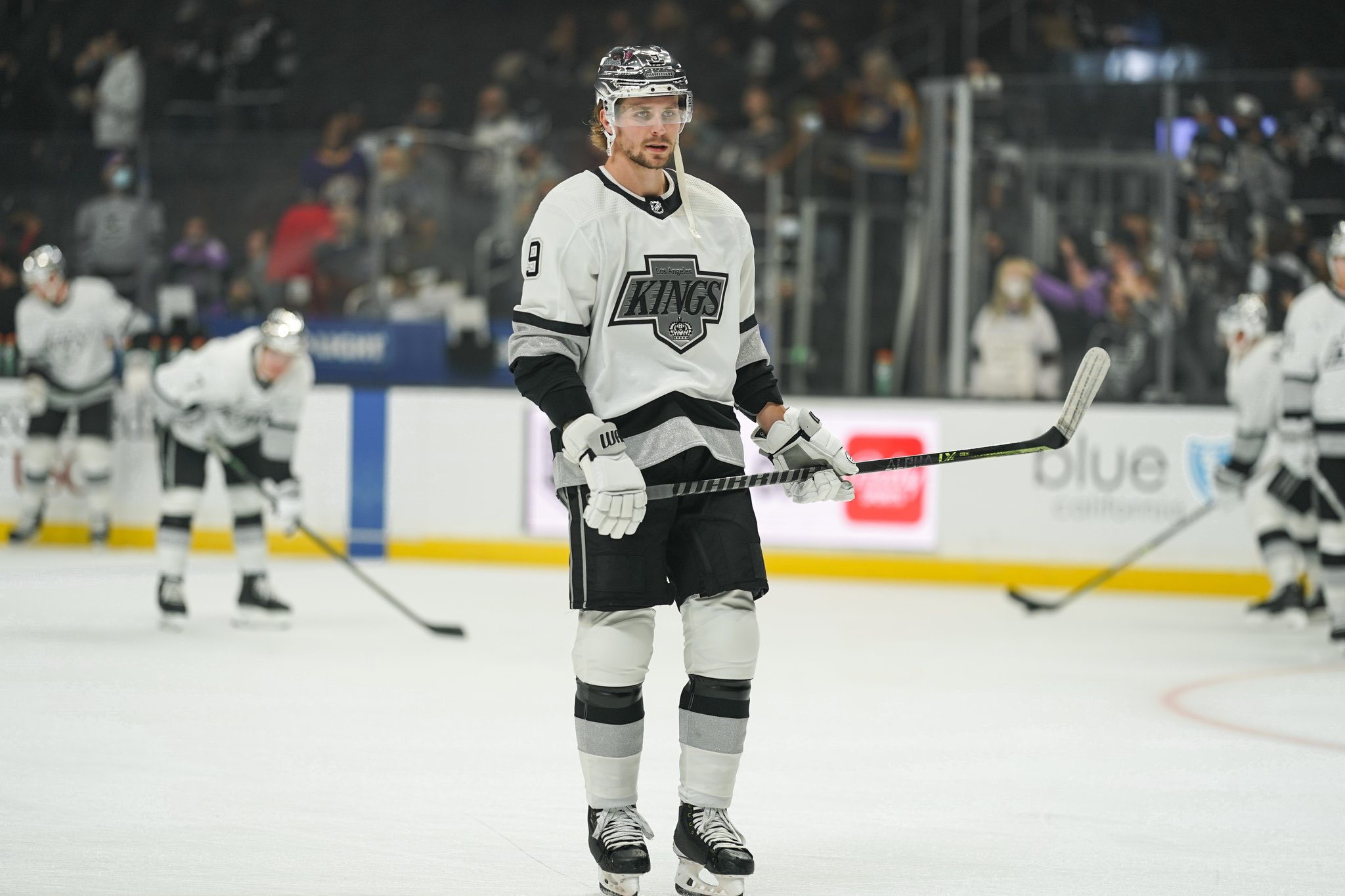
4 hours ago, SSmith48 said:
For what it's worth, what can be considered to look "professional" in any sport has become a thing of the past (for example: more monocolor looks and new alternate helmets in American football, no more home/road designations in the NBA, more teams using non-gray jerseys on the road in the MLB).
I don't mind the look, I think colored helmets can look good on the right white sweaters, and I don't really notice anything "less professional" about it other than it's not what the status quo is. Heck, I wouldn't mind seeing some triple mismatch here and there on some teams. As an admission, I liked the general look of the uniforms when the Kings wore chrome domes. Sure, it was a bit too flashy, but the color balance worked well, and IMO looked better than white black or white helmets could achieve for the look.
Hmm yeah quite possibly its a reaction to what I am used to seeing, however I would submit that the visual similarity to minor league/college hockey drives my reaction. Not that this is a good reason why it shouldn't happen, but I don't like it. The balance of colour - while it can work okay some of the time - is too top heavy. It almost makes them look smaller. If 2 or 3 teams did it then thats fine..im just worried a dozen or so teams will jump on it and that will result in a whole lot of subpar looking unis.
-
1
-
-
3 hours ago, henburg said:
How can you not love this?
Its easy not to love it. They look like they're wearing pyjamas and I'm just not a fan of the contrasting helmets. It makes the away team look less 'sleek' and 'pro' in some way. I wish I liked it, but it just doesn't make the away team look better IMO.
-
2
-
2
-
-
I think dark road helmets CAN look okay if there is a strong enough presence of the same colour on their jerseys (ie, the shoulder yokes). If it's a predominantley white jersey (like the Leafs' road) it just looks unbalanced and I don't like it.
I'll see if my theory holds up if/when we see more....
-
1
-
-
3 minutes ago, ruttep said:
I think you're in the minority here, and it's not even anything to do with the design of the new jersey, but the fact that it was only brought back for nostalgia. When a jersey is brought back solely for nostalgia, I think people simply prefer a direct throwback.
And people loved it. Not because it looks better. but because that's how it originally was. My point is that when you have throwbacks that you're just wearing as throwbacks, people want a direct throwback, even if there's a way to improve upon the original design.
I mean, fair point and you're probably right. I'm just a sucker for strong design (as I see it) regadless of historical accuracy. I apprciate a good throwback but if i think the design could be improved (and they actually do it) I'll be a materialistic, consumerist shmuck and fork out for it.
-
2
-
-
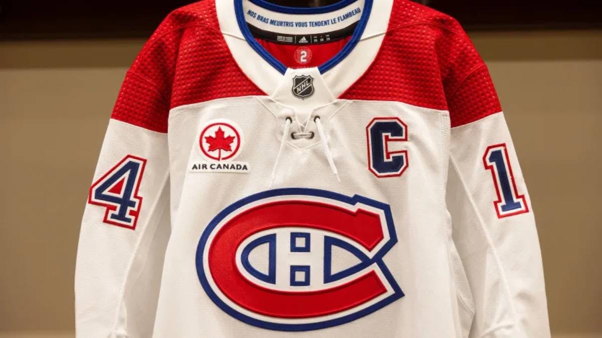
3 hours ago, AFirestormToPurify said:
One of the 3 richest teams in the league disgracing BOTH jerseys now with stupid sponsor patches. One that looks like our oldest rival's logo at that! I hope Geoff Molson wakes up tomorrow morning with ingrown nails. Greedy bastard
Yeah its a maple leaf but if you had to pick a logo that compliments the look and feel of a jersey then this isn't that bad.
It's when the logos start to stand out like a sore thumb that is really starts to get depressing. Like the TD logo on the Canucks' black jerseys.
-
1
-
1
-
-
On 11/21/2023 at 10:56 PM, Chromatic said:
The whole uniform just looks dingy, I think that's the best way to describe it. Its like they tried to infuse the 'dive bar' or 'grimy hot dog stand' aesthetic into a hockey uniform.
On 11/22/2023 at 12:52 AM, Ridleylash said:
I disagree. The 'upgraded' flying skate jersey works better for me - the white in the logo gets in the way of the contrast of the yellow. Without the white, the yellow and red pops much better. There's plenty of crisp contrast going on. The sublimated Vs on the striping, yeah sure I could do without but its not that ergregious.
I bought one of these jerseys and I wouldnt have bought one of the original throwbacks. This newer one feels much fresher and sharp.-
1
-
1
-
-
On 11/18/2023 at 11:31 AM, AFirestormToPurify said:
I don't think away jerseys are boring. A lot of teams look better in white imo
The fact is; teams that wear dark buckets with white jerseys are minor league teams, often the smaller markets with cheap owners. It's not a good look. It cheapens the whole look and makes the uniform look top heavy
Color vs color, whiteout (including the pants), gray based jerseys, hollow numbers, those things might be alright for other sports for many reasons (tradition, pace of play, color of playing surface) but not hockey. There's nothing wrong with tradition
This is exactly my feelings on the dark buckets with the white jerseys. It just feels very minor league. I was watching the Leafs the other day and I just couldn't get beyond it no matter how hard I tried. Might take some time, but it just makes them look a bit 'lower-league' and less professional.
-
4
-
-
6 hours ago, Kevin W. said:
Anaheim - no
Arizona - no
Boston - doesn't count this season
Carolina - no
Chicago - no
Colorado - they kind of already do
Columbus - they already do
Dallas - yes
Florida - no
Minnesota - no
Nashville - no
Ottawa - no
San Jose - no
Seattle - no
Tampa Bay - maybe
Vancouver - yes and they previously did
Vegas - no
Washington - yes
Winnipeg - no
Tampa Bay, really? That's very much a shoulder patch logo and nothing more to me.


2024-25 NHL Changes
in Sports Logo News
Posted
I wasn't really being sarcastic, but ok. And no, no one is saying the colour preferences by anyone is 'random'. Anything but.