

Bayne
-
Posts
1,908 -
Joined
-
Last visited
Posts posted by Bayne
-
-
I agree with that.
-
12 hours ago, jmac11281 said:
No opinion is wrong but your opinion is wrong!
 9 hours ago, buzzcut said:
We need a dislike feature just for posts like this.
I'm telling you, it's overrated. If it came out today it would be heavily critiqued. I like the fin, but the way the W is formed looks completely clunky and it's not even a nice H in the negative space. Not to mention the grey outline version which is just wrong. It should be two elements sitting on an empty background. And blue and green sitting next to each other doesn't work that well either. It's a good concept for a logo, just executed poorly, in a very outdated fashion.
-
The Hartford Whalers logo is overrated.
-
Any of the Flames jerseys with black in them suck. Even pre-Edge.
This is how they should look.
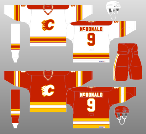
They need some black.
-
I really like this uniform myself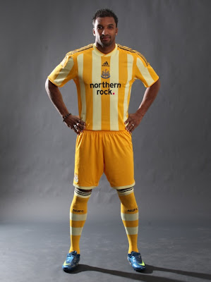
These Newcastle away kits were gorgeous. GORGEOUS.
Good God, no!!!
Look, you can have all the yellow you like in your Norwich FC unis, just keep your lemony-colored mits off of the Magpies' kits.
It's a unique look thats for sure. It's technically not a bad strip at all, but the colours....and the fact that it's Newcastle is what makes it so repugnant IMO.
-
The Columbus Crew logo isn't terrible but those men need to be far less detailed. It's like a freakin photograph!
As for the Buffaslug comment.....no, that logo was godawful and the jerseys did nothing to help that IMO.
I think the buffaslug is a thousand times better than the Crew logo.
They're very different types of logos, but at least the Crew logo is shaped like a football crest and has the right idea (just not executed properly imo). The Buffaslug was something that belonged on a football helmet, not on a hockey jersey. It was terribly uninteresting and bland, looked like a robot buffalo with no legs and was flat as a pancake. Just a bad hockey logo all round.
-
The Columbus Crew logo isn't terrible but those men need to be far less detailed. It's like a freakin photograph!
As for the Buffaslug comment.....no, that logo was godawful and the jerseys did nothing to help that IMO.
-
An unpopular opinion among those that follow Aussie football: I think the Fitzroy/Brisbane Lions' traditional leo is ugly as hell.

Sadly, they whiffed rather badly with the new lion....they were so
 close to hitting it out of the park, but that head is

It's definitely an upgrade over their old-school lion design but you're right, the head could have been done better.
-
This has probably been mentioned, but I think this logo sucks.

I've always seen it as an elephant. I've never seen it as a an igloo or an N.
Yeah I've never liked it much either. It's another bizarre 60's/70's logo that does not work anymore, I'm sorry.
This logo looks really bad, due to all the silver lining around the buffalo and the swords...

Totally agree. The elements in this logo are perfect, but they aren't done right and the silver outlining is horrible, just horrible. Too many thin lines all over the place which I hate in a hockey logo, because the jerseys are usually so bold and simple.
-
so ugly.
-
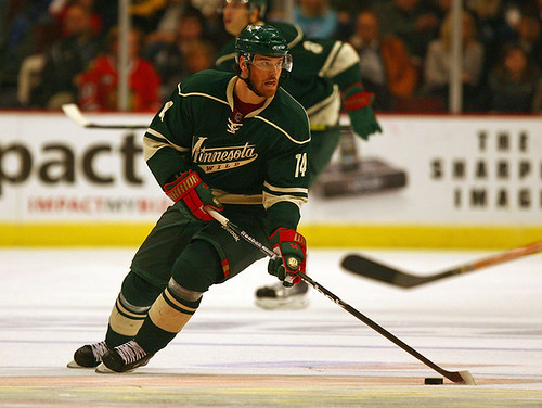
I really loved the copper and navy blue. Maybe the navy was too dark, but it still looked cool.
-
^pretty unpopular, but I agree I didn't like the rainbow stripe template jersey. It looked kind of messy, plus the logo was the goofy characature one so it looked like something out of disney.
Their current unis are okay, but the edge template is a bit boring and safe. They could do a lot better.
-
Honest to god, am I the only one who doesn't love the Montreal Canadiens home jersey? Don't get me wrong, red and blue can look great together. The Rangers do it well and Washington have a nice thing going too...
But there's something about the Montreal unis that just bug me. For one, I'm also not a huge fan of their logo. It's a very good logo, but I don't love the squashed look too it, compounded with the horizontal stripe around the torso just worsens it even more. The red and blue together are too garish for me - there's not enough buffer between the two and we all know how you need a buffer between those two colours. I would love to see the Canadiens logo without the blue stripe behind it. Make the logo a bit bigger of the front and get rid of the stripe, it doesn't help anything IMO.
I don't hate it by any means, but I certainly wouldn't put it top 5 without thinking like most NHL fans seem to do.
If I could send a hug to you via the internet, I would.
Naawwww... internet hugs!
-
They are very good but I guarentee if they came out tomorrow announcing 2 new teams and these as the sweaters....they wouldn't go 1 and 2 on everyone's list. No way. The history of them plays a part, you have to admit.
-
It's definitely the historical aspect of these jerseys that keep it held it such high regard. If a new team came out with a jersey design like that today and we had never seen it...would we all be in love with it straight away? A bit like the Chicago unis. Take away the history and yeah it's still a good set, but it's not really THE best, which a lot of people claim it to be.
-
Honest to god, am I the only one who doesn't love the Montreal Canadiens home jersey? Don't get me wrong, red and blue can look great together. The Rangers do it well and Washington have a nice thing going too...
But there's something about the Montreal unis that just bug me. For one, I'm also not a huge fan of their logo. It's a very good logo, but I don't love the squashed look too it, compounded with the horizontal stripe around the torso just worsens it even more. The red and blue together are too garish for me - there's not enough buffer between the two and we all know how you need a buffer between those two colours. I would love to see the Canadiens logo without the blue stripe behind it. Make the logo a bit bigger of the front and get rid of the stripe, it doesn't help anything IMO.
I don't hate it by any means, but I certainly wouldn't put it top 5 without thinking like most NHL fans seem to do.
-
 1
1
-
-
One of the ugliest uniforms of all time:
agreed. its very overrated.
-
Hi all,
Just wondering if anyone could help with some svg to pdf transfer problems I'm having.
I have a logo that I made in a program called inkscape. Looks great. Saved it all and opened it in illustrator CS5. Still looks great. Did some slight modifications to it. Saved it as a pdf to go get it printed but when I look at the saved pdf document, some of the shapes and text have thick ugly stroke applied to them. It's not as easy as just removing the stroke because when I do it seems to reappear in different areas. Is there a setting when I save it as a pdf that might explain this? I'm a bit lost atm as to what to look for. I'm kinda new to illustrator too.
-
Got it. Galapogos BRK
-
Can anyone tell me what font this is? I need to redesign some and for the life of me can't remember/find where I jotted down what it was!
-
-
I'm still a fan of those navy oilers jerseys. More so than what they have now. I just think the navy and copper look suits the team better. I can't warm to the current set - I mean, its nice, but it doesn't feel right seeing them in bright blue and orange.
 close to hitting it out of the park, but that head is

Unpopular Opinions
in Sports Logo General Discussion
Posted
That's just uncouth