


MJWalker45
-
Posts
24,706 -
Joined
-
Last visited
-
Days Won
10
Posts posted by MJWalker45
-
-
7 hours ago, HOOVER said:
Is that an assumption or from a source?If they're catalog orders? I'd say that's proof right there. We know Nike only gives so much free stuff to the Group of 5 schools before they have to pay for the rest.
-
 1
1
-
-
21 minutes ago, HOOVER said:
What’s sad about these is that they’re what you guys call “catalog order” from Nike Team Sports…one of the tells is the cap sleeve. It’s a sublimated panel. It always stands out most when used on a black uniform because it has a slight sheen to it, and because it’s a different fabric, it doesn’t keep the same shape as the standard cap sleeve fabric that matches the body of the jersey. I’ve always hated this.
Those new Utah State unis are “catalog order”, too.
This is the kind of stuff that BSN and other team dealers can deliver. Shocked to see Nike putting it on these schools, unless they’ve dumped them off onto BSN, too.
It's the school making the call to go with these, and it's saving them money to do it since they don't get the full treatment that the big schools do.
-
2
-
-
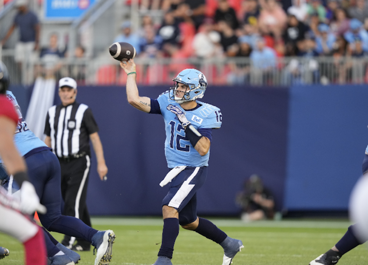
28 minutes ago, nuordr said:
Yesterday, the Toronto Argonauts unveiled navy pants:

Are we expecting a navy version of that jersey now as well?
-
7 minutes ago, Brave-Bird 08 said:
It appears MLS and adidas have entered "city connect" territory. This is going to go well...
adidas could have gone with Retro Reverse and this would have been a great kit design. Instead we have a 90's graffiti jersey.
-
Chelsea still has no kit sponsor for the front, nor the sleeve so they wore the EPL badges and anti-racism patches on both sleeves. I was surprised to see the anti-racism on both sleeves, as Nottingham Forest only wore it on the right sleeve.
-
7 minutes ago, ATLJ said:
Apparently new Atlanta kit. Matches advertising they had about the third kit.
Are MLS just coming up with crap like this so teams don't ask for third kits? Ugh!!! Reminds of every softball team that wears individualized airbrush helmets.
-
9 minutes ago, GDAWG said:
This league needs to hold firm on the hiring of Briles and not rescind it due to backlash.
They're going after controversial coaches to get attention for their league. Rolovich was fired for refusing to follow the laws of the state when it came to vaccines requirements. They aren't getting rid of Briles, or Rolovich if he comes in. They also may never kick a ball, so we'll see if it even matters.
-
On 8/11/2023 at 3:25 PM, TrueYankee26 said:
Off topic but are those new world feed graphics on the top left?
These are the new world feed graphics.
TNT (Formerly BT) are still using the previous scorebug as well.
-
2
-
-
The IFL has hired Art Briles, and says they will be bringing in Nick Rolovich in as well. We'll see how this goes. They're planning on playing in June 2024.
-
15 minutes ago, TrueYankee26 said:
Off topic but are those new world feed graphics on the top left?
No, that's the NBC graphics. It's annoying how white numbers disappear on the lighter backgrounds on the TV. It looks pretty good on a computer though.
-
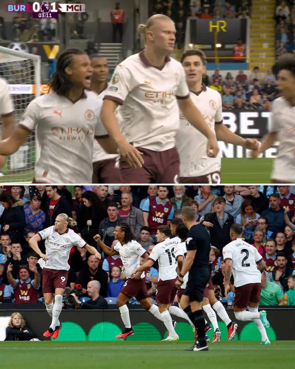
16 minutes ago, Digby said:
Man United and Man City with pretty similar away kits on the year. Funny!
On my TV at work City looks more orange crème than white, but in pictures that color just drains out.
-
2 hours ago, Sodboy13 said:
Looks like they got both the 2 and the 4 of the Champion font pretty much right. The 7, though, uses a straight diagonal instead of the signature curve.
Apparently that was the style they wore the year they won the Alamo Bowl. Or at least this guy did. There are other jerseys for sale with the more famous version of the 7 on them. The guy pictured above appears to be the anomaly of the team, or the way that the jersey stuck to the pads it gave that effect and Nike ran with it.
Based on this picture vs Central Michigan I'm going to go with the uniform sticking to the pads. There's video of the game, but it's a quick cut ESPN bowl game video that cuts out anything other than the plays. I'll have to find something else to confirm.
They did have this version of the 7 in the 1960's, but I don't think you pull this out of your history to mash it up with another decade.
-
1 hour ago, oldschoolvikings said:
Stripeless pants for the loss.
That's what they wore though.
-
4
-
 1
1
-
-
Just now, tBBP said:
I need to see the 2 and 7 of this number font.
That said, two things: a/ I've wondered how long it'd take Purdue to do this, so I'm glad they finally did, and b/ this confirms what I've been suspecting: the pendulum has indeed swung back the other way toward traditional (okay, throwback, but traditional still the same.) Who'da thunk traditional would be the new trend???
We know Nike can make the Champion fonts, based off the Jets, so I hope we see that here.
-
1
-
-
42 minutes ago, Digby said:
And the answer is... NYCFC. Going with an NYC Parks theme with the little green and gold leaf logo. I like the idea, execution's not quite there for me -- the pattern kinda loses the tree effect for me, and I don't like the bright green stripes. But otherwise I do like a dark green and gold and light blue color scheme, so that's kinda nice and pretty distinctive.
I think they could have pulled off the parks theme a little better, but it's not a bad shirt.
-
12 hours ago, 4_tattoos said:
The jersey numbers bother me. They need mesh holes in them to fit the theme.
I think most teams had the mesh holes in the jerseys, but some teams like Johns Hopkins and Princeton appear to have not had these, depending on the shirt. I wonder if they felt it just looks better on TV to not use the porthole designs.
This doesn't appear to have the porthole mesh, but their away jerseys certainly did.
As did another version of the white jerseys.
-
15 hours ago, solvetica said:
Not to be outdone by UAB, the FIU Panthers quickly counter:
These look like they were made for a Florida All Star game. Still 100 times better than that crap UAB dropped yesterday.
Instead of that 305 logo they should have just left the panther head by itself. Stick 305 on the bumper and call it a day. I have to admit, I like those jerseys, but the helmet is just too much. I know college teams are all about showing off their "local" pride, but the area codes and zip codes as the largest part of the design are overdone by now.
At least the field will look good.
-
 1
1
-
-
16 hours ago, jerrylawless3 said:
Is this the worst new uniform set of the cycle? The combination of classic stripes and modern chest stripes is catalog garbage.
Can you tell the head coach has been coaching at the high school level for a while? Hahahahaha!!! These are all horrible. IT's like someone got access to the old EA Sports teambuilder and just went bonkers with it.
-
1
-
-
3 hours ago, Digby said:
Matt Turner is going to Nottingham Forest. Good move to get actual consistent playing time, I'd think... but good thing his M.O. is shot-stopping because he'll have plenty to stop there. Arsenal making a 2-5 million GBP profit over a year on a guy that played like 4 Europa League games for them. Inflation is such a problem these days.
Strangely they're going after Dean Henderson still as well. What's with teams trying to have two keepers now?
-
3 minutes ago, aawagner011 said:
Now that we’ve seen the Cincinnati black uniform, are we sure the white ones were placeholders? They are the real deal, in my opinion. Same template, same contrasting collars and cuffs, same font. Only difference I can tell is the chest wordmark is applied with a patch on the white jerseys whereas the black jerseys have a slightly bigger wordmark directly applied.
Yeah, I think the giant patch is the only thing that would change on the aways,
-
2
-
-
19 hours ago, colinturner95 said:
looking like a 90's inspired throwback weekend?
-
10 minutes ago, andregunts said:
OMG youre the man
No biggie. I've been trying to order uniform patches for my soccer team. I went through Stahl's, but I know there should be cheaper options, I just needed a large order on short notice so I when with a screen printing instead of of actual patches.
-
9 minutes ago, andregunts said:
adidas Z.N.E. Premium Full-Zip Hooded Track Jacket - White | Men's Lifestyle | adidas US
They have the blank one without the federation logos on the Adidas site
If you figure out what the makeup of that adidas patch is I'm sure you could order one to slap on the right hand side. It might cost a bit to order the minimum required though.

-
Just now, andregunts said:
Thanks bro, but looking for the Jamaica one")
Go to adidas.com and they should have that hoodie for all of the teams that were in the competition. Jamaica was in there as well. I don't know if they have them in men's sizes though.
https://www.adidas.com/us/jamaica-z.n.e.-full-zip-hoodie/IR7771.html?pr=still_interested&slot=1


College Football 2023
in Sports Logo News
Posted
I'm pretty sure they aren't either. That's why it's easier for these schools to go with the traditional designs instead of trying to get something that stands out.