


Morgan33
-
Posts
7,646 -
Joined
-
Last visited
-
Days Won
14
Posts posted by Morgan33
-
-
35 minutes ago, Bmac said:
I'm confused. Many teams have taken inspiration from past local professional hockey teams for Winter Classic uniforms. Suddenly we're deciding the Blues aren't allowed? Give me a break.
PS - I realize some folks have concerns about the actual jersey design, which is totally reasonable.
Yeah, and they've all looked underwhelming at best. The worst of which, being the Dallas Texans fauxback which resulted in little more than a green Detroit template with a logo whose only interesting feature was the felt material it was made of. Just because a design is old, doesn't mean it's worth bringing back.
The St Louis Eagles jersey is a relic from an era where little time and consideration were put into uniform design. The striping is derivative, the colours are synonymous with much more iconic teams and the logo is a third rate illustration at best. The St Louis Flyers jersey is the gaudy bastard child the New York Americans and Washington Capitals with no aesthetic ties to the current franchise what so ever. Neither of those designs are worth resurrecting.-
 2
2
-
-
They shouldn't throw back to the Eagles sweater because they're not the St. Louis Eagles. They're the St' Louis Blues, a second six franchise started in 1967. The Eagles were around for one season in 1935 and had an 11-31-6 record. Not exactly a sterling history worth remembering.
A 1987-1994 throwback, with a few tweaks, has the potential to look amazing. Hopefully this is the direction they take.
-
2
-
-
10 minutes ago, Cujo said:
Got to see the VICTORY stripes as they got torched 9-2 by Florida.
I hope their appearance on the ice wasn't too triggering for you.
-
1
-
 3
3
-
-
1 hour ago, Michael Bolton said:
Have you been to Tampa? It wouldn't surprise me one bit if that was intentional.
59 minutes ago, Cujo said:I just don't get how you build that uniform and NOT see the Blue Lives Matter flag. That's the very first thing that comes to mind in that "ViCtOrY StRiPeS" image they tweeted out.

-
6
-
1
-
-
1 hour ago, Cujo said:
BFBS is their best ever? The bar must be low out there in Ohio...
Proper stripe widths, contrasting shoulders and real hem stripes go a long way. Just replace the black base with Navy.
-
1
-
-
I recall people claiming this* evoked Blue Lives Matter... How ridiculous.
*the best jersey the Blue Jackets have ever iced.
-
1
-
-
1 hour ago, AFirestormToPurify said:
They absolutely nailed the gloves. 10/10
As far as I'm concerned they just need to bring back black gear, they could even keep the current jerseys
Nah, the current jerseys are still
 . They could win 10 championships in a row in them and they would be still be bland, characterless trash completely ill suited to represent a cool and exciting name like Lightning.
-
It's better than their last two attempts at a black alternate but that really isn't saying much.
Everything about the construction of this jersey screams "lazy." From trying to pass off a poor shoulder patch as the primary crest to the maddening use of Detroit's single, floating hem stripe (again!). It's an alternate jersey. The hem is allowed to be different from the home and roads. Why not use a hem design similar to your first black jersey? All it would take is making the bottom stripe blue.
I like the use of silver on the sleeve stripes but why is it featured nowhere else on the jersey? Adding some metallic silver to the logo and numbers would have gone a long way as well. The liberal use of metallic silver on the primary crest was the most distinctive element of their inaugural set. Why not give that shoulder-patch-turned-primary similar treatment? Or better yet, just use the inaugural logo instead.
Overall, it's just another "alternate for alternate's sake" that proves that creatively in NHL third jerseys was last seen on the back of a milk carton... I honestly hope the Fanatics switchover gives us a break from third jerseys for a while. So many of them are either pointless, lesser versions of their primaries (see NYI, Edmonton, Pittsburgh and Washington) or complete dumpster fires that sink their respective brands (see Arizona, Dallas, New Jersey, NYR, Philadelphia and Toronto).-
6
-
-
3 hours ago, Bayne said:
The Wild's green and yellow jerseys are decet (I don't love them as hard as a lot of people seem to) but I think their red and green jerseys are beautiful and they should just continue to own that look. I find it to be far superior to the North Stars re-colouring, and it's their history as the Wild. By doing this they are yet another team succumbing to an alternate history that shouldn't dilute their already unique and strong identity.
I'm just glad somebody brought those colours back since Dallas would rather ice an even tackier "Black Ice' fashion jersey than honor their true history...
Those colours are too good for nobody to use them. Just get rid of that hideous advert and it's one of the best looks in the league.
-
1
-
-
11 hours ago, ruttep said:
Not even the best uniform matchup featuring the North Stars throwback. Let's throw some blue into that:
(The Rangers' and Flames' away jerseys are also my two favorite away jerseys in the league)
I'm sure people on here have had more than enough of posters whining about jersey adverts... But that "TRIA" patch is just absolutely horrendous and spoils the entire look.
We finally get proper North Stars colours back after 30+ years and they're ruined by that.-
3
-
-
On 2/10/2024 at 6:07 PM, ruttep said:
For the first time in who knows how long, the Carolina Hurricanes are wearing white helmets with their white jerseys by their own choice, and of course the only reason they're doing so is to play Whalers cosplay.
This organization's uniform decisions are a complete joke.
Agreed. Their entire uniform history, since winning the cup in 06, has been an endless comedy of blunders...
Cluttering their distinctive Championship jerseys with unnecessary piping.
Ditching their storm flag striping to play Team Canada cosplay and having a generic road counterpart that doesn't even match.Somewhat redeeming their home jersey for the Adidas changeover while leaving the road unchanged.
Managing to make their already abysmal road jersey even worse with a derivative diagonal script, bush-league nickname and worse striping.
Making their ridiculously ugly Black alternate their full time home jersey.
Bringing back their best jersey for one season before retiring it for good.Not having a matching home and road in over ten years.
Not being able to decide on a primary logo.
Coloured helmets on the road.
Minimizing silver to the point where it barely exists.
The list goes on and on...
-
3
-
 2
2
-
 1
1
-
-
23 minutes ago, Kramerica Industries said:
....some of the RR's involved color swaps that simply didn't fit with the ethos of the original designs, they didn't make sense in that arrangement. The Lightning taking the OG storm jersey and giving it a white background was nonsensical because you don't picture storms occurring in bright surroundings.
I respectfully disagree. What happens to the darkest of skies when they are illuminated by Lightning... They can turn white, even if it's only for a split-second. I see the Lightning Reverse retro as a capture of that split second and in that context it works.
I'm sure many will disagree with this interpretation but I love that jersey. Hell, the two Reverse Retro's are the only good designs the Lightning have come up since winning the cup in 2004.-
2
-
-
Not that it really matters but "Eggplant" just sounds better to me.
-
1
-
-
On 2/1/2024 at 1:18 PM, ruttep said:
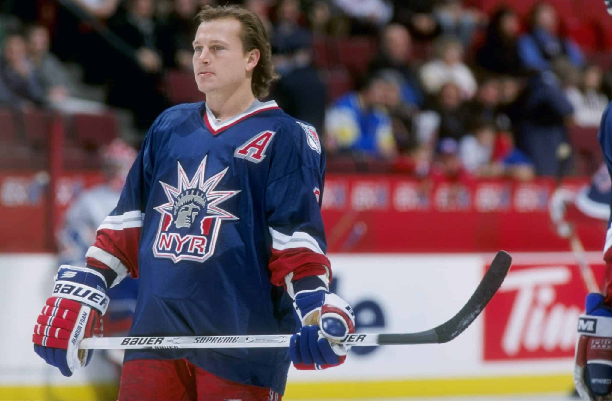
I've actually come around a lot on the Rangers SS jersey. The more I look at it, the more I love it. I think what works about it is that the Rangers finally released a special jersey that doesn't have any navy blue. That's always been a pet peeve of mine with any special Rangers design -- the jersey ends up looking too dark. It's so refreshing to see a design without navy blue.
I'm not kidding -- Every alternate/special Rangers jersey ends up using navy blue (the second RR had navy blue trim):
Navy or not, it's an absolute travesty that this is not their full time alternate.
-
4
-
 1
1
-
-
2 hours ago, Lights Out said:
I've always wondered if Reebok had a design ready to go or if Lou put the kibosh on it before they even got started.
They probably did if they went through the trouble of creating this monstrosity
 .
.
I can't stand the Stadium Series... Drove the whole Outdoor Game concept right into the ground. There should just be a Winter Classic and Heritage Classic.
-
 1
1
-
-
11 minutes ago, ruttep said:
Honestly I wish more teams would do what the Devils did in 2014 and say screw your gimmick, we're just gonna wear a throwback in our Stadium Series game.
The Devils should have just worn their Green Reverse Retro's. Those were way to good to last just one season.
-
1
-
 1
1
-
-
On 1/26/2024 at 12:54 PM, AFirestormToPurify said:
Islanders:
Pure garbage. I have not one single good thing to say about this one. Fire everyone involved in the creation of this monstrosity
+1. I would have honestly preferred they just went with a Navy version of their home jersey... It wouldn't be remotely creative but it at least it wouldn't look like hot garbage.
-
1
-
-
That Sharks third looks fantastic. It would look cleaner without the gradient but that's just a small nitpick. This is the fist time a long time where a team's third jersey unveiling didn't scream "alternate for alternate's sake."
-
1
-
-
The Rangers and Flyers are decent. I actually like what the Flyers did more than their actual jerseys. New Jersey and NY are atrocious. This trend of Dark striping on dark bases needs to die.
-
1
-
-
17 minutes ago, Dante_X said:
Contrast? What's that? An important design principle? Nah...
-
Getting really tired of gimmicky design elements that do nothing to improve the quality of uniforms. Things like...
- Hollowed out numbers
Looks tacky. Like something you'd find on a cheap fashion jersey.- Stealth Striping
Why would you go out of your way to make one of the most important aspects of a uniform invisible on the ice. Asinine.
- Hanger effects
Why is so much time and energy dedicated to something you'll never see on the ice.
-Metallic Helmets
Not a single instance of them has looked passable let alone good. This trend needs to die yesterday.-Oversized Sleeve Numbers
Maybe you could justify them for Stadium Series uniforms but they should not be on uniforms in regular rotation. Looking at you Philly.
-Sublimated Sleeve Patterns
They contribute nothing to the quality of the design. Both Calgary and Vancouver's alternates would look cleaner without them.
-Reversible Jerseys
Easily the stupidest gimmick yet. If there was ever a uniform to sum up everything wrong with NHL jersey design today, it's Toronto's alt.
-
6
-
2
-
-
I wish the Canucks would leave their identity alone. Nothing they've done since 2020 has been an improvement.
-
6
-
1
-
-
43 minutes ago, Nordiks_19 said:
Fans have been calling for the Ducks to return to those colors for like 15 years now. There is only 3 explanations as to why it never happened :
1 : The Samuellis are too stubborn to consider it2 : The marketing team are complete morons to acknowledge the money value in those jerseys
3 : The Samuellis don't give an F of what the fans want.
They also won a championship in those colours... not that I'm advocating they stick around. If I had my way, their original jerseys would return unchanged.
-
2
-
-
15 hours ago, Ridleylash said:
Sure, fans that moved south with the team from Minnesota or who bought North Stars jerseys long after the fact because they thought it looked nice; but let's not pretend like Dallas fans give too much of a
about the Stars' time in Minnesota when they've won a Cup in Dallas and the North Stars didn't exactly have a lot of glamor on the ice.
You've personally talked to all these fans and got their two cents on the issue? Or are you just pulling it out of thin air to support your narrative? If Dallas Stars fans don't care about their Northstars roots, why do articles from fans like this exist? I guarantee more Stars fans care about their Northstars history than anything to do with the Dallas Texans.
https://www.sbnation.com/2017/3/29/15106256/minnesota-wild-north-stars-jerseys-dallas-stars-nhl-mad-online-cut-it-out-dave-coulierQuoteNo, but the fact that the only time Dallas ever considered a North Stars throwback design got scrapped while they've been perfectly OK with Minnesota making two different North Stars throwbacks with the Reverse Retros while they went all-in on their Dallas history kinda indicates that the Stars doesn't really seem to care too much about their Minnesota days anymore beyond the historical aspect.
Their recent reverse retro was based off a uniform worn by both the Northstars and Stars.
QuoteAnd yet they deliberately chose to homage an old-school Texas team in their current colors over any kind of North Stars homage, which would've printed them money.
You realize that during the design process for a Winter Classic, the two uniforms are not created independently of each other... Nashville didn't have a rich history they could throwback to so they did a homage to an old Nashville team. Dallas followed suit. Their decision to not play up their actual history had nothing to do with wanting to disassociate from it.
If they wanted to make a clean break from their past, there wouldn't be retired numbers from Northstar's players in the rafters and they would have ditched Green for a scheme based of the Texas flag.QuoteSeems to me like they just don't think they need the North Stars imagery; which makes sense, the Stars have been in Dallas longer than they were in Minnesota...
Their current uniforms have Northstars imagery in them. The Italicized Star from the classic N-Star logo has been on the front of every single Dallas Stars uniform since their inception. So has their main colour green. Add some yellow trim to the current set and it's practically a direct throwback to what the Northstars were wearing in 1991.
Quoteand won their only Cup in Texas...
In darkened Northstars Colours. Were the Oilers making a clean break from their past when they went from Royal, Orange and White to Midnight Blue, White and Copper? No.
Quoteso why bother with making an homage to a team the majority of their own fanbase would only know from history videos, Wikipedia and video games?
Because they're the same team. Acting like they aren't is revisionist history. No matter how much you wish the team didn't move.
-
1
-


 . They could win 10 championships in a row in them and they would be still be bland, characterless trash completely ill suited to represent a cool and exciting name like Lightning.


2024-25 NHL Changes
in Sports Logo News
Posted
it's a blanket statement for sure, but I stand by it. With the exception of what Seattle did recently, underwhelming is a generous way to describe those uniforms you listed.
Vancouver and Dallas cheated us out of potentially great looking faux-backs based on their respective team's actual histories, Calgary had a truly horrible colour scheme, Minnesota looked goofy with the brown elbow patches, Winnipeg shoehorned a contemporary logo on a retro jersey and the rest simply looked boring.