


Morgan33
-
Posts
7,647 -
Joined
-
Last visited
-
Days Won
14
Posts posted by Morgan33
-
-
1 hour ago, maz said:
It took a mediocre, disjointed, very 90's-looking logo and turned it into a very 2000's-looking logo that is still disjointed and, somehow, more mediocre.
The Lightning's history is 90's overdesign and 2010's oversimplification with a 2000's "wtf is this" era sandwiched in between. That said, I'd take their 90's look before the Reebok Edge disaster and the current wannabe Maple Leafs yawnfest. You're a 90's expansion franchise based in Florida with a pretty badass name - it's okay not to look like a 100-plus-year-old Original Six team.
Arguable points for sure. The Lightning have never had a logo that could be considered great. The only thing their first two logos had going for them was the colours. I once thought their original logo could look okay if they dropped the off-kilter and wholly unnecessary "Lightning" text but that just makes it even more bland. Maybe they should go back to the drawing board entirely and come up with something that is more than a Bolt in circle... But they really need to bring back silver and make black more prominent.
-
What was wrong with this? Not saying it's perfect but it's miles better than what they're using.

-
 4
4
-
 1
1
-
 1
1
-
 1
1
-
-
That font looks a lot better italicized. Some of the Serif's look a little wonky but with some slight adjustments, it could look great.
-
Making the perfect Lightning set is as simple as putting the 2007-11 logo on the original striping template with their original shade of (Hawaiian) blue.
-
On 1/8/2024 at 11:06 AM, monkeypower said:
The Victoria Royals of the WHL unveiled these third jerseys last week. Minus the outline numbers and adjusting the shade of blue, what about something like this for the Lightning?
All the instances of black touching blue muddy things up a bit too much. If you got rid of the yoke and extended black all the way to the cuff on the sleeve stripes you'd have something. The 2007-2011 logo would be a good fit for that template.
-
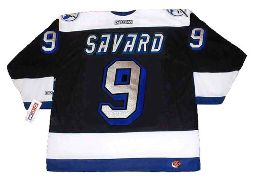
1 hour ago, tBBP said:
Maybe it's just the lighting but those silver numbers look really cool in this photo! What do the Lightning have against silver these days anyways? Their original scheme was so original and represented their namesake perfectly. As Admiral said about the Sharks, it did all the heavy lifting on an otherwise conservative design.
-
1
-
 1
1
-
-
5 hours ago, AFirestormToPurify said:
A brighter, more electric shade of blue for starters. Take this new jersey and change nothing else but the Leafs blue to a Lions Honolulu blue and the jersey is instantly a million times better. They could even take a page from the Kings and VGK and ask Adidas to make a sparkly blue just for them
Perplexing why they ever got rid of the Hawaiian blue in the first place. Every alteration and change since has been a downgrade aside from replacing the paintbrush font with a triple layer bloc.
-
1
-
-
On 1/4/2024 at 1:33 PM, ruttep said:
I was with you until this point. "Copy Detroit?" It's lazy for sure, but the presence of a single hem stripe doesn't necessarily scream Red Wings to me. Their primaries definitely copied Detroit when they were originally designed in 2011, but not every single jersey with a single hem stripe is automatically a Detroit copycat.
I just said the hem copies Detroit, not the entire jersey... Obviously nobody is going to mistake them for the Red Wings when they hit the ice in these. My point is that so many teams in the past 10 years have gone with variations of Detroit's single, raised hem-stripe. Sure, there have been varying widths & colours but it still comes off as lazy when you see it recycled over and over again. A team with an interesting namesake like "Lightning" could and should be more creative... Especially for their alternate look.
-
 1
1
-
-
The creativity shown on this new Lightning jersey is nothing short of mind blowing... The way they moved a logo that barely passes for a decent shoulder patch to the front and cut out its center to lazily shoehorn black onto it is particularly imaginative.
So is the adaptation of a striping pattern, used by two other historical teams, blown up to 'Stadium Series' dimensions. I particularly like how the dark blue stripes are placed directly on a black base so they can't be seen at a distance of more than a few feet. I hate it when you can actually decipher important design elements on the ice.
And speaking of important design elements... I particularly like how they handled the hem, resorting to the most oft-repeated crutch hockey uniform design has to offer today: "When in doubt, copy Detroit." -
8 hours ago, Ridleylash said:
Feels like there's a lot of people who were spoiled by the two Reverse Retros who were hoping they'd just bring one of those back as an alternate or that Tampa would be yet another team to just throw a throwback design onto the Adidas template and call it a wrap.
Put me in this category. I don't like their primary uniforms but could live with them if they had a black throwback from 2004. Not only would this look significantly better but they'd have a championship associated with all three of their jerseys.
-
1
-
-
The Kings have never had a sufficient crown logo... All of them from the "forum blue" version to the one that sits in their current, pencil-point, logo have been overly fussy and detailed. They just need a simple crown on the front of their jerseys, perhaps with a subtle regional tie-in.
-
3
-
-
On 12/13/2023 at 2:44 PM, TenaciousG said:
Seattle really knocked it out of the park with this one. While their Reverse Retro felt cramped and somewhat hastily thrown together, this uniform is executed perfectly from top to bottom. The simplification of the logo and nonchalant script are brilliant. As is the decision to have red restricted to the logo and numbers. Part of me wishes they had done something different for the Winter Classic so this could be their full time alternate. It's that good. Best use of vintage white I've seen in sometime.
-
2
-
-
13 hours ago, Chewbacca said:
I still think they should’ve gone with that and the matching way they were planning on wearing it with.
Came very close to happening... Looks great in a vacuum but there are already two primarily blue and white teams in the league.
-
2
-
1
-
-
2 hours ago, ruttep said:
-
1
-
 1
1
-
-
The Predators issue isn't the use of gold at home, that was a brilliant move that has really helped their brand stand out. It's ridiculously bland jerseys, with nondescript, minimalist striping. Time has shown that maybe getting rid of silver entirely wasn't the best idea either. Still, they are very close to a great design and in my opinion, the solution lies between these two designs... Surely there's the potential for the perfect Predators jersey there.
-
6
-
1
-
-
6 hours ago, DTConcepts said:
Agreed. This is all they had to do to make these jerseys a home run, or at least passable, imo
That's a improvement for sure... I like the addition of Royal Blue to the crest. Unfortunately, there's no saving that striping configuration.
-
2
-
-
It's so frustrating that the Liberty design still isn't a part of their main set. Navy base/royal base... either would be an marked improvement over what was released. That logo just isn't meant to be used as a front crest.
-
5
-
-
Also going to strongly disagree with that statement. Off the top of my head, I can think of 7 teams that looked better in 2002/03 than they do right now...
The Anaheim Ducks, Carolina Hurricanes, Colorado Avalanche, Florida Panthers, Nashville Predators, New Jersey Devils and Tampa Bay Lightning.
-
2
-
1
-
-
2007/08 was far and away the NHL's ugliest season.
-
10
-
-
Agency looks horrible with an outline, especially if said outline is indistinguishable at a distance of more than a few feet... And they didn't even use the same silver as the logo...
Anyone know if there will still be Authentics*?
*with the fight strap -
5 hours ago, Ark said:
Canucks identity should be having a million different identities, like Oregon. It's too late to stick to one...
Why is it too late? They've essentially had the same primary set for 16 years, which is the longest they've stuck with anything...
-
3
-
1
-
 1
1
-
-
8 hours ago, VancouverFan69 said:
Nothing wrong with having a secondary colour scheme for a 3rd.
It's a problem if the two schemes are complete opposites of each-other and one of them is a carbon copy of a divisional rival. Sure, the Flames dropped black from their main jerseys but its still prevalent on their alternate.
QuoteThe reality is, is that the Canucks are a 2-colour scheme franchise, like it or not
The reality is that their entire identity amounts to never being able to decide on an identity. And putting the Skate back into full rotation is the latest chapter in said crisis.
Usage of the Skate should be confined to a direct throwback on special events only. Everything Chromatic said about the new version is correct. The Skate's appeal is entirely rooted in nostalgia.
QuoteAs for the font, the Canucks always have used the legible and timeless Athletic block font since their pre-NHL days in the Pacific Coast/Western League days prior to the Reebok rebrand in '07. The Agency font is cheap and weak and has no place on a professional sports uniform.
I've come to really like the way agency looks on the back of their otherwise traditional looking uniforms. It's become impossible to separate from Burrows slaying the Dragon. Would I be upset if they switched to a Bloc? Not really. But the only way a green outline would work is if it was separated from the blue base with another white one. Blue and Green should never touch.
-
1
-
-
36 minutes ago, Chromatic said:
Every time I see these thirds I hate them more and more.
Agreed. The Skate should be a special event jersey, worn a couple times a year, and not be a part of their main identity package. Moving away from blue and green is where the Canuck's identity problems began and I don't want to see history repeat itself. Their primary set looks great, especially now that the script is gone. Also don't see any problem with the team owning the Agency font... Enough teams use a Bloc already.-
1
-
1
-
1
-
-
Seattle looks great. Vegas would look passable if they had incorporated grey into the striping. As it stands? Just another modern striping-configuration that pays little to no attention to contrast.
-
1
-


/cdn.vox-cdn.com/photo_images/2321526/GYI0064153814.jpg)


2023-24 NHL Jersey Changes
in Sports Logo News
Posted