-
Posts
907 -
Joined
-
Last visited
-
Days Won
1
Posts posted by SCL
-
-
3 hours ago, LAWeaver said:
At least with the 49ers and 76ers, those brands are named after historically-significant moments/eras in American history. I'm sorry but naming yourself the 32s because you were "founded" in 1932 is dumb.
I personally don't have any gripes about "Commanders" as a name, just the uniforms from the neck down. That being said, ever since I saw this concept from @mcrosby several years ago (particularly the plane logo), I've been a fan of the name Redtails honoring the Tuskegee Airmen. It keeps the obligatory military theme that the team/league apparently want to keep (because 'MERICA and FOOTBALL).
Redtails is the equivalent to the Guardian's approach and in the end infinitely more successful than the direction of Washinton.
-
 3
3
-
-
21 hours ago, GoGreenGoWhite said:
Jersey's are great. The logo is absolute garbage, heck the Love's logo is superior.
-
 6
6
-
-
5 hours ago, NeauXone said:
I am no insider but I'm sensing something's changing soon in Minneapolis. Wolves kicking off the playoffs with two throwback games for 1&2 after already wearing the classic jerseys around 25 times during the regular season (by far the most out of all our jerseys), plus our playoff branding featuring bright blue and green as apposed to navy/slate blue/black like in the past. If not this upcoming season I'm feeling a color scheme shift by 2025.
Just needs to, it's too clean and time to move on from the drab.
-
 4
4
-
-
-
13 minutes ago, 8BW14 said:
All of the triangles is the Broncos design tells me that whoever was pushing this redesign did not understand the assignment. Say what you will about the outgoing uniforms, but those were a cohesive whole. The logo is dynamic. The curves convey speed, power and grace of a bronco and it carries over into the striping of the jersey and pants.
They new uniforms apparently emphasize snow-capped mountains. There are triangles everywhere. Straight lines, hard edges, mountains. The last time I checked, the team was still called the Broncos. What are they doing? It doesn’t have to have a “theme” or tell a story about #Colorado. They’ll be back to something reminiscent of either of their previous uniforms in 5 years.This guy gets it

-
 2
2
-
-
-
-
32 minutes ago, DCarp1231 said:
If Denver actually has a plain white helmet, that is the most peewee football ass decision a team could ever make.
Agreed given the jerseys that have leaked, the blue helmet should remain with new stripe.
-
This is a truly terrible rebrand. Pirates weren't minimalists.
-
 2
2
-
-
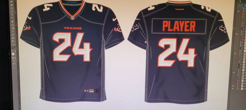
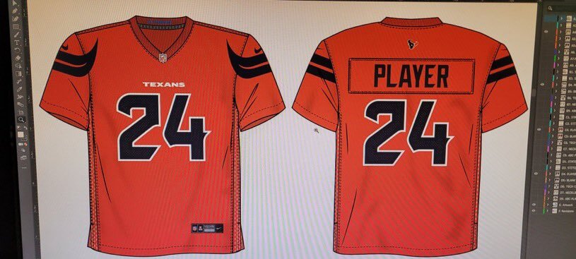
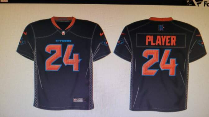
What does an English H have to do with the Texans? Rice University being in Houston?
-
 1
1
-
-
Texans going to pull a Bucs here in a few years and go back to the now prior set.
-
 1
1
-
-
12 hours ago, fouhy12 said:
Looks like this is our uni matchup tonight:
UConn has made the Connecticut throwbacks their main postseason jersey the last two years, which is a good thing because those jerseys rock. The Purdue uniforms are pretty good, too.
Purdue needs a black and a gold version of the throwbacks to achieve perfection.
-
2 hours ago, burgundy said:
When did the Broncos sign Nick Foles?
Nick Foals?
-
 1
1
-
 2
2
-
-
5 hours ago, adsarebad said:
so annoying when everyone in the comment dumps on Fanatics,
When It is Nike who is to blame for the new uniforms.....
-
https://uni-watch.com/2024/02/14/nike-and-fanatics-whos-responsible-for-mlbs-new-uniforms/
Fanatics is responsible for the ens#!tification of the entire industry, they are co-conspiritors in this MLB mess.
-
 2
2
-
 1
1
-
-
White mask was always the best glad the Browns are returning.
-
 6
6
-
 2
2
-
-
12 hours ago, aawagner011 said:
I don’t love either of these designs, but the original bomb pop was better.
Also, sorry to clog the board but I gotta pour one out for adidas and the DFB. Supplier changes like this, the end of a truly iconic relationship, don’t happen very often. Teams change suppliers all the time, but Germany and adidas are about to conclude about 70 years of partnership, nearly unheard of these days. I truly can’t believe it’s happening. Countless masterpieces over the years. A crime for it to end. Hopefully Nike treats the Germans on the same level as France and England. If so, I’m sure they’ll look good. But they’ll always be missing something without the three stripes on their sleeves.
These are not all of their kits, but they represent their best. Either the pinnacle of design or noteworthy moments in the partnership’s history. Adidas hardly ever whiffed on das deutsches trikot.
If adidas and Germany couldn’t figure it out, I think the phrase is something along the lines of “football is dead.”
Just terrible, the Gernman national team in something other than Adidas seems wrong. Puma I could get but Nike is sacrilegious.
-
 1
1
-
-
Should have kept the number font, everything else looks solid.
-
19 hours ago, tBBP said:
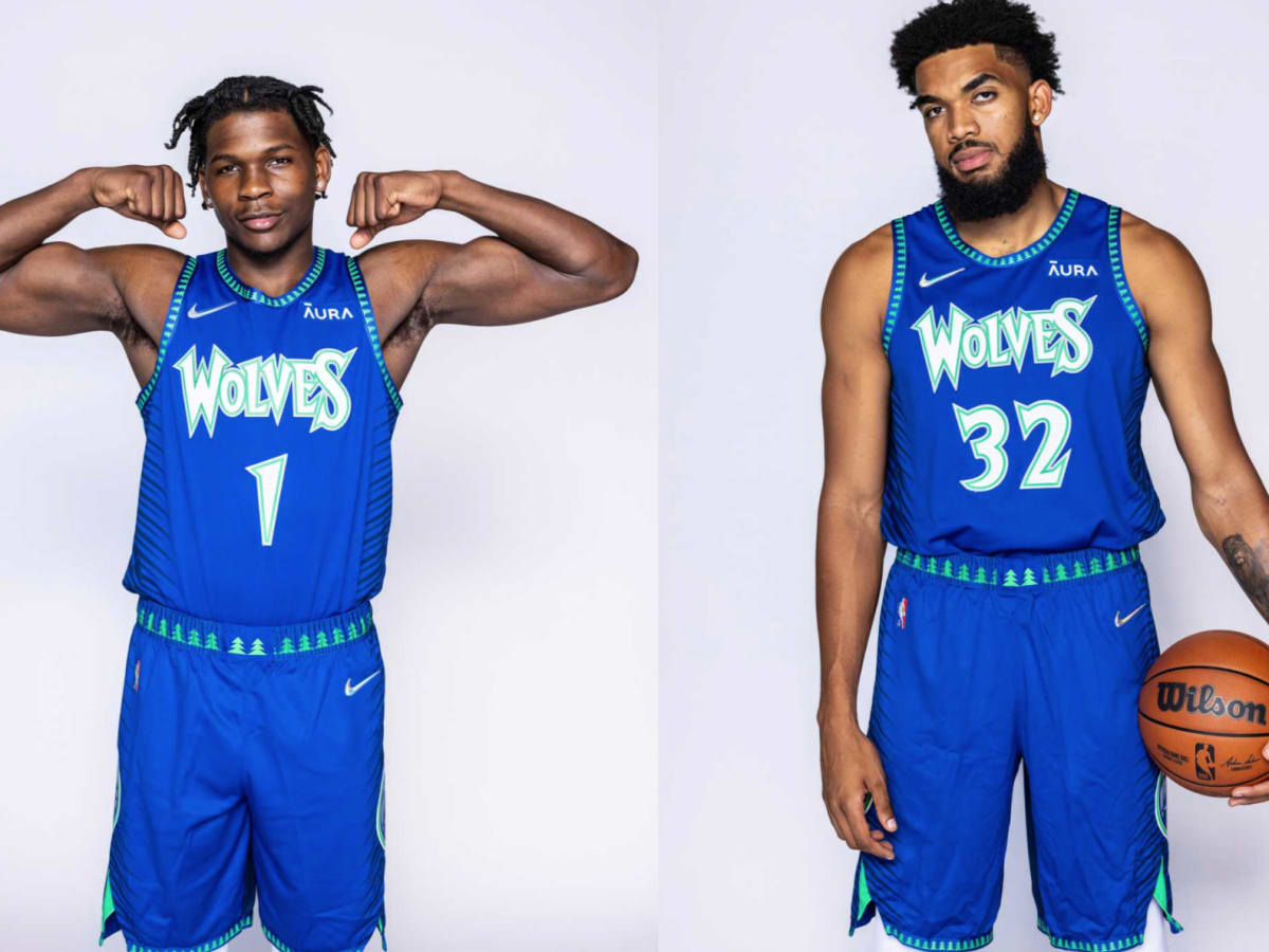
All of that being said (*opinion piece incoming*), I believe, if the Wolves really wanted to, they can marry up the most distinctive elements of their looks over the years and devise a signature look that can last. I look at the Miami Heat as a benchmark...for the most part they've kept the same look since the late '90s. It may not be the fanciest primary look, but at least they've stuck to it. If I were to throw out a vote for the Wolves, I could go with either their current throwbacks, or something based more on their 2021 Mixtape sets:
Now with this, I think there are things they could definitely do to "tone it down" just a tad--namely removing the extra outline on the blues--but this uniform brings out that beautiful royal blue and bright kelly green. I can take or leave the navy backs of those, but I personally love that quirk of those uniforms...very reminiscent of the split backs of the Vince Carter Raptors uniforms. (They'd defintiely have to tone down the blend effects between the two colors, though, because with the tree trim and I guess "tree" font, it definitely becomes distracting.)
Anyway, if I had a vote in the matter, I'd streamline the mixtape sets, devise a white set to match, and let it be what it be forevermore. But that's just one man's opinion...my two rusted Lincolns.
The mixtape is a top uniform in Wolves history and should be the basis for a new set as you said.
-
 5
5
-
 1
1
-
-
On 3/16/2024 at 11:36 AM, aawagner011 said:
The shorts are terrific, bravo to Nike on this set.
-
-
Everything is great except for the primary logo, reminds me of the Winnepeg Jets in that they are both unnecessarily busy.
-
 2
2
-
-
1 hour ago, WBeltz said:
I think this years crop is probably the best we've seen in a while. I have some gripes, but overall, these are all (mostly) phenomenal.
Yeah it feels like Adidas tried with the MLS across the board for once.
-
 4
4
-
-
20 hours ago, PaleVermilion81 said:
For a team called the Loons it makes no sense and doesn't alignment to any of their kit history. That's the stupidity of it. If it was, say, a team called the Galaxy it would be the perfect kit. Or a team based in some state where they had a song that said, "The stars at night...are big and bright...". For a team who is the Loons...just dumb...
Loons are active during the starry night, the tie is fairly seamless to me.
-
 1
1
-
-
What's funny is the Sack Exchange uniforms are among the worst throwback uniforms that will inform a modern set.
-
 2
2
-
 1
1
-









.jpg)


2024 NFL Changes
in Sports Logo News
Posted
The Broncos were that number font, for it to be gone is such a shame...