


truepg
-
Posts
1,225 -
Joined
-
Last visited
Posts posted by truepg
-
-
8 hours ago, pepis21 said:

Red - V
Retro Eligibility - V
Fire - V
Those aren't that good to me either, I much prefer all the 00s' sets to these, even the sleeved one included.
But I ain't getting my hopes up for that mentioned new red uniform one bit, given all the City and what-not redundant uniforms they are doing now.-
 3
3
-
-
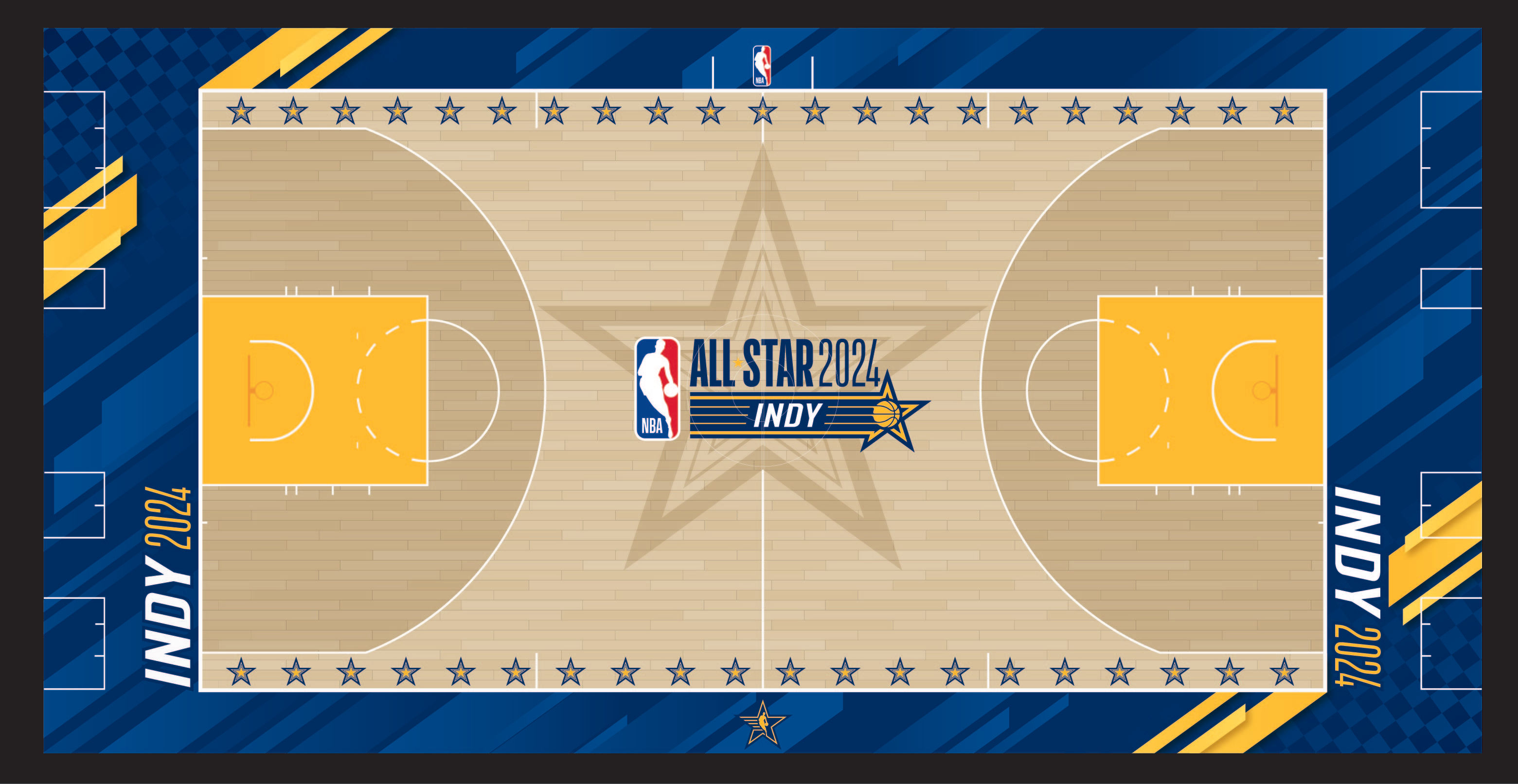
11 hours ago, pepis21 said:
All Star court:
Another year that the All-Star court doesn't match the uniforms. This further supports my theory that they've had the uniform assignments messed up.
-
On 1/26/2024 at 2:22 PM, pepis21 said:
Back of warmup:
Pants:
Are both teams gonna have same warmups?-
1
-
-
Those colors of the All-Star unis are really pleasant and the design is not bad at all, considering what has been rolled out all these past years, even though I can see the issue with not enough contrast between the two. I need the wordmarks to be East and West, though, now that the usual format has been reinstated.
I also can't help thinking that this design was intended for the event held in Cleveland, given how the actual ones had a very Hornets-y feel, and the fact that they had the uni assignments for these games messed up these past years.
Still, these are not quite on the level of All-Star game unis and branding that there used to be in the 00s, when you could tell what the unis looked like just by naming a sepcific year and the city. I really miss that level of branding for this event.
-
1
-
-
2 hours ago, Kramerica Industries said:
26 games was the longest in-season losing streak of all-time (2010-'11 Cavs). 28 games was the longest losing streak altogether; the 2014-'15 76ers lost their last 10 games and then the '15-'16 team lost their first 18 games.
Ok, I see. Well, the Sixers' is not the same thing. -
5 hours ago, Dynasty said:
I kept seeing headlines saying they were tied for the longest losing streak for like the past three games. I don't know what was up with that
Exactly, had been seeing that and that they had already set the record even before the game against Boston. -
22 hours ago, projectjohn said:
Kinda wild we're getting to the point where teams using their traditional jerseys in the same game feels like a special occasion.
This. The way teams should be looking and the scheme they should be following most of the games is starting to be treated here in the way a special occasion would.
17 hours ago, Around the Horn said:The fact that I'd take these back right now just shows how much the Knicks have mailed it in design-wise in the Nike era
Nothing that has come after those unis (the regular colorways) has been better or close. That was a really solid template and look.
11 hours ago, bushy said:Clippers & Grizzlies both wearing different shades of blue.
I love color vs color, but this isn’t it. And I’m sooooo over every game featuring City jerseys.
Of all the color on color matchups which I'm not a fan of at all, this is not really offensive and actually works. There's enough contrast, and the Clippers dark blue comes across more as black for being dark enough.
-
1
-
-
Never liked those or any other Christmas jerseys. The ones with the same script replacing team fonts were super generic, the other ones just plain lousy and bad. The snowflake patch does the job well. Additional jerseys for Christmas wouldn't even have the same effect in current jumble of random uniforms.
-
4
-
-
That MVP trophy is an interesting and cool shape.
-
2
-
-
7 hours ago, Brave-Bird 08 said:
Heat at home is unwatchable. Gracious, what was the NBA thinking?
10 hours ago, pepis21 said:After watching enough IST games I'd say that gray, beige and even light colors like Lakers or Timberwolves are farily ok and games are watchable, but darker ones and especially red courts are really sore to eyes.
Heat, Bulls, Sixers, among others.. Nuggets, Pacers, Suns, among the other colors. The light base floors are easier to watch and aesthetically better, but still ugly to be fully covered in paint instead of having the wood surface.
-
1
-
-
Ok, so, the Warriors' navy Statement uni is better-looking and a better design than their regular sets.
Add some thinner yellow bridge wires pattern in between the side piping lines and it could make them more interesting at that.
-
 1
1
-
-
The more I look at these tournament courts, the more I become convinced they should've gone only with the center lane graphics, leaving everything else the usual way, and it would've had a sufficient attention grabbing effect. I've also noticed that the ones that work from the bunch, are the monochrome, where only one color is used alongside the wood shade or another light color base (such as gray, which, on the other hand is ugly on its own). Then again, the Celtics' court has no business looking good, but apparently for this reason does. Regardless, overall these courts have that cheap elementary school rubber court look, which had been already mentioned.
Phoenix's court was another eyesore with not only the uniforms but even players' skin tone getting blended with the floor. Another wreck job should be the Pelicans'. -
30 minutes ago, the admiral said:
You're surprised a team hasn't done a Stuart Smalley court design?
I literally said my opinion wasn't about the message.
19 minutes ago, RichardWitham said:i dont hate the tourney courts at all. it's good to experiment. do some work better than others, yes. but that's ok people hate things they arent used to , give it time and you will get used to it and maybe in diffrent seasons, they will have diuffrent designs
It's far from only not being used to something, the games were hard to watch and the eyes hurt. Physically unwatchable, apart from looking atrocious. And it was obvious on paper, without any need to "experiment". The least they could've done was test-drive them and would've come to the obvious conclusion.
-
1
-
-
3 hours ago, Cujo said:
NBA courts have reached an all-time low. Really. Who thinks this stuff is nice?
Apart from the cringey message, as a visual style, compared to the tournament courts and most of the City nonsense, I can totally live with this, and I think it's a fully functional and visually interesting graphic element that I'm surprised hadn't been used previously.
-
3
-
-
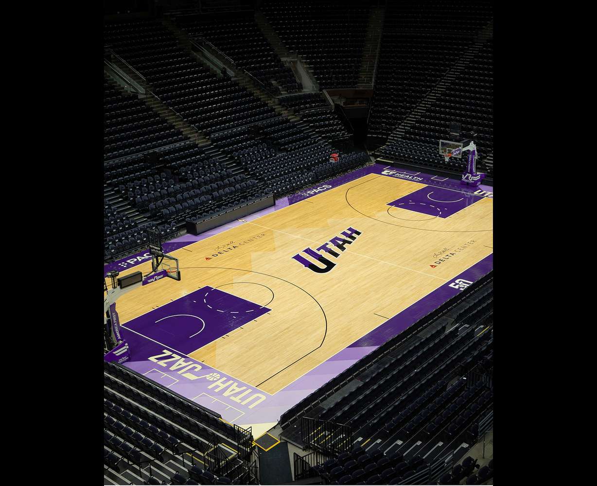
On 11/3/2023 at 1:52 AM, kimball said:
The Jazz's City Court.
Don't feel like this monochrome purple is the Jazz look at all, they need the light blue in there with it. I get Kings' (and the other rival purple teams') vibes from this floor, but not the Jazz'. -
As much as it looked perplexing and contradicting design-wise, I didn't want to sound like the older guy who can't take any novelty and wanted to see how these courts would play out (or how the NBA would make them to), but... they are exactly as visually and aesthetically dysfunctional as anticipated.
Ironically, one of the worst courts on paper, the Bucks, ended up being the least problematic and ugly last night. There's just way too much color saturation and visual clutter and not enough contrast with the players on these courts. The NBA just flat out decided to forego any design principles in terms of functionality with these for the sake of in-your-face attention-grabbing effect.
Now it was impossible to watch the highlights not only for the absence of playmaking and constant jacking up of threes that the NBA game has become, but it was hard to look at the picture. If the NBA was wise, they would ditch these courts right away.
What's interesting, the one element that ended up actually "making sense" is the "runway" lane, and it also looks appealing from the rim camera angle. They could've limited the tournament floor graphics only to that (with the center court trophy) and focused on it while keeping the regular wood stain elsewhere.
-
3
-
-
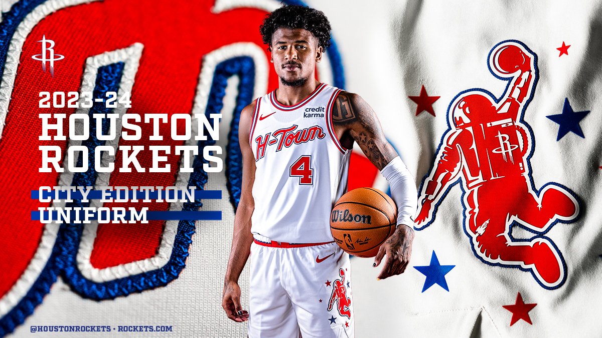
3 hours ago, tscuzzy said:
Rockets are calling this logo the "dunkstronaut". Lot of potential here for an official secondary logo one day. They need to drop the R ... there is just so much potential behind a space/earth/rocket logo.
Has the potential to be an interesting playful secondary/tertiary logo, but their main R monogram is still one of the best logos in the league.-
1
-
1
-
-
7 hours ago, cshookemHORNS said:
Link directs to an X thread (is that still the correct term? lol) with other leaked city jerseys so that leads me to believe these are real. If so, very disappointing IMO.
This is the best look they’ve had throughout their OKC existence, without all the unnecessary outlines with that font and wordmarks and unappealing color combinations, and it is not saying a lot. If they insist on staying put on this joke of an identity, at least treat it this way.On a separate note, that background logo mosaic is an interesting idea, and doesn’t go over the top. Not much use for a game jersey as much as for fashion, though, which these jerseys are.
7 hours ago, B3N said:We have hit new lows with this season's city uniforms:
That Denver jersey is so bizarre.. I appreciate the boldness of that idea (even though they are pushing that theme too much and it doesn’t mean a thing for outsider consumers), and, apart from that mountain skyline getting completely lost in the background, you have to establish a clear typographic hierarchy between the two numbers. The player number should be the one with the primary emphasis – either by an obvious size difference, and/or by a different treatment, like having the altitude only as an outline, for example, if keeping it big.What comes to Washington, they went with:
– Gimme the Grizzlies old colorway
– Say no more, fam.
-
2 hours ago, pepis21 said:
That waistband old-style basketball logo with the leaf is beautiful.
-
4
-
-
On 10/16/2023 at 5:25 AM, SSmith48 said:
Watching some Nuggets highlights, and it seems the court has a slight change where the hardwood has more color variation in between each of the individual strips. Some are darker, some are lighter. Results in a pretty cool/unique aesthetic, something a little more natural.
I agree that it looks more interesting that way, but only those sublimated graphics on otherwise uncolored paint areas just don't work, it still looks too bare regardless (same with the Pelicans). They need and could do something more interesting with the paint.
-
1 hour ago, pepis21 said:
Was thinking about same, that one edition of City should exist for at least two season, but on the other hand it's hard to say you don't get that thrill every year when leaks came up.
To me, the very fact that the City unis change each year (or any specific short cycle of years) makes them irrelevant and disposable and lack any thrill in anticipation. They are just an afterthought for me on these boards.---
What comes to the large amount of black jerseys around the league in general – well, it had been steadily and firmly moving in that direction over all these past years, so it's strange to see that kind of reaction now. At this point it just is what it is.
-
7 hours ago, fortunat1 said:
So it's the Pacers with the graffiti this time around..
-
"Heat Culture" on a uniform is total cringe, it's even beyond airport carpet. The only suitable way to have it would be as a small detail signature inside the collar or near the tag or such, the way they sometimes put it.
On fan apparel or maybe even warmups, a whole different thing.
-
13
-
-
2 hours ago, gosioux76 said:
The whole thing feels like a cheap tourist t-shirt you'd find at a souvenir shop, right next to coffee mugs that say "Life is Better at the Lake!"
Agree with this part especially.


2023 - 2024 NBA changes
in Sports Logo News
Posted
Other than they've been pushing really hard to be a black team, from the court to the uniforms.