


truepg
-
Posts
1,225 -
Joined
-
Last visited
Posts posted by truepg
-
-
Hadn't witnessed them introduce the rainbow, only always found it to be very random and disconnected from the identity and rather unappealing on the uniforms (and the logo).
-
On 9/22/2022 at 7:29 PM, SSmith48 said:
To me, they took and changed everything that worked in that uniform. The white letters gave it the needed visual depth, and those triangles on the shorts really worked as a darker two-tone being navy. The stars are a fitting addition, I guess. Other than that, this used to be the Nuggets' best uniform of the regular rotation, now with the made tweaks it reminds me of a cheaper McDonald's All-American uniform look.
-
 3
3
-
-
4 hours ago, Discrim said:
How? Black and blue have always been their colors.
Instead of being fully black, it could've used a white inline, or, would've worked better in plain blue.
-
On 9/15/2022 at 11:25 PM, CDCLT said:
Yuck. Every time the Hornets change courts it's a downgrade. I hate that "partial primary" logo they're using inside the 3-point arc and I hate the silhouette logo as well. I do like the basketball at the free throw line as a nod to the old court but why are they getting rid of the honeycomb wood pattern? It would tie in really well to the new Statement jersey.
I think the court is great, other than being black. I found the recent use of honeycomb pattern both on the parquet and the paint and out of bounds areas, two different styles at that, a harsh stylistic and visual clash. The new uniforms not so much, though. The honeycomb really isn't the best choice to have on them, indeed.
-
22 hours ago, Shadojoker said:
Certainly didn't expect this new meh City of theirs to be their most interesting jersey this year...
What comes to the other unveilings, the Magic found a way to incorporate the star pattern that really works. Only the collar and arm trim is BFBS, needs white elements.
The Timberwolves did a great job indeed in coming up with simple but clever tweaks to the wordmark to resemble fangs and harken back to their 90s-00s' style wordmark while retaining the modern look all at the same time, however, it has too many narrow letters squeezed in there that ends up too crammed visually and busy for a chest wordmark to work. Maybe they could do a similar treatment for "Wolves" or T-Wolves" to resolve that issue. Other than that, not in love with the new "Tron" unis. The previous black "MINN" were better.
And what about the Lakers? Are we finally getting rid of their purple unis with black? But... only to get it replaced by another version using black, even though slightly better in a way?... Uh, SMH.
-
1
-
-
5 hours ago, pelicanfan said:
i’m actually not a big fan of these. i really liked their statement jerseys as is. i’d rather the MEM pattern be subtle. like how it was originally just on the collar and waist.
Yes, this one feels like a change just for change's sake, and they downgraded at that. The collar and arm trim was their thing on these.
-
1
-
-
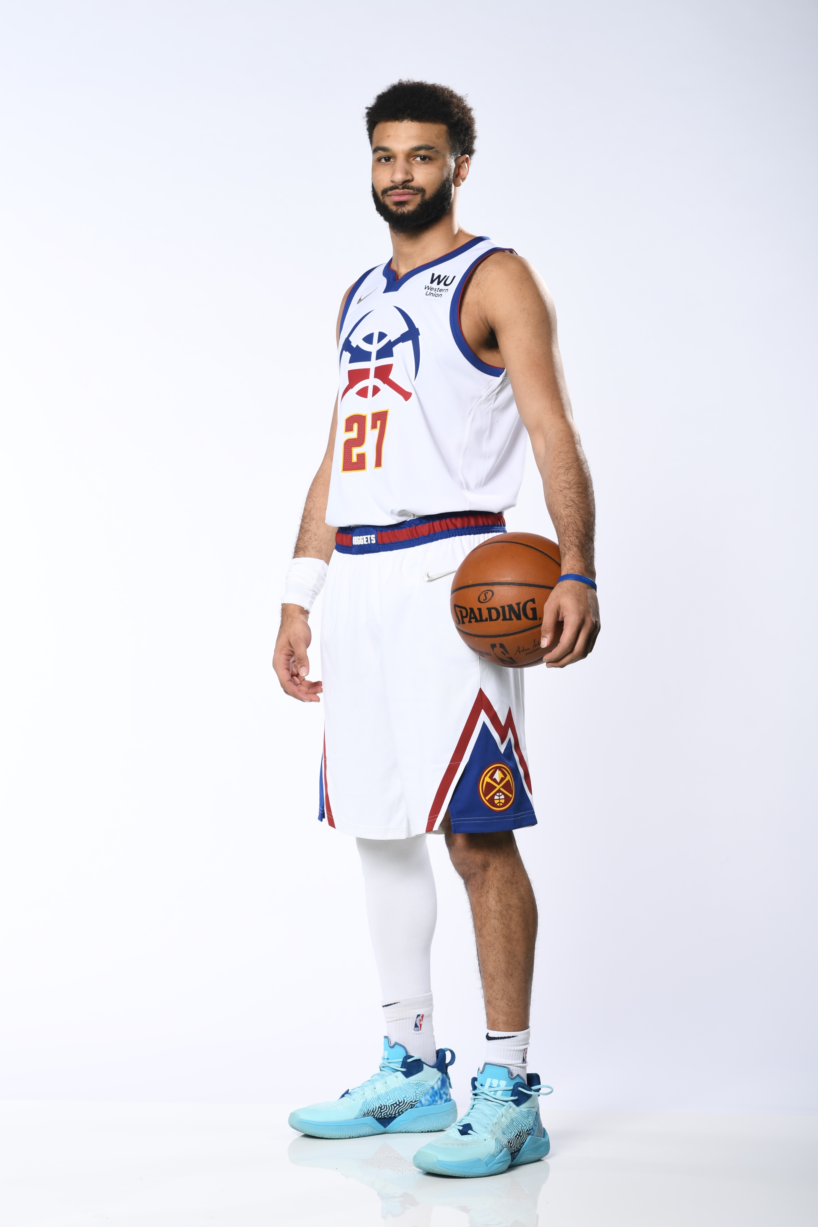
I loved the powder blue and yellow Nuggets, but the logo package they have now is the best they have had. The uniforms are just very meh, with the Statement royal blue being the nicest one, while not totally perfect either.
This was an excellent uniform for the current brand and in general:

-
7
-
 1
1
-
-
I don't get it how it's totally okay and the NBA teams let their players play in such meaningless extra-curricular pro-am leagues, when the international tournaments that actually bear meaning are frowned upon and approached with such caution and some players aren't even permitted to participate, like this year's Heat rookie Nikola Jovic or Juancho Hernangomez just recently while with the Wolves.
-
1
-
-
I'm ok with the Grizzlies' color scheme, as long as they feature yellow more prominently, like they used to do in their previous sets, and what the current primaries are lacking.
Not feeling teal as a primary base color for them anymore, at least not with yellow.
-
2
-
-
9 hours ago, -Akronite- said:
I just want to note that single color trim also sucks. When Nike made this move with the Pelicans and the '17 Cavs, it looks amateur and crappy to me. The jump to going without a trim color is even less exciting but single color trim already looked like unprofessional trash to me.
That has always been my sentiment too. They also did it with the Jazz going from a two-colored collar to plain solid, which watered down and cheapened significantly their previous set. Didn't bother me as much with the Cavs, though, since they had much more else going on on the jerseys.8 hours ago, CaliforniaGlowin said:It's bad enough the hornets minimized the purple. Now without a white trim?

Where do you see that?
-
2
-
-
1 hour ago, dont care said:
I see kid Cudi in a practice jersey.
I'll have to agree with this.P.S. Contrary to the common sentiment, I like the black set the most out of the three. There's nothing wrong with the C logo and it is beautiful with the gold, and makes that uni only more interesting of the bunch using all three colors, since they're all so overly simple. Somewhat like the Hawks' black set. The number is placed visually properly in regards to the logo, and if anything, black is the better and more fitting choice than navy to pair with the two main colors, and complements them well.
-
1
-
-
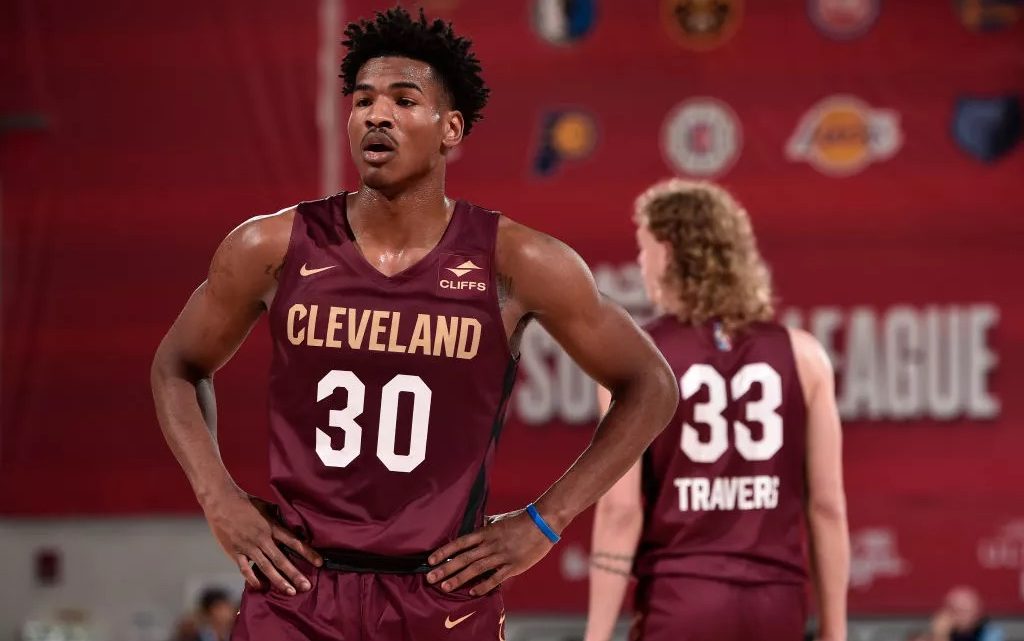
12 minutes ago, NYCdog said:
Another mistake from the “Mistake by the Lake”
Should've just gone back to the LeBron rookie era branding. It was the best look the franchise has had in its existence
Ditching it was the biggest mistake.-
2
-
-
26 minutes ago, VDizzle12 said:
The real question is who the hell is signing off on these uniforms? Do fans really want to buy a plain white tank top? If so, counterfeit companies must be licking their chops. The Jazz uniforms are a disaster, but at least they managed to put some sort of design effort into them. It's funny that so many were surprised we didn't get any leaks of the Cavs jerseys. I bet it's because people saw them and just assumed they were practice jerseys or something for the summer league.
I usually try not to blame designers, because I know the client is king. But the Cavs hired this apparently internationally renowned artist to have complete control over their brand and I can't say I like any of his decisions aside from the updated color scheme. The updated logos are a jumbled mess of eras, generic and the new uniforms are embarrassingly boring. Sometimes being an artist doesn't automatically make you qualified to control a sports brand.
You already said it all right there. After seeing the beautiful photoshop concepts of the possible new uniforms, I was already ready to fully sign-off on this new direction with the uncalled for return of the ball-net logo replacing the sword, but little did I know. That being said, as a Cavs fan I've already experienced this kind of change, and the Cavs had already hit rock bottom with their unis once before, so, I'm not gonna let it affect me that much. At least we have a nice up-and-coming team, lol.
On a positive note, the graphic elements used are nice along with the inline number treatment, and the color scheme with the proper gold is gorgeous and does really set them apart from the rest of the league. The number placement together with the C logo on the black jersey has also been resolved in a proper way. Only that I'd have preferred the number inline to be cropped out on the wine and black unis.-
5
-
-
11 hours ago, eRay said:
Good to see that the new sponsor patch might be applied in teams' colors.
-
2
-
-
2 hours ago, LA Fakers+ LA Snippers said:
Since you seem to be getting confused, let's make this clear: your ability to make an NBA logo is not whatw e are talking about. The question at hand is "why do you think the Jazz rebrand is better than the Nets'?"
Also, hiding a court pattern inside of a stripe and recoloring old stripes don't carry the same weight. Brooklyn's jerseys also have collar, shoulder and shorts trim, unlike the Jazz's practice jersey look.
I'm confused? You guys can't even stay on track and pay attention properly to what I've been saying. And that was literally what was suggested to me.
1 hour ago, WSU151 said:It sure is fun reading non-answers and deflections.
Sounds like your definition of "amateurish" is "I don't like it".
The last thing I need to be doing is proving anything to anybody around here. The last time, though, another user demanded me to show the free font that I claimed was used on a jersey ended up being just that to his utter amazement. Even then, as I had already pinpointed and skimmed over it, it's been done on these boards already numerous times before regarding the Nets, and there's really no reason to pick anything thoroughly apart here anyways, since, as it seems, the contingent on these boards isn't mostly much affiliated with the design realms, nor that it should be. Either way, you should've already settled to disagree and moved on by now, as it was already obvious.
-
 2
2
-
 1
1
-
-
1 hour ago, WSU151 said:
Do you really think it only took 5-10 minutes to design the Nets logo? What makes you say the current logo didn’t take time and effort and consideration?
I was responding to your suggestion of coming up with one myself. The actual Nets logo is its own separate discussion.
QuoteIf you’re going to call something amateur, you shouldn’t avoid/deflect on the details. It should be fairly easy to defend your claim, but your refusal to talk about what would make it more professional looking is quite telling. Is it the kerning of the letters, the width of the strokes, sloppiness, or anything else?
The only issues you brought up were:
The Nets have basic trim (minimalism isn’t amateur, and the herringbone pattern in the trim isn’t basic).
The Nets numbers and letters aren’t “crisp”. Nobody knows what that means. What do they need to look like in order to be “crisp”?
I did bring it up in another message, but I had answered that point of yours already too:
4 hours ago, truepg said:I went through all the issues in general. Sure, we could pick apart and go through every element and detail here in specific, but that has been done already several times on here ever since the Nets introduced their logos and identity, so I'll just leave it at that for now.
What comes to the herringbone pattern – it's as useless a detail as the fainted stripes on the new Jazz' unis that isn't visible apart from a real head-on close-up inspection that doesn't make the design in general any better. So it's absurd that its being brought up in this comparison all the while the one y'all defend has the same exact issue.-
1
-
-
11 hours ago, WSU151 said:
What would a professional Brooklyn Nets logo look like to you? Feel free to give us your ideas and a concept.
You really haven’t told us why anything in the current design looks amateurish.
Coming up with an appropriate professional logo requires time, effort and dedication, and I'm not up for that in case of this matter. However, some decent ideas have popped up here along the way, from someone who had taken part in the developmental design stages or just other that would be more fitting.I went through all the issues in general. Sure, we could pick apart and go through every element and detail here in specific, but that has been done already several times on here ever since the Nets introduced their logos and identity, so I'll just leave it at that for now.
-
2
-
-
3 hours ago, WSU151 said:
I don't think anyone, either novice designer nor professional designer, would agree with you. The Nets logos aren't amateur...everything is pretty much on point, design-wise. The black and white might be boring, the font might not be the most exciting...but everything fits together.
Plus, I think the designers of the Nets logos are members of this board and worked for Reebok/adidas at the time.
None of those points change or affect the fact. Just says more about the people in question.
The Nets logos were even brought up here just recently by another user as an example of the poor level of design in the NBA amongst the major leagues, and pop up every now and then.
That being said, the proficiency level of design the NBA fields and half its teams come up with is rather questionable and not impeccably professional to a considerable extent. What can a novice say here?

-
1
-
-
11 hours ago, LA Fakers+ LA Snippers said:
"Reading comprehension?" Really? You're entitled to your opinion, but if you reallly think that me paragraph was about whether or not the rebrand fit the Jazz, you really need to look in the mirror. The Lakers uniforms don't fit the Jazz, but they're one of the best uniforms in sports, period. I was responding to you saying that the Jazz's rebrand was of great quality and execution (an outlandish claim) while denouncing the Nets' rebrand and saying it was exponentially worse (another outlandish claim). You can like the Jazz rebrand, I'm not here to attack you or your opinion personally (hell, we have an entire thread for unpopular opinions, and I have a few entries myself). But to say that a basketball jersey with insanely large lettering, numbers comperable to a football uniform, nearly unoticable design elements that area lazy holdover, and an appaling color scheme is objectively better than a well-thought-out brand with design elements that fit not only said brand, but adequatley fit the parameters of a basketball uniform is complete and utter insanity, which is why I brought up the contraian definiton earlier.
TL;DR: There is no way in hell that the Nets' uniforms are worse than the Jazz's
I will be expressing any opinions I see right and suitable, and argumented, on top of that, regardless of whomever considers them "unpopular" or any other thing I could care less about on well-founded grounds or not, like you do there without giving any legitimate design arguments.
Quoteover an opinion that you believe is objectivley true, which is objectivley false.
Oh really?
The hell.. SMH.
Quoteand I would like if you stop insulting my intellegence level over an opinion
Talking about mirrors and asking me, next time you'll know better than to take the freedom of calling out someone.
-
 1
1
-
3
-
-
13 minutes ago, NYCdog said:
There’s beauty in simplicity, that’s the Brooklyn look and it has local ties. It’s prefect.
What the Jazz have done is just plain boring with no real ties except “Beehive State.” And even then, they choose to use Volt, not Yellowjacket. Embrace the Purple Mountain Majesty look of the Stockton/Malone era. The future concept uniform (right) they unveiled should’ve been the way
Simplicity and the Brooklyn look is one thing, poor quality of execution is another.
The second part with embracing the purple mountains was my stance from the beginning.
Everything being posted right now off point that I made.
-
1
-
-
21 minutes ago, LA Fakers+ LA Snippers said:
If you replace "Nets" with "Jazz" and vice versa, this makes total sense.
So having two colors that contrast cleanly, correct scaling of numbers and wordmarks appropriate to the "respective standards" of an NBA uniform, and designers who actually cared about each detail is "ameturish"? But taking two colors, one of which wasn't even in the intital design plan, choosing a nice font, but then sullying it by enlarging the size to where it is almost comical, recoloring old unifroms elements to where they are almost unnoticable, and adding no new elemnts to stand apart from the rest of the league is somehow "executed in a professional way in terms of design principles"? Spare me the bull :censored:, cause I don't buy it.
You can buy whatever the heck you want or not. Hundreth time again, the conversation wasn't about how appropriate it is for Utah or the Jazz, which I've been an opponent of from the beginning, but the quality of technical execution of whatever it is they decided to go with in this case. Once again, reading comprehension, FFS.
-
 1
1
-
1
-
-
23 minutes ago, Digby said:
I mean, I don't see what's amateurish about the Nets' rebrand. It's simple and minimalist, but the type size and leading both look proper for a basketball uniform, unlike the Jazz.
It looks like the front number being that big and aligned with and tightly to the wordmark was the specific intention. The Nets' jersey elements just follow, well, the basic alignment.
The Nets' amateurish approach is present everywhere in their identity starting from the details in their logos to the font selection and treatment and ending with just how lousy and lackluster the level of the graphic elements, logos and uniforms as a whole are. A team in a league at the highest professional level in the world has to hold itself to respective standards.
Whatever this new Jazz identity is, at least it was executed in a professional way in terms of design principles, and it shows.
-
1
-
-
4 minutes ago, MJWalker45 said:
That's the issue with this new look. If you're the Jazz you should look like the Jazz, not the EDM movement.
Never disagreed with that from the beginning.-
1
-
-
19 minutes ago, MJWalker45 said:
I'd disagree.
Oversized front numbers, colors that don't say either Utah or Jazz. They look even plainer with no side striping, even with three colors used. This looks like the uniform a team in a Disney Channel movie would wear.
I wasn't talking about looking like the Jazz in particular.
16 minutes ago, Digby said:I've always disliked the numbers that Brooklyn uses; in a vacuum the Utah number font is better but it's ruined by being too large, applied amateurishly, and of course being part of this entire senseless rebrand.
You just agreed with my point. It isn't applied amateurishly, though (like the Nets brand is in general). The fact that the rebrand is outlandish wasn't part of the point I made there.
16 minutes ago, LA Fakers+ LA Snippers said:Contrairian - noun
- a person who holds a contrary position, especially a position against the majority.
- someone who trolls on message boards to get reactions.
Which one are you?
You think I give a d*mn about whatever your majority thinks? I don't come here to be agreeing with the majority, I come here to express my opinion on the topic.
-
3
-
1


2022-23 NBA Logo & Jersey Changes
in Sports Logo News
Posted
This constantly rotating City and 'else' program has me personally totally disinterested in and not looking forward to the new uniforms that are released, other than the regular sets, and seeing them just as an afterthought, which they have also been design-wise for the most part. The effect that was expected right from the implementation of the program.