


truepg
-
Posts
1,225 -
Joined
-
Last visited
Posts posted by truepg
-
-
I loved the Melo era baby blue Nuggets' color scheme, but the one they have now also has some interesting colors to work with. It's that if only they distributed them differently, making a bigger emphasis on the lighter shade of blue and the maroon, like they had done on one of the Earned uniforms with the axe logo on the chest which was white, and their current blue Statement. I also liked the maroon alternate.
The court is rather boring indeed.
-
 2
2
-
-
After the season's been played out, the airport carpet on a jersey still feels awkward.
-
4 hours ago, eRay said:
If they are one of the teams changing this year (or next year) I'd bet they're leaning toward more of the blackletter look from the statement jerseys, not less. Personally, I'd prefer that to the current Icon and Association wordmarks.
That'd be very unfortunate. Their regular wordmarks are fully disposable, but I'd keep the LAC monogram and add script wordmarks to the package instead similar to what they used to have. Losing them was a mistake in the first place.
3 hours ago, Old School Fool said:This isn't the only time the Kings have had a dumb decision regarding their court, remember in 2013 they had a 3D logo at center court. I've never seen a team do that before and once you see it you understand why.

I didn't hate that treatment at all. It worked for the Kings.
P.S. As a matter of fact, that exact Clippers' city map graphic creates way cheaper a look.
-
2 hours ago, pepis21 said:
I wish they leaning towards red rather than black.
Yeah, they better ditch all the black, blackletter font and the urban court graphic nonsense. I'd rather see them predominantly in blue, though.-
1
-
-
10 hours ago, bushy said:
Man I hate what NBA jerseys have become. I’m watching the Lakers/Warriors game and you can barely tell who’s who.
Lakers playing in their white/blue/yellow Minneapolis retro jerseys & Golden State playing in black jerseys and a black court at home lmao.
All that thousand times over, and what really annoys me on top of that is that the matchups never end up looking like you're expecting or picturing them to look like anymore when you turn on game footage....That, and wearing white on the road just will never make sense to me.
-
7
-
-
19 hours ago, Old School Fool said:
This is the only time yellow accessories worked for them. It doesn't look good with the powder blue jersey.
Agree, but to me they don't look optimal even with the navy unis. The bold use of vibrant color is applaudable, but I'd rather see them wear those all-yellow accessories with their white unis. The navy would look better with powder blue.Something about that dirty-ish shade of yellow is also off-putting to me.
-
1
-
-
28 minutes ago, iamdaviinci said:
Agreed that stripping something so charmingly over-the-top of its essence would be doomed from the start....but isn't that what's being suggested by a new mountain identity with most of the same colors and a cleaner look? Please forgive me if I've misinterpreted, but that path seems like something that could instantly end up as a "Mom, can we have '90s Jazz jerseys?" / "No, we have '90s Jazz jerseys at home" meme. It would have to be done almost if not perfectly, and I don't think the Jazz currently have much margin for error in approaching their next identity.
As @Digby mentioned, though, last year's City Edition mashups may offer some answers. Teams like the Wolves and Raptors successfully reintroduced '90s design elements by flipping the color palettes. That helps to avoid direct comparison to classic looks, letting the uniform stand more on its own merits.
Perhaps a larger application of this has been seen across many of the Grizzlies' recent looks. For example, the patterned trim on their previous and current Statement Editions draws inspiration from their inaugural Vancouver uniforms, but does so in a way that's true to their current identity and aesthetically modern. The inspiration connecting the two uniforms is clear, but I'd be surprised if anyone saw the two and invited a direct comparison between them.
You gave a good example yourself as an answer to your initial question. I would go even further and point to the color mashup "Isaac Hayes tribute" City edition from a couple seasons ago that had the same trim pattern and used the Vancouver era colors, in addition to those Grizzlies unis you already mentioned. They did a great job in achieving exactly that - reintroducing an element in a modernized, but still recognizable and I would say clearly associable way with the original. The Wizards are another good example with their regular look. The Hornets have done it too, although, with mixed success.
-
30 minutes ago, iamdaviinci said:
Good design is always paramount -- but I think that becomes an infinitely more challenging (if not impossible) task when you compete with nostalgia. The beloved '90s identities have become iconic because they were one-of-a-kind....often imitated, but never duplicated. The current Jazz Classic Edition is rightfully awesome, but something similar yet different would always be looked at a being less than; there's no replacement for the original thing.
I'm curious to know your thoughts, as well as anyone else's, on whether or not modernizing a '90s identity can actually be done effectively. Of the most popular ones - Jazz, Raptors, Grizzlies, Suns, Magic, Wolves, Rockets, Hawks, Pistons - none of them have tried. The closest example I can think of is the recent Suns leaks, which were scrapped due to online backlash.
The charm of the 90s' identities lies in its own way of being "over the top", and trying to "modernize" such a look would kind of strip it of its essence. The Raptors did something along those lines with the uniforms that followed the originals, which resulted already in a different, 00s' design aesthetic.
That's why creating a new "mountain identity" for the Jazz wouldn't be to replace the old one, rather than using those motifs for a new, modern, cleaner look that takes cues from the original, which is totally doable. The design that was on the Jazz prototype jersey I was talking about had already achieved that in a way, if only I could find the photo.P.S. The Wolves had kinda made a successful attempt with their last year mashup uniform, but it would've needed some further cleaning up to take it to "modern" standards.
-
3
-
-
19 hours ago, iamdaviinci said:
I'm a big proponent of continuing to push design forward, though, so I'm also adamantly opposed to the idea of just reverting to more detailed mountains, copper/sky blue, etc.
Sure, but not at the expense of good design. The way the old mountains were rendered and the shape achieved by using only two shades of color and very basic shapes, was rather simple, actually, and would work as well on a cleaner modern uniform.
Regarding the color scheme, as it has been gone over on here, there already are several purple teams with different supporting colors, and on top of the fact that copper and sky blue match purple really well and have already been part of the Jazz' identity that they can own, it would also be a simplified color palette compared to their 90s' package.-
1
-
 1
1
-
-
1 hour ago, LA Fakers+ LA Snippers said:
If you are referring to the mixtape design I mentioned, the one I was talking about wasn't this, it was some kind of a prototype or a Mitchell & Ness jersey that had the mountains with a modern single-color Utah wordmark from their previous identity and a simplified purple & teal color scheme. -
3 hours ago, iamdaviinci said:
At this point, I think the best outcome would involve converting the 2023/24 City Edition to their eventual Icon Edition and flipping the colors to create the accompanying Association Edition. I'm not sure about the logistics (timelines, rules, etc.), but from all I've seen most fans really like the design. It plays on the current trend of overwhelming '90s nostalgia, but in modernized and sustainable way. It focuses primarily on purple, retains the current era's black, and could serve as a perfect palette cleanser between all of the chaos and the eventual next iteration of their identity. Plus, since it's already out there and generally well-received, it's much less of a risk.
Not a fan of that new style mountain jersey design. The mountain rendering looks too generic and lazy being layered like that, and there shouldn't be any black. Gimme copper and sky blue.
There was a Jazz mountain jersey prototype or some mixtape-edition design circulating around that was much better than this.
-
I like the color distribution on these Dallas' uniforms (only they could've done with just one, the lighter shade of green). What I don't like is the emphasis on the 70s' aesthetics. They should've toned down on the Boogie Nights, and maybe add the green inline to the numbers instead of the wordmark. This is the right base for the actual main identity update.
-
2
-
-
1 hour ago, kimball said:
I REALLLLLLLLY want to hate this, but it oddly works? Maybe? I think?
They ended up way better than what I thought them to be going off the leaks due to the powder blue in the trim, but I really am not feeling those blue circles with the logo inside. Without them and if the wordmark had the same exact treatment as the number, it would be a really decent design.
The court has a nice color combo with a really pleasant shade of light brown. The City courts are unexpectedly rather good in general this time around for the majority of the teams. -
The Nets looked beautiful last night against the Wizards with the red compression pants too. Surprised no one had mentioned it here. Also nice to see KD play in a proper design.
-
8
-
1
-
-
14 hours ago, pepis21 said:
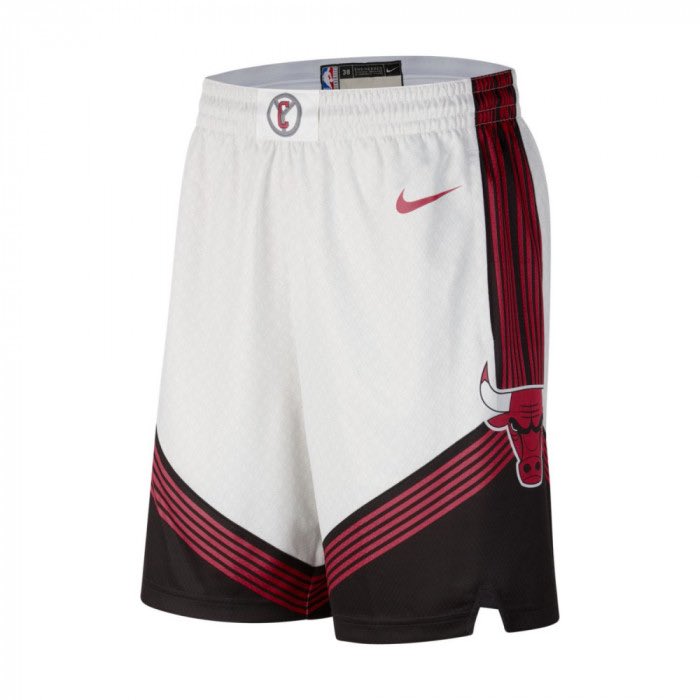
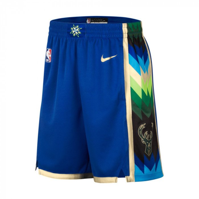
That whole bunch of City uniforms is so meh, as said, indeed, that would improve the quality of the league's uniforms simply by not existing.Those Bucks' shorts are just gorgeous, though. And I can't help thinking that those Bulls shorts would look even better with gold (à la Cavs) used additionally
-
1
-
-
On 10/31/2022 at 12:46 AM, Old School Fool said:
Seeing the Wizards throwbacks make me realize how much I actually liked the wizard logo when it was recolored and modified. The campaign button/monument logo is great but the wizard just has something about it. They should bring it back as an alternate logo.
Surprised to see this logo being longed for on these boards all of a sudden, since at the time it was very hated, especially at this recolored stage.I can see where you're coming from regarding it having that particular "something", but to me it's nothing to warrant having it brought back, since the current Wizards identity is so flat-out solid – well, it was until their primary logo was bastardized with the addition of the circle and stars around it.
-
49 minutes ago, pepis21 said:
And this is from game:
Didn't expect to like those unis as much as I do, they're all-around solid.
-
5
-
-
19 hours ago, Conrad. said:
They should've stopped before touching the fonts and kept their regular wordmark and numbers, and this would've been a decent controlled design. Now it looks more whimsical and all over the place than its 90s' counterpart, and that's saying a lot.
EDIT: Or used a more streamlined font of that style for the wordmark. Is that really the same font that's used for the numbers??
-
At least the multiple color key issue without having the college lines was solved


-
 1
1
-
-
The removal of college lines felt weird to me at first, but then I got used to it rather rapidly, and now they look very superfluous, which they really are, even though they allow for inclusion of secondary colors.
-
1
-
-
7 hours ago, MackAttack said:
super unpopular opinion would be an understatement but I like Utah's new jerseys, except the highlighter yellow one. The black jerseys would look great at home on the all black court. I like the simplicity and the merch is clean as well.
Was about to come say the same. I wasn't supposed to like this new Jazz identity, but I really do. The yellow uni included. They did a good job. Kudos.Even the note logo, which I didn't care about at all, strikes really differently well in this identity. A lot also has to do with the fact that the previous identity with all its variations was very trivial with the logos and the color palette.
The Cavs' unis are the worse ones compared, it's just a plain blank set with logos slapped on, apart from the black one which stands its ground somewhat thanks to the use of three colors.
-
1
-
-
1 hour ago, projectjohn said:
Another nitpick is the free throw circles not being accurate. For instance, the Pistons' teal court had the free throw circle fully teal, not half. It seems like the NBA suggests (requires?) the lane to be one solid color these days, for whatever reason.
And for some reason doesn't require it of the Heat...
-
3
-
-
1 hour ago, pelicanfan said:
i hate to be that guy but it really does irk me how throwback courts often now have the two horizontal lines in the paint removed. i dont understand why they do this. makes it look inaccurate to the originals. as if moving around wordmarks and having to change arena logos wasnt enough.
I really miss the bronze-colored inisde of the paint for the Wizards there. -
That Celtics' Bill Russel City uniform looks the least Celtics – or, nothing like, to be more precise – that I recall seeing, on top of having the Bucks' colors. Even the "Irish pub" unis were Celtics' green (or close to it).
Nothing wrong with it per se, nothing great about it either, though. It's a black Celtics' block-style wordmark and numbers outlined in gold away from nailing the look.


2023 - 2024 NBA changes
in Sports Logo News
Posted
They've used same font with the Cavs before.