


monkeypower
-
Posts
4,726 -
Joined
-
Last visited
-
Days Won
5
Posts posted by monkeypower
-
-
Per the Barstool blogging discussion, I think their real cash cow now is podcasting and the more visual/audio content, along with merchandise, instead of the blogging.
From what I understand, it's also kind of the nature of the beast with making money through internet content. It's more about the sponsors and merch than actual clicks or views.
This is probably for another thread, but I wonder if there's going to be a podcasting/Youtube/internet sponsorship bubble burst soon. Someone like Barstool has the history with major companies that sponsor content or put ads on their podcasts, but it seems like every Youtuber or podcaster is sponsored by Audible or whatever VPN is hot in the streets. How much money is there in these ads and how much money do these smaller sponsors have to spend?
-
 1
1
-
-
58 minutes ago, the admiral said:
Okay well you have to understand that I was a huge Bret Hart fan as a kid and the idea of a developmental hockey team continuing to honor him tickles me.
Back for the 20th anniversary they used his theme as the goal song.
-
So the pink Ducks jersey was for the 15th anniversary and then they wore it as an alternate for a couple seasons after.
Then for their 20th, they brought back the actual throwbacks and added the original starburst logo on one shoulder with the anniversary logo on the other.

Then after that season they switched out the anniversary logo for another starburst logo and wore it as an alternate up until last season.
They are playing an outdoor game in Regina against the Pats the day after the Flames and Jets play. This will be the second time the Hitmen have played outdoors (the other time was also against Regina) and wore these jerseys last time, so I am expecting some pink and grey again if there are going to be jerseys for the game. They also kept these around as an alternate for a few seasons too. (This was also during a time period where one of the helmet decals was flipped for some reason)
17 hours ago, Wade Heidt said:Not a Hitmen fan myself, but curious about how their fans would feel about a return to the original colours full-time.
1 hour ago, the admiral said:The Hitmen should absolutely have hot pink accents all the time, it's the one uniform issue in major-junior that I can work up any passion for. Don't overdo it, a little goes a long way, but it's ridiculous to do anything else. They're the Hitmen from Calgary, Alberta, Canada! Come on!
I think the current colours have been around for so long at this point. As a fan of both of these teams, I think a fairly good comparison is the Ducks. They both started with branding deeply tied into their ownership with unconventional colours. They both changed to their current branding after new ownership took over and have seen championships in current branding with their first championships coming in the first year of the current branding (the Hitmen have since won another).
Not that I think there's as much clamor for the pink Hitmen as there is for the Mighty Ducks, but the current branding has been around for so long now that I think both ownership groups are fine with keeping the old branding around for anniversaries, special occasions and double dipping on the merch.
-
The Hitmen are having Bret Hart Night on November 2 in conjuction with Prostate Cancer awareness.
-
1
-
-
13 hours ago, nash61 said:
I could see them pulling a Winnipeg and going to Calgary. The Hitmen drew 7363 last year, while Stockton drew 3690. The Flames already own the Hitmen, and could do with them as they pleased.
Yeah.... that's not going to happen.
-
I was at home over the weekend for Thanksgiving and my dad was telling me he and others keep seeing the anniversary patch as the sleeve numbers during games, so the Hitmen players look like they're all #25.
-
2
-
-
The Battlefords North Stars unveiled their third jerseys and they're not good. The intention is to be some sort of an amalgamation of team history but the jersey sucks. It's like the EDGE Thrashers alternate had a baby with the original EDGE Blues.
They used to be called the Barons from 73-83 which is where the colours come from and then it has the N-star North Stars logo which the team also used to wear.
Also their social media sucks, even by jr. A standards, hence why I have to use a portrait video from Facebook (just make the video go full screen). There's no good full body pictures of the uniform anywhere yet, even from the two local media organizations.
-
3 hours ago, CaliforniaGlowin said:
"Well, we got the most votes for _____ but we went this direction instead."
"Well, we got the most votes for [insert locally relevant team name] but the guys from Brandiose heard the ramblings of the town drunk calling an animal by a name nobody else has ever used once and we know it'll sell hats online so...."
-
1
-
-
I think the Ducks have done that well now that they quasi-updated the colours, and put them back into chronological order, a few years ago.
I wouldn't hate if they updated the 2003 Western Conference Championship banner to match the newer template, but still in the Mighty Ducks style.
-
1
-
-
I don't really like banners with big pictures of the trophies on them.
-
5
-
-
FredNats doesn't really roll off the tongue like something like PawSox does, but I guess they're going to force it to work.
I do like the George logo though.
-
1
-
-
So what's kind of weird, but makes sense in terms of production costs/efforts, Red Deer's already existing alternates didn't switch templates and I would assume they just have the same jersey set from previous years.
I assume that would be the case with most, if not all, the pre-existing alternates? (though the Hitmen anniversary jersey isn't on the new template either)
-
Triple post baybee!
-
Meh.
Not a fan of the socks at all and they slant the opposite way the jersey stripe slants.
The mask logo is sublimated on the silver of the socks and jersey stripes but doesn't appear to be on the shoulders.
They almost had a better silver(grey)/25th anniversary jersey for their 10th anniversary.
-
Yeah someone posted the pic of the jersey in the store a page back or so and the removal of the phantom yoke, trim and armpit colour (this on both jerseys) is new this year with the new templates. So that's definitely an improvement, but they still have the bad, and poorly coloured balanced, number font though.
Also, online the Hitmen season ticket package says it comes with a "Commemorative 25th Anniversary Jersey" so it could be assumed there's supposed to be an alternate jersey, because they did this for the 20th anniversary too, but there has been no information at all about it. My family has season tickets and I asked my dad about it over the weekend and he said they have the tickets but haven't even gotten any information on how to get this jersey.
The home opener, and next game, is Friday so we could get some information about it during the week but there's been no mention of it besides with the season ticket information.
-
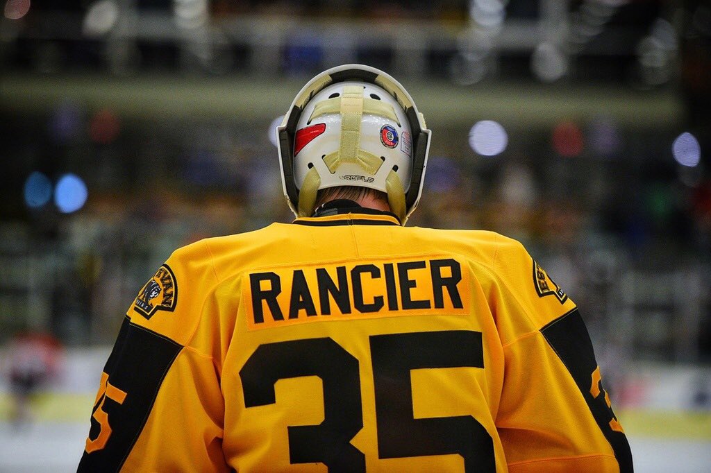
Oh no Estevan, what are you doing?
-
The Battlefords North Stars unveiled their new home jerseys.
(Fun fact, there's actually not a Montana's in North Battleford. When I was there the parent company had plans for opening one but it never went anywhere, so maybe that changed.)
Last year's alternate turned away jersey in the playoffs is back as the away jersey.
And they're unveiling a third jersey in early October, so they're potentially pulling a Hurricanes by having three jerseys that are all different.
-
Spokane's 35th anniversary.
-
2
-
-
In other Jr. A news, the Calgary Canucks unveiled their home jerseys during their first game of the season. It looks like they cut the sleeves off the white jersey and stitched them to the blue jersey.
They didn't wear their new jerseys during the preseason and it turns out it was because the jerseys showed up just hours before this game. Their Twitter account posted a picture of the boxes when they arrived at the arena at 1:27 pm with puck drop being at 7 pm that night.
The Canmore Eagles first game isn't until Wednesday and they also wore their (now) old jerseys in the preseason, so I guess we won't see anything until closer to then if not until the game starts.
Also the Yorkton Terriers unveiled their new home jersey and it's not great.
There's no decent picture of the back of the jersey, but the NOB is an orange namebar with black font.
-
1
-
-
7 minutes ago, M4One said:
Really, really horrible new road jerseys for the Estevan Bruins of the Saskatchewan Junior Hockey League. White breezers should never, ever be used.
[pic snipped for space] [just look in the post above]
I was just coming here to talk about this. The NOB and numbers are yellow on white and as someone who used to do colour in this league, I don't know how legible it would be from a distance.
Also the weird SP brand jersey cut where the stripes don't go all the jersey (and socks) doesn't help either.
-
I do like that they put Gloria on the ring.
-
12 hours ago, M4One said:
Did last year's jersey still have the phantom yoke and the trim to nowhere, or is the removal of them also new to this year's jersey?
The removal is new this year. Also the armpit colours are gone, so the template switch has been a big improvement for the Hitmen.
We’ll see if the bad number font stuck around though.
-
Yeah you definitely didn’t need to post all the pictures individually here...
I saw the Hitmen jerseys in person and it completely skipped my mind to check if the armpit colours were still there. From some angles it looks like they are gone, at least from the dark jerseys.
-
On 8/29/2019 at 5:59 PM, B-mer said:
So the Sting release shows two different CCM treatments on the back. Not sure if this was seen or known. Looks a lot better without the weird stuff.
The white one isn't the Quicklite template, it's the old one for some reason.


AHL/ECHL/Minor/Junior League Hockey Changes
in Sports Logo News
Posted
From the Hitmen's Bret Hart game.