


monkeypower
-
Posts
4,726 -
Joined
-
Last visited
-
Days Won
5
Posts posted by monkeypower
-
-
Part MLB thread, part Media thread.
Harris Blitzer Sports & Entertainment, the owners of the Sixers and Devils, are interested in buying the Mets and SNY.
QuoteWhile both men declined to comment, The Post has also learned that the recent ramping up might have been piqued by reports the Wilpons are finally willing to part with their television network, SNY, giving Harris and Blitzer a chance to merge their other franchises onto one “superregional” sports network.
I don't know enough about the area nor the broadcasting in the area, but from an outsiders perspective, a NY-NJ-Philly regional sports network seems interesting.
-
8 hours ago, the admiral said:
When you have a name that's so unwieldy in two languages that it goes by one letter, then yes.
Well all the leagues have the one letter nickname, so it's not just the unwieldiness of the name making them go by one letter.
8 hours ago, the admiral said:There's also an argument for using a different color than the OHL's shade of blue, but that's tough because Quebec should have dibs on blue. I do like the idea of the three component leagues of the CHL being color-coded.
I've also always liked that idea, but it would only really make a difference on graphics and the colour of the league websites.
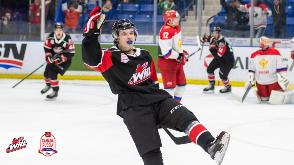
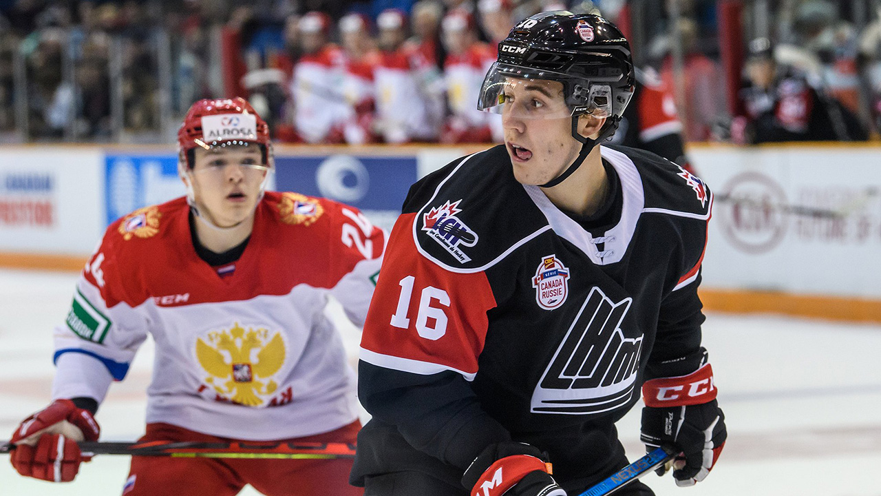
Then you get to the Canada-Russia Super Series where all three leagues wear (the WHL's colours of) red and black, I assume to play up the Canada aspect, so the league colours get thrown out the window there.

-
-
Wrong thread
-
I’ve always wondered about the future of podcasts because of the advertising model.
At least I don’t think Facebook can kill podcasts like they did some websites.
-
3 hours ago, Sport said:
[...] it sounds like the guy knows he's auditioning for a major league role, goes on way too long, and in doing so it sounds like he's yelling a prepared sound bite, which always sound worse than whatever spontaneous thing comes out in the moment. It was a
championshipDecember game, yes, but it's also theCalder Cupregular season and you'd find 0 peoplewho Clevelandin Saskatchewan who'd say thischampionshipgoalended their droughtto make it a 6-2 game is meaningful, so he's at 14 out of 10 and he needs to be at like a96-7.Edited to reflect my previous life when I did colour for a Jr. A team in Saskatchewan.
There are some very good pxp guys who in Jr. A, but then there are just as many, if not more, that are not. The points about auditioning for a major league role, going on too long and yelling a prepared sound bite are very true (spoiler alert! Some of them are prepared, to an extent) because they are using it as an audition to make clips to move up in the broadcasting world.
An example of this is if in one game a couple pages worth of Doc Emrick-isms had been printed out and taped to the wall of the press box by the pxp guy (a completely, totally hypothetical example of course).
-
I don't know if I like the bird as the for Scouts. I'm sure they'll explain it somehow, but I don't see how a bird fits into "Scouts". I feel they probably were a bit leery about any Native American connection, but I think using a horse would make more sense because then it would tie back into the statue and the original Kansas City Scouts.
-
I missed this when it happened, but the 2021 expansion Sylvan Lake team in the WCBL unveiled their name and logo back in March.
There is something off about the head of the gull and the notches at the bottom of the outline are unnecessary/don't line up with the G nor the S, but is easily one of the better logos in the league because most are middling to bad.
The blob in the middle of this logo is eponymous lake. The fact the N in "SEASON" is partially covered by the lake and the need for a maple leaf in an all-Canadian league aren't great, but having a semi-competent alternate logo is a step above for teams in this league.
Though they might not have a stadium built for 2021 because of the COVID-19 shutdown and subsequent economic downturn.
-
 1
1
-
-
13 hours ago, Fitzy0220 said:
Pens tried a Black out before the '16 Playoffs during practice, was reported that the Goalies would have a Hard Time picking up the puck, Which is why they chose Gold Shirts to hand out to the fans, it was called the GOLDRUSH.
Just like Centerfield )beyond the Fences) at Baseball Parks cannot be white because the Batters have a hard time picking up the ball coming out of a Pitchers hand
Pens DOMINATE color in the Home uniform is BLACK (Gold and White are mere accent colors)
Flyers DOMINATE color in the Home uniform is ORANGE (White and Black are mere accent colors)
DOMINATE Home WHITE (Pens) vs the DOMINATE ORANGE Road (Flyers)
http://www.nhluniforms.com/Penguins/Penguins16.html
http:/http://www.nhluniforms.com/Flyers/Flyers09.htmlCool? Don't know how that all relates though.
13 hours ago, Fitzy0220 said:HOME Fans are going to Cheer for you, Be your STRENGTH when you need it, When you're on the Road in a Hostile Environment, (like say Philly) don't you want to wear your Colors to be a Show of STRENGTH
Well, it should err on the side of the home team and they should be wearing their dominant colour at home.
13 hours ago, Fitzy0220 said:When my Wife and I get dolled up (LOL very rare occasion) to go out somewhere, she wears a Evergreen colored dress I wear White shirt, gray pants and a tri-colored striped dark green / gray / white tie (DOMINATE color I have on is white / gray, that dark green in the tie is just there as an accent color to match her dress)
Cool? Don't know how that all relates though.
-
3
-
-
5 minutes ago, Fitzy0220 said:
I HATE the fact that the NHL went with Dark at Home. Home games are so BLAND now. Was awesome going to Pens games at the Civic Arena and seeing Opposing Teams Colors come into the Building
*snipped for space because it's the same "wanting to see other team's colours" argument*
The home team should be the one wearing their colours in their home arena.
-
6
-
-
Three Jr. A updates.
I missed this because I was meaning to keep an eye out for these, but the expansion Cranbrook Bucks of the BCHL who are supposed to start next season unveiled their jerseys a while ago. They are quite boring and I find them pretty unbalanced because of the inconsistent striping. I do think something like the Maple Leafs can work with different sleeve and hem striping, but this doesn't. Maybe it's the fact that it's three stripes on the sleeves and only one on the hem, or maybe it's because the hem stripe is too thin. I don't know, I know I just don't really like them. (The white jersey is just the inverse of this jersey, I wanted to save space on this post)
Meanwhile over in the AJHL, the Calgary Canucks have a 50th anniversary logo and continuing their weird effort at rebranding from last year, it features the current colours but only the old logo.
And then also in the AJHL, another thing I meant to keep an eye out for but also missed, the semi-expansion/semi-relocation team in Blackfalds that's supposed to start in the 2021-22 season unveiled their name and logo.
QuoteThe jersey colours will be a mix of grey, black and white. “Grey represents strength and control, while white represents new beginnings and balance, and black represents power and intensity.”
So... it'll probably be another junior hockey team using the Kings template.
Quote“We selected ‘Bulldogs’ because there is already an established familiarity with the Town of Blackfalds and their Minor Hockey Association,” said team owner Doug Quinn. “It was less about a lack of imagination and more about wanting to be part of an established team and its community. We look forward to bringing an exciting and entertaining AJHL team to Blackfalds.”
In a weird twist, the team that is relocating to Blackfalds (who actually took a leave of absence for the 2019-20 season prior to being sold and then won't play again until the 2021-22 season), the Calgary Mustangs switched to Mustangs from Royals in 2010 because they wanted to separate themselves from an minor hockey organization in Calgary who they shared a name and logo with. So they had changed in the past to separate themselves from a minor hockey association just to find themselves once again back connected to a minor hokey association. (The connection is in name alone. There is no formal connection in organizations between junior hockey and minor league hockey teams in Canada).
As for why the Jr. A team shared a name and logo with the minor hockey association, according to a news article I just found about the name change, the future-Mustangs ownership had been lent money from the association in 1990 to help buy the Jr. A team.
-
1
-
-
I really don't know if this means anything, especially since there is the chance the season won't happen and they are one of the teams on the MiLB chopping block, but the Vermont Lake Monsters have been promoting a lot of Vermont Expos merchandise recently.
-
1
-
-
The Hurricanes are likely to cut ties with Charlotte and move their affiliation to the Wolves. Florida would then presumably take over Charlotte.
https://www.newsobserver.com/sports/spt-columns-blogs/luke-decock/article242352706.html
-
Yeah it's passive voice, it is just a long Wikipedia writeup at the end of the day and I don't think many peers are reviewing the "History of the Los Angeles Angels" page. I was more aiming to the part there's (apparently) been a history with the Angels and their name.
-
I was reading through the Angels history on Wikipedia, because I've got nothing better to do, and I noticed some things.
QuoteIn 1962, under the terms of their agreement with O'Malley, the Angels moved to Dodger Stadium, which they referred to as Chavez Ravine.
In 1964, [...] The need for a new stadium became more evident. It was believed that the Angels would never develop a large fan base while playing as tenants of the Dodgers. Also, O'Malley imposed fairly onerous lease conditions on the Angels; for example, he charged them for 50% of all stadium supplies, even though the Angels at the time drew at best half of the Dodgers' attendance.
Stymied in his attempt to get a new stadium in Los Angeles, Autry looked elsewhere. His first choice for a stadium was the site offered by the city of Long Beach. However, the city insisted that the team be renamed the Long Beach Angels, a condition Autry refused to accept. He was able to strike a deal with the suburban city of Anaheim in Orange County, and construction began on Anaheim Stadium (nicknamed The Big A by Southern Californians), where the Angels moved in 1966. On September 2, 1965, team ownership announced the Los Angeles Angels would thenceforth be known as the California Angels, in anticipation of the team's move to Anaheim the following year.So it was believed the Angels would never develop a fanbase trying to play underneath the Dodgers and then owner balked at a team name preferred by a city and it impacted stadium issues?
Time is a flat circle.
-
4
-
-
I hadn't heard about the SB Nation news and that's a shame. I haven't really read their articles or visited their site at all, but their YouTube videos (and past videos posted on Jon Bois' old personal channel) are top notch.
-
3
-
-
Scrolling through the App Store and I come across this game called Super Hit Baseball or something like that.
Check out the logo for the Badgers.
-
27
-
-
I've recently been having issues seeing embedded tweets in posts. It seems to be just a me issue though because other people are responding to tweet post and quoting it, but it's just blank for me.
It happens on both desktop and mobile.
-
1
-
-
52 minutes ago, jgiff17 said:
Exactly! Aggies absolutely hate the beveled aTm...is there any example of a beveled logo that actually looks good? They usually look busy and do not Carry over to hats or any small sewn on logo very well
I think Texas Tech's bevel is pretty good and I think is better than the old flat version.
I have a hat with the Tech logo on it and I don't really have any complaints with how it translated over.
The difference with A&M's logo is that 1) I don't believe Aggie fans really like the bevels, and 2) the beveling on the A&M logo is incorrect.
SpoilerAll these images are taken from a website called nobevel.com, hence my point about A&M fans not liking the logo.
-
16
-
-
Since this thread got bumped again, why not refresh and update, plus explaining my signature.
NHL - Anaheim Ducks: I watched the old Mighty Ducks cartoon on TV (which is on Disney+) when I was really young. I have no idea if I would have known or understood the connection to the actual team, but my parents obviously did because I have old pictures of me in Mighty Ducks gear, some of which is boxed up in storage somewhere.
MLB - LA Angels: I picked the Angels when I was younger because they were the Ducks local team.
NFL - New York Jets: My mom went to New York sometime around the turn of the century and came back with a Jets shirt for me. I guess I could have just as easily been a Giants fan.
CFL - Calgary Stampeders: Hometown team
NBA - Utah Jazz: I've only really started paying attention to the NBA within the past five years or so and my favourite team wasn't that solid. I floated around a couple "favourite" teams to see what stuck, and I know I have some posts on the boards when I was a fan of these teams, with the Jazz being one of those potential teams because of how much I liked the 90s mountain jerseys. The Jazz were playing on TV one night, so I decided to watch. Rodney Hood hit a buzzer beater to win and I decided right then I was going to be a Jazz fan. So I've been a Jazz fan since December 16, 2016 (in now just looking up the shot again).
CHL - Calgary Hitmen: Hometown team
USports - Alberta Golden Bears: The university I go to
NCAA - Texas Tech Red Raiders: Two summers ago, I became friends with someone who was at Texas Tech at the time and I decided I would also follow the football team because I didn't really have a NCAA team that I was a fan of. I wasn't really intending on becoming a "fan" fan, but then I actually got really invested over the last two seasons. I also claimed the basketball team before last year's March Madness, which ended up being their run to the finals, so that turned out really well.
NLL - Calgary Roughnecks: Hometown team
Jr. A - Battlefords North Stars (SJHL), Drumheller Dragons (AJHL): In a prior life, I did colour for the North Stars and interned in Drumheller for the station that covered the Dragons, though the internship was in the summer
(Summer Collegiate) WCBL - Okotoks Dawgs: Hometown-adjacent team
MiLB - New Hampshire Fisher Cats, Vermont Lake Monsters, Wisconsin Timber Rattlers: New Hampshire has become a special place to me over the past two years and I went to a Fisher Cats game last summer.
I really like Burlington and went out of my way to find the Lake Monsters office to spend a lot of money at the team store one day when I was there.
I had a handful of MiLB hats previously, but the Timber Rattlers were the first one I went back and bought a second item from. This happening around the same time I created my Twitter account, so they were actually one of the first teams I followed.
(I still plan to keep collecting MiLB hats/merch and I have, but these three will probably remain my "favourite" teams. For the record, I also don't really care about any allegiances to the Angels system)
-
1
-
-
This is a change that I only recently came across. The Winnipeg Blues of the Jr. A MJHL were sold to the owners of the WHL's Winnipeg Ice prior to this season and they switched from St. Louis jerseys to the Ice's jerseys, but kept the yellow so there's a lot of colours.
I also think having the Ice logo be the shoulder patch is a weird move.
-
-
The Calgary Hitmen raised a banner for former GM/Coach/Executive (and current Vegas Pro Scout) Kelly Kisio with his introduction into the Forever a Hitmen program over the weekend.
They don't have a picture of just the banner anywhere. The thing he's holding in the banner picture is the WHL championship trophy.
-
25 minutes ago, Ridleylash said:
The Pats have been in Regina for over a hundred years, and the Blades have been in Saskatoon for fifty-six. I have a difficult time believing that either team is going to get squeezed out by an AHL club, especially if they share an arena like how the Hitmen and Oil Kings already share arenas with an NHL tenant.
The NHL and CHL fill different niches in terms of fans and corporate sponsors. The AHL and CHL would fill the same niche, roughly, and could cannibalize each other. I don't think there's a market for both an AHL team and a CHL team because they would be at the same non-NHL level. (I'm willing to give Winnipeg a few more years and see what happens once the Ice, er.. ICE, get their arena).
The Hitmen and Oil Kings are also both owned by the NHL tenant they share an arena with and fill dates as noted by @rams80. Also noted by him is that the Blades and Pats are the primary tenants of their current arenas, so a second team would not be the same situation as the Flames/Hitmen and Oilers/Oil Kings for the above reasons.
25 minutes ago, Ridleylash said:The B-Sens have an arena capacity of 4,400. The Comets have an arena capacity of 3,860. The IceHogs have an arena capacity of 5,895. If those capacity numbers can support an AHL team, Saskatoon and Regina's arenas can definitely do so.
Duly noted. But like I also said, it's not necessarily just the size of the arena, it's the potential fan support for minor league hockey in Canada.
25 minutes ago, Ridleylash said:Abbotsford didn't work for the Flames for an entirely different reason; because it was a place filled to the brim with Canucks fans who were never going to support a team directly affiliated with one of their most bitter rivals. There was a direct and heated NHL rivalry there, there isn't in Saskatchewan. Saskatchewan also has a fair amount of Flames fans, from my (admittedly hazy and second-hand) recollection, so a Flames affiliate in Saskatoon or Regina would do a lot better then it did in Abbotsford due to that pre-existing fanbase.
It's not really an entirely different reason. A rival province, not just in sports but also in politics and general provincial pride, hosting the development team for an Alberta team could again be a hard sell.
I also just posted that the Flames weren't one of the top three teams for Saskatchewan in that Sportsnet survey, which doesn't need to be taken as peer-reviewed fact but it should at least be noted.


.jpg)


AHL/ECHL/Minor/Junior League Hockey Changes
in Sports Logo News
Posted
The Prince Albert Raiders unveiled their 50th anniversary logo.
The Raiders started as a Jr. A team in 1971 and moved up to the WHL as an "expansion" team in 1982.
The green star represents their Memorial Cup championship, the gold stars represent their two WHL championships and the white stars represent their four national championships from their Jr. A days.