


projectjohn
-
Posts
463 -
Joined
-
Last visited
Posts posted by projectjohn
-
-
Just now, burgundy said:
That would not surprise me at all, unfortunately.
Nike has pushed chrome/gray pretty hard for Detroit teams the last 5 years or so.
-
I'm afraid. Very afraid. But then again, if the focus grouping Uni-Watch posted about a few years ago was presumably getting feedback for potential City Connect jerseys, maybe I shouldn't be.
https://uni-watch.com/2021/09/22/exclusive-tigers-focus-grouping-new-throwbacks/
-
1 hour ago, MCM0313 said:
There aren’t that many royal and red teams, are there? Pistons come to mind and they’ve always rocked those colors wonderfully, with the exception of their absurd foray into teal.
The Pistons have pivoted heavily into black and gray in recent years (thankfully gray seems to have mostly passed), and also seem to be actively minimizing red to the best of their ability - refusing to bring back their old red alternate as the Statement edition, and eliminating their classic court design which was red-heavy. I keep hoping sanity will prevail at some point, but the trend just keeps getting worse.
-
2 hours ago, WBeltz said:
Detroit, I dunno, I hope it isn't all white.
Prepare to be disappointed.
-
 1
1
-
 1
1
-
-
2 hours ago, Pigskin12 said:

I can live with the Lions in all-blue when this is what this matchup looked like last time Tampa visited Detroit.
If the Lions are going to insist on mono-color, at least the mono-blue is the least egregious (IMO.)
-
2
-
-
4 hours ago, MJWalker45 said:
As long as their are stripes on all of the pants, the Lions should be an upgrade.
I hope you're right - I'm pretty concerned given the team president gave a statement (paraphrasing) the new ones are quite a change, while referring to the 2017 set as a subtle change to the prior set, as well as how heavily the Lions have leaned into the monochrome look this season.
-
1 hour ago, Lights Out said:
They absolutely will as long as they can milk money from it. The Steelers/Ravens Wednesday game a few years ago got 10 million viewers. The Cowboys/Giants Wednesday game in 2012 got 22 million. It's only a matter of time.
Kinda wild we're getting to the point where teams using their traditional jerseys in the same game feels like a special occasion.
-
1
-
-
8 hours ago, Old School Fool said:
Wondering what the neutral site games later in the In Season Tournament will look like? Here's the court from NBA 2K24. It's exactly what you expect.
Also yes, all 30 courts are in the game during the tournament. Play at your own risk.
That honestly might be the least egregious one.
-
2
-
-
3 hours ago, TheBigFiz21 said:
I like the Vikings regular set but these are just phenomenal.
-
3
-
-
33 minutes ago, tBBP said:
I feel like we're in a weird spot with this uniform. On the one hand, this still looks about as modern today (at least to me) as it did on day 1 in '96 (which is about all the aggrandizement Nike needs to further their own ambitions, no? lol). The navy pops off that orange SO well. I've always questioned, though, why they made the side panels navy on the white uniforms??? Orange against white has decent enough contrast (see Volunteers, Tennessee for definitive proof).
I always felt like Nike really nailed a lot of their designs in the late 90s and early 2000s, both across the NFL and the NBA, certainly compared to the messes they crank out for the most part these days. For the Broncos, it seems like there's two camps, those who feel like the look is a modern classic, and those who hate it and want to go back the 80s era look. I'm in the former, but I can understand the latter.
-
1
-
-
1 hour ago, CaliforniaGlowin said:
Wood is definitely not an issue.
Sorry couldn't resist lol
-
6
-
-
35 minutes ago, the admiral said:
So we're doing 2006 concepts in real life. Baseball jerseys with filled-in plackets can't be far behind.
These certainly look like they were designed by a 12 year old in MS paint.
-
1
-
1
-
-
NBA design has been getting progressively worse for 10 years now, give or take, as they chase Gen Z's curious tastes and Adam Silver's European soccer leagues fetish, so I was prepared for something bad here, but goodness gracious. Something's going to have to reach a tipping point soon, I hope.
-
1
-
-
17 hours ago, pelicanfan said:
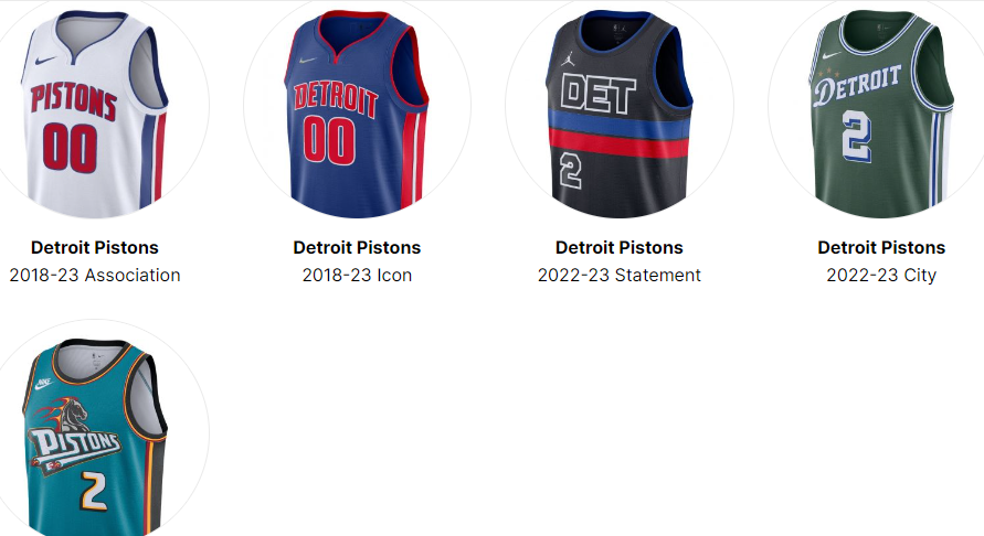
theoretically i dont think the city edition line would be this much of a problem because its only 1 in 4 jerseys changing every year. but once other factors roll thats when teams really start to lose their identity. like the statement editions. those were suppose to be just as consistent as icon and association jerseys but now we have the suns who have the pixel gradient jersey or the clippers with the mister cartoon street style jersey. neither of these teams' statement editions look anything close to their other two core jerseys. add that to the mix of city editions and now we have teams who have jersey sets that are split in half (2/4) with two random jerseys. maybe even more with throwback jerseys in the mix. (ex: pistons last season)
Thank you for this. I would begrudgingly live with the City Edition if we weren't seeing experimental/off-brand stuff beginning to creep into the Statement Edition jerseys as well. As you said, I was under the impression the Statement Edition was more or less supposed to be the equivalent to the alternate jersey of yesteryear (pretty much just a recoloring of the Icon jersey, or at least something fairly on brand.) That is starting to no longer be the case. The Pistons' above is one of the most egregious offenders, using a non-team color and a non-team font.
-
4
-
-
14 hours ago, BBTV said:
Maybe just keeping the Kobe jerseys but adding the "showtime shadow" to the white numbers, and then maybe a purple shadow to the wordmark (for the sole reason of making it juuuust different enough to warrant the change) and dropping the side panels would have been the way to go. The down shadow looks bad, as do the purple uniforms with all the black. There had to be other solutions to moving on from the Kobe look without looking like the Great Value version of the Showtime team.
I guess I understand the Lakers' desire to move on from the Kobe era set, but I don't understand is how they arrived at what they ended up with. They could've just transitioned the Kobe era look onto a crew-neck style jersey, perhaps with drop shadows on the numbering, and it would've turned out much better, IMO.
-
7
-
-
12 hours ago, jp1409 said:
Lions in white jerseys, silvers pants but white socks... This combo badly needs blue socks to look decent.
I believe this is the first time this season they're not in a mono-color look, so baby steps, I guess.
-
5
-
-
I think the Pistons' one is supposed to honor the Bad Boys, considering the Chuck Daly signature on the jocktag. Overall I'd say it's not great, not terrible - better than the "Motor City" ones they spent years rolling out at least.
-
2 hours ago, SSmith48 said:
Why is Nike/The NBA so obsessed with black/navy/white for city looks? When these were introduced, I was under the impression that these uniforms would be the most unique ones in a team's set. In just a matter of years, the creativity with these (outside of maybe the mixtapes we got a couple of years ago) have nosedived. It feels like they are just phoning them in at this point in most cases, just so they can get another jersey out to make money from and for collectors to buy.
Washington, San Antonio, and maybe Indiana might be the only ones the intrigue me right now, but I'm desensitized at this point. It's hard to care much for a fun new uniform when I know it will only be carried for less than a season then never mentioned again.
I have to hope against hope that at some point sanity is going to prevail and the whole City Edition program will get mothballed. Only a handful have ever been worthwhile to begin with and now that those have been blown through, things are quickly going from bad to abysmal. But I guess somebody out there is buying this stuff, or else they wouldn't keep doing it.
-
5
-
-
6 hours ago, Conrad. said:
Nope
Good. I admire the Heat have stuck with a great set for so long, rather than forcing change for the sake of change.
-
5
-
-
35 minutes ago, CS85 said:
Gimme some blue socks and I'm actually pretty OK with Lions going white on white.
I still wouldn't be a fan, but it'd be at least somewhat passable if the pants had some blue striping or something. I don't know who on the design team thought blank white pants would be a good look.
-
2
-
-
10 hours ago, Pigskin12 said:
As expected. Pretty bland choices all around so far:
Jaguars white over black
Bengals white on white
Titans all-white
Bills all-blue
Lions all-white
Good grief. Overall I am not looking forward to the Lions new set next season (fearing it's going to be worse than what they have now), but if it gets rid of the all-white and all-gray combos I guess it's worth it.
-
Speaking of the Knicks, I find myself wishing they'd bring back the orange keys instead of the all-blue court design. Maybe it's just because my formative years were the late 90s and early 2000s, but it looked way better that way, IMO.
-
3
-
-
I'm not a fan of city nicknames and other stuff like that creeping into the Statement edition jerseys, which I thought was originally intended for the City edition set, and not the "core" jerseys of Icon, Association, and Statement. The Pelicans one is overall relatively harmless though - the Pistons Statement from last year is a far more egregious offender with the non-team color and unofficial font.
-
2
-
-
54 minutes ago, SantosD_ said:
100% agree with you, and I think the league in general needs less blue and red as primary colors
The problem here is that most of the teams that are blue and red dominant have always used those colors. Why should they change just because other teams also use that color scheme? Change for the sake of change rarely leads to worthwhile results, IMO.


/cdn.vox-cdn.com/uploads/chorus_image/image/68591093/usa_today_15362401.0.jpg)


MLB 2024 Uniform/Logo Changes
in Sports Logo News
Posted
I don't subscribe to "The Athletic," although there are ways to get around the paywall that I presume are verboten to discuss.