


projectjohn
-
Posts
463 -
Joined
-
Last visited
Posts posted by projectjohn
-
-
I'm convinced Conrad put the logoman back on the front of the jersey in his mockup just to tease us.
-
 4
4
-
 3
3
-
-
31 minutes ago, Germanshepherd said:
I very much hope that all of these leaks having the city or team name instead of dumb nicknames like "City Never Sleeps" or "The Land" is a league wide trend. This Knicks one looks pretty much just like a traditional alternate jersey, for instance. It's benign enough it's kind of a shame it's for one year only.
-
7
-
-
57 minutes ago, adsarebad said:
When the team no longer look the team you root for, it only natural to stop caring.
You need to at least recognizes a tiny bit. And these colors are just insanely awful
I really have no idea how these got past the concept stage, let alone a prototype produced, and even worse into production and going to be used for at least a few seasons.
-
1
-
-
4 hours ago, DJT said:
New photo of the Jazz jersey coming soon. Looks like a gray-ish looking stripe down the side? Probably their powder blue or whatever they call it.

I know there's been quite a bit of talk about these already, but goodness these are so bad.
-
9
-
-
3 hours ago, truepg said:
To me that logo was just okay, a little on the generic side. The first rendition of the court with that identity, though, had everything right in every way, and I don't get why they felt the need to mess around with it so many times after, resulting in not so good and considerably weaker looks.
A combination of maximizing merchandise sales with LeBron on the roster and the Dan Gilbert getting restless after a year or two effect.
I agree that the LeBron 1.0 era look and jerseys was something that should have stuck around longer than it did, although I guess I can understanding wanting to hit the reset button after “The Decision.” The endless tweaking of the 2010s, though, was not good.
-
3
-
-
22 hours ago, Digby said:
The Heat are, at worst, a top-five franchise in the entire NBA this century, since they've had this brand. How on earth is that "mid"?
Gotta respect the Heat, even if I don't like them (beating the Pistons in '06 and then I was not at all a fan of the whole superteam thing). They've always been a very well run organization, with a great brand and look. As has been mentioned, Vice is fine in a vacuum and it could probably even work if they were starting as a new expansion team, but throwing out the brand equity they've built up is unthinkable. I certainly can't see that happening as long as Pat Riley is still around.
Tangentially related - maybe I'm somehow making this up, but I'd swear I remember reading somewhere LeBron James wanted the Heat to switch to crew neck jerseys as a condition to sign there in free agency in 2010 and Pat Riley pretty much told him to pound sand. Seems like it could be true, considering the Lakers conveniently did just that when he signed there (there's just the whole 2-year notice on jersey change thing.)
-
1
-
-
19 hours ago, Conrad. said:
first look at the Draft hats:
Looks pretty good, and also confirms those 5 teams to not change logos for next season (damn you, Thunder, and to a lesser degree Magic!). Everyone keep eyes peeled for 2 specific hats

Paolo Banchero holding a Pistons hat makes me sad. Other than last year, it seems like the Pistons never have any luck in the draft lottery

-
1 hour ago, gosioux76 said:
I would assume, at this point, that they'd just stand pat with what they're already wearing. If they're this late in the game reacting to fan sentiment, it would be the only practical approach. The music note statue color switcheroo would seem like one tiny clue toward that conclusion.
Yeah, I'm mostly thinking of all the warm-up gear, etc. that has probably already been manufactured for next season in the black and yellow colors, especially if there is going to be a new template for that stuff - not sure the league would like the Jazz still using "last year's" style compared to everyone else.
-
3 hours ago, Old School Fool said:
Between the owners comments on Twitter about Purple and the music note changing back, I'm starting to wonder if maybe they're pulling the plug on the rebrand. I hope so because I didn't like what I was seeing and neither did anybody else.
Here's what the outside of the arena looked liked during the season.
Would that even be allowed? Isn't all design/gear already locked in for next season by this point? IIRC, there is a 2 year lead on new jerseys, although I suppose if a team wanted to scrap something and stay as is, that might be allowed?
-
16 minutes ago, LA Fakers+ LA Snippers said:
it can’t be that bad, can it? it could only be another blue or white, or a new red jersey.
Unfortunately Conrad has said it’s not a red jersey. From the teaser list he posted, that leaves dark gray, royal, or navy as possibilities IMO. Hopefully it’s not dark gray (ditching one gray for another doesn’t sound likely). I’m not sure which route they’d go with a 2nd royal jersey, I wouldn’t want them to have some wildly differing design aesthetic from their traditional side panels look.
Navy has been used by the team previously, although it was officially removed from their color scheme in 2017 with the new primary logo.
-
5 minutes ago, Conrad. said:
^ yep, i gave that a RT. it's true, but I'm not too enamored with what's replacing it. kind of a lateral move, maybe a slight upgrade.
Hopefully it's not the "dark gray" one from your teaser post. But I don't see how it could be worse. Baby steps, I suppose. We'll get that red jersey back someday.
-
-
5
-
 1
1
-
-
29 minutes ago, CS85 said:
I'd watch Clown League Baseball, honestly.
-
4
-
 1
1
-
10
-
-
On 3/7/2022 at 2:43 PM, Conrad. said:

Ugh, I'll bring the pitchfork!

(also, you got 4 of your guessed correct)I keep hoping the Pistons will come to their senses, drop the grays and bring back the red alt from the mid 2000s to match their traditional home and aways, but it never happens. If it's not happening next season, that means it will have been 15 years (!) since it was discontinued and most likely it is never coming back.
I really hope they get some fresh blood on their design team sometime soon - other than the 2017 primary logo, they haven't hit on a single design item in over a decade, perhaps with the exception of this year's Mixtape jersey. At the very least, I hope they bring back the classic court design next year instead of the monstrosities they've used this season.
22 hours ago, pepis21 said:Barely no one likes gray alternate but they still going to keep it. Ehh...
Someone on the Pistons' design and marketing team seems to like them, and apparently that's the only thing that matters. Maybe the Pistons will be the "dark gray" jersey mentioned by Conrad? If they're not going to bring back the reds, I guess I could live with the "Chrome" if they made some modifications, such as eliminating the thick shoulder piping that doesn't match the standard home and road jersey, and doing something about the red accents that for some hard to describe reason have never looked right to me.
Edit: Here's a quick and dirty MS Paint edit of some wallpaper @Conrad. posted on his Twitter feed last year of how I think the Chrome jersey could be tweaked to be greatly improved. As mentioned, elimination of the thick shoulder piping and red trim just makes the whole thing look much more palatable to me.
-
1
-
-
On 12/19/2021 at 12:04 PM, YELDARBfield said:
Starting to really appreciate the Bally Sports double-wide scorebar-ticker-chyron:
I hated the Bally's one when they first switched over from Fox licensing last year, but it's become passable compared to some of the stuff that's out there now on other networks. Removing the unnecessary gray underneath the scorebug and ticker and letting that space be transparent was a big improvement. Just wish the ticker itself was not continuous and only popped out once in a while, with the score bug otherwise being centered.
-
4 hours ago, Froob said:
Pistons should keep the city jerseys as the new statement, pistons should always have a red jersey and these ones are great
I personally prefer the mid-2000s red alternate, but this would work too. Either way, the gray jerseys need to go yesterday.
-
2
-
-
16 minutes ago, NicDB said:
That's my big beef with the city jerseys... the fact that they HAVE to change every year. Every city has a limited amount of things worth celebrating. Even New York and LA.
I could halfway accept if, say, my Bucks made every city jersey with a cream base, thus giving it some sort of consistency that actually alludes to the city. But as it is... I'm dreading when they finally scrape the bottom of the barrel and trot out a brown jersey because they want me to celebrate cryptosporidium. (For the uninitiated... google that at your own risk.)
The whole concept of the City edition has always struck me as gimmicky minor league baseball branding. I understand it's just excuses to pump out new jerseys every year and increase merchandise sales, but I wish the whole thing would just go away.
-
7
-
1
-
2
-
-
11 hours ago, ltjets21 said:
Oh how I dearly miss these. Might've been my favorite uniforms in basketball, don't know how you can completely badger a classic like this.
Totally agree. I'm glad that the Heat and Pistons (at least the traditional home and roads for the Pistons), whose uniforms were from the same timeframe and IMO are similar modern classics, have resisted pressure to change their sets.
-
2
-
-
1 minute ago, QCS said:
Keep in mind that teams are due for new Statement jerseys so we'll see more than just the City jerseys leaked. Speaking of Statement jerseys, maybe this will be the year the Hornets finally drop the CHA jersey for a purple pinstriped set.
IIRC from what was released at the time of the Nike switchover in 2017, Statement editions can change every two years, but it doesn't seem to be a requirement. I've been waiting for the Pistons to dump the grays for 5 years, for instance, and it still hasn't happened.
-
3
-
-
6 minutes ago, sayahh said:
Never been a fan if the Pis-teals but I am sure some ppl are.
It really scares me how much Gen Z clamors for the teal on social media. Enough so that I've worried that the inept Tom Gores management group might actually consider bringing it back full time. Hopefully this Classic Edition satiates them.
-
3
-
-
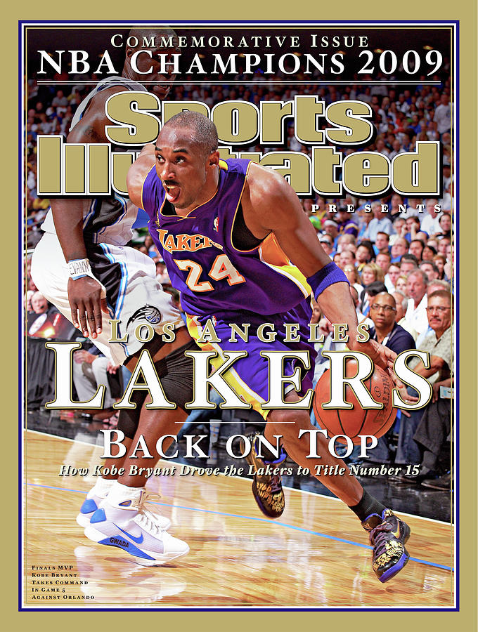
3 minutes ago, UnclearInitial said:
Good G-d, they somehow :censored:ed it up even more (though TBF it might look better, if it wasn’t THE LAKERS)
It's mind boggling to me how the Lakers have screwed up their jerseys so badly from the great Kobe/Shaq era look to what they have now.
-
5
-
-
Just now, mattb6 said:
Oof.
-
2
-
-
Pistons teal Classic edition that was first hinted at back in 2019 by one of the beat writers seems to be confirmed; https://www.detroitnews.com/story/sports/nba/pistons/2019/11/18/detroit-pistons-tantalizing-teal-jerseys-could-hit-court-again-2022/4228726002/
I still hope every year they'll drop the gray Statement and bring back the mid 2000s red, but I expect to be disappointed on that yet again.
Seems like there's a number of teams doing late 90s/early 2000s classic editions next year. I know I'm getting old when it doesn't seem all that long ago they were just the regular jerseys..
-
2
-
-
44 minutes ago, Digby said:
I think the City uniform scheme might be less polarizing if it was limited. Pick a long weekend or two and make it a limited run. When teams, even historic ones, are wearing their off-brand uniforms for 20% of games, that's where the brand is getting confused.
This has long been my biggest gripe. While I think most of the City edition jerseys to date have not been good (although this year's "mixtape" series is the best I've seen overall), the biggest issue I have with it is the frequency. I did not need to see the Pistons wearing Raider tribute black and gray roadkill uniforms ~25 times a few years ago, for instance.
-
8
-


2022-23 NBA Logo & Jersey Changes
in Sports Logo News
Posted
Well, they should already have you on staff as one of their designers..