


projectjohn
-
Posts
463 -
Joined
-
Last visited
Posts posted by projectjohn
-
-
9 hours ago, Shadojoker said:
Wow Detroit going with a Green jersey?? I need Context.
If this jersey was red tho??!! It would have been ABSOLUTELY FIRE!!!
It's based on St. Cecilia's Gym in Detroit. It seems to be a decent look, especially considering the terrible "Motor City" theme the Pistons went with for so long. The lack of consistency in the jersey cut/style drives me nuts though - the Pistons continue to use wishbone for their classic look but seemingly have gone back to crewneck for everything else. I wish they'd pick one or the other (and bring back the reds as the Statement edition, but that's another story.)
-
 3
3
-
-
13 hours ago, upperV03 said:
We just gonna ignore these???

Blame Nike all you want, but the Lakers signed off on these original BFBS threads (back in ‘13 for the original sleeveless version). Who knows whether that idea originated at Adidas or within the Lakers organization, but it doesn’t come to fruition without the Lakers ultimately signing off. I don’t think it’s a stretch at all to say that those very likely influenced the decision to add black into the purple threads when unveiling their new uniform set in 2018. You can bet those Hollywood Nights jerseys and the associated merch did pretty good sales numbers because 1) they’re the Lakers and 2) black sells, so the Lakers probably saw an opportunity to further integrate black into their identity by way of the new purple unis in that 2018 update. If there’s something to blame Nike for (even then the league had to approve it), it’s forcing the Association/Icon/Statement/City designations and getting rid of the white at home/color on road. That pushed the Lakers’ purple unis into alternate status, which likely made the traditional purples seem more dispensable in the Lakers’ eyes. If they wanted more of a traditional purple uni, or at least one without black, they’d get it. It’s clearly something they like, especially seeing as this new one is the 2nd iteration of the purple/black Statement unis.
I remember those being complained about vociferously at the time, yet here we are only about 10 years later and they're realistically quite tame by today's standards. The NBA uniform-scape has turned into the wild west in short order.
-
5
-
-
9 hours ago, Froob said:
My god what did the do to the lakers purple jerseys? Nike deserves jail time for this
to
The 2000s Lakers jerseys were the best they’ve ever looked and that’s a hill I’m willing to die on.
-
8
-
 2
2
-
-
1 hour ago, Conrad. said:
IMO this one is a little over the top and I think why the Spurs avoided the Fiesta motif for so long. They nailed it with the 2020 version and should have kept that one around a few years like the Suns and Jazz did.
-
20
-
 1
1
-
-
Posted on Reddit, the first in-arena look at the Pistons' Hardwood Classic court that I am aware of:
-
7
-
4
-
-
Seeing the Pistons new Statement jerseys in action tonight for the first time - I still wouldn’t say I’m big on them (we all know their statement edition should be either the 90s or 2000s red jerseys), but at least they are an improvement over the Chrome. They’re decent enough in actual game use that I won’t dread seeing them use these like most of their alts from the 2010s decade.
-
4 hours ago, gosioux76 said:
UPDATE: I posted this as a joke, but at the same time, this is how generic grocery products have been displayed in parts of the country and the world for decades. I remember seeing plain, yellow boxes of potato chips in the grocery store as a kid. In fact, these products come from No Name Brand, which is owned by Canadian grocer Loblaws, which has intentionally leaned into this aesthetic. But this sort of brutalist design used to be the standard for grocery generics -- it was either highlighter yellow or plain black-and-white packaging.
Recognizing this, it's all the more baffling that Utah would take on a look that can be defined as "generic" on several levels.
Loblaw's?
-
1
-
 5
5
-
-
29 minutes ago, truepg said:
And for some reason doesn't require it of the Heat...
I'm guessing old court designs that haven't been been changed or updated in many years are grandfathered in? Otherwise, I don't know. NBA style and design rules are all over the map these days.
-
2 hours ago, pelicanfan said:
i hate to be that guy but it really does irk me how throwback courts often now have the two horizontal lines in the paint removed. i dont understand why they do this. makes it look inaccurate to the originals. as if moving around wordmarks and having to change arena logos wasnt enough.
Another nitpick is the free throw circles not being accurate. For instance, the Pistons' teal court had the free throw circle fully teal, not half. It seems like the NBA suggests (requires?) the lane to be one solid color these days, for whatever reason.
-
2
-
-
Pistons City Edition shirsey has apparently leaked.
Doesn't look bad for a City Edition. I certainly like it more than the awful Statement jersey that was previously released, and beats the year after year of "Motor City" garbage they used to go with.
-
4
-
-
2 hours ago, Old School Fool said:
You know this Celtics stuff reminds me that they had an alternate court for last season but never used it.
Yikes. Not used for good reason IMO. I'm glad some teams still understand classic design and tradition.
-
4
-
-
10 minutes ago, CDCLT said:
I would kill to see the Hornets take advantage of this. Bring back the throwbacks!
Many teams would benefit from this IMO. Even not being a teal guy, I would have much rather seen the Pistons' teal and/or maroon joints from the 90s the last half decade than uninspired at best and ugly at worst "Motor City" jerseys year after year, for instance.
-
2
-
-
50 minutes ago, Conrad. said:
yea, the old Classic Jazz uniform will be this season's City uniform. #PurpleIsBackButNotReally
If using a Classic edition jersey in the place of a City edition is allowed, I wish more teams would take advantage of that option.
-
4
-
-
On 9/15/2022 at 6:45 PM, Shadojoker said:
OH NO!!!!

I can't believe the leaks were true!
----‐------------------------------
Oops my bad. This is just an HD version of the leak from earlier this year.
This honestly could be a strong contender for the worst NBA jersey of all time. I've always thought dumb city monikers like "Buzz City", "Motor City", "City Never Sleeps", etc. were gimmicky and had no place on jerseys in a professional sports league (leave that to fashion jerseys and minor league baseball), but "Land" really takes the cake.
-
6
-
-
1 hour ago, LA Fakers+ LA Snippers said:
I'll never be convinced that these aren't the best Lakers jerseys of all time. At least certainly far superior to what's come after them.
-
5
-
3
-
 1
1
-
-
44 minutes ago, UnclearInitial said:
These instantly become the best jerseys the Magic currently have in their set (although it seems like it’s missing a pinstripe on the front of the shorts). Huge upgrade on the previous Statement and they should make this the primary away with a matching white if they’re intent on keeping the Dwight-era logos. It was always confusing why the T-Mac jerseys had pinstripes side panels and stars on the front when the way it was done here is so much better
Is that bad lighting or are the side panels green? Pretty good though, and bonus points for keeping the same jersey cut (yay consistency) across all uniforms unlike some other teams..
-
4
-
-
Seems like City edition jerseys might be shifting back towards more traditional wordmarks rather than gimmicky (IMO) stuff like "Peachtree" or "City Never Sleeps." Hopefully this is a league-wide trend.
-
3
-
-
16 minutes ago, LA Fakers+ LA Snippers said:
What a difference. It never ceases to amaze me how hobbyists can create mockups that are way better than what so-called professional designers create. Here's another one I thought was a big improvement over the real thing:
-
7
-
-
7 hours ago, Conrad. said:
Smh, the team didn't even communicate with Nike, then. Nike is using a material color named Pitch Blue (it has a completely different color code than Black, of course) for the Pistons Statement uni. We'll actually see that color again with one of the City unis.
Not a surprise, I suppose, considering what a disaster their design team has been for the last decade or so, with few exceptions.
3 hours ago, alero_incognito said:how hard is it to make a good pistons jersey?
It's not that hard; the Pistons just refuse to do it for some reason.
-
2
-
4
-
-
1 hour ago, Conrad. said:
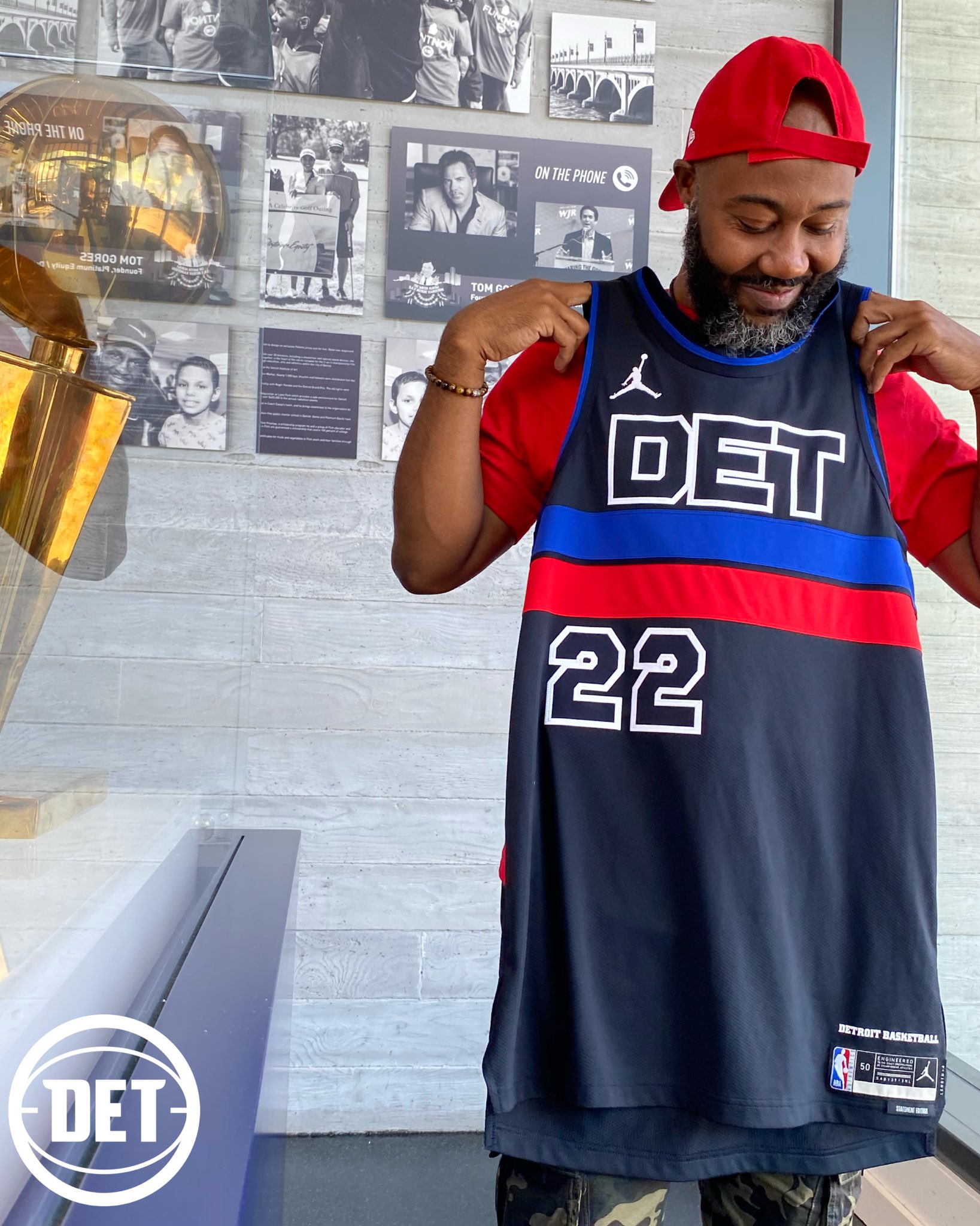
Fwiw, these Pistons unis are dark navy, not black, but only weirdos like us will actually acknowledge that. Casuals will see them as black.
As for the design of them, the chest stripe is nice, but the typography and use of 'DET' (that no one identifies with in the city itself) are misses. Obviously, these would be better in red with a 'PISTONS' or 'MOTOR CITY' wordmark in either the current typography or something from the team's history.I know you have access to the official Pantone hex values and whatnot, but the team itself identifies the jersey as black. Here’s an excerpt from a “The Athletic” article discussing the unveiling.
Quote“Knowing that red, white and blue are always going to be at the core of what we do, we wanted to find a way to add a different element,” Kirkham said. “A lot of the things Cochise brought up, adding black, creating a more vibrant view of red and blue … how could you complement that with a good, core color? Black was always something we wanted to figure out how to insert, but Cochise’s thoughts are what sparked the idea to add some type of element and not be a rinse and repeat of our grey uniform that was a carbon copy but a different color.”
Interesting since I agree it appears to be dark navy in some pics.
-
16 minutes ago, pelicanfan said:
im starting to dislike this push for statement jerseys to not even look like a core jerseys anymore. statement jerseys should have at least some resemblance of the icon and association. leave the outlandish designs for the city editions.
p.s they couldnt have at least used their regular font?
Well said. You definitely hit upon my biggest issues with this jersey. No consistency with the classic jerseys (icon or association), be it the font, the jersey cut (I know most here hate the wishbone but I think the jersey style should be the same for an entire set), or shoehorning in black out of nowhere into the color scheme.
This would be more than passable as a City edition (especially with the horizontal stripe homage to the Bad Boys era warmups), but as part of the primary set it’s a swing and a miss.
-
4
-
-
7 minutes ago, tigerslionspistonshabs said:
What in the actual
 are those? Is it like an April Fools joke or something, just trolling that guy?
The Pistons desperately need to bring in some new blood in their design department. Other than the 2017 primary logo and last season's "remix" jersey, they have botched every design item for 15 years.
-
1 minute ago, CDCLT said:
BFBS, city abbreviation, black on black numbers, right-aligned numbers, what a mess. I don't hate horizontal stripes on basketball jerseys but this is a disaster.
Can we bring the Chrome back?
-
2
-
4
-
-
Not a fan, but could be worse I guess. I don't like how it doesn't match the cut of the association and icon jersey.
-
 2
2
-
1
-


 are those? Is it like an April Fools joke or something, just trolling that guy?

2022-23 NBA Logo & Jersey Changes
in Sports Logo News
Posted
Maybe he was just talking about the Cavs jerseys in general?