projectjohn
-
Posts
463 -
Joined
-
Last visited
Posts posted by projectjohn
-
-
1 hour ago, ThunderCeltic said:
Anyone else getting new "Statements"
Rumor was that the Pistons' new statement edition will be unveiled next week. I'm both curious and nervous as there hasn't been the slightest leak about it. But it can't be worse than the terrible grays they used for far too long.
Edit: Looks like it's unveiling today at 3:13 PM ET. Conrad beat me to the punch below.
-
Pistons "Martin" merchandise: https://www.pistons313shop.com/collections/martin-collection
I know it was said this year's City edition isn't Martin-themed, but I get the feeling one of the future years might be.
-
 1
1
-
-
Slightly off-topic to this thread, but it sounds like Bally's (Sinclair) is facing bankruptcy on their RSNs and are prepping a sale.
https://barrettsportsmedia.com/2022/08/30/diamond-sports-rsn-sale/
Hopefully whoever ends up buying them develops a better graphics package (and no continuous news/scores ticker!)
-
 1
1
-
-
19 minutes ago, gosioux76 said:
Now seems about the right time to air my annual lament that the NBA was better when each team had its own unique warmup designs.
I've mentioned this before, but my favorite part of the All-Star Game was seeing the players called out in their different warmups. It really showcased how colorful the league was at the time.
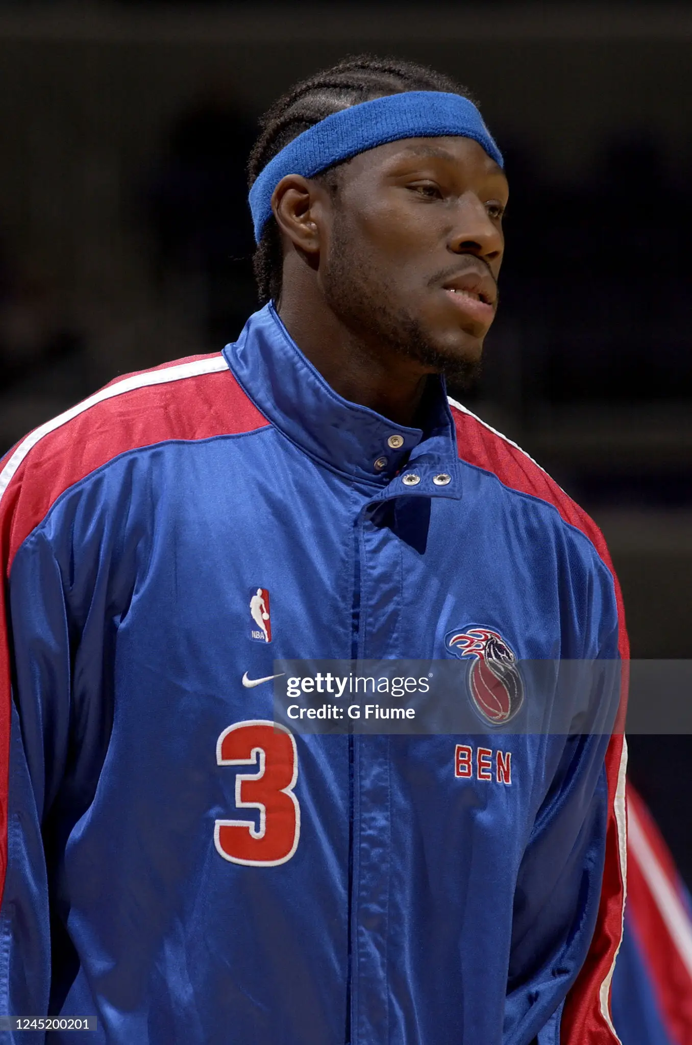
I know those days are sadly over, what with economies of scale from templated designs, but it's a shame. I remember Nike had still had some degree of individuality on warmups as recently as the early 2000s when they had the contract for 8 teams. Both the Celtics and Pistons had classic style warmups at that time.


Remembering the higher quality of the Nike 1.0 days was a big part of the reason I was excited when they got the NBA deal in 2017, but unfortunately it's been a disappointment.
-
 2
2
-
 2
2
-
-
36 minutes ago, Discrim said:
Actually the gold jerseys came around about a year or two before they changed the regular set's bronze to gold IIRC.
That Wizards shiny gold alt with the black shorts was one of the ugliest uniforms I've ever seen.
-
 1
1
-
 1
1
-
-
12 hours ago, MNtwins3 said:
I guess it's unpopular of me to say I like Golden State's new uniform lol
"It could be worse" is the way I would phrase it.
-
 5
5
-
-
14 minutes ago, Krz said:
Heads up: Apparently the Detroit city edition is one of the best this year, and is based on St Cecilia’s Gym. Also all the leaks so far are accurate.
Only place I’ll share thisInteresting. I know this is the first year of their city edition jerseys being designed by Detroit rapper Big Sean, so while I'm not sure exactly how they're going to turn out, I can't imagine they'll be any worse than the "Motor City" junk that was trotted out year after year during the mid to late 2010s all the way through 2020-21.
-
48 minutes ago, GFB said:
I would be happy to take that one too - just the 2000s edition is still more or less a color swap of their still-in-use from that time regular look so it would be more easily resurrected.
-
 2
2
-
-
14 minutes ago, MNtwins3 said:
File this under "awesome throwback, but should never be the primary again"
I'll take it as an appropriately used throwback - it's better than the "Chrome" or "Motor City" garbage they've been churning out for the last 10 years or so, and it will hopefully placate the nostalgia and Gen Z crowds that have been so vociferous for it.
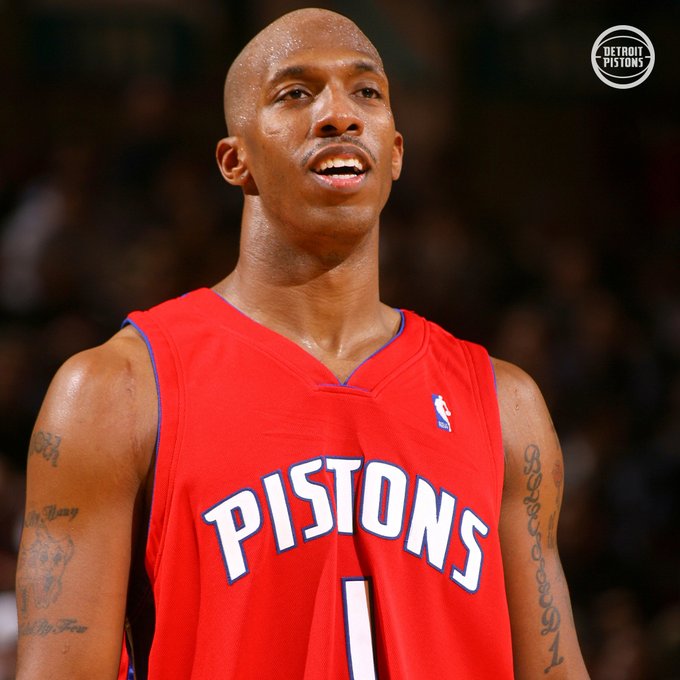
Meanwhile I continue to wait for and be disappointed in their refusal to bring back the mid 2000s reds as their statement jersey.

-
 6
6
-
-
I can’t speak to the accuracy, but there’s a rumor the Pistons’ classic edition will be announced on Tuesday.
Also claims the new statement edition in September and city edition in November, which sounds about right.
-
-
That statement jersey is why the league approving all of these weird one-off and wild designs is frowned upon by so many on this forum. One iconic moment occurring in an otherwise horribly designed jersey, and it is now a regular part of a franchise's identity. I guess anything goes in the regular season, but I really wish the league would implement an icon, association, and statement only rule for the postseason.
-
 4
4
-
-
9 hours ago, pelicanfan said:
judging from that picture it seems like there’s no more contrasting arm holes, collar, or waist band. hard to see if there’s any side design but i see a little something on the left side of allen’s shorts (i think it’s just the C logo) i hope i’m wrong but they kinda look like they’re going the Utah route.
Not that I think it looks like it will be anything special, but it will probably be better than the Utah set (not that that's a high bar). Interested to see exactly how the gold is going to work with the silicon layer to make it more shiny.
-
 1
1
-
-
4 minutes ago, Satomiblood said:
The Jazz look reminds me of what the Clippers tried to do in 2015. It's such an awful swing and a miss that it's made me wonder how in the hell it even got approved. Then I remembered that bad taste, brand ignorance, and social media shills make for a dangerous combination.
The chasing of fire emojis on Instagram has led to a lot of questionable design decisions in recent years, IMO.
-
 5
5
-
-
3 hours ago, Pirate_Nation said:
New Pistons logo?
Like some others have mentioned, this seems to be either some kind of custom item or fan gear. I am wondering what the new Pistons' statement jersey is going to look like. I've come to be a little afraid it's going be something based on the "313" logo that looks like was officially added to their set.

Still hoping they bring back their classic court next season too instead of what they used last year.
-
6 minutes ago, FiddySicks said:
Oh, don’t get me wrong, the Heat look very good, and them going toned down is the right move. I’m more surprised that we never got something along the lines of the Magic sublimated stars but with flames or something instead. The Magic sort of lost their identity when they ditched the stars, and I sort of feel like it was an attempt to “button things up”. Problem is, Heat culture is led by Pat Riley and has Miami to fall back on, so the whole “Buttoned up” approach works well for them. The Magic basically play in Florida’s version of Sacramento, so them toning it down just emphasized how bland their surroundings are.It's not too often I'd encourage a professional sports team to go with a whimsical design approach, but it definitely works for the Magic.
-
 3
3
-
 1
1
-
-
48 minutes ago, McCall said:
I'd even argue that if (IF. Big IF) they were to alter their identity and change up the colors, the Floridians color scheme would work way better than the Vice colors.
Vice has always struck me as a look that works fine as a not overly-used alternate, but would get old very quickly if it was the day-to-day set.
-
 3
3
-
-
The front numbers on the black and yellow jerseys are just comically huge.
-
 3
3
-
-
Oof. I'm generally in favor of minimalism and traditional design, but these aren't it. Reminds me of the Sixers jerseys they switched to right after the AI-era ones (and the slightly updated AI ones) were retired. Just too plain.

-
32 minutes ago, DJT said:
Could be wrong but I thought it was at least 2 years.
I also remember reading that statement jerseys are supposed to be worn for 3 seasons but not sure if teams are held to that.
For some reason, it's in my head that it's 5 years. I could be getting it mixed up with the NFL, but I know when the Pistons switched back to RWB from teal, they did it as soon as they were allowed, and that was 5 years (1996-97 to 2000-01, switching back in 01-02).
As for Statement jerseys, what was released at the time of the Nike takeover in 2017 said Statements could be changed every two years. But with the state of jersey and City Edition madness in the NBA these days, who knows what the rules are or if they're even enforced anymore.
-
1 minute ago, Krz said:
I'm really interested to see how Nike/Utah justifies their design choice. Is there anything deeper than "we just like wanted to change the colors"?
Probably some NikeSpeak about the beehive state, I'm guessing.
-
 1
1
-
-
4 hours ago, TaylorMade said:
Pistons are making a slight alteration to their shorts. It looks like the 313 logo is being promoted to the official logo set. Hopefully this means the DP logo will be sunset for good.
Looking more closely at the primary logo on the shorts, is the outer outline white now, instead of gray as it was previously? I certainly wouldn’t mind gray being officially removed from the Pistons color scheme.
-
14 minutes ago, LA Fakers+ LA Snippers said:
I liked the DP monogram, more than this 313 biker logo. This whole “Embrace Detroit/Look like the Lions” thing has been a turn for the worse.
Their design team isn’t good. Other than the 2017 primary logo, I can’t think of a single thing they’ve done that I’ve liked in at least 10 years. I suppose finally getting rid of the gray jersey would qualify.
-
 2
2
-
-
15 minutes ago, kimball said:
Yeah, I’m not huge on the 313 logo. I’d much rather have a cleaned up version of this on the shorts, warm-up gear, etc. I suppose the 313 logo is an improvement over the various “DP” monograms they’ve used, though.
I also hope they bring back their classic court design over that blue, non-painted lanes boondoggle they used last season.
-
 1
1
-


2022-23 NBA Logo & Jersey Changes
in Sports Logo News
Posted
They'll have to bring the reds back at some point, you'd think. Hopefully this one doesn't last nearly a decade like the two iterations of "Chrome" did. I can't imagine it isn't better but your opinion doesn't fill me with optimism.
Given the 3:13 unveiling time, I'm now afraid my fear about "313" being plastered as the wordmark on a jersey is going to become a reality. Man, how amateurish that would be..