


j'villejags
-
Posts
1,242 -
Joined
-
Last visited
-
Days Won
4
Posts posted by j'villejags
-
-
37 minutes ago, BringBackTheVet said:
I was thinking the point would go down, but I also really like the way you did it. The only thing is that IMO if the stripes are wider at the bottom, then the middle stripe shoudl probably match the socks - which I think works well the way you did it... as long as they don't decide to mix and match.
WHen you look at when the current set was unveiled, the pants were absolutely designed to go with certain color socks - they then deviated from that. Notice how the wide part of the stripe matches the socks.
Great point, thanks! Looks like the home and alternate would follow this pattern, but the away would either need the white socks with the current pant stripe, (option 4), or I'd need to swap the order of the red and white stripes on the black pants.

-
 1
1
-
-
37 minutes ago, YankeeBaseball0934f said:
Awesome job! Is this template available for download?
Thanks!
This is something I've been building for a while now, and am modifying it as I go. It's not currently set up as a template that'd actually work for anyone else since there is no real order to these layers. To give you an idea on how scrambled it is, there are currently 936 individual layers, and the file size in Photoshop is currently 5.28 GB.

If I ever get it to a point where I feel it would be a great tool for someone, I'd be willing to share. It's just not there yet.-
4
-
-
Here's an update. I tried working a pant stripe in and have added a few options on the away set.
I've been working on this template for a while (since the TCU release 2? years ago) but it is honestly not all that great for implementing details on the sides. I was thinking something like this for the pant stripe to mimic the shoulder stripes --
Should I flip it so that it is coming down instead of up? I like BBTV's suggestion about the striping. Might need to try mirroring it instead for that effect. For now, here's what I've come up with --
Home
Alternate
For the Away sets, I used a few potential combinations with various accessories. Thoughts? Any preferences?
Option 1
Option 2
Option 3 (only using different color accessories)
Option 4
-
4
-
-
15 hours ago, simtek34 said:
Red Socks should be worn with the Black Pants. Add something to the pants as well, so they aren't so plain. Those are my only big complaints. Otherwise, it looks good.
Thanks! The black socks with black pants thing doesn't really bother me like it probably should, but I will give it a shot with red socks.
I struggled a bit with a pant stripe that pairs with the action going on at the shoulder. I feel it almost needs to be a similar style of tapered stripe(s). I'll see what I can come up with and will post an update.
-
It's been a while since I've made a concept, and thought I'd give the Falcons a shot with their new uniforms coming soon. I like trying to guess what Nike will do, so this is my attempt at that.

I wanted to give them 3 distinctive sets, rather than 9 mix-and-match combinations.
What do you think?
Home
Away
Alternate
-
12
-
-
Just now, GDAWG said:
They have not announced one yet.
Thanks! For some reason I had UA in my head but couldn't find anything to corroborate that. -
Has the uniform provider been announced? I might've missed that.
-
This thread right now --
-
14
-
-
7 minutes ago, daniel75 said:
God I really hope Gargoyles isn’t a team name, that’s just bad. Try saying “Go Gargoyles” out loud, it’s not pretty.
Oh... well damnit! -
1 hour ago, Wings said:
Looks like it is New York Gargoyles. Give me my damn cookie

Love the name and it brings some really fun imagery. That said, I always think of this classic clip when I hear 'gargoyles.'
(Make sure to turn down the volume a few notches before hitting play.)The "gar-gyyyles" reference comes at 2:23
-
1
-
-
-
I'm having some issues logging in from my phone with Safari. I keep getting an error that my username/password is not correct, even though it's 100% correct. I've logged in and out from my computer using the same log-in information and it works fine, but my phone says that information is still incorrect. I've changed my password 2-3 times to see if that helps. I've also cleared my cache on my phone. Not sure what else to try. Any other suggestions to get it to work?
I use Chrome from my computer but I stick with Safari on my mobile devices. I've tried to log-in from Chrome on my phone and it actually works on that browser for whatever reason, but am hoping to avoid switching back and forth between Chrome and Safari for this website. Any tips would be appreciated.
-
EDIT: Sorry, I meant to post this in the technical issues thread.
-
Awesome bowl cut there, bud. He looks like Pistol Pete's slack-jawed cousin.
This one is pretty good too.
-
2
-
-
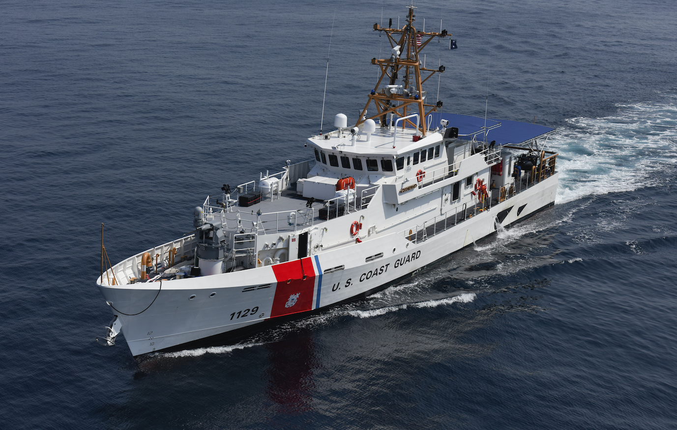
Connecticut Cutters rolls off the tongue nicely, and would have a double meaning with the cut fastball, and the Coast Guard cutters. The U.S. Coast Guard Academy is in New London, Connecticut.
-
8
-
-
13 hours ago, SFGiants58 said:
Here’s a “garbage” post that’ll get me a lot of flak:
I’d love it if the Browns changed their name to something like “Bulldogs.” They aren’t the same team as the old Browns (no matter how much the NFL tries to pretend otherwise), and they’ve sullied the legacy of their namesake team by being mediocre to horrendous for their entire existence (e.g., only one playoff appearance in their history). It’s time to acknowledge the truth about the team, give the records back to the Ravens, and build a new team identity (albeit one with the old Browns’ colors, can’t go too far).
Also, the Brown family founded the Bengals and play at Paul Brown Stadium. I don’t like that they’re named after a guy who wound up founding a division rival.
I know now that I’ll get heat for that opinion, but I’ve long felt this way. The “Browns” name should rest in the same grave as the Oilers’ identity.
Also, Baltimore Ravens > Baltimore Browns. When a local name is that good, you can’t pass it up.
If they did decide to rebrand like that, I'd want to see them tweak the color scheme a bit. Keeping the brown/orange look would make them the same old Browns to me. Going with a simple brown/white uniform would give them a clean look, and would also help differentiate themselves from their in-state orange rival.

Either way, I'd like to see them at least de-emphasize the orange to fully embrace brown. White lids wouldn't be unprecedented --

-
Saw this today on Behance & thought it looked familiar. https://www.behance.net/gallery/27966807/ROYAL-LIONS-FABRIANO-Identity


Looks like that dude may be making some serious cash off of it:
I absolutely love Fraser's lion logo. That's always been one of my favorite logos -- not only from him, but in general.
Every little "tweak" they did to differentiate it from Fraser's just made it look worse.
Also, it appears that the Behance page has been taken down.
Fraser's work must get stolen every week. we constantly see examples of this kind of thing. most of the time it's not worth making a court case about. i don't know if this would be one of those times or not either, but if merchandise is being sold FD could claim all the profits the logo has generated.
I'd love to see that happen.
-
That's a nice logo and I really like that first color scheme you had going. I went to your Behance page to compare your project to his "project" and I'm thinking -- Ooh this is cool. Click. Oh, I like this too. Click. Wow, look at this one! Click. -- There's so much good stuff on there.
You can tell he just used the paint bucket tool to swap colors by all of the rough edges. I also noticed he went ahead and "borrowed" your Lions wordmark while he was at it. I'm guessing the culprit is a kid.
-
1
-


NFL series (ATL, CLE, NE, WAS done. AZ update added 04/19/23.)
in Concepts
Posted
I appreciate the C&C everyone! I'll likely revisit this when the new uniforms (and potentially logos) are revealed with an update.
For now, I thought I'd come up with a variation of what I've got so far. My personal favorite was the black set, so I've based the rest of the set on them. Each uniform now has gray pants. (Note: I'm calling them gray, as I don't think the color is quite silver, and I'd like to let the Raiders own black and silver.)
I thought the red gloves and shoes feel like something Nike would do to highlight their product, as red tends to flash against black and gray. I also think it helps differentiate from the Raiders a bit more, while maintaining the overall black/gray aesthetic.
Home
Alternate
Away
Do you think the gray pants work with this version of the red jersey? Or am I forcing it? I tried gray numbers on the red jersey, but I didn't feel there was enough contrast. Instead, I replaced the white stripe on the shoulder with a gray stripe to try to tie them together. Thoughts?