


j'villejags
-
Posts
1,242 -
Joined
-
Last visited
-
Days Won
4
Posts posted by j'villejags
-
-
They went nuts with the radius tool. Bold.
-
Just now, FinsUp1214 said:
Also the presentation event itself was hilariously amateur hour, I guess I should have seen this coming. The YouTube stream crashing for five minutes, Lalas trying five times to say “Emmy Winning” but saying some variation of “Ebble Wimble” instead, 300 minutes of highlights for no reason but filler, and “watch parties” in Dallas, Seattle, and Vancouver that weren’t watch parties at all and filmed with Nokia Bricks should have been an indicator of what was coming.
That thing had a soundtrack and it was “Yakety Sax” on repeat.
“Ebble Wimble” is hilarious. Now I wish I’d seen it. Sounds like something you’d say while chewing on rocks.-
 1
1
-
-
-
1 hour ago, PlayGloria said:
The first letter in HOUSTON is the same "H" that was leaked previously. I don't think that's coincidence. A worn-out black shirt with a navy/red/white logo is throwing me off to where I don't want to pass judgement just yet. But my initial reaction is that it does not look good.
Yeah, the logo looks so out of place. They could’ve at least given it a vintage/worn treatment for the shirt.
But I’m afraid even without the context of the worn-out shirt, the logo would still look odd next to that font. They might need to tweak the logo a bit if they want to actually pull off the look they are going for.
-
1 hour ago, cajunaggie08 said:
Who happens to be from Houston. OMG its all coming together! American Bad Ass Texans are on the way!
About 10 years ago, the Undertaker came in to my place of work. He’s a massive human, so he naturally stands out in a crowd. But he had a buzz cut, and people didn’t initially recognize him without his hair.
Some of my co-workers grew up idolizing him and were naturally hyped when they realized who it was. My buddy was pacing in the back, and I tried to get him to go say hey to him. He said, “what am I supposed to say? Hello ‘Mr. Taker,’ big fan?”
I talked to him as he was checking out, and told him the guys in the back are freaking out you’re here. They are die-hard fans. He just laughed and said, “oh, another failed disguise.”
He came across as a genuine and humble dude.
-
7
-
 2
2
-
-
Seeing the fan shirts the Nuggets had laid out for Game 1 had me thinking -- what if they adopted more of an Avalanche-esque color scheme?

-
4
-
-
16 minutes ago, WSU151 said:
The bigger decal was mentioned in the unveil
Ah thanks, I missed that.-
1
-
-
1 hour ago, MCM0313 said:
I would love to see a red facemask on their current helmet. They could do that concurrently with changing their primary to red.
-
12
-
-
On 5/12/2023 at 11:16 PM, TheOatsMustFlow said:First look at a new Cardinal helmet in natural lighting. Looks the same.
Is it just me or does the new helmet decal look slightly bigger than it used to? -
1 hour ago, Discrim said:
So jaguars don't exist and everybody knows the famous Cowboy horseshoe. Got it, Titans fans

I’m over here having an existential crisis.-
 1
1
-
7
-
-
Saw on one of the Okstate message boards I visit that “new helmets are also coming but are not in yet.”
Makes sense because these had no helmet bumper in the pictures, and there isn’t much attention paid to the helmets in this release. And all of the helmets shown have already been worn.
-
Just now, aawagner011 said:
Interesting they go with the stylized wordmark but plain block numbers. I wouldn’t hate a stylized number font similar to the wordmark. It looks classy without being over the top. Two complaints I believe would help a lot:
I wish they would limit the number of helmet decals in rotation. The reveal still shows off multiple designs with two white (classic logo and script Cowboys), orange with script Cowboys, and black Pistol Pete. The script Cowboys does nothing for me. Maybe limit it to the OSU logo and Pete in various colors. Using so many different decals makes the uniform feel less cohesive.
Try to match the weight and thickness of the helmet stripe to the sleeve stripe. The last photo above with the all white uni highlights how they use the same stripe pattern and yet they look very different.
Overall, nice job. Also interesting: this is another team going away from a logo on the collar (Texas was another). Both have chest wordmarks but this could be the start of a trend to more minimalist designs. Maybe teams have seen how cluttered that area can get with patches?
I agree with all of this.
For the helmets, the Cowboys script has always been a Cowboys basketball thing. It was cool as a one-off but I'm not liking it over the OSU brand logo. Pete has always looked a bit awkward on the helmet due to the shape of the logo. Our OSU brand logo is perfect on the helmet. This return to a traditional look would make for the perfect time to dial back the logos used on the helmet and stick to using the brand logo across the board.
For anyone interested, this is what the numbers might have looked like if they matched the wordmark. I think they would need a little more width and weight for a football uniform. As is, the numbers being tall and skinny might've made it difficult to pull off with the wordmark and numbers already being so low on the jersey.
-
5
-
-
2 minutes ago, GriffinM6 said:
Those are SWEET. Love that they have both black-heavy and orange-heavy white jerseys as well.
That's my favorite part too. I'm an Okstate alum and have been wanting the two white options for years. Always made more sense than having a gray jersey.My main issue is with the template for how low the wordmark and numbers are on the front of the jersey. Wish we could scooch it up a bit.
-
5
-
-
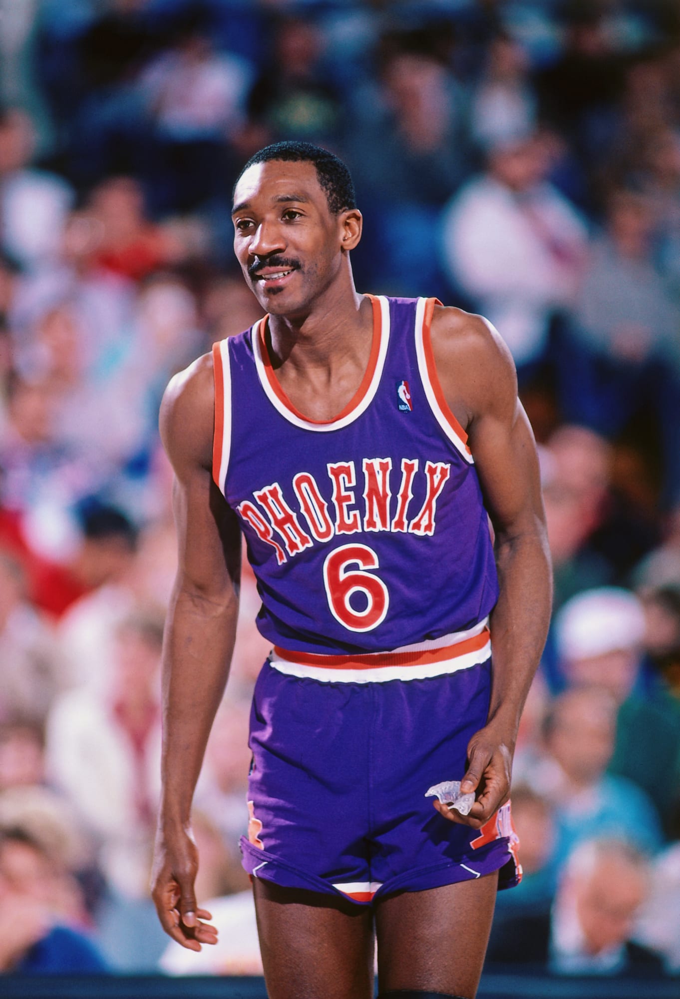
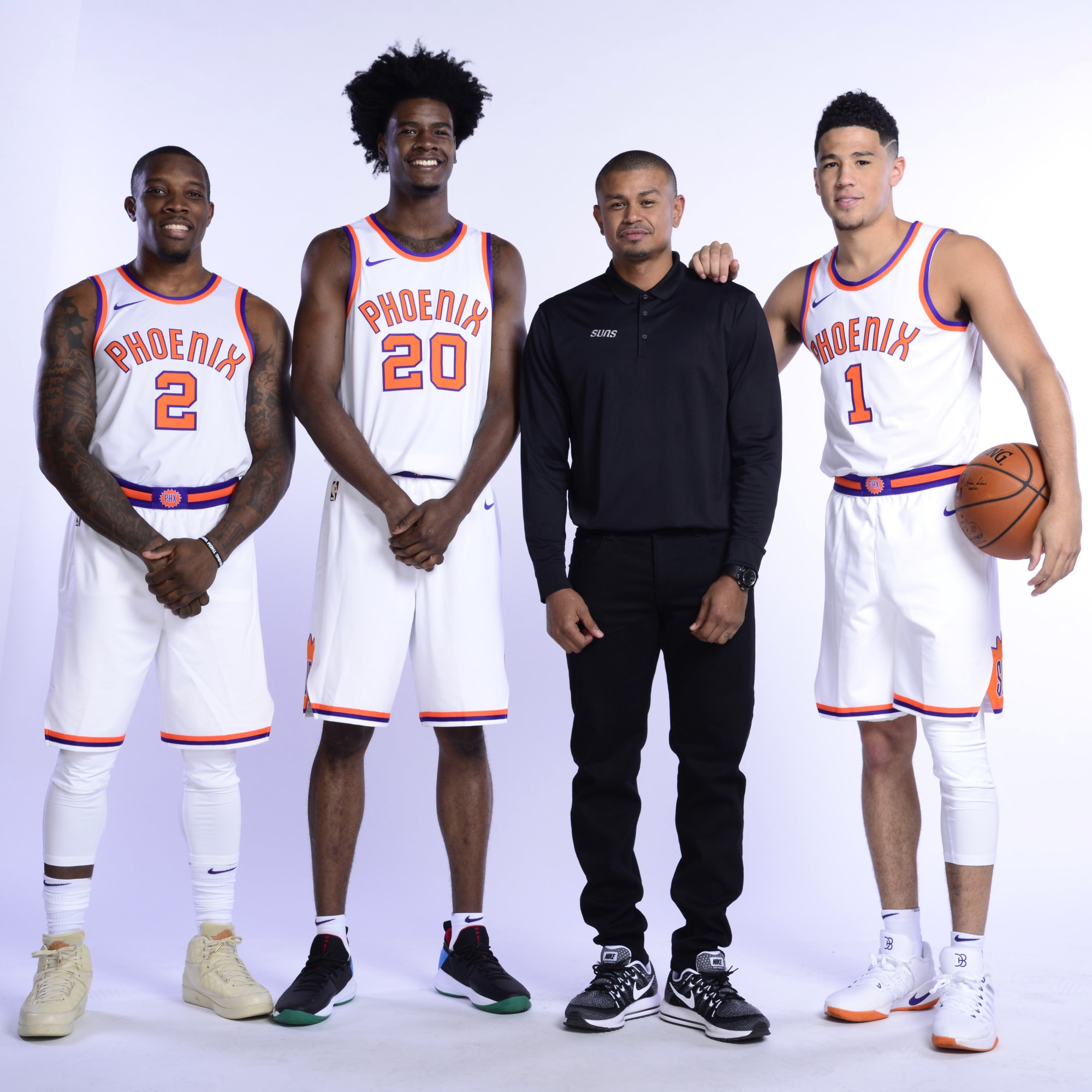
17 minutes ago, tBBP said:
You sure about that?
Granted, aside from a font change to the chest scripts these were pretty much the same sets Phoenix came into the L with, but I don't think these, or any version of such, has ever even seen a floor since the '92 (?) change. (I could be wrong though.)
I mean Tom Chambers, Jeff Hornacek, babyfaced Kevin Johnson and young Thunder Dan Majerle all sported those...I wouldn't mind seeing these come back at least once a an alternate. (But not primary though, just to be clear.)
It was intended more as a play on words.
I agree they’d have to incorporate those as a throwback if that happened.
They did throwback to the original set a few years ago, so that was the closest we’ve seen to that era for PHX in modern times. I prefer the western font over these though since it added some flair to an otherwise simplistic look.
-
6
-
-
44 minutes ago, jdukie said:
Why not just go back to the Barkley era full time? Is there some rule that prevents this - I mean the NFL and MLB go back to old brands all the time.
If they go back to the throwback, they won't have a good throwback left to throw back to.-
1
-
-
Bottom right was designed by @Htown1141. He'd posted it over on the concepts board.
https://boards.sportslogos.net/topic/126762-dawg-pound-logo-design/#comment-3338528My vote was still with @VDizzle12. Bummed to see his entry didn't make the cut. Happy for H-Town though -- well-deserved! Hope he wins at this point.
I'm liking bottom left for being different. I think it would pair nicely with a new Brownie the elf logo done in a similar style.
It'll be embarrassing if that middle logo wins.
-
4
-
-
35 minutes ago, Cujo said:
Alts should be forbidden from series clinching games and the entire Finals.
EXHIBIT A:
JR Smith looks like he’s about to float off into space.-
6
-
-
25 minutes ago, Jezus_Ghoti said:
I am always surprised when people here say they like the red helmet. I think people perhaps just like the idea of more red helmets in the league. Heck, I am on board with that.
But in practice it just did not work for the Texans. Maybe it would work with a flatter finish, but to me it clashes very hard with the red jersey. Could possibly work with the blue jerseys?
Looks great with the blue. Good call.
The helmets almost look like they might’ve been going for a candy paint look — which would be cool for Houston.
-
1
-
-
15 minutes ago, Michael Bolton said:
I hope so much the Texans switch to red as their primary. Inject some color into that drab, forgetful division.
-
1
-
10
-
-
1 hour ago, BigDmo said:
Kind of funny too given the conservative direction Oregon has taken with uniforms and uni combos the past 3-4 seasons
Agree. And I'll add that Oregon has a color palette that made it work.
Colorado's earthy tones do not provide the splash of color needed to pull it off. All they can really do is use different finishes on their helmets to try to give it some pizzazz, but I don't think it's nearly enough to compare to what Oregon has done.
Guessing this all means we'll see a gold chrome helmet, which will look cool and all, but it doesn't make them Oregon. -
3 hours ago, VDizzle12 said:
I thought the same thing. She's a tiktoker who has a big following, so I'd be shocked if she didn't win.
Yours is better in my opinion. The neck on hers is bigger than its head, the CLE feels too forced, the mouth is way too far back, etc.
Hoping you win! -
38 minutes ago, TenaciousG said:
Yeah, until people stop caring and now you don’t even drive engagement for actual announcements.
A tale as old as time. Sheep cried… err no. Boy cried wolf. Or something.-
1
-
-
1 hour ago, WBeltz said:
This would be the second iteration of that style of uniform, this being the first:
The new one definitely fits closer to the throwback itself, as this was in current school colors. The AMES helmet though should get more use, especially on the red helmet. Would be *chefs kiss*
Those were better. You can actually read the numbers. Agree on the helmet.Side note, I really like the chevron bar patch they wear on their regular uniforms as a nod to Jack Trice and this look.
-
2
-
-
7 minutes ago, Cujo said:
Based of this grainy unveiling video, the Texans are in fact a confirmed Reebok creation.
The synchronized movements were almost like an interpretive dance. Uniform reveals have come a long way. (Kind of.)
-
2
-


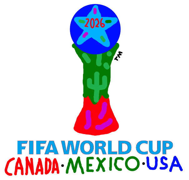


2026 FIFA World Cup Logo
in Sports Logo News
Posted
That is so
disorientating