


j'villejags
-
Posts
1,242 -
Joined
-
Last visited
-
Days Won
4
Posts posted by j'villejags
-
-
Never understood Minnesota's recent use of the white collar on their home jerseys, or even the white numbers. My favorite uniforms they have worn did not have any white. They are one of the programs that would benefit from embracing their rich history and sticking to a more traditional look. Their colors work so well for it.

-
 17
17
-
 1
1
-
 2
2
-
-
1 hour ago, NashConcepts said:
Still trying to figure out the helmet stripe but here's an attempt.
I think you’d need to flip the hidden jet on the stripes so that it would be headed up rather than down.Also, what if the stripes were contrails?
-
6 minutes ago, SCL said:
I prefer WFSS, white for snows sake.
Or SFSS -- Snowcapped for Snowcapped's Sake?-
1
-
-
45 minutes ago, Survival79 said:
It wasn't perfect but I actually liked how the black in their old logo added some contrast with the shadow effect.It would be even better if they flipped the black and blue.
-
11
-
3
-
-
3 minutes ago, Rygi13 said:
New Michigan State Uniforms
Pretty nice but the numbers look comically large.
I wonder if the person who designed the Greek Key pattern knew it would continue to be used thousands of years later in places that hadn't yet been discovered. One's legacy doesn't get much better than that.-
7
-
-
1 hour ago, Sodboy13 said:
From the "icy" emoji to the follow-up "All in the details" tweet, just about the most trite, by-the-numbers way to do a football uniform unveiling in 2023. The presentation and the uniform itself are perfectly befitting of a MAC team.
Or, I guess, a Big 8 team.
I'm an OSU alum and immediately thought of our uniforms when I saw this. I always hated how imbalanced our W-O-O combos have looked. W-O-W is definitely the way to go -- (for us and the Broncos).-
6
-
-
28 minutes ago, RyanMcD29 said:
To back up my point earlier, those are also Syracuse rip-offs with the number font!
Yeah, and Syracuse definitely wore it better. Lol -
1 hour ago, colinturner95 said:
The shoulder stripes don't feel like Illinois:
They could have slapped outlines on the numbers and a matching stripe from the helmet to the pants and that would have gone a long way:
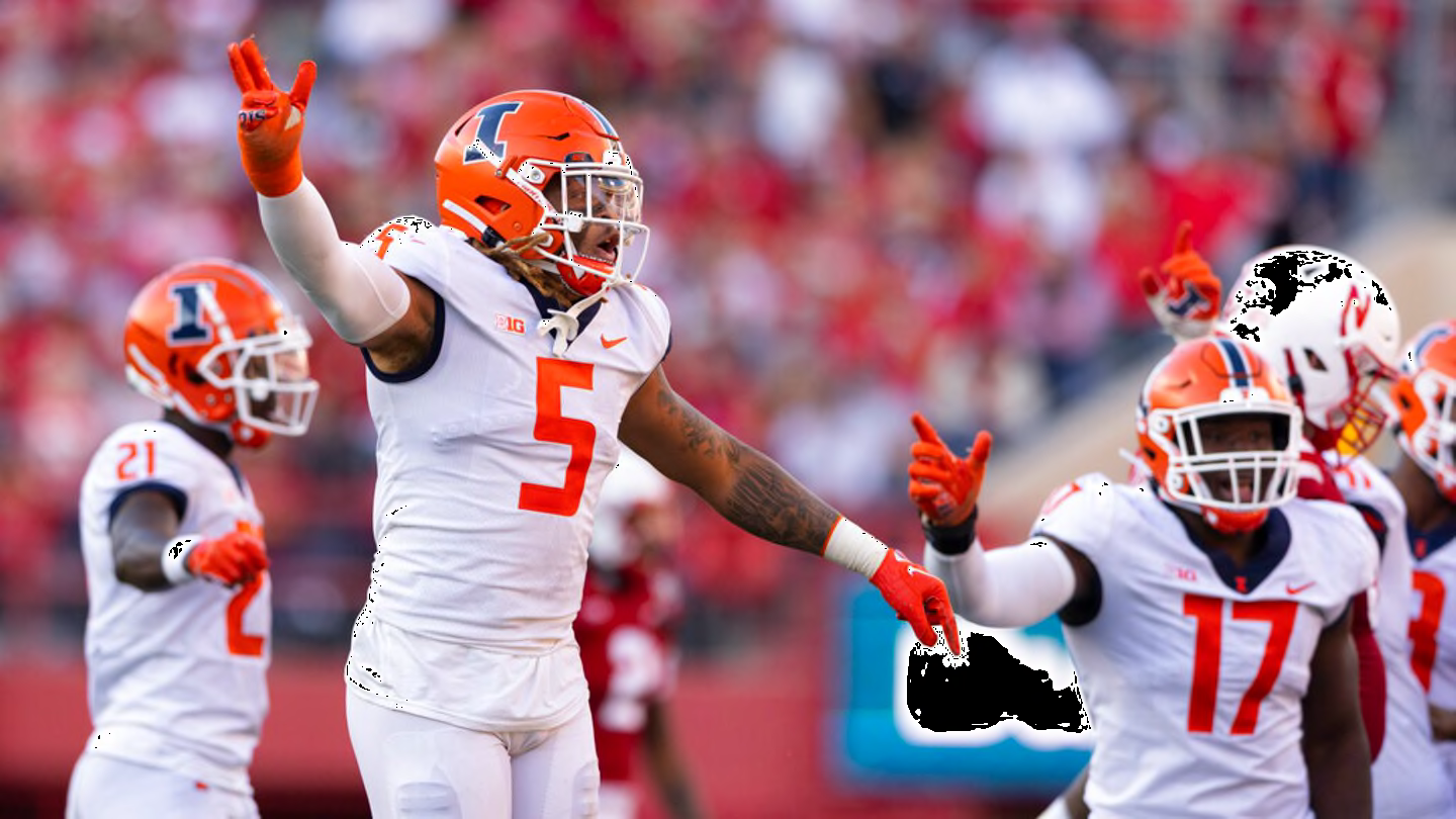
Not perfect, but better than the Syracuse rip-offs
I like the two uniforms on the bottom for the Illini but would want to drop the white from the helmet to match the jersey and pants. (Or add a touch of white as a tertiary color to the uniform.)
-
4 minutes ago, DCarp1231 said:
I remember when the name change discourse first started, someone came up with Redwolves because “that
 sounds tough bruh” and people ran with it.
When in fact, it sucks, is a horrendous option, and absolutely needs to stay as far away from this team as possible.
How would you and the fans feel if they switched from 'Washington' to 'DC'? Doubt they'd ever go that far but just curious on how the DMV would feel about it if they went for a complete reset on the team name.
-
1
-
-
1 hour ago, BBTV said:
Also, those old Seahawks blue uniforms were mostly worn in the dull-sterile-soulless Kingdome, so they in turn also looked dull. You almost never saw them under bright-natural light, where admittedly they looked significantly better. I only rarely got to see them live on TV, because the Seahawks were practically never in any national game, but used to collect football cards in the '80s and remember thinking how dull they looked compared to some of the other teams that also wore a royal-ish blue.
It's my opinion that the current Seahawks colors should be their "forever" colors, whether they keep the current uniforms (which IMO have aged pretty well for a non-traditional uniform) or adopt a more traditional look (I'm in the crowd that thinks the above recoloring of the throwback looks pretty good.)
Great point. And even post-Kingdome, these throwbacks will naturally look a bit more dull playing under cloudy skies more often than not. -
11 minutes ago, monkeypower said:
Well, all they did was flip the colours of the endzone text.
For a team that has a colour in the name, there's not much of that colour on the field anymore.
By the response he received, I thought they might be dropping the bevel.
They have been leaning more into their throwbacks in recent years, and it seems overdue at this point to make that change. Seems like it at least inspired the wordmark in the endzone.
-
1
-
-
18 minutes ago, oldschoolvikings said:
I'm not sure why anybody would advocate for a uniform that combines the throwback template with the current colors. IMO, the current colors are pretty bad. That dull navy blue and that ugly slime green? No thanks. And the throwback colors are the best thing about the older uniforms. Royal blue and kelly green are gorgeous together. The colors are the best thing about the throwback.
I made that graphic. In my initial post, I had suggested royal as the primary and navy as an alternate, because I also prefer the throwback colors. However, I think navy has a place moving forward with the team given their Super Bowl runs in that color scheme. A navy alt would be better than a black or green alternate in my eyes. Or worse, a ‘throwback’ to the current set. Just my opinion.-
3
-
-
Commanders immediately getting the shorthand nickname ‘Commies’ was kinda funny for a team in DC. Surely someone saw that coming, right? Guessing Snyder didn’t care.
-
7
-
 1
1
-
-
1 hour ago, Rygi13 said:
OSU Grey Uniforms 2023
The white outlines on the numbers really make them pop against the grey. Great look, should be in the annual rotation.
I think a double outline on the numbers would have worked well in this case. Adding a black outline would match the striping pattern on the rest of the uniform and I think could have the added benefit with readability. The numbers on gray uniforms tend to get lost at any sort of distance.-
6
-
-
12 minutes ago, natodesigns said:
Posted this on BigFooty yesterday but thought I'd share it here too. This kit would look unreal with the current colour scheme (Just squint your eyes and pretend its the current Seahawks logo on the shoulder and helmet lol)
Agree with you. Not sure if you're trying to pass that off as yours but I made that and posted it here yesterday. On 7/19/2023 at 5:36 PM, j'villejags said:
Seeing the old logo back makes me miss it. I think the totem pole aspect of it gets a little more lost in the sauce with the new logo. Maybe that's just me.I like the collar stripes but agree with you on the shoulder stripe logo. It gets redundant on the side view with the helmet logo. Using the stripe pattern would make more sense.
I would like to see a matching set with both navy and royal. Revert back to the royal as a primary, and keep a navy set as the alternate. Might need to find a 'tweener gray/silver color that works well with both sets. And perhaps even a green.
(Spoiler tag for those who don't care to see a mock-up comparing the two color schemes.)-
3
-
-
3 minutes ago, VDizzle12 said:
The Commanders and Colts have really gone full 90s NHL with their alternates and helmets. Where the alternate has nothing to do with the primary uniform or any throwback worn in history. The Browns all-brown uniforms to a lesser extent could be included too.
Even with color rush, teams would alter a current template with new colors or just use a throwback uniform. These two have been completely out of the left field and feel disjointed with the home/away primaries.
It could be a slippery slope where we end up in a world with Association, Icon, Statement, and City NFL alternates.-
 1
1
-
 2
2
-
-
20 minutes ago, spartacat_12 said:
I'm a Tom Petty fan and have listened to that song dozens of times, but even I didn't make that connection, so it seems like a big stretch by the marketing department. I can't really think of what notable impact Indiana has had on pop culture outside of Hoosiers and Parks & Rec.
Stranger Things could've made sense -- taking place in the fictional town of Hawkins, Indiana.
-
1
-
-
3 hours ago, B3N said:
The Tom Petty lyrics they used for the tweet start making more sense as the song goes on.
--
She grew up in an Indiana town
Had a good lookin' mama who never was around
But she grew up tall and she grew up right
With them Indiana boys on an Indiana night
...
Last dance with Mary Jane
One more time to kill the pain
I feel summer creepin' in and I'm tired of this town again-
6
-
-
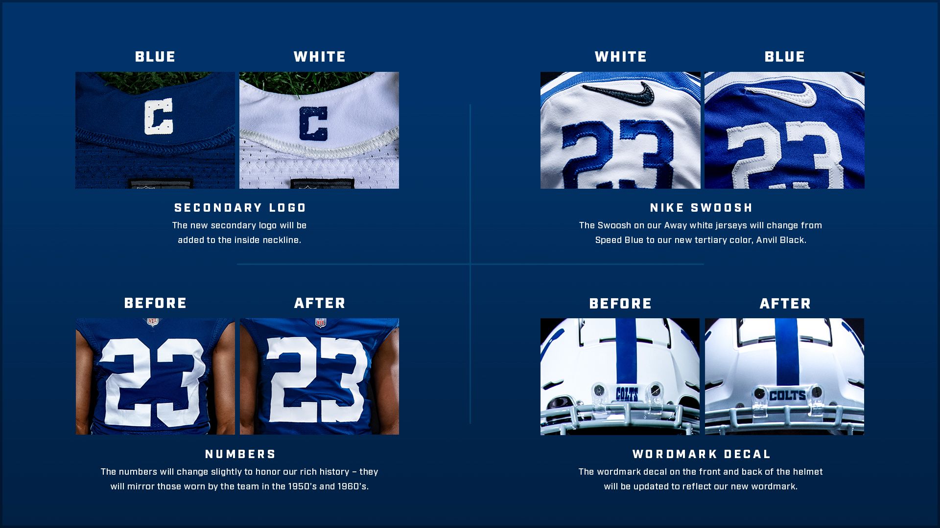
1 hour ago, aawagner011 said:
Never forget all of this was made possible by adding black to the color scheme by making the radical change to their away uniform. Damn you black swoosh.
Came here to post this. It's hilarious how the black seeps in and spreads like the plague. Colts dipped their feet in with the Swoosh, and are about waist deep in now with the helmet. Now that they have a black helmet, they will use it to justify a black jersey, pants, and socks as their next alternate.
This feels like the Longhorns dropping a black helmet.
-
3
-
-
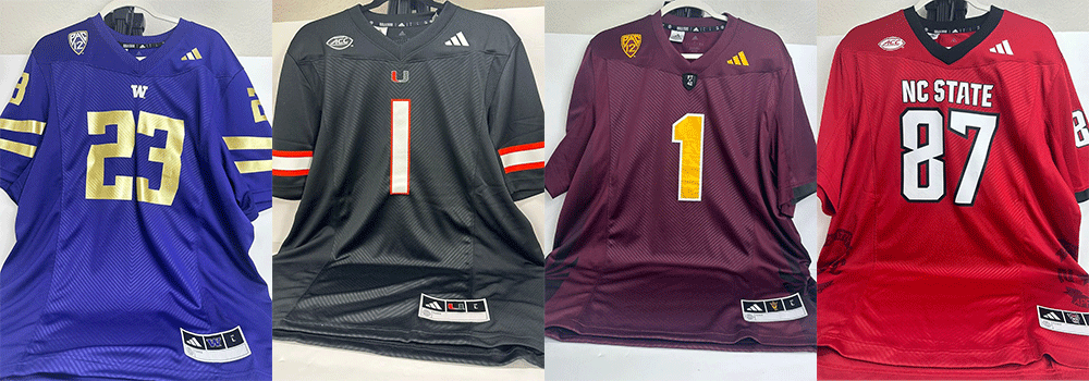
30 minutes ago, dont care said:
That seems to be the template for adidas this year putting the flag on the side, nc state has the same treatment
12 minutes ago, Rygi13 said:Matches earlier leaks
Nebraska To Celebrate 100th Anniversary Of Memorial Stadium With Throwback Uniforms – SportsLogos.Net News
The old state flag treatment was much better.Interesting-- thanks! I haven't been paying enough attention.
I don't like it for NC State either. It'll be one of those head scratching design choices we look back and laugh at in 20 years.
-
1
-
-
1 hour ago, 8BW14 said:
The Seahawks throwback could so easily be adapted to contemporary standards in the same way as the Vikings and Chargers uniforms. Just use the new logo, ditch the collar stripes, use the current number font and match the pants stripes to the sleeves and voila. I’d probably ditch the bird from the sleeves but maybe not? Either blue/green combo would work for me, but I think I might prefer the throwback colors.
Seeing the old logo back makes me miss it. I think the totem pole aspect of it gets a little more lost in the sauce with the new logo. Maybe that's just me.I like the collar stripes but agree with you on the shoulder stripe logo. It gets redundant on the side view with the helmet logo. Using the stripe pattern would make more sense.
I would like to see a matching set with both navy and royal. Revert back to the royal as a primary, and keep a navy set as the alternate. Might need to find a 'tweener gray/silver color that works well with both sets. And perhaps even a green.
(Spoiler tag for those who don't care to see a mock-up comparing the two color schemes.)Spoiler-
9
-
1
-
3
-
-
From a design perspective, I like the way the State script looks on MSU's helmets. They are really the only SEC school that uses 'State' (LSU doesn't really count in my eyes), so maybe owning that is a good thing.
That said, it's generic enough that it's giving me Fansville vibes. Might need a bulldog or something to go with it.
I think I'm going to miss the gray a bit, as I liked them having a tertiary color to differentiate from A&M. The Egg Bowl alternates were completely over the top but maybe having a touch of gold could work for them.
-
7
-
1
-
-
1 hour ago, AJM said:
Just a sneak peak but happy to see white outline on player numbers return and the state flag removed from the chest.
I'll be honest -- the state flag was subtle enough for me that I did not even know it was there. Looking at old pics and I kinda like it.
Looks like they are adding it back though on the side of the jersey though? Seems like an odd placement but I'll withhold judgement for now.-
1
-
-
Seahawks might have the best throwbacks in the NFL.
-
1
-

/cdn.vox-cdn.com/uploads/chorus_image/image/50775839/usa-today-9531316.0.jpg)


:format(webp)/cdn.vox-cdn.com/uploads/chorus_image/image/36486894/nfl_sanders_02.0.jpg)

/cdn.vox-cdn.com/uploads/chorus_image/image/52097359/usa_today_9545765.0.jpeg)
/cdn.vox-cdn.com/uploads/chorus_asset/file/19926469/577368704.jpg.jpg)
 sounds tough bruh” and people ran with it.


College Football 2023
in Sports Logo News
Posted
Why does that man look like a wax sculpture?