


j'villejags
-
Posts
1,242 -
Joined
-
Last visited
-
Days Won
4
Posts posted by j'villejags
-
-
4 hours ago, nuordr said:
They are the same pants and they don't match the helmet. But I'm fine with that. I'm just happy they used a brown facemask.

Side note but what are the thoughts on the helmet stripe's application with SpeedFlex helmets? Wish there was a cleaner way to fit a stripe on there without seeing the white between the cuts. Curious what any EQ managers here might think. -
1 hour ago, VDizzle12 said:
I only wish the Vikings would have gone with a darker purple/glossy helmet. Still a great throwback look.
I do agree that a glossy shell would complete the look. Only thing missing for me.-
 1
1
-
-
11 minutes ago, oldschoolvikings said:
Embedded for you.
Kirk would be the guy who couldn't tell how it was different than their normal jersey. -
1 hour ago, cajunaggie08 said:
And before that it was the Red River Shootout
I prefer the RRS name but that logo is horrifying.
Red River Rivalry is a mouthful. I think it's impossible to say it 5 times fast without sounding like you have a mouthful of marbles. -
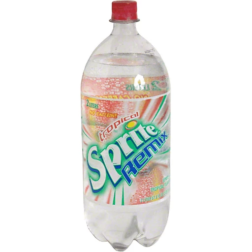
11 hours ago, BadSeed84 said:
I'm in the mood for a Sprite Remix.
You should try the Sprite Lymonade Legacy. So good. -
1 hour ago, colinturner95 said:
- The tapered stripes suck.
- The tonal stripes suck.
- The single layer numbers suck.
It's actually making me miss these.
Ah yes, the iconic jaws of Husky Stadium. They need some refinement but I thought it was a look they could build their identity off of. Miss those numbers for them (PNW reference aside).-
2
-
54 minutes ago, Germanshepherd said:
minus big points for keeping the chrome helmets around.
You’re not wrong. That said, the first two things that come to mind when I think of WKU — (1) their mascot and (2) chrome helmets. Lol-
3
-
-
6 hours ago, SSmith48 said:
Colorado State unveiled some new (long overdue?) uniforms. A bit more of a classic take; only gold pants, no gray alternates in sight, striping on the pants and sleeves. Not bad, it looks good in green and gold.
Can't help but think that their rivals down in Boulder might feel a little ripped off though:
Green/gold is one of my favorite color palettes in sports. And I forget how good their helmet looks.-
3
-
-
2 hours ago, throwmesomepics said:
Could someone share what a mono creamsicle uniform would look like?
-
7
-
 2
2
-
-
This look would make a lot more sense for a team named the Panthers if their '95 cat bros didn't have a history of wearing black/teal/black. I've liked silver helmets/pants being used to help differentiate the two teams. For the same reason, I like gold being visible on the Jags uniforms.
I would love to see new helmet stripes, pant stripes, and a fix to the awkward shoulder loops / TV numbers. Also, that all-black Carolina look would look better if there was silver on the helmet stripes OR if they removed the silver from the jersey and pants. Collar should be black as well since it lacks the silver outline.
Overall, their look is starting to feel a bit hodgepodge. I'd like to see them with a new uniform set to give them a fresh look with more cohesiveness.-
5
-
 1
1
-
-
My guess is battle red primary.
-
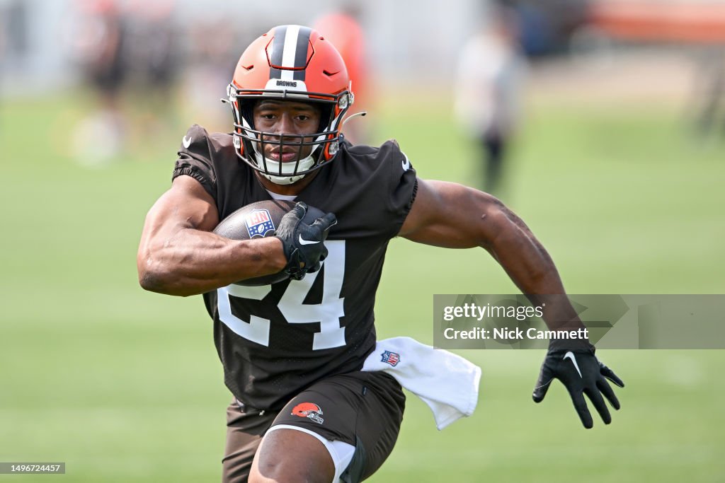
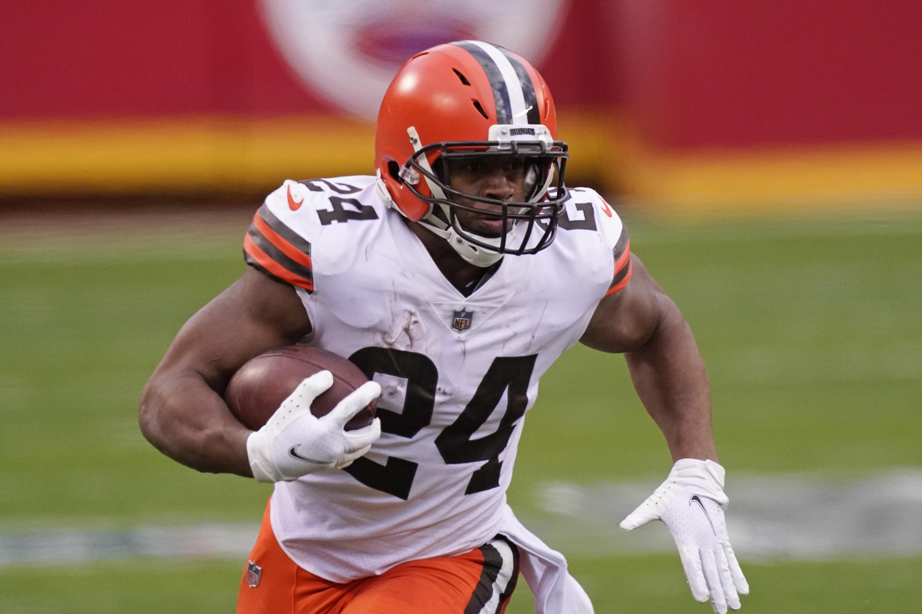
6 hours ago, MJWalker45 said:
Nick Chubb has changed helmets at mincamp. He wore the Schutt previously.
Definite upgrade. I’ve always hated his helmet.-
1
-
-
5 hours ago, PERRIN said:
When uniform news has stalled or potential rebrands are still in theoretical stages, I love seeing concepts here. It helps visualize new ideas and gives people more to talk about. I don't want to see them completely dominate entire pages, but I appreciate seeing new concepts every once in a while when discussing teams that either face an identity crisis and are exploring new directions or only need a few tweaks to be great. In small doses, they don't hurt anybody and only bolster discussion. I'd rather see concepts being posted here than see news threads get clevejacked for the umpteenth time.
Agree. I’m guilty of this as I’ve shared concepts here in the past. My favorite thing to do on the site is mock up photo realistic renditions based on the descriptions of what a uniform is rumored to look like. But those bits of information have been few and far between these days.
I definitely don’t mind seeing concepts as they can be used as conversation pieces to show, (rather than state), an opinion on how a uniform could/should look.
I do see the counter point and how it could bog a thread down. I haven’t minded it as long as the poster isn’t being too self promotional or spamming the board with their concepts.
-
2
-
-
2 hours ago, CaliforniaGlowin said:
Pretty cool. Looks like they could’ve leaned a bit more into the wave effect on the Seawolf. While the patterns on his neck do evoke waves to me, I can’t help but wonder what it might look like if it was a bit more obvious. I think hitting the wavey wolf idea a bit more on the nose would have helped it stand alone as the Seawolves logo.I like the mirrored A’s in Sonoma State — unique. The negative space on the A’s gives a shark/wave effect too, but I guess it might look even more wavey if they were both pointed the same direction. It would be cool if there was a way to give a similar treatment to all of the negative space at the bottom of the wordmark.
-
1
-
-
21 hours ago, Pigskin12 said:
Anyone else disappointed that neither the Jaguars or Titans seem to have any plans to upgrade their uniforms? Both teams are entering Year 6 with the current sets, both of which are not very good uniforms.
There is no reason the Jags can’t come up with something more interesting than what they have now. I mean there was literally no effort put into this current set. It seems like they’ve just grown tired of doing this every five years and are trying to stick with an identity, even if it’s a bland one.
The Titans also probably think what they have is good (even though it’s awful) and have had enough success in it that they associate it with winning, kind of like the Seahawks and their overrated set.
It may be wishful thinking but I think the Jags will have new uniforms next season. Fred Taylor had hinted at something being in the works.I hate the Titans so I don’t mind them looking ridiculous for a while longer.

-
1
-
-
39 minutes ago, kb105 said:
Cheez-It still sponsors the Citrus Bowl, just last year they sponsored both bowl games played at the Citrus Bowl in Orlando. My guess is Kellogs just wanted to use different brands instead of using the same for the same city.
Ah, thanks. I failed that reading comprehension test today.

I guess I didn’t realize there were two bowls sponsored by big Cheez.
-
1
-
-
2 hours ago, DCarp1231 said:
I guess since some can’t differentiate the Ravens from the Vikings, Baltimore should elevate the status of red.
In an eventual rebrand, make the red eye solid and more prominent while adding thin red stripes to the helmet, jersey, and/or pants. Red facemask too.
I’d welcome it. I’ve always thought purple and black with a tiny bit of red looks so good.
Vince Carter helped make ‘the look’ cool for me.
-
14
-
-
38 minutes ago, kb105 said:
Speaking of Orlando based rebrands, the Cheez-It Bowl has been re-sponsored to the Pop Tart Bowl, making the two Citrus Bowl based games being the Cheez-It Citrus Bowl and the now dubbed Pop Tart Bowl, to the acclaim of 4 year olds everywhere.
Does that mean it’s the end of the road for the “I WOKE UP FEELING THE CHEESIEST, COACH!” commercial?-
1
-
 1
1
-
-
4 hours ago, gothedistance said:
Is that the game against the Cardinals in 2019?
I believe so. This was the picture I'd used to make that edit. They were wearing white over purple, and that was the only time they wore that combination at home that season.
-
2
-
-
11 hours ago, McCall said:
Medieval knights or fruit people in space.

Space Knights-
1
-
-
I still want these purple flake helmets for Baltimore to mimic the raven’s flash of purple in the sunlight.
Similarly, I think they could pull off the Oregon iridescent effect as well. Black numbers with a purple sheen.
-
15
-
 3
3
-
1
-
-
32 minutes ago, Ted Cunningham said:
Kenny Pickett was wearing it last year.
Might just be my love for the Speedflex but I hate the look of these helmets. Just find them to be rather dorky for some reason.Zeke was looking like a long lost Power Ranger with the tinted visor.
-
5
-
-
7 hours ago, RyanMcD29 said:
Something to maybe keep an eye out on, as this past weekend Syracuse women's lacrosse head coach Kayla Treanor was wearing this
and today with Carmelo Anthony's retirement announcement came this
Pretty cool. I like Jordan Brand for the schools with ties to Jordan Brand athletes. -
I was curious what this variation might look like. Still doesn't look good, but nonetheless, thought I'd share --


:format(jpeg)/cdn.vox-cdn.com/photo_images/4592966/130772473.jpg)


:format(jpeg)/cdn.vox-cdn.com/uploads/chorus_image/image/6074543/20130103_ajl_as8_310.0.jpg)


NFL 2023 Changes
in Sports Logo News
Posted
It's definitely giving NFC Central vibes. (I forget how light the pewter used to be.)
Taking it one step further: