-
Posts
1,242 -
Joined
-
Last visited
-
Days Won
4
Posts posted by j'villejags
-
-
2 hours ago, WSU151 said:
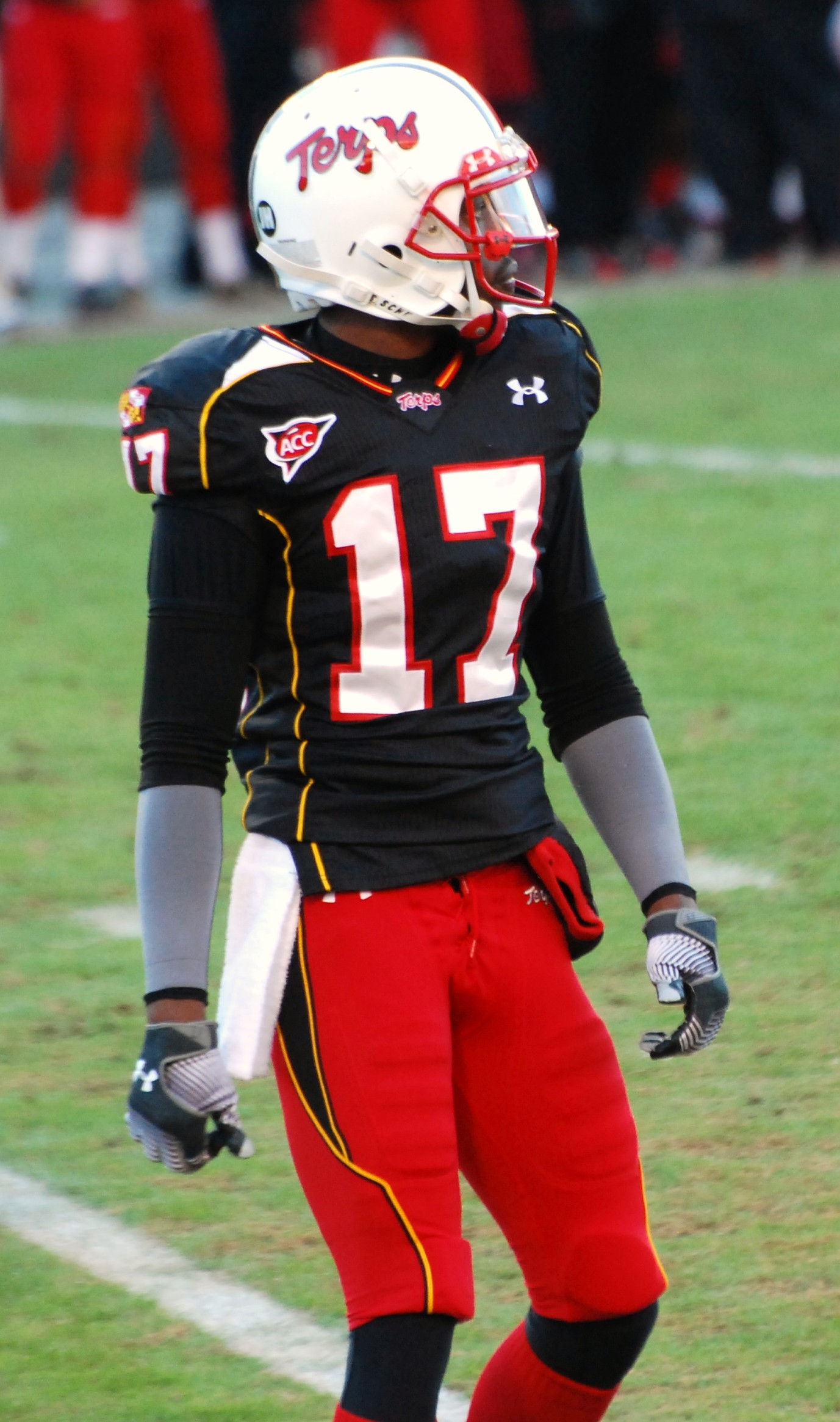
The black/red/black set was very underrated, and the Terps made Aachen Bold pretty famous.
It's just so... thick.

-
 7
7
-
-
Agreed. ^^
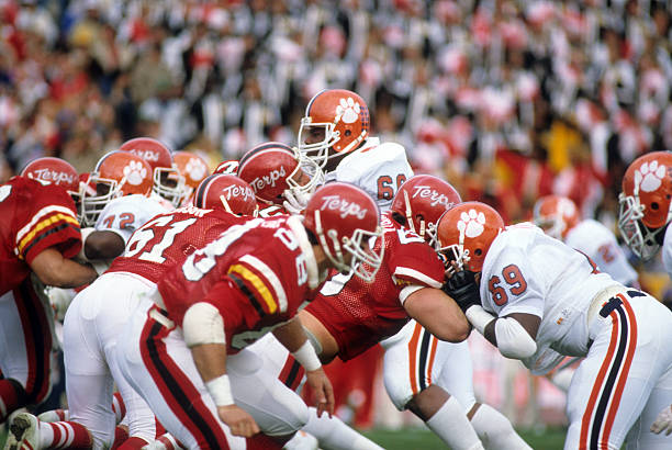
These posts had me looking back at their uniform history. Maryland has had some decent looks over the years but I don't know if I could say they have ever really looked good. In fact, some of their sets were pretty terrible.
(Spoiler tag so that this isn't a wall of photos.)Spoiler

The helmet and pants here look like they belong on Missouri.

Mentioned what I didn't like about these earlier in the thread.

If I didn't know better and could not see any logos, I don't know if I would have guessed this was Maryland.

Decent, but those shoulder stripes are atrocious.

They went through an awkward, overly-piped, phase

Gradients?
These were about as close as they've gotten for me but I'm not feeling that number font.


I'd like to see more of the Terrapin over the flag.

I think they could do some cool stuff by sublimating the shell pattern in small doses. Something similar to what TCU had done very well at times. Maryland could absolutely pull off a refined, modern set, but for whatever reason, they like being a bit extra.

-
 3
3
-
-
1 hour ago, SmackNCheese said:
Willing to permanently redact my "Maryland doesn't fit in the B1G" argument if we can have this match-up every 2 years.
It does look nice! And I agree, certainly a more fitting B10 look. But I will say Michigan looks so good that they can help make just about any uniform match-up palatable. Best uniforms in football.


-
 3
3
-
-
On 4/25/2020 at 3:12 PM, DNAsports said:
Far and away the best is D
I'll be the contrarian and choose B. Black is a school color, so it doesn't feel BFBS to me. The over-designed aspects are muted and aren't too in-your-face like they are in A. The gold and red provide nice contrast against the black. Not a perfect uniform by any means, but I like the overall aesthetic. I'll take it as an alternate.While I also like a lot of throwbacks, and love helmet scripts, I didn't care much for the original design of D. Particularly the asymmetric coloring of the sleeve stripes, and the lack of gold on the helmet and pants. The striping patterns don't necessarily need to match, but the different elements do not feel cohesive.


This might be my favorite Maryland look. They need to tone down the flag elements they use, but I still prefer Maryland in modern/edgy form.

 s
s
-
 10
10
-
-
1 hour ago, MJWalker45 said:
Numbers and wordmarks form the school's site.
https://logos.virginiasports.com/#marks
https://twitter.com/VirginiaSports/status/1253707882136252418/photo/4
While the actual weight of the numbers seems fine, the added lines make the numbers look kind of fat, for lack of a better word. For example, I see the top of the 9 as a beer belly hanging out. Maybe inflated would be a better term. -
On 4/10/2020 at 8:27 AM, canzman said:
These Pats uniforms are great starts but you are missing "TV" numbers on the shoulders or sleeves. For standard uniforms they are required by the NFL. They let it slide for "one offs" like Color Rush or Throwbacks for standard home and away uniforms they are required.
Thanks! TV numbers have been added.
On 4/4/2020 at 7:46 AM, Punchy_Gungus said:Pats look great! I think I slightly prefer the white versions. I love the jersey striping and stars on the sleeve cap, although that may not leave room for TV numbers. I'd also like to see the pants stripe in more detail, as I can't tell what exactly it looks like. Overall, this is amazing and would be a great direction for the Pats to go. Great job!
Good call on the TV numbers. I had to shrink the stripe to get everything to fit, so there is a lot going on up there now.
I may need to come up with an alternate angle or something for the pant stripe since there's not a good way to see it with the way I'm presenting it. This is what I had in mind though --
 On 4/10/2020 at 8:03 PM, SEANL said:
This is one of my favorite concepts for the Patriots I've seen that uses the current logo. The only thing I would want to see is what the jersey would like like with the sleeve striping actually following the seam rather than keep an angle to the chest.
Good thought, and I had something that would have looked closer to that initially. I may revisit this later to see if I can improve on the shoulder design.
For now, here's the update I have.


Alternate white look --


Likely will be moving on to the next team from here -- either the Bucs, Chargers, or Rams.
-
 6
6
-
 1
1
-
-
3 hours ago, Midway said:
An original take, I dig it! Though it is odd to see the 3 striped socks reappear here. It just seems so synonymous with their look even though they don’t and have never actually matched any other part of the uniform.
Thanks! And I agree with your take here. I almost went with a blue/red stripe to match what I have on the shoulders instead, but ended up settling on what they've been using.
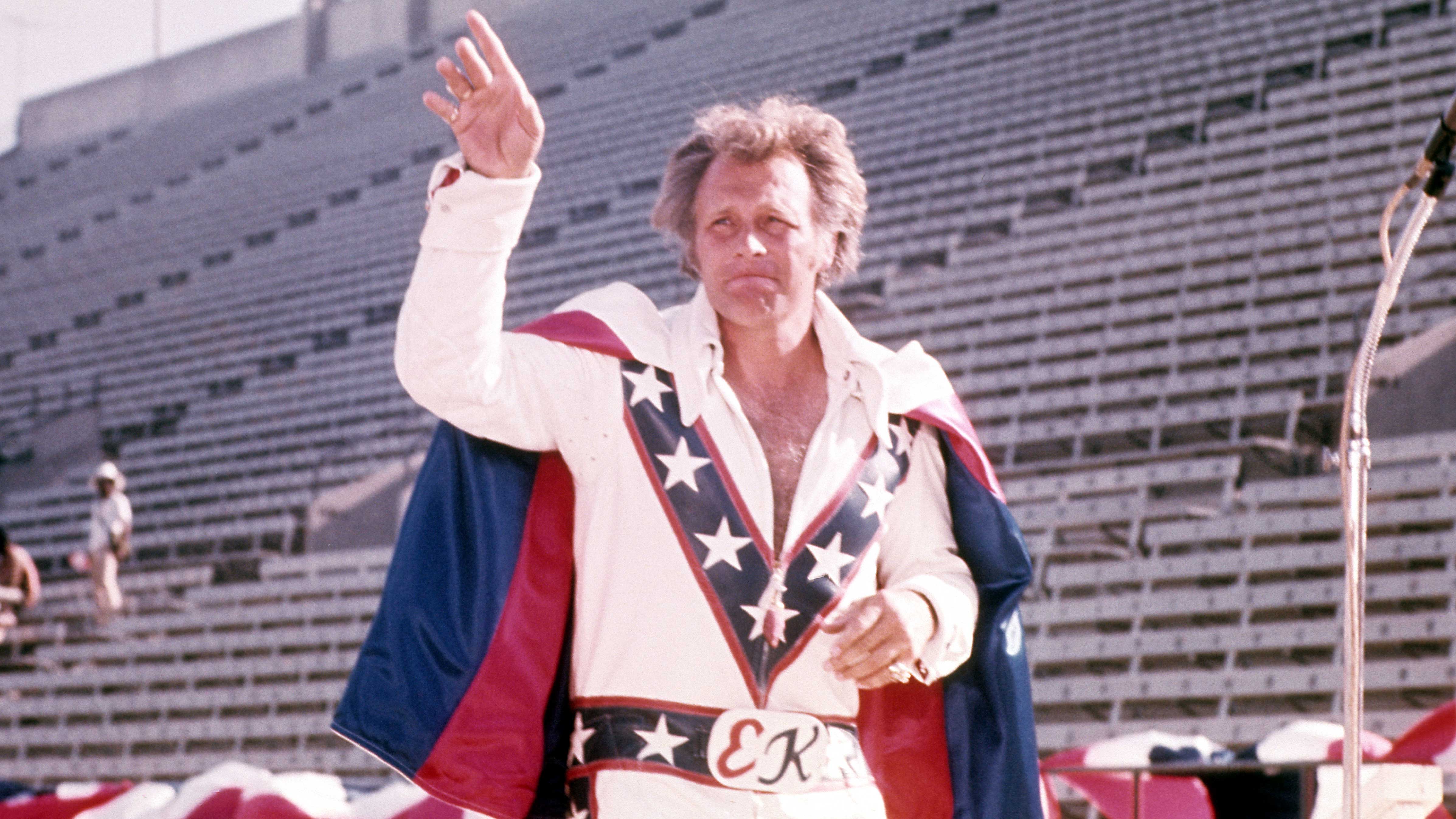
Here's an alternate idea I've been playing with on if they were to ditch the silver. I am afraid these colors with stars and stripes might be putting off too much Evel Knievel vibes though.


-
 2
2
-
-
Moving on to the Patriots. I liked the symbolism from this 'unofficial' flag of New England featuring 6 stars for the 6 New England states. Patriots also have 6 Super Bowl trophies now, so it seemed like an interesting time to put more emphasis on the 6 states of New England.

I used the star pattern on the sleeves. I started with the color rush striping pattern, but ultimately moved away from it as it made the shoulders feel too busy next to the star pattern.


I prefer the silver pants for New England as I feel the navy pants makes this too bottom heavy. However, they look more like the Patriots here.

Thoughts?
-
 16
16
-
-
On 3/21/2020 at 8:18 AM, 8BW14 said:
The brown outline isn’t bad on the orange jersey but maybe try a drop shadow?
There would be a precedent for the Browns and it adds to the old-school vintage look you’re going for with the cream
Thanks for the suggestion! I think it looks great. Thoughts?

-
 9
9
-
-

Here it is with an outline. I kinda liked it with the brown TV numbers -- it reminds me of the Ohio State alternates.
-
 2
2
-
-
3 minutes ago, WavePunter said:
White numbers with no outline works for Tennessee, so the Browns should be just fine.. your jersey is much lighter than your helmet and accessories, so adjusting that will help as well.. also worth noting, the orange jersey is an alternate.. it's allowed to be a bit different.. or, if "consistency" is holding you up.. you could argue that all jerseys have numbers with a brown outline..
Somehow that thought never crossed my mind. Great point.-
 2
2
-
-
-
Here's what it looks like with cream numbers. I wasn't sure if there was enough contrast between the cream and orange, and it may need an outline like @chcarlson23 suggests. I'd like to keep it consistent with the other jerseys though, which would mean outlines on all 3 jerseys.

Also, I put together a brown pants and cream sock option for the away set.


Yes, might be getting a little crazy here, but...
MONO. CREAM.

-
 3
3
-
-
Here's the full set.

I avoided brown pants. I also went with brown numbers on the alternate, as the cream on orange didn't have much contrast.


-
 14
14
-
-
3 hours ago, 8BW14 said:
Not crazy about the orange outline on the numbers. I think the Browns should be a single-color number team for life. Love the off white though.
10 hours ago, Punchy_Gungus said:Th browns a bit too dark, it looks almost black. Still a great start for the Browns.
Here's an update. Lightened the brown and removed the number outlines. I think that helped quite a bit, as now it feels much more like the Cleveland Browns. Thanks!

-
 1
1
-
-
5 hours ago, Punchy_Gungus said:
Th browns a bit too dark, it looks almost black. Still a great start for the Browns.
Thanks! I will lighten the brown before completing the full set.
-
Updated the sleeve design to the more traditional look. Thoughts @jp1409?

Also, I've added TV numbers. I've updated the helmet bumper to the NFL standard white, and added "Browns" across it. I suppose I might ought to also make the chinstrap white as well for accuracy.
I wanted to finalize the design here before making the away and alternate. I will work on getting those posted for a complete set later in the week.
-
 6
6
-
-
I've started the second team -- the Cleveland Browns. Will put together an away, and an orange alternate as well. Here's a preview!


-
 3
3
-
-
2 hours ago, L10nheart404 said:
Great, last one... Can you do that same combo for me, but with the black he's instead?
Some variations with the white/white and black lid.


-
53 minutes ago, KevinJohnsonThaTruth said:
Can I see a red helmet, white jersey, white pants, red undershirt, red socks, white shoes combo?

-
 7
7
-
-
3 hours ago, SEANL said:
These are great - I cannot tell which lid I like more and the metallic finish is perfect. The striping pattern is unique, clean and exciting. I also like the lack of outline of the striping. The grey pants fit the team identity. Overall great!
The numbers throw me off a little bit as if they clash stylistically with the striping patterns, but I can't tell if it is the font, the actual number 21, the outline or the position the player is in.
The Falcons would definitely benefit from a re-brand, so I am glad they are doing that. If they can get anywhere close to a design like this it would be a success.
Thank you! Great feedback. Placing the numbers correctly gave me some trouble and they never quite looked right to me either. I will try to clean that up with the next set.
I could definitely see how a more angular font may have paired better here. I tried going with a more traditional block look in an effort to tone down the "edginess," if you will. I prefer a more traditional look from Atlanta, so it was my attempt at blending the two styles.
Also, I don't know that I've actually mentioned this, but the striping pattern on the shoulder was pulled directly from the wings of the logo. If you flip the logo around, you can kind of see it.
-
 1
1
-
-
30 minutes ago, aawagner011 said:
Not to mention that teams are allowed 85 scholarships plus however many walk-ons, so it is very realistic to have over 100 players and not have enough numbers for everyone. This is not even getting into the fact that each position may wear certain numbers, dictating number availability. It wouldn’t be possible without duplicates.
Good point.

And I just wanted to say I noticed you made the 960,000th post on this board. Congrats bro!


-
 8
8
-
-
Thank you! I appreciate the feedback from everyone to get me to try it with a red helmet. I didn't think I'd like it as much as the black helmet, but I think I actually prefer the red lid over the black after comparing the two.
Now, I'm thinking of switching gears and making this a series. It'd be my takes on the changes coming around the league this offseason as @oldschoolvikings has done. I'll update the thread title once I post the next team. You can expect the Chargers, Bucs, Rams, Patriots, Browns to be coming at some point this offseason.
If I'm still going strong with this after that, I will work towards completing the league.

-
 7
7
-
-
Here's an update of sorts. I've darkened the red to more closely resemble this new wordmark.

Also, used the 'ATL' in Atlanta as the helmet bumper, and 'Falcons' as the new chest wordmark.


I've also added a metallic red helmet as a variation of the original set.


-
 16
16
-


:format(jpeg)/cdn.vox-cdn.com/uploads/chorus_image/image/55798755/513474.0.jpg)
/cdn.vox-cdn.com/uploads/chorus_image/image/55225917/716230.0.jpg)


/cdn.vox-cdn.com/uploads/chorus_image/image/65605601/usa_today_11388861.0.jpg)


 s
s


College Football 2020
in Sports Logo News
Posted
It looks edited to me. There are a couple places where you can still see traces of the beveling, and they happen to be in corners where a soft, round Photoshop brush may not quite fully reach if someone were to quickly paint over the numbers. But as you suggest, I'd imagine it is indeed a sign of things to come.