


j'villejags
-
Posts
1,242 -
Joined
-
Last visited
-
Days Won
4
Posts posted by j'villejags
-
-
4 minutes ago, DCarp1231 said:
Absolutely no harm in unveiling 3PM EST/12 PM Mountain/Pacific ST
Funny that they scheduled it right before the Suns game so that no one outside of this board will be paying attention. Almost like a Friday news dump. -
7 minutes ago, DCarp1231 said:
What happened to
Amelia Earhartall the flag sublimated uniforms?
What a gnarly way to go. -
6 minutes ago, Survival79 said:
I promise I won't do it again... in this thread.

I think our collective hearts skipped a beat imagining them doubling down with more piping and side panels.-
 1
1
-
-
Just now, GDR said:
you have no idea what you just unleashed in this thread lol
Survival is our Dillon Brooks. He’s poking the bear(s).
-
 1
1
-
-
Just now, DCarp1231 said:
Oversimplification? In this economy?
Oof. I’ve been duped. Lol -
2 minutes ago, Survival79 said:
TEMPE — The Cardinals will have a (slightly) new look this season, but it's not a dramatic change, and perhaps not one most people will even notice.
When Nike started making NFL uniforms in 2012, the red they used was the one in their color book that most closely matched the Cardinals' color, but it was not an exact match. In recent years they have added more colors to their color book, so they now have a closer replication that is more in line with the team's red – Cardinal red.
The color correction coincides with Nike's shift to a new uniform technology. While there have been reports that other major changes were afoot, the team is not dropping black from the color scheme or making any other drastic re-designs.
Makes me think they are going with the Jacksonville route by way of oversimplification. Either that, or more piping. -
4 minutes ago, panthers_2012 said:
So, how are we holding up?
Still think the uniforms are gonna suck, but let's be hopeful.
I think they’ll be mostly good, with one or two head scratching elements that should’ve been refined. -
2 hours ago, McCall said:
So that A's City Connect uniform is gonna be a pretty awkward situation.
Oakland!! This one’s for you!!-
1
-
1
-
-
EDIT - duplicate lol
-
6 minutes ago, AdobeDesignBG said:
What time zone is this?
It's Arizona time, which is Pacific time since they don't acknowledge daylight savings. Their 7 PM is 10 PM eastern.-
2
-
-
1 minute ago, Carolingian Steamroller said:
I love me some Leslie Nielsen.
This thread tonight:-
2
-
 3
3
-
6
-
-
2 minutes ago, jerrylawless3 said:
Can't tell if the tiny Lorem Ipsum is just a designer's mistake or another troll job
Damn. Good eye!
-
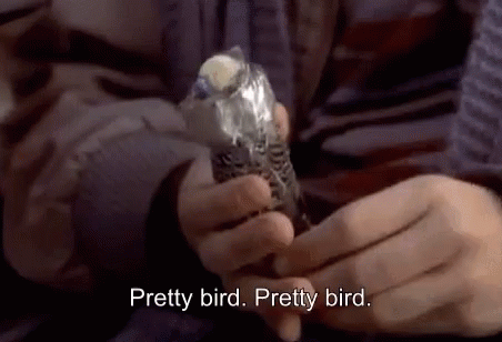
12 minutes ago, leopard88 said:
I think this is our guide --
Grey helmet with red on front and eyes, like an actual bird head
Orange facemask to emulate the beak
All grey jersey and pants
Grey socks with an orange stripe to emulate the legs.
It's just so obvious!!!!!!!!!!!!!!
Such a pretty bird.-
2
-
10
-
-
16 minutes ago, VDizzle12 said:
Some of the results are definitely.....interesting.
https://web.witcontests.com/browns/contest/design-your-ideal-cleveland-br-230405
Not that it's unexpected, given it's a fan contest. I started up top but I'm sliding.
I think your entry is my favorite. I’m gonna vote!-
1
-
-
2 minutes ago, Gary said:
So 7ish
7 Phoenix time — damn they are really going to drag this thing out. -
2 minutes ago, jerrylawless3 said:
Michigan > University of Michigan > Go Big Blue
BLUE IS IN THE COLOR SCHEME
I’m thinking it could mean that Michigan’s brother is Michigan State. Saguaro green confirmed.
-
5
-
-
3 minutes ago, MCM0313 said:
Saints should use everything from their white Color Rush set except the socks.
Pretty easy fix.
-
16
-
1
-
-
51 minutes ago, Karnage84 said:
This is a great series. Looking forward to seeing what you have in store for the Lions. I'd suggest something along the lines of what you've done with the Browns - a great blend of traditional/modern. Incorporating white would also be a good idea to add a little more contrast to their current set. I feel like Carolina is moving in the direction of Carolina blue/black, so I don't think Detroit should go that way with black and/or a black jersey or helmet. It does look cool but it's also very reminiscent of the Matt Millen days which we want to forget as a franchise.
I appreciate it! Good insight. I’ll add the Lions to my queue. I do have a general sense of what I’d like to do with them, and it does not include black.
-
21 minutes ago, TrueYankee26 said:
I realized it on this post lol. I have been pronouncing it sa-gwar-oh all this time
Username checks out.
-
4
-
-
Thoughts on this direction for Arizona? Tried to pull from the clues and colors that have been posted, while putting my own twist to it.
The maroon to orange gradient gives off a copper vibe without actually being copper. I couldn't help myself and did end up using a copper facemask -- (although it sounds like copper won't actually be used on the actual set).
I am interested in adding some detail to the shoulders or shoulder caps. However, it seemed like anything I did to the jersey made the pants and helmet look excessively loud. I played around with the idea of a stylized AZ flag, and tried another gradient. I have also tried to visualize a feather pattern a la Oregon. But again, I think it quickly loses its balance and becomes too much.
Certainly welcome any thoughts and opinions. I'll add a road and alternate variation, but wanted to get some thoughts first to refine this.
--
@HOOVER wanted to share the update-
1
-
 1
1
-
-
4 minutes ago, tBBP said:
I can't understand the disdain for the Panthers, either. I've always liked their uniforms...I don't like, however, some of what they've done to/with them lately.
Now the Snatit is a different story. From having lived in Nashville when those first came out to now, I've tried—really hard, in fact—to find some redeeming quality in those sets, and to date, I've found exactly two. I will say that I like the shape of the shoulder yokes—I've even somewhat reluctantly come around on the two-tone gray treatment (two-tone blue, two-tone gray...ehh, I'll let it ride). With that, and it being the same color on all their jerseys, I also like how the two-tone grays plays against each individual jersey color; coincidentally, I find myself liking it best with the columbia blue jerseys. But that for me is where it stops. Now I can't get on Nike for the navy helmets, as I think that was the league's idea to go from white to navy, but that logo really doesn't read well against the navy helmet...and that silver/white stripe is just out of place (perhaps its too should've been two-tone gray). Then there's the numbers, a classic case of Nike "doing too much"...especially when one number pair, 11, looks stitched on backwards. But perhaps my biggest gripe—and this is probably more on the team since I watched this slowly happen during the years I lived there—is how they pushed their most identifiable brand element—columbia blue—not even to the back burner, but dang near completely off the stove.
Now, if y'all wanna know something funny...
I've always felt the Cardinals' uniforms got more hate than warranted. Of course that won't matter after today so...

Oh wow. I don't know how I've never seen those before (what team is that?), but that color combo actually looks pretty nice!
Jacksonville Bulls — a USFL team from the 80s. -
3 minutes ago, buckeye said:
There's no way they can be worse than what they're changing from... right?
-
9
-
4
-
10
-
-
23 minutes ago, gothedistance said:
Or a QB who isn't that good.
Read this in her voice.
-
1
-
-
On 4/10/2023 at 6:45 AM, HOOVER said:
@j'villejags just stumbled upon this thread after seeing the link in your signature. These are, I think, the nicest concepts I've seen done on these boards. Nailed the Browns. Love the star patterns on the sleeve of the Patriots and avoidance of Navy pants; the Falcons concept is 1000x better than what we ultimately got; ditto with Washington. The artwork/template itself is just beautiful.
If you ever decide to dust these files off again, would love to see the Falcons Black jersey/Grey pant set with an Anodized/Satin Silver helmet, and anything else you'd come up with. Maybe a good time for a Cardinals attempt?
Thanks! Appreciate the kind words. I might get back into it at some point. Time has not been on my side, so I’d set this aside for the most part.
That said, I can definitely attempt the Falcons tweak you’re describing. And I agree, I’d like to try Arizona at some point. I’ll tag you if/when I post an update!
-
1
-


_(cropped).jpg)


Arizona Cardinals new uniform extravaganza
in Sports Logo News
Posted
Graphic on the faaarrr right has some gray in it. And I do see a couple pieces with darker red tones. But I feel like I'm reaching. Don't see anything to indicate an actual change to their color palette.