

JayMac
-
Posts
5,470 -
Joined
-
Last visited
-
Days Won
2
Posts posted by JayMac
-
-
Bye bye, Florida Panthers. Quebec City will finally get their team back soon. Will it be the Panthers or the Coyotes?
-
Anyone know what fonts were used for old NBC and CBS football scores in the 80s?
-
Seattle's logo with the blue is far better than the 2012-current version with grey.
I'm torn on this one. I think the gray makes it pop a bit more though. But IMO, it's a toss up.
-
I disagree with your statement about the NFL being diluted. 12 good QBs? Not by a long shot. In fact, I could easily think of 4-5 backup QBs that could easily serve as starting QBs if given the chance. The NFL is the most balanced league based on talent out of the big 4 easily.
QBs is a bad position to make that certain kind of point. With the new rules and pass happy offenses, there are many good QBs. A better position would be RBs or CBs. There aren't that many good ones. But overall, the talent pool isn't good enough for 32 teams even in the NFL.
NHL will expand to 32 teams in the next coming years. The twos teams recieving teams will be Seattle and Quebec City. Both cities have arenas to play in and blatant rivalries. Seattle will start in the Pacific Division. Quebec City will start in the Atlantic Division, Detroit will move to the Central.
The NHL will not move Detroit back to the western conference. Imagine the uproar. It would be worse than it was before realignment.
-
I remember watching a replay of 'The Drive' and I remember seeing a player for the Broncos with 3 letters and I remember how spaced out it was.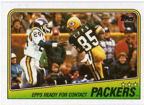
Another unpopular opinion is my love for the Vikings with a white face mask.
What I find more fascinating is the huge gap between each letter of 'Epps.'
That's why I originally posted this on the other page... I actually liked the way his name was spaced out on the back.
Edit: After research, the player's name is Clarence Kay.
-
1990 (and here's your bonus player in a wrong uniform):
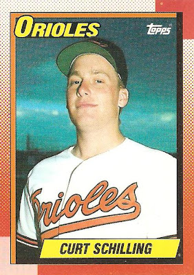
and a player in the wrong body. I love Curt Schilling, but man that dude didn't give one thought to keeping himself in shape or doing any exercising.
My dad was a huge Schilling fan and I used to tease my dad by saying that Schilling got fatter and fatter each year.
-
Which reminds, I prefer pullover jerseys over button-ups.
It's been a while since we've heard this one.
-
My state is kind of an odd one. Half of New Jersey likes New Jersey/New York teams. But the southern half likes Philadelphia teams so I see a lot of New Jersey license plates down here that have Phillies, Eagles, and Flyers logos.
-
Red, navy and white is a cliche colour scheme.
I'm not sure how unpopular or popular of an opinion this is but I am in full agreement.
-
The NFL should have alt helmets. It would let teams try out different looks without doing the full-blown rebrand. Maybe if the Jags could have brought their helmet out as an alt one year, we might have only had to deal with it for two games instead of five years. Alts let teams get some of their crazy ideas out without long-term damage.
Yeah god forbid that they can use more than one helmet per season. Sadly, since they can't even wear throwback helmets anymore, this will never happen.
-
It was a slightly better version of the Dallas Stars Edge jersey. That's not saying much at all.
Black, copper, and white - with the only barely-noticeable blue being on the sleeves - and that could easily be mistaken for black. The Capitals logo I actually like - the colors? Awful.This is better than the blue version of the home/away.

-
I think the NL Central is the most boring division in MLB, both from watching the games and the Uniform/Logo Standpoint
Lots of blandness. I agree. If Houston had stayed in the division, they would bring some needed color to it with their re-brand. Actually, both central divisions are boring.
-
This I can agree with. That unique barley color jersey is perfect for a team named the Brewers. I'll never understand why people would like to see a return of the yellow, when this is their current option.Out of all of the Brewers current home uniforms (i.e. besides the retros), this is their best look:

I think that gold would look a lot better paired with royal blue. I think I hate the navy/gold color combo more than the uniform design itself.
I love the gold colored jerseys. I think they should go for a color in between navy and royal blue though.
-
Back in the day it was because the die in colored socks would bleed into a players skin and was toxic so they wore white socks and stirrups to help that. Now there really is no need for them and I hated reading uni watch because of Paul lucus' boner for themI've said this before, but I think stirrups in baseball look stupid. They're a bygone relic from another time and I don't want them to come back.
They looked especially bad in the 80's style with the thin stripe of color.

I'm usually a traditionalist when it comes to sports aesthetics and I wore stirrups every year as a little leaguer, but I'm also about functionality and practicality. What is the point of that pencil thin piece of fabric and how does anyone think it looks better than a fullcolor sock?
I guess that's why the white socks are called sanitary socks.
-
That is a very strange sight
-
NFL - Seattle Seahawks: I loved the old color scheme and my first ever jersey was a Steve Largent replica back in 1987. They have been my team ever since.
MLB - Philadelphia Phillies: home team
Baltimore Orioles: I was a huge fan of Cal Ripken Jr.
NHL - Philadelphia Flyers: home team
NBA - Philadelphia 76ers: not a huge NBA fan but they are my home team
College Football - Pennsylvania State University: my alma mater and favorite NCAA team since I was young
Florida State: Somewhat of a bandwagoner on this one. When I was young in the late 80s/early 90s, I didn't know any better and like both FSU and UF. My dad said I couldn't do that so I picked the Seminoles.
Soccer - Chelsea: I saw a random EPL game with them and Liverpool in 1999 or 2000. This was before they were really good. I liked the way they played and they were a bit of an underdog back then.
-
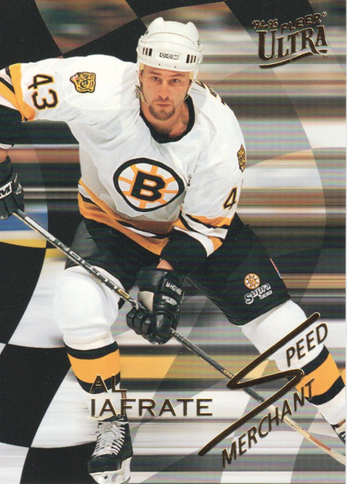
He bounced around and injures killed his career but man did he have a slap shot!
Nevermind the wrong uniform, that hardly even looks like him! Where is his signature pony tail??
-
After seeing the previous posts, I like the Milwaukee one in the Norris Division. However, no "sections"? You know, 2 4-team sub-divisions?
I would group like this:
1. - Campbell Conference:
1.1. - Smythe Division:
1.1.1. - Northwest: Calgary/Edmonton/Vancouver/Seattle
1.1.2. - Pacific: Anaheim/LA Kings/Phoenix/San Jose
1.2. - Norris Division:
1.2.1. - Central: Chicago/Detroit/Milwaukee/St. Louis
1.2.2. - Midwest: Colorado/Houston/Minnesota/Winnipeg
2. - Wales Conference:
2.1. - Adams Division:
2.1.1. - Northeast: Boston/Buffalo/Quebec/Montreal
2.1.2. - Mideast: Cleveland/Ottawa/Pittsburgh/Toronto
2.2. - Patrick Division:
2.2.1. - Atlantic: Hartford/NJ Devils/NY Islanders/NY Rangers
2.2.2. - Southeast: Carolina/Philadelphia/Tampa Bay/Washington
Any thoughts?
The Flyers have to play with the Rangers, Devils, and Islanders.
-
Oh what could've been for the 80s and 90s Phillies if they had kept him.Still pains me to see this, although, I still wish him the best.
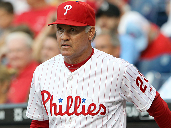
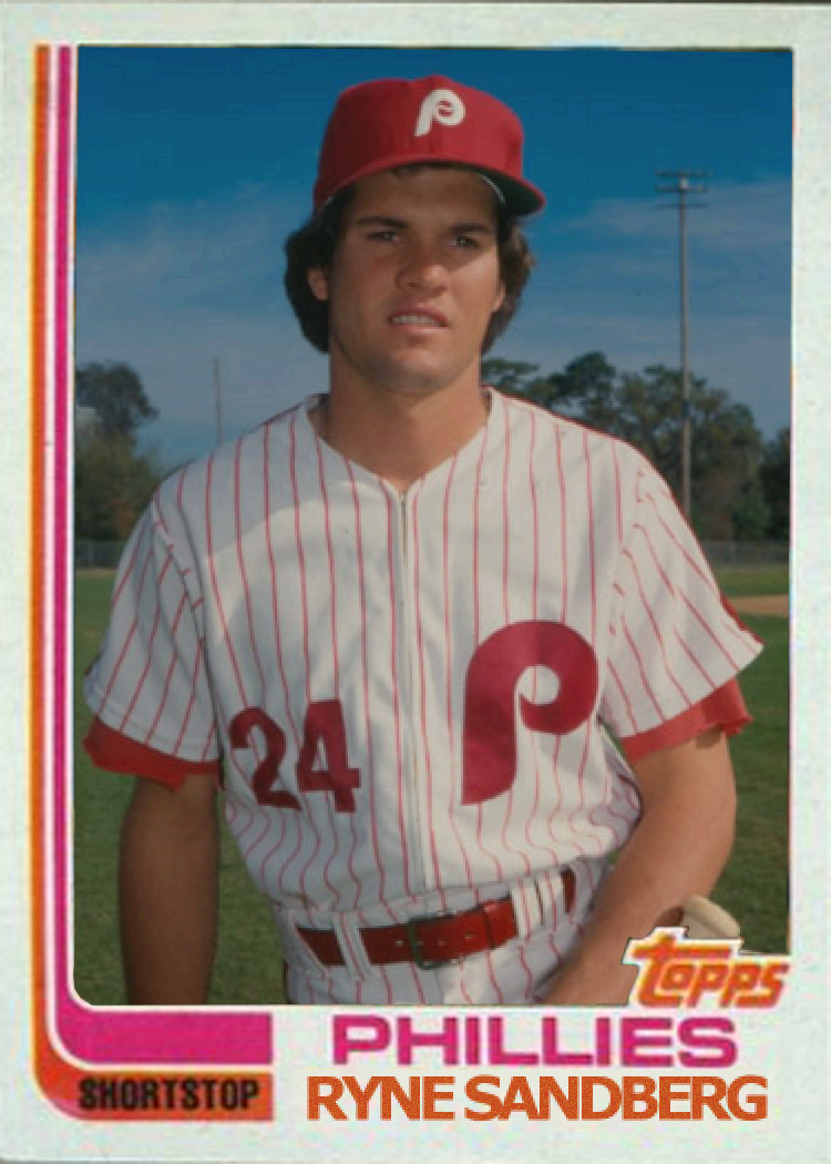
It's where he started
Nothing would have been any different for the 80s or 90s. Not sure how old you are but that was an organization that was not run in a way that was conducive to winning, or even competing. Also, not a single negative word has been said about him, so I'm not sure what you're talking about. When the team flops (or players start dying on the field due to old age or osteoperosis or something, because old), it will be on RAJ, not Sandberg.
I'm 32 so I do remember some of those crappy teams. He would have made them at least watchable. As for him taking the heat when the team flops, he will be the scapegoat once RAJ is gone.
-
Still pains me to see this, although, I still wish him the best.
It's where he started
Oh what could've been for the 80s and 90s Phillies if they had kept him.
-
Still pains me to see this, although, I still wish him the best.
He won't have much of a shot because the media around here are bashing the team and saying they are too old. Rightfully so and it's a shame because it won't be his fault.
-
The Sixers better use the black and gold for the banner. I understand he came back for that one year and wore the current look but the black and gold is his era.
-
The Phillies home uniforms bother me to no end. We look minor league.
I can't stand the road unis. They are so outdated.
-
These black Flyers jerseys were pretty good.
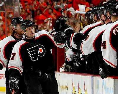
If they had a hem stripe in the same scheme, they'd make an excellent third for the Flyer's current set.
I don't think that's too much of an unpopular opinion among us Flyers fans. It's when they became the default away jersey that people (including me) had a problem with it. The Flyers are orange and black but that was a great alternate.
-
 1
1
-

Rare team matchups
in Sports Logo General Discussion
Posted
Wow. Jon Kitna in his early days after the NFL Europe stint.