-
Posts
1,366 -
Joined
-
Last visited
Posts posted by ltjets21
-
-
Sigh, I really thought the large city wordmark era was officially over.
-
 2
2
-
 1
1
-
 1
1
-
-
-
1 hour ago, BBTV said:
Speaking of the Jets, the undeniably best UW piece ever - every little detail about the Jets last redesign - came out today. Everything about Woody Johnson asking how to know what’s “cool”, to the NFL giving Nike the brand, and them coming back with alternative suggestions only to be told to “know your role and shut your mouth”, to the design being THISCLOSE to being a green and white version of the Steelers batwing uniform. Lots of unused concept logos and unis in there, and more real-world examples of how the league, team, and Nike interact (including the league giving Nike their version of the story they want told, then Nike coming out with their version of the Nike Speak for it.)
I just read the whole article. Woody being a douche is probably what left us with the half baked elements like the traditional oval and repurposed New York wordmark. But boy this article makes you appreciate what they ended up going with! 3 tone green uniforms? silver helmets? This could have been way way worse.
-
It is funny that the new Falcons logo is very good and probably a better logo but I just happen to like the old one a million times more.
-
 4
4
-
-
I was at the Mets game today and finally got to see the difference between this year and last years on field jerseys. Behind home plate at citi field the Mets sell grossly overpriced game worn jerseys, hats, pants etc. On last years jerseys the orange outline and blue numbers were layered. Now they are this weird frankenstein mix. They aren't like the screen printed twill numbers on the old replica/ swingman jerseys but are only one piece. The orange outline and blue number are connected with the orange outline being raised a little. The jersey patches are an absolute disgrace. They use what appears to be cheap unlayered and ironed on twill. Something truly has to give to end this disgusting disgrace. From a fans standpoint I also cannot imagine these would hold up long after a few washes.
-
 1
1
-
-
6 hours ago, SportsFan12 said:
The internet will ruin the Jets for us. Don't worry.
That user commented that and referenced this picture. i think he believed that these were white socks when in reality its double socks with the white crews pulled up very high.

-
 1
1
-
-
19 minutes ago, VDizzle12 said:
The Browns have done such a good job fixing their branding in the past 4 years. But the logos still seem to be the one spot that they just can't get right. An illustration of an outdated piece of equipment is not a logo, regardless of how iconic it may seem. It makes even less sense now that the team uses two different helmets. I've never owned anything with the helmet logo on it and never will. A dog is fine for the Dawg Pound and Brownie is fine for throwback merch. But the team needs a legit logo. Something as simple as a CB monogram is the best move.

This should be the primary logo, end of story.
-
 9
9
-
 4
4
-
 1
1
-
-
As a Jets fan I am very happy with the revamp. Still interested to see how the helmets will match up with the jersey color. In reality the 2019 jerseys should have been these with a few modern twists. I would've put the abstract jet logo on one of the jersey stripes and done the same on the pant leg but I understand why they went ultra conservative.
-
On 4/3/2024 at 9:52 PM, tohasbo said:
I have always wanted to see an Arena League game. Yeah it may be absolutely silly but also a lot of fun too
Arena Football is the only minor football league that ever grasped my attention. The high scoring aspect is entertaining and it feels like a different product than the NFL, unlike the NFL wannabe UFL, AAF, and XFL . In the late 2000s there was also a very strong brand. Saturday games were broadcast on ESPN. Not sure what really was responsible for their downfall.
-
So I'm still not certain about this rule. I understand a team like the Eagles can have their standard Midnight Green, Kelly, and ALT Black. But could a team Like the Vikings have alternate White and Gold Helmets with no historical precedence?
-
The batterman below the piping on these jerseys is driving me absolutely bananas.
-
 9
9
-
-
For the love of god, can the lakers drop black from their purple jerseys?
-
 13
13
-
 4
4
-
-
What I am confused about this whole thing is don't teams have their own seamstresses that apply names and numbers to jerseys? Am I just making this up? Or were these seamstresses just given these garbage numbers/patches? I wonder what last years numbers and fonts would look like on this current template. I also find it funny how colleges look better than the MLB now.

-
On 2/16/2024 at 8:04 AM, MCM0313 said:
Ah! My mistake. Must’ve been an inaccuracy within the game I played a lot.
Did they continue to also have the helmet and the conference logo in the end zone all the way up through 1997?
https://www.gridiron-uniforms.com/fields/controller/controller.php?action=main
This is a great website. A database of field art and covers most teams entire histories.
-
 2
2
-
-
It might be an unpopular opinion but ever since the LA Super Bowl I've thoroughly enjoyed the templated super bowl logos. I think I even prefer them to everyone designing their own individual logo. I think a lot of the rhetoric around the old logos is rooted in nostalgia. In the first 20 super bowls I'd say there were about 4-5 unique logos. A ton of them also were just generic red white, and blue outside of the logos involving the roses from Pasadena super bowls. I think it is important to acknowledge as well outside of the Scott Norwood super bowl these didn't appear on jersey patches until Elway vs the Packers so I think there were different design influences. Do the logos below show any flare or personality of either New Orleans or San Diego? The one gripe I do have with the current system is that it is a bit corporate but I've gotten passed that.

 .
.
-
 4
4
-
-
1 hour ago, GriffinM6 said:
I still think the Jets would be better off making minor tweaks to the Sack Exchange uniforms. I'd like to see them keep the current unique block font rather than go back to a generic one. A small Jets wordmark at the base of the collar wouldn't be too shabby either.
I wouldn't say the Sack Exchange numbers are generic, look at the bend on the 7. I believe this is a champion block font which used to be quite popular but now I don't think it is used anywhere.

-
 5
5
-
-
On 1/15/2024 at 9:07 PM, Brave-Bird 08 said:
My biggest pet-peeve with the Buccaneers, since they are actually wearing red tonight, is that the orange stroke on the numerals is too similar to the red and makes it look like the numbers are just pewter-red-white instead.
They should widen that stroke, change the shade of orange, or even drop the pirate ship logos from the sleeves and add a stripe sequence where the orange pops a bit.
Just a shame that the color is part of the scheme, but really gets drowned out by all the pewter and red.
In this day in age especially, if it aint broke dont fix it.
-
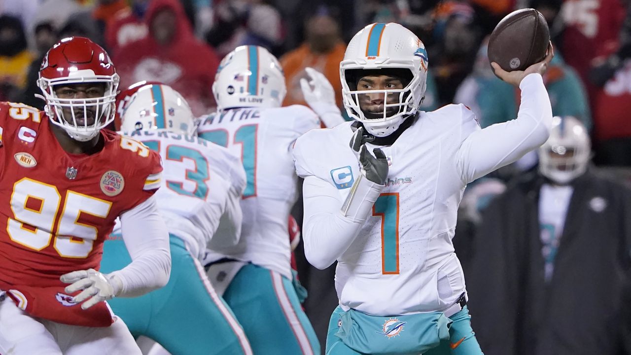
Dolphins finally got aqua and logoed hand warmers. In year past they had these Navy ones that stuck out like sore thumbs.


-
On 1/8/2024 at 7:43 AM, canzman said:
I don't know if I am alone on this one but I am upset the Bucs are playing on Monday night for a second year in a row. Personally I always enjoyed when a warm weather team hosts a playoff game in the sun. It is even more at risk since the Rams and Chargers moved into a roofed stadium. I can only count on 5 or so occasions we have had it in the last 15 years. JAX vs Buffalo 2018, TB vs Philly 2021, TB vs LA 2021, SF vs MIN 2019, SF vs NO 2011, and MIA vs BAL 2008.
-
-
32 minutes ago, aawagner011 said:
Mets new Nike fan replica has been released. Looks largely the same.
While we have been ragging on a lot of the new Nike designs, I will admit getting the front numbers and sleeve patches back on the replicas is a major win. They were only available on the authentics under Majestic and then Nike continued to use rebadged Majestics product for the first few years of their partnership.
I'm not sure if these are replica jerseys. Those typically have came without patches or front numbers.
-
-
48 minutes ago, GoHawks said:
Jerseys worn for every game are picked out prior to the season starting and no one knew this would be a primetime game till this week so they probably picked out the white and are unable to change it now.
I wonder when the last time they wore white at home for a primetime game. As far back as I can remember in the early 2000s they always wore teal/aqua or orange.
-
5 hours ago, timjameskohler said:
So the Titans and Texans are going to have the same color scheme?


 This.
This.


/cdn.vox-cdn.com/uploads/chorus_image/image/71018418/1241555516.0.jpg)

 .
.


MLB 2024 Uniform/Logo Changes
in Sports Logo News
Posted
So I recall the argument for the small names and numbers seemed to be to make them as "light as possible". I wont say these are quite as big as last seasons name and numbers and this I don't believe this an on field jersey but it just proves that everything said is nonsense to cover their asses. Hopefully everything starts to change soon but my biggest fear is the batterman sticking below the collar piping.