


ltjets21
-
Posts
1,366 -
Joined
-
Last visited
Posts posted by ltjets21
-
-
18 hours ago, MJWalker45 said:

Unfortunately I think we'll get pants that match the jerseys instead of that light color that's on the hat.
In my opinion there is nothing really wrong with these. Much better than the previous two years and more in line with the Home Run Derby Jerseys of the past. The only issue is them replacing the team uniforms everyone loved so dearly.
-
 13
13
-
-
18 hours ago, monkeypower said:
Has there been any rumblings of a Jets throwback look?
I ask because the release of the black helmet last years kind of implied that throwbacks would eventually show up and there have been plenty of throwback logo appearances, the original full plane logo and the 80s-90s logo, on the coach apparel in offseason content.
I was lead to believe it would be a tribute helmet. This would mean it would have the green shell they currently use but with the retro facemask and logo. However, since we haven't seen anything this late in the game maybe it has been scrapped.
-
7 hours ago, Old School Fool said:
I was going to say the Bills but they got new uniforms with the Seahawks at the same time. So I guess both of them were the first.
Also, this Bills look was stupid. I don't hate it completely but I think it's just stupid if that makes any sense. How are you gonna have a royal blue team logo and wear navy top to bottom? Stupid.
Overall a lot of Royal teams seem to randomly claim navy. The Knicks statement jerseys are Navy for no reason. The Blue Jays powder blues have navy hats and accents as well, which looks specifically bad because those are their Division Rivals colors. Spare me that the beak on the Blue Jay is Navy. Hell, I even remember the Cubs used to have a navy BP uniform. All this is basically as bad as BFBS in my book.
-
1
-
-
2 hours ago, VikWings said:
Teams clinching in city jerseys has to stop. But yes nothing will top the Cavs' sleeves.
Like if the Heat clinched in the red alts? I'm fine wit that, but these one year jerseys shouldn't be allowed. At least Denver's is still in their team colors, thank god.
I think the Raptors winning in jerseys that say "North" might've been worse than the T-shirts. Just so cringe at trying to be cool.
-
2
-
-
6 hours ago, Jezus_Ghoti said:
Given how bad some of these new NFL uniforms look with stripeless pants and same color socks, I'm starting to come around on the idea that college football is right and letting legs show isn't so bad. I think I might actually agree with Will Anderson here.
I prefer this:
To this:
Yes....but this on the other hand is atrocious.
-
7
-
 1
1
-
 1
1
-
-
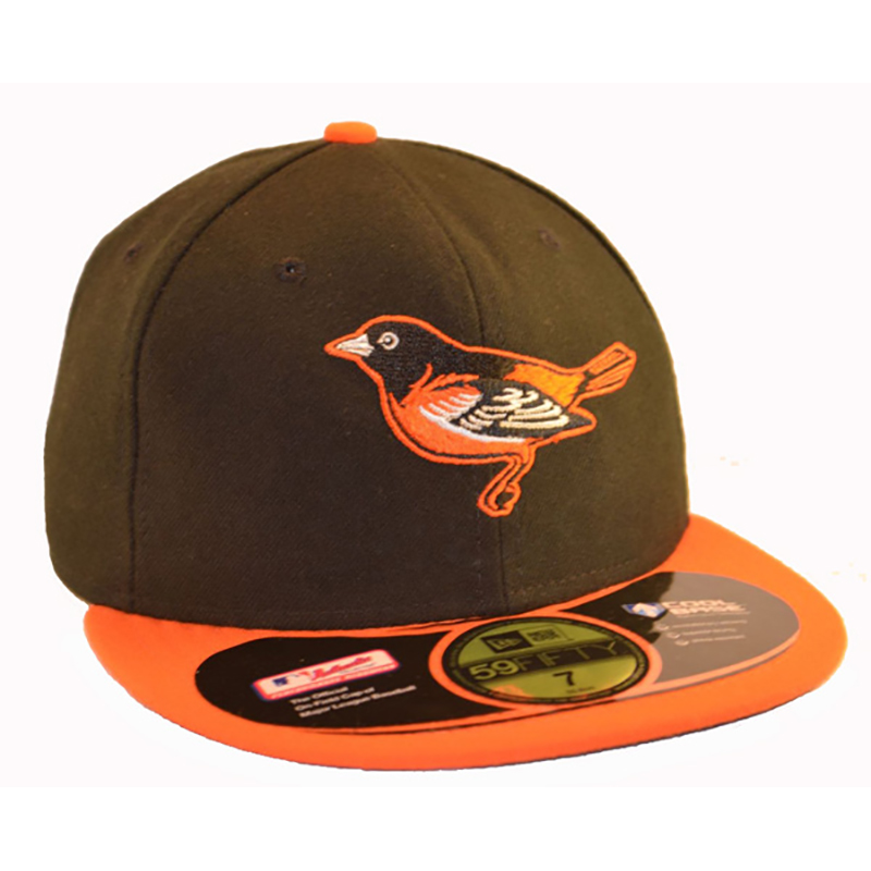
This is the best hat the orioles have ever worn.
-
3
-
1
-
 1
1
-
 4
4
-
-
On 5/19/2023 at 5:43 PM, philly97flyer said:
Any reason the Giants didn’t wear the navy helmets with the white color rush last year, instead opting for switching the decals on their standard helmets like they did in the pre-2 helmet days?
Because the Navy helmets dont match and are stupid.
-
2
-
-
On 5/16/2023 at 1:32 PM, dont care said:
I highly doubt they will use a design element from a logo they had to retire for being Native American.
I hate to go down this rabbit hole but how are zig zag lines Native American?
-
On 5/4/2023 at 11:37 PM, bushy said:
The purple Lakers jersey is so ugly.
It truly is a shame. Do not understand why they ever decided to mess with the purple jersey.
-
6
-
-
3 hours ago, BBTV said:
Mello-era colors with the alt wordmark from the navy jersey could have been their forever jersey.
The current ones are nice enough, but not "strong" for lack of a better term. I'd find it hard to be inspired while wearing navy and dark red. It looks fine on merch, but I think the bright light blue and yellow makes for a better sports uniform.
I think the current nuggets identity is pretty terrible, especially when the Melo set was universally loved. The NBA feels like the only sport teams consistently change their primary colors. NFL you will see shade changed ie the Chargers but never like the NBA where teams like the Jazz, Nuggets, Hawks, and Cavs have changed their overall identity multiple times. It also seems like outside of the Knicks almost all playoff teams are going color at home. First NHL now the NBA? Plus in baseball half the time teams are wearing their colored softball tops at home.
-
6
-
-
On 3/1/2023 at 11:38 AM, WSU151 said:
For 2023, the Vikings and Jets will have “tribute” helmets (not labeled alternate helmets), which means - as far as I can tell without seeing an actual image - they’ll be the current helmet finishes with throwback decals and facemasks (also likely means the black Jets helmet is sticking around at least one more year).
I’m assuming that means 80s throwback jerseys for the Jets, and either 1970s or 1998 throwbacks (25 years since 15-1) for the Vikings.
Where did you see this? Not doubting you just curious
-
50 minutes ago, VDizzle12 said:
Glad to see mine is still in the top 10. But man there's some interesting options to say the least.
Emily Morgans submission looks like a rip off of the Stark Sigil.
-
1
-
-
7 hours ago, McCall said:
So that A's City Connect uniform is gonna be a pretty awkward situation.
Not the first time
-
 7
7
-
 1
1
-
-
15 minutes ago, namefornamesake said:
This entire sequence has made me despise the city of Las Vegas. They have had a boatload of sports teams just handed to them in just the past 5 years at the expense of far more dedicated fans in Oakland. They don't deserve this. They just don't.
I usually agree but the A's have tried to get a stadium done in Oakland for almost 20 years. Hell the Raiders had been trying since before their first move to Los Angeles. Just an uncooperative city and state for professional sports.
-
7
-
2
-
-
3 minutes ago, Bmac said:
I love that the Rays modified the throwback to fit in with their current identity and become a full time alternate. Not everything has to be a direct throwback. There's so many colors in that uniform that it doesn't need to rely on black as the base color. In fact, I think navy compliments the gradient word mark better.
The Mets wear a black jersey and have no other black elements in their other sets. This is how it should be done instead of merging era's for no reason. Lets just hope this eventually leads to a re-brand from the "sun-ray" cop out identity.
-
1
-
-
37 minutes ago, BBTV said:
OMG. It’s not just that there’s so much white space, but it’s “off white” (or just a different material, but either way it stands out way more than it needs to.)
I really thought my Mets wouldn't do this with all of Cohens money. This is a catastrophe.
-
1
-
-
The 3 Artist inspired Nets uniforms have been the 3 worst uniforms in NBA history.
-
2
-
1
-
2
-
 1
1
-
-
7 hours ago, JOEYxFRESCO said:
The Blue that was mentioned in the photos looks nothing like the original electric blue though.
-
1
-
-
9 hours ago, DCarp1231 said:
This likely won’t happen at least for another four years, but good grief do I want Washington to swap their alt black helmet for gold. I don’t even care if they keep the same decal design. Just anything but all black.
I want them to burn that whole identity. Including the stupid name.
-
5
-
-
57 minutes ago, DCarp1231 said:
Drastic color changes happen a lot in sports. Not sure why now it’s a big issue.
I feel like this is only true really in basketball. Do teams change shaded in the NFL? Yeah Chargers, Eagles, Jets, ETC but rarely do you see something NBA esque like the Jazz going from Blue, Green, Gold to Yellow and Black.
-
1 hour ago, Mingjai said:
Was watching a bit of Taiwan-Netherlands. I can't tell if it was the lighting, but Netherlands' jerseys looked navy blue. Even the coaches' gear looked navy. Probably just the way fabric reflects the lighting.
They are Navy Blue. This year their colors are navy and orange
-
3
-
-
1 hour ago, ManillaToad said:
I said their branding is more major league. You'll notice this is the logos subforum and not the sports in general section

No all their branding looks like clip art. Also in this day and age uniforms with no manufacturer look busch league. Just look
how baggy Scooby Wrights jersey is.
-
2
-
 1
1
-
2
-
1
-
-
On 2/8/2023 at 4:26 PM, ~Bear said:
The Jets are in a really interesting situation with their branding and what they should do going forward. Their current set is painfully mediocre and should be changed when they get the chance. The helmets are fine, but the ugly shoulder stripe reeks of the 2010's Nike disasterclass uniform rebrands. The BFBS is probably the worst BFBS set in the league since the shade of green they use isn't bright enough to actually contrast against the black, and instead it creates a horribly muddled look.
In a vacuum, I'd say the Jets should revert back to a set inspired by their 1978-1989 look. I don't think there is any need for black in their branding. They've done it before, both in this historical example and also in their last set (albeit with a darker shade of green), and they pulled it off quite well. I'd also argue that it would preemptively differentiate them from the Eagles should they ever decide to return to a Kelly Green era-inspired set, although given their current success with the midnight green, I'm not convinced they would beyond their planned throwbacks.
Also, regardless of the uniforms, the Jets need to return to their classic logo as well. It was subtle yet clearly invoked the jet imagery they were going for. The current logo is an ugly oval. If it's supposed to be football-shaped...then why have another football IN the logo that tramples over the font?? No iteration of this logo has been very good, and it's time to let it die.2000's uniforms with current "Gotham Green" Call it a day.
-
4
-
-
The Super Bowl LII field was easily the worst in league history. Followed by the uneven and navy heavy Super Bowl XLIX field


/cloudfront-us-east-1.images.arcpublishing.com/pmn/OV647APGKFF5ZE4XZQR4I6KBRI.jpg)


:max_bytes(150000):strip_icc():focal(611x494:613x496)/Golden-State-Warriors-Oakland-jersey-2-c10d626eb92046229f63e6e84d24d1df.jpg)


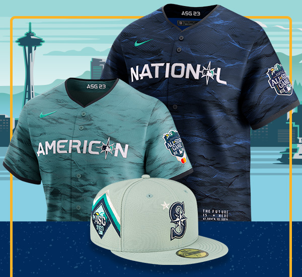
NFL 2023 Changes
in Sports Logo News
Posted
I would've preferred a throwback to this era as well. I almost expected it as well with it being 25 years since their '98 team.