


BJ Sands
-
Posts
3,589 -
Joined
-
Last visited
-
Days Won
6
Posts posted by BJ Sands
-
-
These would be pretty solid, though I don’t love the traditional pants striping with the horn motif. (That’s not a knock at you; I’ve always felt that way about the Rams’ classic uniforms and would prefer just a plain blue stripe.)
-
 4
4
-
-
Bullseye on the White Sox. I’ve never understood why the diamond logo has never been on the home jersey.
-
I love what you did with the White Sox, but I was wondering if you could move the front numbers on the home and first alternate back to lined up with the SOX logo like it is now. You might have to move the SOX logo down a tad, too.
I also feel like the script CHICAGO wordmark should be a little bigger and bolder. But again, these are small quibbles.
-
Am I missing something with the hatred of the new Vandy logo? It’s better than the V they used last year and looks good on a helmet. It’s not great but it’s fine.
-
3
-
-
3 hours ago, dont care said:
San Diego is a no based on their Miami vice-esq socks, also these are city connect uniforms, none will be fauxbacks
Isn’t the Marlins’ kind of a fauxback?
-
What’s with the contrasting belts? There’s some good ideas here but the belts are distracting.
-
6 hours ago, Cujo said:


That is so gross.
And the uniform isn’t great, either.
-
 1
1
-
-
I’m enjoying the hell out of this thread.
-
4
-
 1
1
-
-
-
3 hours ago, Bathysphere said:
I’m predicting the Rams next uniform will be all-white color rush. Probably another new white jersey and pants with exclusively “heritage” accents to honor the Fearsome Foursome era. Or, perhaps, just some new white pants to make a color rush with the current white jersey. I mean, did they say whether it was gonna be new jerseys for both years or just uniforms?
I have a bad feeling it’s a black Color Rush, with matching helmet.
-
1
-
-
20 minutes ago, Ridleylash said:Here's the Leafs' Heritage Classic jersey;
With canvas-colored breezers and gear this could be ok. If it’s blue…
-
1
-
 2
2
-
-
Unpopular opinion: I have no problem with the red jersey. I’d be fine if the white jersey was just a straight white-for-red swap.
-
1
-
-
That’s definitely an upgrade.
-
1
-
-
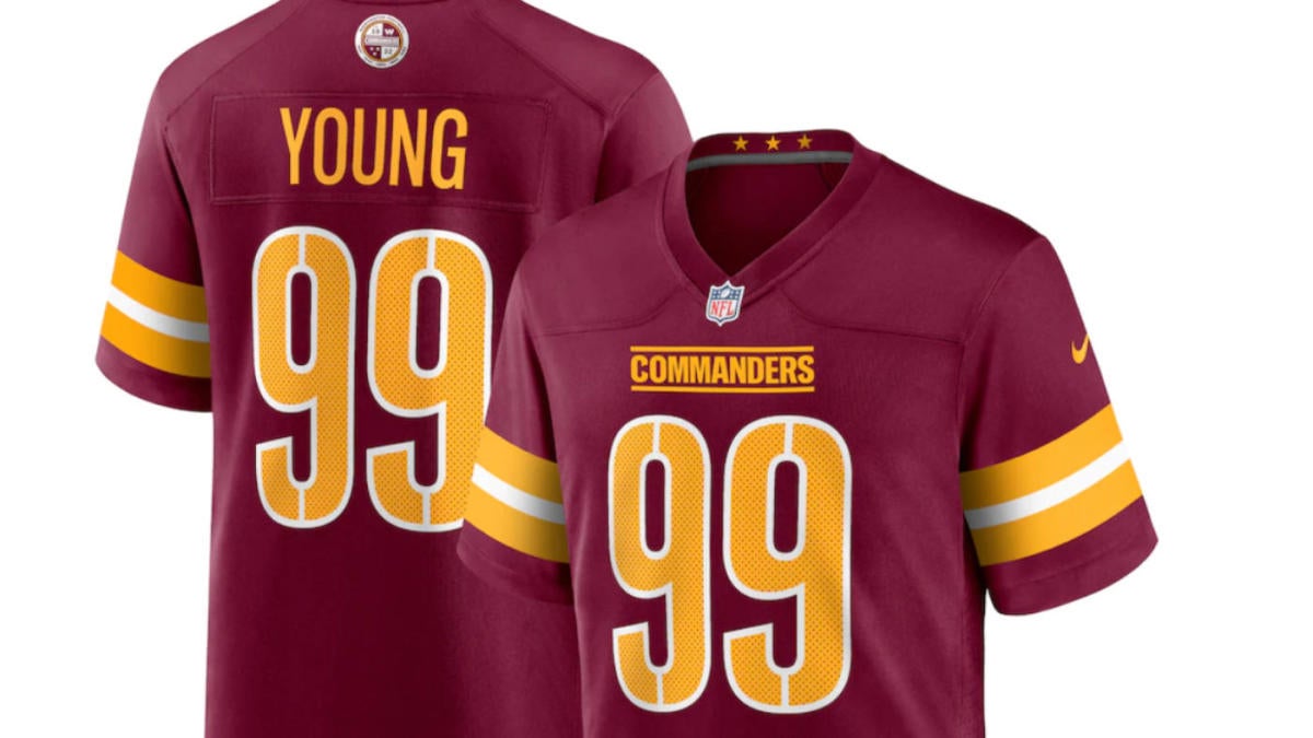
Among the many many problems of this identity, the roundel really clashes with the rest of this jersey because of the small amount of gold. The white really sticks out, and not in a good way.
-
4
-
-
Comman-derps
Comman-doh’s
-
1
-
-
There are multiple typos in that email. Are we sure this is legit?
-
1
-
-
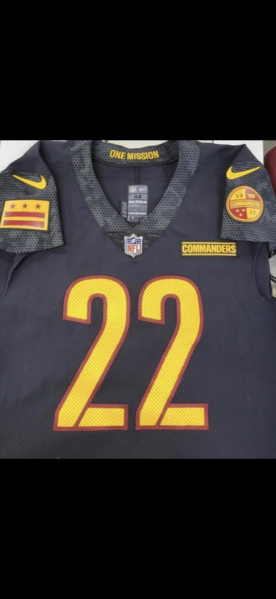
Is the Bears helmet just the current striped throwback?
-
1
-
-
2 minutes ago, Kiltman said:
“We asked our fans* what they wanted to see.”
* fans being only the patrons of the DC metro area Mission BBQs
I don’t understand the 3 wildly different designs
The swooshies are trying to bring the European soccer aesthetic to the NFL, with the multiple uniforms having different designs.
-
2
-
-
Welp, in Madden 2023 I’ll likely be pairing the new helmet with the current uniforms. At least they’ll look decent in my reality.
-
6
-
-
Weird thought: Cleveland Commanders and Washington Guardians sound just as good as the real thing.
-
19
-
-
3 hours ago, DCarp1231 said:
Absolutely not. Matching helmet and facemasks are the worst.
So you’re saying this, the Raiders and the Cowboys are the worst?
-
12
-
-
I’m curious how the CHICAGO word mark would look with a slight curve. A straight line is a little odd.
I’d also like to see the circle Cubs logo on the chest of the blue alt and the new secondary on the left sleeve. And if you decide to add piping on that jersey, you should mimic the blue road uniforms from the ‘80s.
Other than that, you’re cooking with gas.
-
On 1/15/2022 at 11:16 AM, DP487 said:
Thanks! I've seen some concepts that are mashups of old and new sets and I have a soft spot for retro uniforms, so that was a huge inspiration.
MIAMI MARLINS
I really like what the Marlins are doing now, but I've always preferred teal as part of their set — as do the Marlins fans I've talked to. When I first did this project in 2020, I used pink as an alternate to play up the Miami Vice connection, but after seeing the positive reaction to their City Connect sets, I thought it would be cool to combine the teal from the old with that striking red-orange from their new alts.
Their current logo annoys me a little as it has the script "Miami" going across the bottom; doesn't even use the team name. I feel the fish logo speaks for itself, so I removed "Miami" from the logo with some help from a friend; now it's basically identical to the sleeve logo the team wears now.
On the home sets, I added a teal brim as a sort of throwback the team's early years when they wore different colored brims (albeit the colors swapped with the crown). The home sets also use the team name rather than the city, and the numbering on all sets has been changed to match the script.
My Marlins concepts probably have the most alternate sets of any team I've done on this project, which is pretty on-brand for this team. Personally, the teal is my favorite, but the team has also become synonymous with black jerseys since the late '90s.
I love this. One request would be to add an orange/red-billed hat to go with the orange/red jersey. The teal clashes.
-
Anybody can buy a URL and then do a redirect, and I can think of two hockey teams with that name.
I’m not saying it’s not Admirals, but I’m not jumping the gun and saying it is.
-
14
-


/cdn.vox-cdn.com/uploads/chorus_asset/file/16010133/1140009079.jpg.jpg)


MLB 2022 Uniform/Logo Changes
in Sports Logo News
Posted
The more I see it, the more I like the Guardians identity. The new font is unique but still feels appropriate for a century-old team and works well with the conservative uniform design. As a whole, the look is different enough from the past to represent a clean break yet not drastic enough to feel like a culture shock.
I wish the Commanders had done something similar.