


-Akronite-
-
Posts
1,272 -
Joined
-
Last visited
Posts posted by -Akronite-
-
-
6 hours ago, Sec19Row53 said:
If that's the case, most people are wrong. Not knowing what a word means doesn't excuse its misuse. That point is mute [sic].
I completely agree with your second sentence.
So we agree that "pitch blue" is clever.

For the record, extremely dark IS in fact a meaning of the word. But again, I get not liking the use here.
-
 1
1
-
-
1 hour ago, B-mer said:
Here's my attempt at mixing the two. Gives me Tennessee Titans vibes since that's basically what their color scheme was. I feel like the double blue by itself (and with the cannon logo) has an intrinsic old-time feel to it, adding the red gives it a little more modern punch, for better or worse i don't know.

Titans was exactly what I was thinking as well. Their issue is they took a light blue team and made them drab with the navy. Blue Jackets are already a navy team, so it adds a little more pop.
I like this but don't have major issues with any of the looks you've presented.
-
1
-
-
1 hour ago, gosioux76 said:
Maybe this is an unpopular opinion, but I thought the NBA's shiny fabric era was horrible. Some good uniform designs, like the Bucks, ended up looking cheap and gaudy.
100%. I get the nostalgia for that sky blue Nuggets look, but it was much better when they ditched the shiny material. Kinda worked for the Heat though.
-
4
-
-
On 6/1/2024 at 7:05 PM, Sec19Row53 said:
Because 'pitch' is an actual thing that is black.
Most people understand pitch black to simply mean extremely dark. Pitch blue is a clever name to me, though one might find it a waste of time to make a blue so dark it's nearly indistinguishable from black anyway.
-
2
-
-
13 minutes ago, buckeye said:
This about nails what I think they should lean into. This team deserves a new look, the current home look is boring, while the road look is fine but it definitely needs a refresh. I get torn between the two color schemes. I feel RWB is the right call for the origins of this team name, but the double blue is pretty popular. With Waddell coming in, I'd love to see him kickstart a new look moving forward. Nice work all around!
Would a red accent work with the double blue? Because I don't think the logos work as well with just the double blue.
Regardless, I am on team "cannon" when it comes to the primary. It makes me want to get a sweater.
-
Hate the skyline, because it feels too obvious and clutters the uniform. And yeah, the CC program has produced a lot of mono-dark looks.
But seeing the entire uniform, I actually like em. They did well incorporating the city flag and the bright red/blue are popping off the navy. Wish teams would have well-lit promo photos, however.
-
4
-
-
9 hours ago, Germanshepherd said:
Minnesota was behaving themselves uniform wise until tonight. It’s not a bad uniform but it’s so out of place in their set.
I was shocked they wanted to go down looking like that.
I believe Minnesota and Dallas can co-exist as blue and green teams. The Mavs are the ones that should use a navy with a bright green though. I think they need the modern take more than the Wolves, and the accent of green evokes their skyline.
Meanwhile, the Wolves are a team that needs black involved. That KG era will always be iconic. So you can't use the darker blue, and I always loved the way the combo looked from 08-10, though you could go less abstract with the uniforms. Of course, if you wanted to use a darker green like with KG, that could create more distinction from Dallas.
-
5
-
 1
1
-
-
4 hours ago, Axe said:
Purple and teal are an ugly combination. I'm glad the Ducks didn't stick with it.
The 90s called, they said "talk to the hand."
-
1
-
 3
3
-
-
On 5/22/2024 at 8:41 AM, MCM0313 said:
Navy and white versions of the yellow uniforms would basically be their iconic 1990s set designed by FloJo (RIP). I mean, it isn’t 1-to-1, but given the trend of modernizing throwbacks for full-time use, maybe they should do that.
As someone who likes their primary set, this wouldn't bother me. It's unique and I've never liked their pinstripe looks.
-
On 5/11/2024 at 10:27 AM, tigerslionspistonshabs said:
Will Toronto's team follow the pattern of 'piggy-backing' (for lack of a better word) off of the same city's NBA team?
If so, what would work? Dinos?
RaptHERs
-
1
-
-
10 hours ago, WBeltz said:
OKC's City gives off big "Warriors 2009" vibes to me. Maybe it's the colors that are similar.
The Warriors aren't using it (and it never really made sense for them to go away from a classic scheme in the first place) so that doesn't bother me.
In fact, I'd like to see them shift and lean into a navy/orange/gold look. It's far more fitting for the name (dark navy feels more thunderstormy) and the lighter blue standard uniforms have always looked so generic.
I think they look great tonight against Dallas.
That said, still too many alternates these playoffs. I like the Knicks alt looks but I'd like to see them in their classic blues!
-
2
-
-
The Guardians have updated their profile logo to the bat-wielding logo featured on the CC socks.
My hope is that they continue to incorporate the art deco into the branding, find ways to stand out a bit as a red/white/blue team.
The racing stripes and the pattern on the numbers/letters is really well done. Don't love the texture on the blue of the jersey as much. I know some people hate "The Land" but I feel like that would have been an improvement on CLE, personally.
-
9
-
-
22 hours ago, colinturner95 said:
I don't hate it? Like I feel like I should but this is oddly nice
A uniform fit for a bowling league.
This made me realize the intent of the vertical stripes on the Pistons city jersey. Probably should've just read the press release at the time but I rarely bother with digging through Nike-speak.
-
3
-
-
21 hours ago, Brave-Bird 08 said:
- Titans is a standout moniker, unlike "Bears," "Lions," "Commanders," etc.
- Like what Nashville did with the Predators, which is equally an awesome brand, they chose a starting point of something unique to the city and built around it -- in this case, the Parthenon.
- Logo is tailored for a football helmet, and is a perfect balance of signifying the locale (Tennessee flag motif) and the moniker (shield, flames, the sword effect of the T).
- Colors are fantastic
- Their previous uniforms were modern classics
My tongue is halfway in my cheek here, but sorry that they created a brand in the late 90s and didn't use a brutalist hand-drawn logo and walk out with northwestern stripes on their sleeves...
Based on the bolded, that tongue has got to be more than halfway in your cheek.
Now, I do like the Titans moniker because of tie-in, but that name does not come off as standout in the least. Logo is still great, miss the old uniforms like most here.
-
12 hours ago, MJWalker45 said:
Columbus Crew have an Ohio logo with another team in the state, and every team in Texas has a state logo, almost as a requirement.
This one?
I actually was not aware this existed until you mentioned it. I was gonna say that the crew are older than Cincinnati's team but this appears to be part of the recent rebrand so not much precedent.
I will say that for Cincy, it'd be odd since part of their metro area is in Kentucky and among the 3 Cs, they are easily the least "Ohio." But if it annoyed Browns fans that only adds to the appeal I would think.
-
1
-
-
3 hours ago, Chromatic said:
Maybe top 25. It’s still just a gold shield on a blue field like many other states. I definitely wouldn’t put it top 5 just because there’s an easter egg.
If the flag was just the beaver it'd have a top 5 case. And I'm happy for the movement away from seals in recent years.
Biased toward Ohio but have always loved the burgee and feel it pairs best with the American flag. #1 aesthetically is probably between New Mexico and Alaska.
Anyway, we don't really need more sports teams relying on state iconography. Create your own identity.
-
3 hours ago, Krona said:
The hill I'll die on is the should swap grey, white and brown facemasks depending on combos. Grey with brown jersey/white pants, white with brown/orange & white/orange, brown with white throwbacks & any time the insist on brown pants.
Not all that concerned with attaching facemasks to jerseys, but I think the Browns have the ability to look good with brown, white, and gray facemasks, so why not mix and match.
-
Baby NOB look like :censored:.
-
6
-
-
On 3/24/2024 at 1:00 PM, henburg said:
This just looks so bad to me, the colors don't complement each other whatsoever. They look like the non-contact practice jerseys that QBs wearYeah, I don't like it at all. And the torquoise doesn't even seem right, there should be some green in the hue. Don't mind the meaning/use of an alternate color.
-
1
-
-
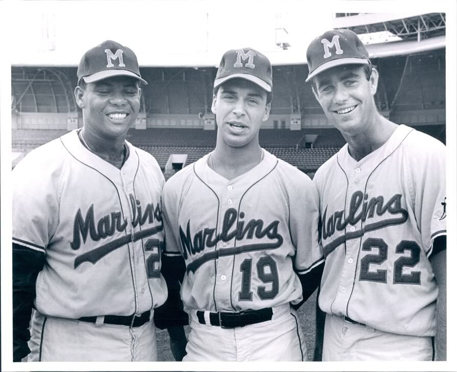
On 3/12/2024 at 11:10 AM, MJD7 said:
Miami Marlins
This jersey is based on the Triple-A Miami Marlins that existed from 1956-1960. Pairing the design with the modern colors personally reminds me a bit of the Miami Art Deco District.
I adore that sleeve logo! Was that something the old minor league team used or did you make it? It's head and shoulders ahead of anything the modern franchise has done and, honestly, better than any iteration of the dolphin either.
-
12 minutes ago, Brave-Bird 08 said:
We could be getting a perfect matchup of silver and blue vs gold and red, but Detroit has to be dumb
If they make the SB they will probably make a similar error. But there's a chance we get something gorgeous. Don't need another red bowl.
-
On 1/23/2024 at 10:43 AM, LMU said:
Dropping unnecessary outlines and trim on road gray jerseys is always a positive. See: Dodgers.
Apples and orange. Yankees didn't use a double outline and don't have a vibrant blue. Same with the Tigers, the orange can do the job which makes the white redundant. Don't feel the same applies for the Yankees.
In modern gray, I think the stripes worked better. The classic look was lovely on the flannel gray. But I guess I'd land at "lateral move."
-
2
-
 1
1
-
-
On 1/24/2024 at 9:08 PM, MCM0313 said:
You know what I wish they’d do? Bring back the purple as a nod to their New Orleans origins, and the baby blue from the mid-aughts since jazz music is based on the blues, plus a nice sky blue seems appropriate for Utah. The cool color scheme complements the mountainous terrain. If they need a warm color for balance, bring back the copper from the Purple Mountains’ Majesty set. For a bit more of a New Orleans flavor, use green as a trim color, or don’t.
I still feel like their double-blue from the mid-aughts was a missed opportunity, and the dark blue should instead have been purple (which stayed in that logo anyway).
I've always liked this suggestion and I love that the NBA has so much purple. Pairing the Red Rocks format with the cool color scheme has been my preferred modernization route (90s look is fun but not worth bringing back full time IMO).
Have never understood the clamoring for copper, personally. The contrast between a bright blue and a darker purple would be plenty to work with.
-
It's been a long journey for Michigan to get back to the national championship. They haven't played in a title game before and Harbaugh was dogged for years about losing big games (against rivals and in bowls). Not to mention everything that went down this season.
And they choose not to wear their classic, iconic uniform in favor of alternate monochrome pants. They are so easy to hate. Go Huskies!
-
5
-


/cdn.vox-cdn.com/uploads/chorus_asset/file/22891446/1342345440.jpg)

2024 NFL Changes
in Sports Logo News
Posted
Of course it is, which is why I get not liking it. The meaning was conveyed, irregardless.