


-Akronite-
-
Posts
1,256 -
Joined
-
Last visited
Posts posted by -Akronite-
-
-
Miami deserved to lose like that bringing orange pants to Clemson.
-
 5
5
-
-
Initial thoughts:
- Scripts are nice
- Navy & cream alt is top to bottom gorgeous, I had wished the Guardians went a similar direction within their set
- Pinstripes are fine, I normally don't like them and find the Twins previous use fairly ugly, but these are subtle enough to work and it's good to limit it to the road set
- M cap is innoffensive but pointless IMO, just wear the TC every day
- In addition to that, I'd use that state outline logo on all the sleeves
- I didn't hate the gold like many others but this looks better
-
1
-
13 hours ago, fouhy12 said:
Michigan back to all-blue this week. Third home game in a row in blue pants.
Not a fan of this trend. Michigan's home uniform is perfect and at most they should do one all blue game. You could even do a road one as long as it's white or yellow for the rest of the season.
I wish the Bucks would use their playoff set for The Game every year with UM in maize pants (the white is also fine, but not as good).
-
1
-
 1
1
-
-
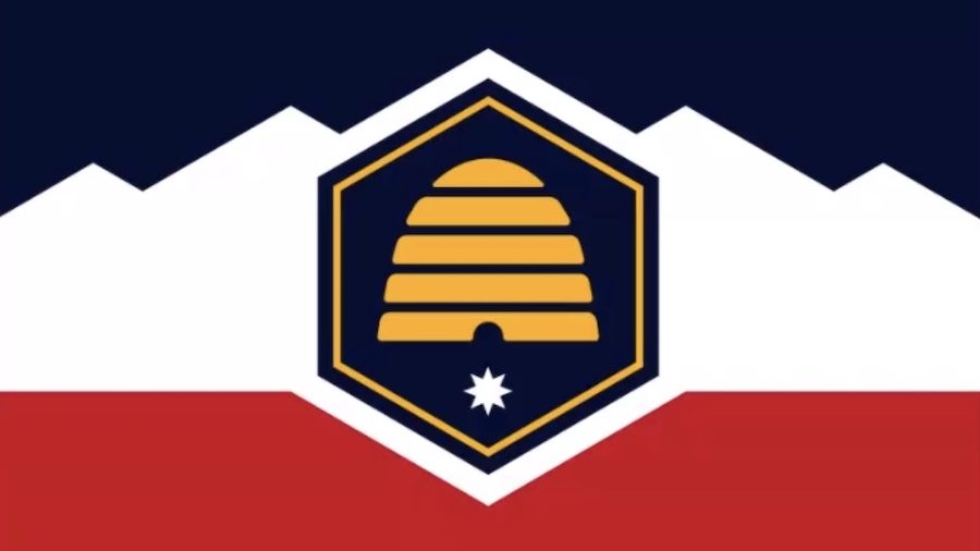
1 hour ago, Foxxtrot44 said:
New flag for the state of Utah to be voted on during the next legislative session

picked from these options
https://ksltv.com/510923/new-utah-state-flag-options-narrowed-to-top-5/
There were simpler, arguably better, designs but I can't blame them for wanting to have mountain imagery. Would launch Utah out of the "we slapped a seal on navy" crowd.
-
2
-
-
2 hours ago, truepg said:
The Nets looked beautiful last night against the Wizards with the red compression pants too. Surprised no one had mentioned it here. Also nice to see KD play in a proper design.
Wild that they chose to wear it against the Wizards, a red/white/blue team with stars in their uniform. It's like how the Browns demand to wear orange pants whenever they play the Bengals lately.
-
9
-
 1
1
-
-
21 hours ago, Digby said:
Could be. The severe lack of the Cavs' signature red on this latest iteration of their black C jerseys makes them the worst yet. Last night's game looks like it was a neutral-court matchup.
I do wish they had more wine on the other lettering, but there is a big ol red C on the chest. I prefer this version to their previous black set.
The kelly is bright and white v black matchups look boring, I didn't mind it at all.
-
3
-
-
Bucknell looks great. I love the horn helmet and favor making it full time.
-
1
-
-
17 hours ago, PERRIN said:
C'mon. This thread should not have gone this long without mentioning it. I can't stand Ohio State, but they have the best helmet - and perhaps the best uniforms - in college football.
Well I didn't wanna be a homer about it... I love when they are blank to start the year and I love seeing them filled up by The Game.
I've always preferred the below for Illinois, but I've warmed up to the block I.
-
1
-
-
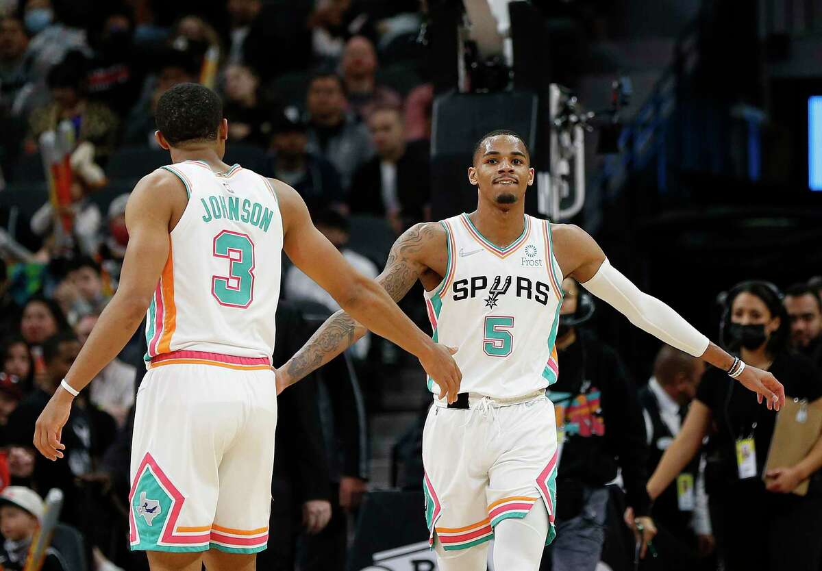
21 hours ago, projectjohn said:
IMO this one is a little over the top and I think why the Spurs avoided the Fiesta motif for so long. They nailed it with the 2020 version and should have kept that one around a few years like the Suns and Jazz did.
I felt the white Fiesta uniform was also quite nice.
But yeah, the new ones seem to be losing the plot. Reminiscent of the descent of the Vice uniforms.
-
3
-
 6
6
-
-
10 hours ago, Sec19Row53 said:
I thought the inspiration was from the early 60s, making this helmet correct. Am I remembering wrong?
I thought they were going for a 2000s look, but wasn't aware of the 60s thing.
-
1
-
-
On 4/3/2022 at 6:10 PM, 8BW14 said:
I think it’s gotta be Michigan right? I think the new finish and dark bumpers/chinstrap make it even better
Even as an Ohio State fan, it's hard not to say Michigan. As much as I love our silver caps and wouldn't change a thing, the winged helmets are undeniable.
Agreed on the bumper, but I'm not sure which finish I prefer. The stickers should end, though. They clutter up an otherwise perfect helmet. Like sure, maybe a few on the back but by the end of the season they look silly. It's not like the Buckeyes where it's a blank slate to fill up.
Some of my favorites...
Tulane white: That green wave is a perfect college logo (just look at him!), their colors are gorgeous, and somehow the chrome decals work here.
Indiana script: The trident is great as well, but these are gorgeous and should get a game a year at least. Had a hard time finding a good photo, which is a damn shame.
K-State: Love the use of purple to make the white pop on a silver helmet, great balance.
Michigan State profile logo: Green and white is a great combo. The logo is one of the best in the sport. And the tapered stripe is a subtle way to incorporate a logo element into the uniform. Alternates should be used sparingly, they've never topped this IMO, a modern classsic.
Navy (Army game 2012): The uniforms in this game are always interesting, but this year has stuck with me. It's unique and cool and screams NAVY. Don't think they've reached these heights since.
-
5
-
-
- 1B Can't argue with the selection, even if I think the modern Dolphins look good and I'm fine with this remaining a throwback option.
- 3B The Raiders have a perfect set but the Texans usually look mediocre and this is not a great combo for them.
- 5B Too much red to make my top, but two good looking uniforms.
- 1W The Cards need the Nike oversimplified look. They've been a mess for decades and it's a century-old franchise, time for a clean slate. If they did that and the Saints wore their throwback all-white set, this color combo could work.
- 2W While I think the Jets generally look fine (not great), white over black is among my least favorite combos in football. Broncos look good here, though, I think their modern look has aged surprisingly well next to say, the Cardinals.
- 3W No idea why teams opt for navy when they play a navy team. This would be a great looking matchup with the Chargers in their primaries. And I agree with the sentiment that this look is unnecessary but could be salvaged by a navy helmet to at least match its inspiration.
-
Was hoping Ohio State would get a shoutout this week. While I still prefer the gray sleeves, we looked great with the scarlet socks and the black & gold of Iowa is a great color matchup.
Other than the golden helmets, I really liked Penn State-Minnesota as well. I think PSU could drop the helmet number and make that their full time look, the plain pants are simply inferior IMO.
-
1
-
-
16 hours ago, Bathysphere said:
Nope, gold bound only by teal is super tacky
I respect your strong opinions and even though I'm on team "Jags last set was salvagable" (all they needed was to fix the helmets IMO), I think you make some good points.
That said, this line made me laugh. What is that even based on?
-
14 hours ago, McCall said:
They didn't have red jerseys in 2016. They were added with the removal of Wahoo for 2019.
Right, I'm saying the navy was dominant in the identity back then. The red jersey is newer but it's become the favored look. If I'm not mistaken, we hadn't had a red jersey since like the 80s.
-
23 hours ago, McCall said:
I still don't know why they took the piping off of the updated navy "Cleveland" jersey with the addition of the red one (and removal of Wahoo), and the same thing with the subsequent switch to Guardians. It features on all the other jerseys and it's subtraction makes the navy one look more like a plain BP jersey.
I think this is an instance where consistency creates inconsistency. All their uniforms use navy piping, including the navy jersey, so it essentially has none. They've used red and gray in the past, and I think I prefer the former
It's also interesting that the navy jerseys were the main look during their 2016 run but since they've shifted to red at home.
-
1
-
-
For me, Bama @ Tenn was the winner this week. Two very simple, iconic looks and a gorgeous color matchup.
Top three are all quite sharp, though. Wisconsin does look good with red pants. It feels more like a Nebraska thing, but the Huskers need to get their stripes back on the pants.
-
Alabama State: Curious how the helmet logo would look with a white stroke, to help it stand out amongst the gold a bit better.
U Albany: Only complaint would be that it's basically LSU's look, which they've been copying already and looks great so... whatever.
Idaho: Solid look with enough changes to make it distinct. The script was smart to keep and adding white makes it pop better.
Central Arkansas: 2 stripe curiosities-
1) Maybe a thicker middle stripe to match the helmet pictured?
2) Maybe black for the middle stripe on the purple pants. I like that you've lessened the black in the identity and it wouldn't match with the numbers, but I guess a predominantly white stripe when you have other colors seems off?
-
1
-
-
On 10/9/2022 at 11:11 PM, MJD7 said:
That's a big reason why I'd want the Bills to go back to the red helmet full-time (or at least as the primary, given the elimination of the one-helmet rule): it would help them stand out more in their division and the rest of the league. The Colts already have the white/blue/white combo locked down; of course, the Colts don't have any red, but I still like the Bills being able to distinguish themselves even more. There aren't enough red helmets in the league.
This is a good argument. The one hitch, to me at least, is that the Bills logo looks much better on a white background. Similar issue with the Texans, even if the overall uniform is better with a colored helmet.
-
3
-
-
8 minutes ago, Digby said:
Seems like the Guardians rebrand was pretty successful insofar as people pretty readily switched to the new name without fuss, and they didn't botch it so badly to attract more undue attention to themselves like the other big rebrand of that moment. Of course I don't know how many people are still wearing Wahoo merch to the stadium, but from an outside perspective I don't see much to be upset about here.
There is still a lot of Indians and Wahoo gear at the ballpark, but that will fade over time. People tend to adopt rather quickly if they actually show up to games. I remember the block C becoming prominent on fan caps and clothing faster than I anticipated (especially since everyone claimed it was boring/crappy). The Guardians gear will grow in terms of fan-share and the folks obsessed with "saving" Chief Wahoo will move on or get drowned out. Not sure we will ever see the stadium completely bereft of the old stuff, but I imagine it won't take long for it to be marginal.
-
On 10/9/2022 at 9:54 AM, BBTV said:
Can someone explain the difference between 7-up, Sprite, Sierra Mist, and Mountain Dew? Aren't they all just lemon-lime sodas with maybe a slightly different weight towards lemon or lime?
The biggest issue with Sierra Mist is that is SOUNDS like a Mountain Dew knock-off when it's actually a Sprite/7 Up copy. They never seemed to find a groove logo-wise either. Makes sense they are dumping it and trying again.
-
4
-
-
Only disagreement for me is that the Jets look fine here, even if green > black. I also like the Dolphins look for the most part.
Someone mentioned Eagles-Cards in another thread and I was shocked. Good lord.
-
As much as I hate Iowa State going all black, no way does it top 2 or 3 on that dishonorable list.
The Tennessee v LSU game actually looks good to me, just held back by knowing both these teams have gorgeous primaries.
-
1
-
-
My biggest issue with the rebrand remains the monogram. Hated it when they released it, but now I think it's just fine. As a fan of the team I have little to no interest in buying a new ballcap, which is a problem. It fits with the branding, but pales next to the iconic logos around the league.
The G-ball has grown on me, even tho I still feel like they need to dig deeper into the art deco.
-
1
-


Unpopular Opinions
in Sports Logo General Discussion
Posted
I can see the argument for the quirk of the seafoam, but at least the light blue pants feel like the same color story. You've got navy and royal already, light blue fits more than sneaking green in there.
Still a bit of a mess, though.