


-Akronite-
-
Posts
1,256 -
Joined
-
Last visited
Posts posted by -Akronite-
-
-
7 hours ago, sayahh said:
They could always go back to yellow and green. Might look like the Oregon Ducks, though. Does any team wear red and green?
The Sonics are supposed to come back at some point, or at least I hope.
Bucks used to be red and green and that was their proper color scheme IMO.
-
 2
2
-
-
On 4/22/2023 at 9:56 AM, maz said:
The whole changing-names-when-relocating thing just got more interesting considering we are going to have a "Las Vegas Athletics" eventually. That's gonna sound really weird, but the Athletics have been around for over 120 years, wearing that name in three different cities. Do we keep that 120 years of history alive into city number four, or find a name to fit Vegas better? (I think "Athletics" is generic enough you can put that anywhere, personally)
While I find the entire system of rich narcsisists moving teams to new cities on a whim disgusting, the Athletics are an odd case. Because they're such an old franchise and have spent decades in multiple cities, it's hard to say that Oakland owns the identity in the same way Seattle owns the Supersonics (to use another green and gold example).
On the other hand, Oakland does have claim to possibly my favorite look in the whole league, with that perfect home cap and gorgeous colors (I prefer the forest but the kelly throwback is great in its own right). I'd be sadder to see the MLB lose that than the name Athletics, but there is something wrong about it in Las Vegas regardless.
Doubt Oakland will get another team any time soon so I imagine they'll keep the name and colors.
I'll also say that pre-Guardians, despite this being a complete non-possibility, I hoped that Cleveland could somehow transplant the Athletics branding because I love it and it's generic enough to go anywhere.
-
1
-
-
3 hours ago, Digby said:
I miss the silver for the Rockets more than I miss the yellow. The silver-heavy era for them was looking pretty long in the tooth so I don't mind their most recent brand update, just don't like that black became the secondary color and silver is tertiary at best.
With the Hawks and Heat both using some combo of red, yellow, and black, the Rockets would not look as distinct if they threw back to the championship era.
Still, owning gray or going back to yellow as the main accent would be leagues better than another red and black team. The Blazers and Bulls have classic looks, the Raptors are a bit indecisive, but we don't need that from the Rockets and it's never looked particularly good.
-
4
-
-
2 hours ago, HOOVER said:
I’m glad he decided not to wear #12, even though Namath offered.Agreed. It's pretty common for guys to be humble enough to offer but I always prefer to see a retired number stay retired. I will say I was okay with one exception, Larry Nance Jr. wearing 22 while in Cleveland.
-
4
-
-
3 hours ago, DCarp1231 said:
While we’re talking Ravens, I’ll always throw in my support for @BrandMooreArt’s redesign. It would be a perfect candidate for the new template as well-
https://moorecreativ.design/ravens

I love this, although there is something quite college-y about it. Not big on the helmet, but don't love their current helmet either.
-
3
-
-
I like the D logo but the Bronco head is perfect for a helmet, no idea why they'd want to go back personally.
The Broncos are a few adjustments away from having a look they could keep forever, IMO. The side panel thing works for them, on the jerseys at least. I'm glad that era of design is over but they are the exception to the rule, in a way. I don't have any memories of the old look, just own orange as the main color and you have plenty of distinction from Chicago.
-
5
-
-
Just now, HOOVER said:
Great job! When looked at like this, it's an immense improvement. I think we'll all feel a lot better about these if they wear non-mono combos.
The only real issue (other than the criminally undue sock hype) with the set is all of it being monochrome. I even think having a plain red jersey works for them (give or take an Arizona), but full-time monochrome would downgrade it a lot.
6 minutes ago, aawagner011 said:
Yeah and that’s a uniform Ohio State wears one time per year and has only for the last few years. That doesn’t mean the Cardinals now “look like Ohio State.” If they look like the Buckeyes, where are the silver helmets and pants? Why doesn’t the cardinal jersey have stripes and why have they added a massive wordmark? Cherry picking one single alternate doesn’t mean they now “look like the Buckeyes.” In fact, you could make a case that the Buckeyes took after the Cardinals. If we are looking for similarities here, the Cardinals have been wearing black alternates for much longer than Ohio State.I agree, only the black gives me OSU vibes, and the gray stroke is a big reason. Black helmet is predictable but nice. I'm not bothered but with an alternate like that you could take a swing IMO.
-
The socks are getting the sublimated sun rays, book it.
-
My east coast ass has been thoroughly duped.
-
 1
1
-
-
On 3/19/2023 at 8:30 PM, -Akronite- said:
I don't like the texture or the Maryland across the back. I agree with the various superior ways presented in this thread for owning the flag motif.
And that's all well and good but also...
As I said before, the flag motif can work, but this look is also gorgeous and I'm glad they are returning to it. I wouldn't call it an overcorrection, just a conservative decision where there were a number of reasonable corrections.
I think the Maryland flag is over-spammed in the various sports IDs in the state. Of course, the Terrapins have as much right, moreso even, to use it and own it. I'd be happy for them to have a flag-based alt again and let this classic look bear the standard.
-
2
-
-
5 hours ago, Digby said:
Quick hasty Photoshop job here but -- if that Suns design turns out to become real (big if), I think this is the better way to do it. And I say this as someone who thinks the Suns color scheme always looks good with black. (The sunburst lines should actually probably be white on the white jersey, not purple, to hit the wordmark outline nicely.)
That's such an improvement. Does a better job paying homage and just fits.
6 hours ago, Old School Fool said:Someone mentioned it but I have a strong feeling the Kings are going to get new uniforms and put black in more prominently. It's been an alternate only which has stood out like a sore thumb.
Also for some dumb reason their main court has been black for the last few seasons, I don't know why they do that when their main logo has no black in it, it makes it look weird and not right.
This isn't the only time the Kings have had a dumb decision regarding their court, remember in 2013 they had a 3D logo at center court. I've never seen a team do that before and once you see it you understand why.
I've always liked the purple and gray look but it's clear they can't let go of black, so I think you are right.
-
Having no familiarity with Deleware State, I love these! I like the bi-color stingers, gives it more definition than the shape by itself.
-
1
-
-
There are a number of acceptable directions for the Cards (Arizona flag, desert cardinal, old school stripes), but my preferred route would be stripping it all down and owning a simple look of red and white. Obviously they aren't the Yankees or whatever, but I like when century-old franchises embrace the fact.
The Jags treatment should have gone to the Cards.
-
9
-
-
On 3/27/2023 at 7:50 PM, chcarlson23 said:
So Minnesota has started considering a redesign of their state flag. There are a number of problems with the current flag, especially when it comes to the actual design.
There was a flag designed in 1989, nicknamed the North Star flag, but I find the design to be a little lacking and it just doesn't have the right feel of a flag. It just doesn't feel like a memorable design, despite being miles better than the current flag.
So I came up with a design that highlights the North Star better, and also calls back to the large Scandinavian population in Minnesota.
I'm calling it the Norsk Star flag! It follows the design of the Nordic Cross flags, but is actually in the shape of a star, the North Star. And green, white, and blue are fitting colors for Minnesota.
I really like the 1989 design but evoking Scandinavia is a solid route as well. I hope every state with a lacking flag considers an upgrade, way too many shields on navy.
-
15 hours ago, DCarp1231 said:
Disliking your favorite team’s rival’s uniform simply because they’re rivals is such a dumb argumentative point.
I’m a Commanders fan, but have always held the Cowboys navy uniform as being one of the best in the league.
Surely there’s some Ohio State fans out there who appreciate Michigan’s uniforms and vise versa.
The “well you’re just not a true fan!” high horse crowd can gtfo, too. I’ll show love to whatever uniform I see fit.
I understand when people playfully hate everything about a rival down to their uniforms. There are far more toxic ways this :censored: can manifest (death threats, etc.) On this forum I try to separate the design from my biases because how you feel about a team really doesn't have a bearing on the aesthetics.
I'm an alum of The Ohio State (
 ) and think Michigan has one of the greatest looks in football. I also have strong opinions about what they're doing wrong (lose the stickers, ditch the blue pants, wear maize on the road more often). I want The Game to be gorgeous every year and it annoys me when they wear their classic set while we don an alternate.
14 hours ago, PERRIN said:
) and think Michigan has one of the greatest looks in football. I also have strong opinions about what they're doing wrong (lose the stickers, ditch the blue pants, wear maize on the road more often). I want The Game to be gorgeous every year and it annoys me when they wear their classic set while we don an alternate.
14 hours ago, PERRIN said:I fully agree.
That being said, as a Red Sox fan, the Yankees' logos uniforms are bad, tradition be damned. Each uniform is fine but boring. What bothers me is the complete lack of cohesion between any two sets. Be consistent, at the very least. No need for 3 different variations of the logo or pinstripes on one set but not another. Makes no sense to me. (Though admittedly, I'm not super knowledgeable about baseball aesthetics.)
I find pinstripes ugly in general and their primary logo is nothing special, but I wouldn't change the Yankees obviously. I also think their road set is great, boring works for them. The quirks between the different versions of the logo don't bother me either.
-
16 minutes ago, ssj_homeslice said:
I think I'm in the minority when it comes to the terps using the flag motif on the helmets. I really love it actually, it's uniquely theirs and i think they own the look.
I don't like the texture or the Maryland across the back. I agree with the various superior ways presented in this thread for owning the flag motif.
And that's all well and good but also...
-
7
-
-
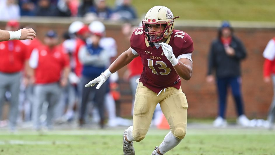
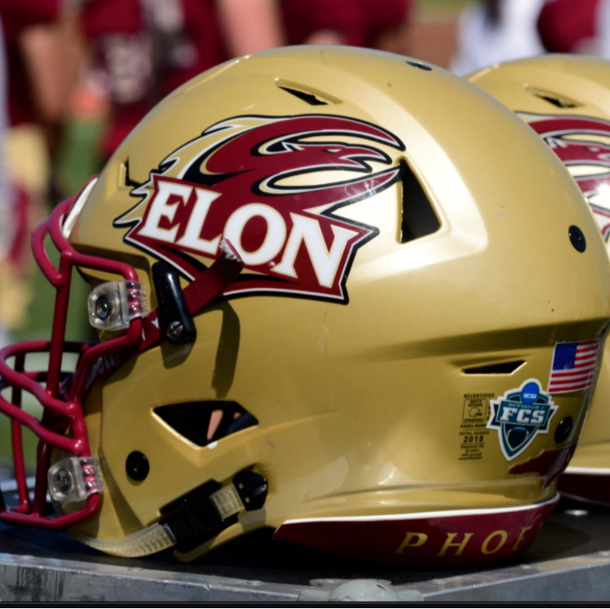
12 minutes ago, NH4 said:
ELON PHOENIX
DESIGN
- I really like Elon's look. It's just a clean and classic look that shouldn't be messed with a whole lot
- I did add the flame from the logo to the sleeve to add a little uniqueness
HELMET
- Same gold helmet with maroon facemask
- Updated the logo to the alternate logo just like the 2011-15 helmet
- School shield on the back
- "ELON" on the front bumper and "PHOENIX" on the back bumper
JERSEY
PANTS
Up next will be Eastern Washington. Thanks for looking and as always C&C is greatly appreciated!
I've never this logo seen before but it looks great on a helmet without the letters. Shoulder pattern is a really nice touch.
-
1
-
On 2/24/2023 at 7:42 PM, tBBP said:
Well there's also "SKI-U-MAH"... but one would have to know/care about [the U of] Minnesota to even know that. (I only know because I live four hours from it.) Then there's the also-less-known "WOO PIG SOOIE" of Razorback Nation.
(There's also "HOOK 'EM HORNS"—but we ain't gon' talk about that.
 )
)
"Go Bucks!" is common but OH-IO would be considered the main cheer/slogan/whatever.
I guess I'd take no nickname over another bulldogs or eagles, but I do love the diversity and uniqueness of college nicknames generally.
-
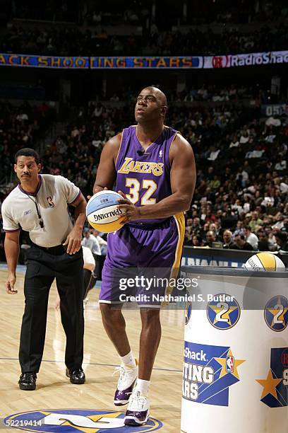
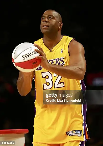
On 2/19/2023 at 9:12 AM, prof said:
Took a sec to realize this wasn't prime Shaq.
-
8
-
-
Can't say I'm a big fan of the Lafayette look, but it doesn't have much to do with your additions:
- The plain L is kinda boring, but the serif L feels very similar to their rival Lehigh (a concept I'm looking forward to).
- Stripes make it more interesting, even if somewhat busy.
- The Leopard just doesn't look go to me. They decided to make it a 3D perspective, but the angle is awkard so the other eye is just sort of peeking out. Plus it's too detailed, failing to provide either an intimidation or a kitsch factor to sell it.
- All in all, your update still feels like an upgrade.
-
3
-
1 hour ago, NH4 said:
I'll update the teams when they officially enter their new conferences, so July 1st.
How about something like this?
I think it's an improvement, the full version feels like a shield compared to just the head, especially for the white helmet.
-
2
-
-
I'd be curious how Austin Peay looks with the full logo on the helmet. As is, feels a bit slight.
-
Maybe the bottom shape could come inward a bit to be even more net-like? I think I prefer the downward hoop because it brings focus to the name.
-
 1
1
-
-
On 1/29/2023 at 4:24 PM, seasaltvanilla said:
As to the US, they got it right in the 1934 Tour of Japan:
THAT'S THE ONE, THANK YOU.
-
2
-


/cdn.vox-cdn.com/uploads/chorus_asset/file/23172427/1237733497.jpg)


2023 - 2024 NBA changes
in Sports Logo News
Posted
Purple and black feels more them but I find their current identity far more aesthetically pleasing.
Their black alts certainly have way too much gray, which is such an odd choice.