


-Akronite-
-
Posts
1,256 -
Joined
-
Last visited
Posts posted by -Akronite-
-
-
15 minutes ago, Discrim said:
I'd said it when I merely made a concept centered around it, but I didn't want a white Bengals helmet to exist...and this is in spite of the fact that it remains one of my favorite concepts. Is it weird that I like this helmet but also think it doesn't need to exist?
Not at all. There is a difference between something being aesthetically pleasing and being appropriate for on-field apparel.
In this case I'm cool with it. In fact, I'd prefer they fully commit and drop the hints of orange still on the uniform.
-
 2
2
-
-
Ooh thank you for starting this!
I thought Ohio State going blackout was the right choice for the Wisconsin game. Not the same level as Nebraska but still, a lot of red if they went with the primaries. All white v all black doesn't make for the most interesting looking game, but at least there's contrast.
As a big fan of K-State's look, I'd have given their upset the #1 spot, but can't fault the ranking here.
-
1
-
-
As a defender of both the Falcons and the Seahawks, that's just a bad matchup in terms of color anyway. Majority navy v majority black is no bueno.
Feel like 1,2,3, or 5 could've all been #1 and deserved it.
-
1
-
-
18 hours ago, aawagner011 said:
I’m not so sure. I think the classic helmets and pants with the black jersey look fine, and still resonates as Ohio State. On the flip side, the all black is such a departure from their usual look.
I think they could pull this off in a similar way to Notre Dame’s green jerseys or Georgia’s black jerseys where they’re viewed as a classic alternate jersey without having to succumb to the trendy alternate uniform head to toe that looks nothing like their usual uniform. I miss those days when an alternate was just that, an alternate jersey.
I can appreciate the difference of opinion here. On the one hand, that doesn't look too egregious. But to me, this feels a bit like the black is invading the classic set. I don't mind an alternate being a full blown new look instead of just doing their usual uniform a little worse. Sometimes alternate colors feel right (Notre Dame is a perfect example), sometimes a clashing set feels right. I feel like if Ohio State went the just jersey route, they might feel more inclined to wear it multiple times a year which I do not want.
I'll also note for those discussing proper team colors, I'd tweak the blackout to make the gray more prominent for sure.
The helmets with the scarlet stickers are hot af. The icy white and all-scarlet looks are also... fine... for once in a season. As long as they don't overdo it and bring out the gray stripes come playoff time, I'll be content.
-
1
-
-
3 hours ago, Sec19Row53 said:
You're right about the pants being necessary in some cases. Maybe. A single pair of pants of the correct light color would work for every team, IMO.
Regarding the second point - how would you differentiate an 'overall alt-design' rather than 'just another mix-n-match'. I think I follow you, but I'm curious.
As an example, my beloved an Ohio State:
Regular uniform
Black alternate
The classic helmet wouldn't work as well with the all-black, and I'd hate to see them pair a black jersey with the classic helmet & gray pants. I get the traditionalists who'd do away with all of it, but I think the blackout is aesthetically cool and fine for once a year. Also, glad it's for a night game this year because the blackout looked pointless in the daylight.
-
1
-
-
3 hours ago, oldschoolvikings said:
You’re close, but really that’s one more pair of pants than is necessary.
Well you're living up to your username. I think it's team dependent and two pants is fine or even necessary for a lot of them. I'm also willing to make an exception for alternate helmets if it's part of an overall alt design rather than just another mix-n-match option.
-
16 hours ago, infernoqueso said:
I really don't see how anybody can give the Cavs any credit for the uniforms. There is not a single identifiable uniform element in their set. They just have colors that work well together which is not the same as having even decent uniforms.
Eh, logos and wordmarks are uniform elements. There is some sublimation as well, not that this changes much. It's certainly easy to argue that they are basic or underwhelming, but look at teams like Alabama or Penn State. Sure there is, like, one element when you include the helmet/pants, but do you think their fans look stupid wearing just the jersey? That is not to say these are modern classics, but I see a tendancy here (I've done it myself) to evaluate uniforms based more on expectations than the product itself.
The previous Cavs set was really bad in terms of branding. The only element worth keeping, in my mind, was the gold accent on the neck. I don't like single color trim (especially using navy against the wine), the bent gold accents were arbitrary, and the wordmarks were uninspired.
Now, again, I think if they had added a simple trim element (like two subtle gold stripes), they'd be getting far better reviews. The fact that they went SO simple has gotten a lot of backlash in here, and I get that and agree it was a bit disappointing. But I still think it's an upgrade in their look. The wordmarks, logos, and colors are all improved and featured well on the new uniforms. I also think they will look good in action. It's not a top tier look but it's certainly not a mess or a disaster.
-
1
-
 1
1
-
-
3 minutes ago, guest23 said:
It's not as ugly as the rams white horn set but the 2 color helmet, 3 color jersey, and 1 color pant look is bush league. fsu only needs one helmet outside of a one-off and the white pants can be used as an alt look but require 2 garnet stripes.
The gold quite light and used sparingly, so I think it passes well enough, but I agree with the principle.
-
Both versions look good, though I prefer the first design for those leaf sleeves! Adds a bit of contrast.
-
Oregon: Personally, I like that Oregon doesn't settle on one design and continues to change every year. My favorite helmet look is the wings with the O on the back. Can't say I've ever liked the 3 point stars so while I don't have much critiques, this one doesn't sing to me like a lot of your designs.
Butler: Only issue is that the bulldog on the top of the helmet seems redundant with the logo on the side already. I dig it on the sleeve and pants, though.
NDSU: No notes really. I think I prefer the wheat design to differentiate from Green Bay, but of course the consistent striping looks good as well (their current single pants stripe seems so out of place). Love the full bison logo of course.
CSU: Not sure how I feel about the font-inspired motif, but at least it's an attempt to give them a distinct identity. Only adjustment I'd suggest is finding a way to make the swords pop on the helmet. As is, the gold blends in completely and I'd prefer to emphasize the swords over the letters.
Great work as always!
-
1
-
-
On 9/16/2022 at 12:54 AM, Germanshepherd said:
I actually think the conditions helped the Bears/49ers game greatly. A game in that weather is bound to produce some epic photos, which I’m glad were shared between two of the best uniform sets in the league.
This photo certainly makes the case for that game. Based on the photos included in the OP, I'd go Raiders-Chargers.
But I'll zag in here and say Seahawks-Broncos was a fun, modern matchup. While I'd make some tweaks overall I think Seattle's aesthetic is cool and the game could've been a mess of too much navy.
-
On 9/17/2022 at 11:46 AM, tigerslionspistonshabs said:
Like, I get "The Land" is a nickname, but why put just "Land"?
The previous leak clearly includes a "THE" above LAND and what appears to be a snowflake? No way they just say Land... for the love of God I hope at least.
Cavs new set looks good IMO. I think if they added a couple gold stripes to the trim they'd be getting a much better reaction, but overall it's an upgraded look with streamlined colors and logos.
-
2
-
-
On 9/17/2022 at 1:55 PM, _RH_ said:
FSU wore white helmets last time ... first time ever?
Previous road looks:
So to recap:
-helmet color is clear downgrade over gold
-facemask color is clear downgrade over red
-helmet logo is not improved, IMO a downgrade since it changed a classic
-jersey design (patterns around collar and sleeves) is clear downgrade over previous set
-font is a tossup (both unique enough but not too wild)
-pant color is clear downgrade over either gold or red
-logo on hip is smaller now
If anyone responds in emojis or says something about ice ... I'll smite thee!
If you think an "icy white"
 is a concept without merit for FSU, I can't really argue with you. That said, I think this is a fine uniform when taken as a whole:
- Helmet logos are pretty neglible, especially from a distance. Could've been slightly improved by putting gold in there instead of white.
- Disagree on the jersey design. The new uniform highlights it's pattern while the old tucks them under the sleeves. Don't know much about the previous design on the collar but I think I prefer the new one, tho it could be a little less busy.
- Font is clearly improved IMO.
- Red/gold would look terrible below an otherwise all-white set, but I'm not big on plain pants in most instances anyway.
FSU has looked better but they look good here.
-
1
-
13 hours ago, Kevin W. said:
That solves one problem. It doesn't fix the oversized logo issue.
Got no problem with an oversized logo, but it should be the full Sparky instead just the face.
-
4
-
-
On 9/7/2022 at 1:39 AM, Jay_Mellowed said:
A look at the Cavaliers new court for the upcoming season.
https://www.youtube.com/watch?v=hcQO0M7Zr5c&ab_channel=Dwn2sims
Shocked they aren't using black, but it's a pleasant surprise. The big updated C works better than the shield, this is good.
-
5
-
-
This is a really cool idea. You're using straight edges but the alternating colors gives it a wavy feel, which evokes some Tiger energy. I agree you could use less, though, so maybe they could come off the sleeves since you lose that effect a bit.
Is it meant to have pinstripes on the edges or is that the template? Cause I don't think this concept needs it.
-
1 hour ago, TenaciousG said:
Credit where credit is due: Oregon looks phenomenal. The Duck uni fanboys will actually be correct today.
If only the team could play as well as they look.
I'm excited for the Ohio State v Notre Dame matchup coming up, not only for the game itself but it's week 1 so you'll have blank silver helmets against that Irish gold. Amazing that this is only their 7th meeting.
-
This makes Rice look badass! My one question was the stripes since I've seen similar elements for teams in mountain regions, but pulling that from the seal is really clever and adds a little character to a two-stripe pattern.
-
1
-
-
On 8/31/2022 at 9:46 AM, gosioux76 said:
I know there's a lot to criticize about the execution of this set, but this point is kind of silly.
You can't complain about orange being a barely noticeable accent when it has more orange than the much beloved championship uniforms that came before and after them.
If anything, one of the things Nike did right with the alarm-clock set is make the orange slightly more prominent.
Forget about championships, the Bucs have never looked better than they did during the creamsicle era. It's a shame they moved on from it. (UNPOPULAR OPINION ALERT) And I'll say it again about the alarm-clock uniforms: they're nowhere near great, but they're also nowhere near as bad as the hyperbole. More traditional numbers, plus a rethinking of the helmet, and you've got the foundation of something that works.
Yeah their argument regarding colors is way off base IMO.
On the alarm clock unis the red POPS because the pewter is darker. And you're right, the orange accents give the color more notice than the sliver stripes they get in the Super Bowl sets. I also think the road set had fine color balance with the red since it was on the socks, numbers, and giant logo.
I see the argument for the Super Bowl sets being superior, but the original pewter and darker red were far more muddled than the alarm clock set, even if you prefer the balance.
-
4
-
-
The idea to consolidate the striping to the pattern from the sleeves is cool. The white facemask has a retro feel that isn't necessarily bad. Double stroke on the numbers isn't for me.
-
1
-
-
You kept everything that makes the current look good and just made it a few notches better. Love all the changes, especially dropping the extra logo outline.
VT is another program with a great, unique color scheme. Unlike Wyoming, though, I think there are a number of directions that could work for them.
-
1
-
-
The whiskers remain silly, I could take or leave the tan bobcat. Like the custom font a lot and agree with the stripe tweaks.
Wyoming has one of my favorite looks and a unique color scheme, but they could definitely improve with some adjustments. I look forward to the concept!
-
1
-
-
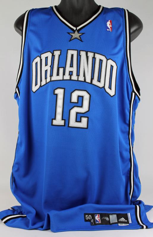
On 8/23/2022 at 5:53 PM, eRay said:
That Orlando look gets way too much flack IMO. It's plain, but they've looked worse.
And I will stand by the TWolves set forever, perhaps with the exception of that collar. They ruined it the next season by taking out the green.
Cavs have already flipped back to metallic gold, I could see teams switching trends again and going with darker, less vibrant looks a la the aughts.
-
4
-
-
Pros:
- Mountain design is really cool.
- New blue feels like a good way forward so the Broncos separate from the Bears a bit.
- Keeping orange as the primary.
- Throwback is perfect.
Con:
- Old school stripes aren't cohesive with the mountain or the modern Bronco IMO.
-
5

:format(webp)/cdn.vox-cdn.com/uploads/chorus_image/image/70757689/1240026919.0.jpg)


/cdn.vox-cdn.com/uploads/chorus_image/image/71379838/_CIM0378.0.jpg)
/cdn.vox-cdn.com/uploads/chorus_image/image/71378949/_CIM0448.5.jpg)


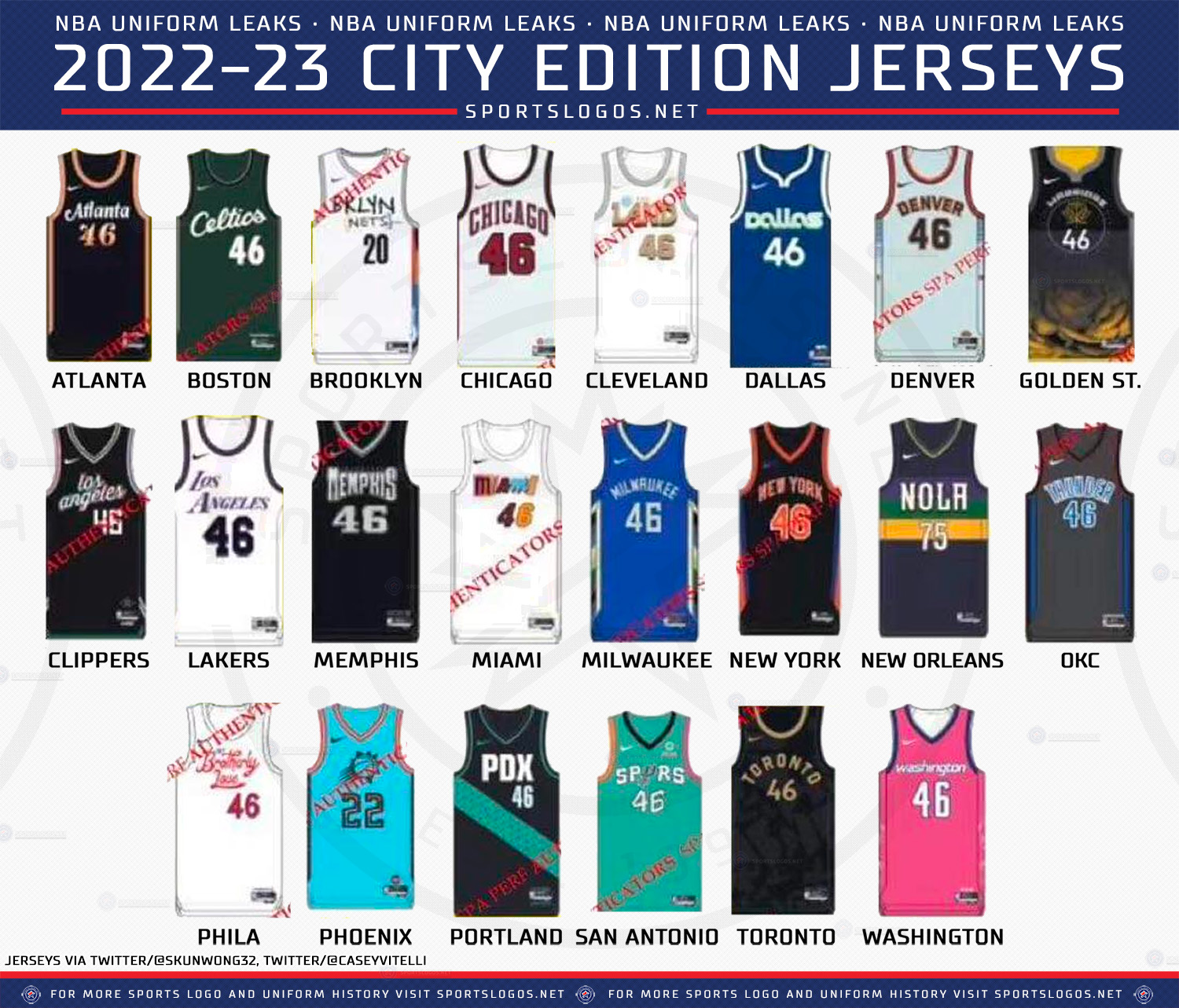
2022-23 NBA Logo & Jersey Changes
in Sports Logo News
Posted
Yep. They built a campaign on the gold but it's fairly lifeless on the road uniform and tertiary in the rest of the set. Not ugly, just dull. Needs something.