


-Akronite-
-
Posts
1,256 -
Joined
-
Last visited
Posts posted by -Akronite-
-
-
19 hours ago, infrared41 said:
Allow me to elaborate. I didn't like them.
Well we'll have to agree to disagree. Cause to me, personally, I think you love them.
-
 1
1
-
-
On 9/20/2023 at 10:59 PM, infrared41 said:
Best List: You went two for four with #1 and #2 being correct. You're kidding with #3 and #4, right?
Please expand on this snipe, both games looked great.
Browns-Steelers matchup does not earn a worst slot IMO. Arguably belongs as an honorable mention, though I would agree the orange helmet is superior and the white alt helmet was never necessary.
-
8 hours ago, Midway said:
Still not sure why Minnesota continues to water down a perfectly good colorway with all these unnecessary white elements. They were getting pretty close to something good with their last set.
It bothers me so much. And the helmet stripe is just textured for no reason now because they don't even include the end of the oar. Just simplify this :censored: and ditch the white collars forever.
Also, I think the Fox scorebug is fun. It's a bit oversized but I don't mind them trying it out.
-
 1
1
-
-
I don't know the actual links between the franchise and the military, but using that design motif looks good IMO.
The shield is their best look by far to me. The perspective of the panther leaping is just so odd, like he has a giant upper body and teeny tiny lower body. I just don't think it has that classic charm you want, it's somewhere between the Detroit Tiger and the Cincinnati Bengal. And the current uniform feels built around the shield rather than an aughts slashy stripe look.
-
Suns did a good job. Putting the wordmark inside of the rays is actually an improvement on the 90s design IMO. Make the ball orange and maybe ditch the side things on the shorts and that's damn near perfect. As it is, a step up from the current look, it's sharp.
-
 6
6
-
-
4 hours ago, VyCade said:
(28/30) Toronto Raptors
It's been incredibly frustrating watching the Raptors strip away everything that made them unique. Ditching purple. taking away the two-sided jerseys, moving to an annoyingly simple block script, simplifying the overall design down to nothing... It's just been one depressing change after another. Like, I understand that removing the edge from uniforms is symptomatic of leaving the 90s, but you're the RAPTORS for crying out loud. THE RAPTORS SHOULD HAVE SOME EDGE TO THEM. Not only that, but why ditch purple? What was wrong with it? What was wrong with the double-sided jerseys? I understand that they might not be for everyone, which is why I've made the alts without those things, but it's still frustrating seeing teams try to fix what isn't broken.
All of that being said, however, I didn't want to make a straight up copy of the mid-2000s jerseys. I wanted something of a middle ground with that and their first kit, which led me here.

I've never loved their pinstripes, always loved that claw logo, and want the Raptors to return the red & purple for uniqueness. This rules.
-
15 hours ago, M4One said:
Adam Silver and every NBA owner's dream court? An ad for every bucket.
Kinda cool but feels like a big waste of energy and a potential distraction on the court that could effect the game.
-
1
-
-
Illinois has looked bad/inconsistent for a while so in spite of them looking too much like Syracuse (and the ILLINOIS look being superior), this is an upgrade. Purely aesthetically it's a really solid set of uniforms. In context, I understand the gripes.
-
1
-
-
2 hours ago, oldschoolvikings said:
Yeah, I remembered that... I just think the other version would look nicer.
Yeah, even if more accurate it's the one part of the throwback that feels botched since it's so bunched.
In general, I feel like modern templates are doing a lot of these designs a favor. Not to say I don't appreciate simple striping, classic logos, etc. but the Seahawks throwbacks look so much better than they did in their day. Less obnoxious sleeve logos, none of that mesh :censored:, bright bold colors... It's such a step up from something that was kinda goofy in comparison.
There are trends like monochrome w/ socks and wearing a t-shirt skirt that look bad now, but in terms of uniform fit the league has progressed so far from the blunder years of giant shoulder pads & crop tops. (Not to say it's wrong to love and embrace the tacky.)
UNPOPULAR OPINION ALERT: I'd toss a lot of shiny pants into the blunder years category as well. In most cases I prefer matte to that early aughts look.
-
2
-
-
1 hour ago, Rygi13 said:
OSU Grey Uniforms 2023
The white outlines on the numbers really make them pop against the grey. Great look, should be in the annual rotation.
Surprised it took them this long to get to it. I do not mind the Blackout or all Scarlet/White/Gray look once a season thing they've been doing. When they go too far with the alts it can be tragic.
-
1
-
-
"Showdown" only makes people miss "Shootout." At least with "Rivalry" it feels like the formal name while fans can still call it the shootout (as I'm sure they do).
Re: Mississippi State - ditching the gray was a mistake, I loved their look overall and the SEC has so much dark red and white already. But I actually like the "State" script, which looks pretty up close. Ironically, I find their primary logo feels more generic. And I enjoy when teams try to own "State" in spite of it being the most common thing in college (MSU and PSU have done this at various points and I dig it).
-
5
-
-
Vikings look great. Wouldn't mind it as a permanent look but not clamoring for it since the stripes aren't unique to them.
The Browns helmet stripe is not distracting enough to ruin the look, but it is kinda odd. The pants stripe is the traditional look, going back to Paul Brown, but they've done brown orange brown in the past and it makes more sense with the sleeve stripes. So... idk. Would the helmet look better if it matched? In any case, would be happy for them to stick with the drop shadow as their alt look and ditch the all-brown forever.
-
2
-
-
If it were up to me to dictate all the different Red & Black repping teams-
Chicago: Red & Black stay, of course
Portland: Keep the Silver/Gray accent, put it back in the logo
Toronto: Red & Black is fine, but get Purple back in the mix (I love that purple has been prominent throughout the NBA and red/purple is unique)
Houston: 90s in Red & Yellow was the best they've looked & played, Red & Gray is also decent, ditch the Black altogether
Atlanta: I like what they 're doing with Red & Yellow on their primaries and Black on the alternate jersey
Miami: Good as is
Cleveland: I can live with either Gold, but keep that Wine deep so they don't get mixed up, don't need Black
A clean red and white is beautiful, but I just don't feel like it fits the identity of any NBA team. It feels like the color scheme of a classic franchise like the Red Wings, and the classic eligible teams have too much history with black. If I had to pick, it'd be Atlanta or Houston.
Other Red stuff: Milwaukee should bring it back for the classic Christmas colors. Denver should ditch it for the Powder Blue look as the primary (can live with the current scheme but has never grabbed me).
-
1
-
-
41 minutes ago, Brave-Bird 08 said:
They've done it on the men's side too, and it's terrible. Looks like practice jerseys. Even Georgia Tech, whose school colors are officially white and gold, have stayed away from trying this.
Honestly I like it. Just needs to be a bit darker still.
1 hour ago, solvetica said:New Kansas uniforms on the way. Should be revealed this evening.
I kinda liked Kansas owning their previous font and these stripes don't really stand out at KANSAS (not that their football team has much reputation). That said, it's a classy look and I can't fault it.
-
1
-
-
1 hour ago, SSmith48 said:
NBA In-Season Tournament was officially announced and... well let's just say that the branding isn't doing anything to change my mind about how I think this is just nothing more than a cash grab and doesn't really serve any purpose logistically and doesn't feel any more prestigious than being a one-seed for the playoffs.
Feels like they pulled their punches here. The branding or name doesn't really excite me. I think they would have benefitted with a more unique or high-quality name. The Wilt Chamberlain Cup? The Bryant Memorial Tournament? Heck, even a corporate sponsor name like the would feel better (as much as I hate it). I hope they have a better marketing plan in place because as it stands right now, all the negative press it is getting so far feels warranted. Nothing being communicated currently tells me why I should care about it as a fan as opposed to any other regular season game or achievement.
And yes, I know that this may be part of a strategy to also appeal to international fans by making something similar to the FA Cup, Carabao Cup, etc. by being an extra in-season competition, but this is still limited to a single league, rather than expanding to others. It's just an in-season playoff tournament that doesn't feel/won't be as important as winning the Larry O'Brien.
They've been creating and renaming trophies to honor past stars so does seem like a missed opportunity... Maybe they're saving it for the trophy while keeping the tourney name malleable?
Disagree on the sponsor. Gimme generic over the YouTubeTV Tournament or whatever.
Have they stated whether there is an incentive aside from bragging rights (somewhere between winning the summer league and getting the 1st seed) and money to players?
-
1
-
-
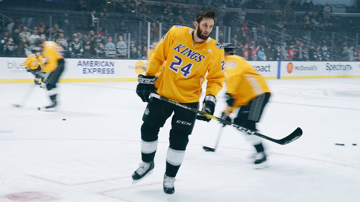
Purple would be my primary choice for the Kings, but they improved their look overall and I dig the purple jersey so can't complain. That previous black jersey was garbage in comparison.
-
57 minutes ago, Rygi13 said:
New Indiana Football Uniforms
As an Indiana fan. I hate these. The mismatched fonts, BFBS, and cheap materials are embarrassing. Indiana's deal with Adidas is notably up at the end of June 2024, could this be a sign of a rocky relationship with Adidas?
I doubt it. I think Tom Allen just loves the throwback look and black accents and made Adidas change the design too late in the process and ended up getting cheaper materials.That's the new primary look? Ugh, I didn't even like those throwbacks. Indiana had a classy, timeless look that didn't need much of anything. This is bad.
-
6
-
-
The NBA has historicall had primary logos that incorporate the name, mascot, and the basketball all in one. There has been a trend to shift away from this, first with a series of roundel logos (which still fit in to an extent) and now to logos where an icon is separate from the script.
To me it feels weird. It makes sense from a modern marketing perspective but look at the blue chip franchises: Lakers, Celtics, Knicks. They all follow the traditional formula and are likely never going to change. So it seems like a waste to make this shift, especially knowing that many of these franchises will be rebranding a few years down the road again anyway.
-
4
-
-
1 hour ago, nash61 said:
Re: Warmup jerseys
I think they had gotten so watered down by the end, that had the big Pride controversy not happened, I don't think people would have really cared.
Like, who is going to miss these?
That Sharks one is kinda sweet, but I think your point stands. Now can we get back to the important business of this thread, fighting about
whether gays are the downfall of civilizationwho's actually mad?-
1
-
-
19 hours ago, PlayGloria said:
Ok. I mean, you can say that, but sexuality is literally the only thing that makes the LGBTQ community a community. Just because you spin it into "acknowledging a group that’s historically been vilified" doesn't mean it isn't about sexuality. It's literally 100000% about sexuality. If it wasn't, there would be no group to acknowledge

Just like if there weren't different races, there would be no reason to celebrate the great Jackie Robinson. That celebration is 100% about race.
Race issues - a good lesson for children
People's sexual activities - your free to do what you want, but doesn't really need to be a topic at a Blue Jackets and Red Wings game
This is kinda backwards though. The fact that certain sexualities have been villified is what led to the various movements for sexual liberation. Hence heterosexuals having no community beyond those that choose to villify homosexuals, etc. as an out group. If not for the vilification, the way we label sexuality and the art & culture that have derived from it would be entirely different. There would be no need for "pride."
Race is only a "good lesson for children" because they should be aware of the history of racism. Given that, I'm not sure what separates it from Pride nights, as the history of homophobia & transphobia is also a good lesson for children. Especially given that sexuality is directly related to families and it makes no sense to keep children away from concepts like "two daddies" and "two mommies."
We can debate the merits of honoring the military at sporting events, but I don't think it would hold any water to ban them on the basis that war is innappropriate for children.
-
12
-
 1
1
-
 1
1
-
-
42 minutes ago, namefornamesake said:
Well, here's how I think this is going to go.
2023: The NBA In-Season Tournament commences. The league uses this development to introduce a brand new advertising path for the league: the bottom half of the jersey's back. While still exclusive to the tournament, Silver touts this program as an experiment with advertising expansion and expresses hope for its implementation throughout the season.
2025: The NBA approves jersey back advertising for the regular season. Fans are naturally upset by the move, but shift into a state of indifference quickly.
2026-27: No uniform developments are seen at this time, but court ad programs are expanded (team names are eliminated altogether from the baseline).
Mid-2028: During the year's All Star Game, the NBA introduces advertising on the front of the jersey, echoing the extant placement on the back. Once again, the measure is touted as an experiment, but teams begin to sign front ad partners as the back half of the season goes on for the following campaign.
2029: Front ads are approved. Fans begin to express real displeasure at the increasing encroachment of advertising in the league. Jersey sales drop for a short period of time, and the league's front office begins to fear that they expanded the ad program too far. However, anger begins to wear off as the season continues.
With this, the jersey ad program nears its end. Considering the value team names hold both market-wise and within fanbases, the league decides not to eliminate the front wordmark (yet, at least). Pant ads are considered, but no consensus is observed. At this point, jerseys are the stylistic equivalent of WNBA jerseys. From here, I cannot make any further reasonable predictions. What do you think? What's your vision for the future of NBA advertising? Do things remain virtually the same as they are today, or is a dystopian league where ads abound wherever a basketball is found in our future?
I hope it at least takes longer to implement, but this is sadly realistic. The tournament is supposed to have a different set of uniforms (gimmicks on gimmicks) so it's a perfect chance to expand the ads and get people used to this bull:censored:.
A compromise that will never happen that I would take given the current trajectory: regular season jerseys have as many ads plastered as you want but in the playoffs they are wiped clean. Again, would never be considered but goddamn I hate this :censored:.
-
1
-
-
I think the Cincinnati Trail Blazers look pretty sweet. Only issue for me is the black wordmark gets lost, just like the Marlins.
-
5
-
-
10 hours ago, pepis21 said:
First thing what they should do is taking that Sacramento wordmark and put it on purple jersey instead of Sac.
You don't love the SAC?!
-
On 5/4/2023 at 1:12 AM, chakfu said:
Interesting that purple/black stuck over their "classic" r/w/b - since they never owned it. Sky blue was Interesting but short-lived. Too many moves and name changes to stick. Makes me think Clippers could do the same.
What other color changes really stuck in recent memory?
Tampa Bay Bucs
Mavericks lack of green
LA Kings
Mariners
White Sox finally settling on black - another case of r/w/b not bring missed
Nets, black still hanging on by a thread
others were soonish after expansion
Memphis Grizzlies
Arizona Diamondbacks
Tampa Bay Rays
The Eagles
A's going forest
And Raptors dropping purple was another expansion adjustment.
On 5/3/2023 at 9:21 PM, Digby said:
Ha, I feel like like it’s the purple jerseys that have too much gray. I like adding that color into their scheme (and I even like the gray jerseys themselves, provided they’re worn against appropriate opposition) but it’d work better if it was below black in the hierarchy.Now that I think about it the purple jersey is the only one that doesn't bother me at all. I can dig a gray side panel on a purple jersey, but the whites should really inverse the colors to emphasize purple.
-
1
-


2023 - 2024 NBA changes
in Sports Logo News
Posted
I feel like both the blue and green shades were brightened for the Seahawks throwback this season as well, so this route is not surprising from Nike. Definitely like it as an update, not a big fan of the navy & neon for Minnesota (though their uniform design has been the much more glaring issue).