


-Akronite-
-
Posts
1,256 -
Joined
-
Last visited
Posts posted by -Akronite-
-
-
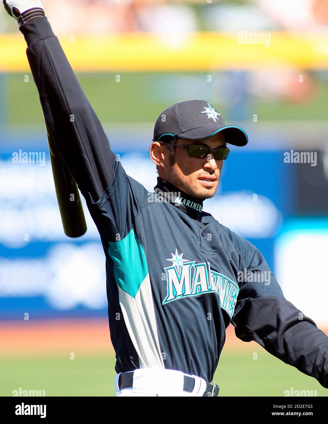
I have no problem with MLB teams shifting away from gray jerseys, as in many cases they are simply lacking aesthetically. The Mariners don't really need 'em, I love their color scheme and the ID should focus on them.
There are teams that should/would never lose their grays (NYY, Bos, CWS, STL, etc.) because they have a classic or particularly nice set. But there are some really uninspired looks (as a Cleveland fan, it's easily the most boring look we have) and tradition is the only thing keeping them around. That said, people love tradition and I get the negative responses here.
I am likely in the minority, but I feel like a number of teams could make a mono road look work in different colors. While overdone recently, I enjoy a light blue road look. I think an all-navy set could work for a few teams as well. The Padres do it really well without using actual gray.
-
 4
4
-
-
This concept is sweet. The 2000s hoop logo never worked for me because of the skewed angle, but this pays homage while looking less cartoony and clip-art-esque.
I find the current brand pretty dull but a shield COULD work and I appreciate this actually trying to tie in Brooklyn. I don't love their colors (Spurs already own em IMO) BUT it has allowed them to use a blank canvass of sorts with regard to alternates, which is cool.
My one note would be on the basketball portion of the bridge. The lines are elongated so it doesn't quite read right. I would be interested in either seeing the shield shape shifted to make it match the spherical look of a ball OR changing direction a bit to make the effect more net-looking. But as-is I'd take it over what they have easily.
Question: Is the top of the bridge supposed to look like a headband? IDK if intentional but it's cute.
-
 1
1
-
-
9 minutes ago, gosioux76 said:
I don't know man, I see no reason why rules can't be broken now and then. I like that this harkens back to the '70s and to Joe Mauer's habit of wearing that with catching gear in 2000s.
To me, it's just like when people were bent out of shape about the Twins using gold at home but not on the road with their prior set. I thought it worked just fine to add a color to the uniform that tied into the home stadium. It's not the norm, but it worked.
The Twins should be given credit for trying things like this.
Yeah, it could be a quirk that works. I would like to see a white-paneled cap to judge, though.
-
4
-
-
13 hours ago, MJD7 said:
Somehow this redesign keeps getting better & better in my eyes. This makes me wish even more that they added an alternate cap in the same style, since it fits with the rest of the uniform perfectly. It makes sense that they reserved it for the helmets though, since that’s what Carew & Mauer wore.
It’s also interesting that they went kept a matte finish for the road navy helmet, but went glossy with the throwback navy helmet. I like the matte finish much more.
I think both finishes can work well in baseball, and a classic gloss look makes perfect sense for a throwback. I would not mind seeing teams have multiple options for different lightings, but we'd probably get mismatched helmets within a game and send half of this board into cardiac arrest.
Still not really sold on the road/M cap stuff, but that home look with the white-paneled helmet is sex.
-
2
-
-
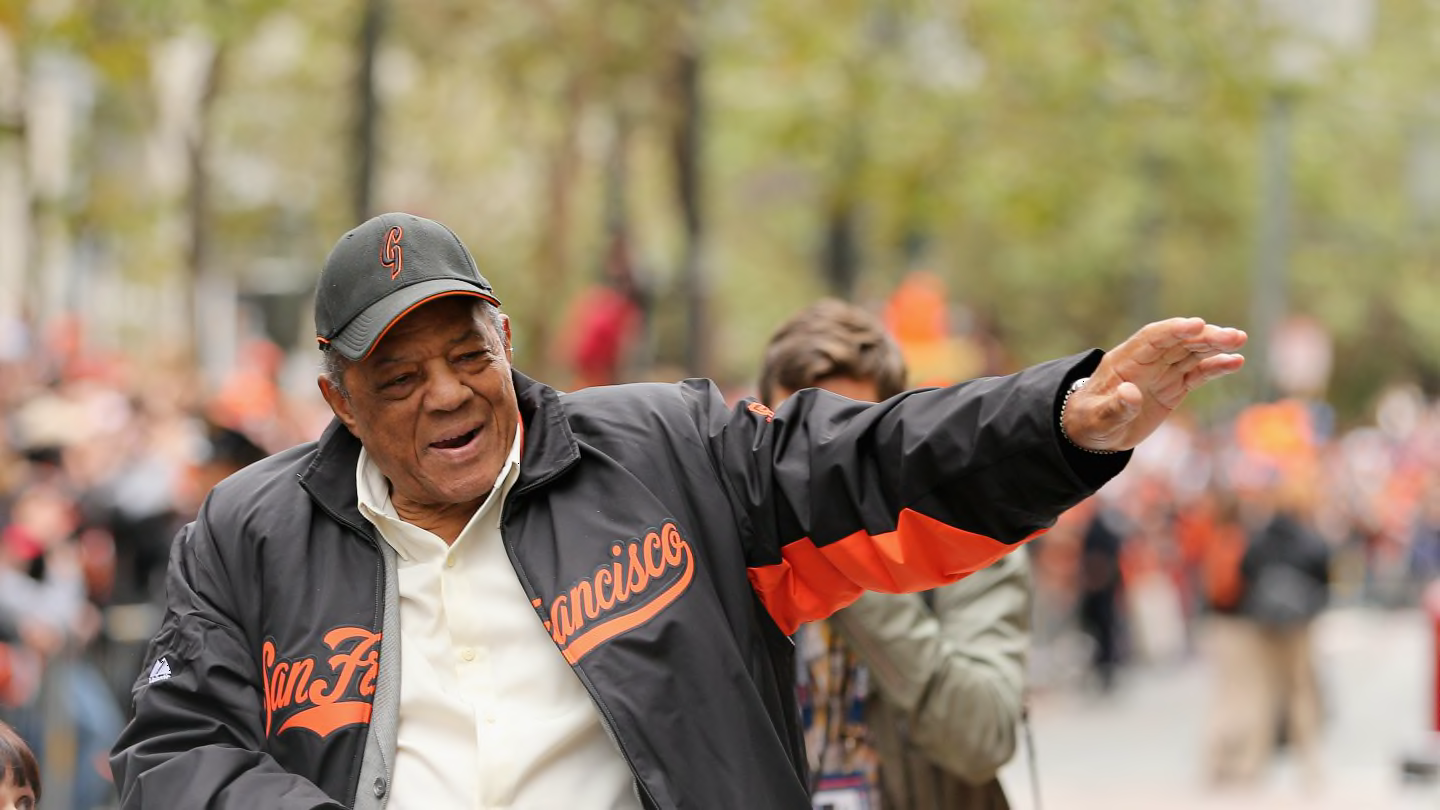
19 hours ago, WestCoastBias said:
They need to bring back these.

It's awesome how Willie seems to have a lifetime supply of these hats too.
I loved a lot of the spring training hats from that style as a kid.
Blast from the past! I had a Cleveland cap from this series growing up.
-
1
-
-
Keep the red on red and yeah, maybe a gold halo/accents. I don't mind the logo redunancy either.
-
1
-
-
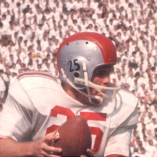
15 hours ago, csura999 said:
I never knew that Ohio State had their traditional striping pattern run vertically up the shoulders. This was a surprise to me when going through some uniform history for Big Ten teams.
Nice find! They threw back to these helmets in 2011 to celebrate the 1961 title.
Interestingly, they seemed to add vertical stripes but it was just a plain scarlet jersey in the 60s at home. Pants stripe was different as well.
-
2
-
-
Adore this Pelicans concept. Incorporating Mardi Gras beads without it being a garish uniform is really something.
Bucks concept is also sweet.
-
1
-
-
On 12/21/2022 at 9:12 AM, fortunat1 said:
I believe that they are referring to the specific cap that they posted. Teal has remained in the brand, as seen with the teal-accented alternate and snake head cap, but this cap wasn't worn for the last few seasons. The last time a teal-accented "A" cap was worn was for the 2019 season, so it's just coming back after a minor hiatus.
Is it teal or turquoise? The DBacks had teal in their original ID, and lots of teams use a teal that in many applications looks like a lighter blue, but in this case I think it's 2 different colors from 2 different branding eras.
-
1
-
-
13 hours ago, ManillaToad said:
What does "modern" mean in this context
Going over the uniform (not to say any of it is explicitly good or bad):
- Helmet uses orange trim on a thick aqua stripe as opposed to the classic AWOWA design in the throwback (or something else classicly football like Brashier stripes)
- Logo is no longer a cartoon, no M helmet
- White facemask rather than gray
- No sleeve stripes, just the logo
- Custom number font instead of a block
- Stripeless socks
- Both the aqua and orange look brighter than older sets from the Dolphins
So basically, there are updates throughout the uniform that distinguish it from the traditional football style, while the throwback is very reminiscent of the classic Browns, Packers, & Saints looks of old.
Miami is largely seen as a popular destination for young people to club and hit the beach. It's trendy and hot. The Dolphins themselves had their heyday in the 70s, but Miami is not a town that lives in the past, generally. Aesthetically I do enjoy the throwbacks a lot, but something about the look feels too old school for them to use full time, at least in my opinion.
-
5
-
 2
2
-
On 12/13/2022 at 11:59 PM, HopewellJones said:
Absolutely. Very underrated uniforms.
But...I think I still prefer the Throwbacks.
The throwbacks are great, no question, but I think a more modern look makes sense for Miami as a city and is a perfectly fine full time look. Keep the stripes as a special occassion thing.
I've always been an Aquafresh logo apoligist, to contribute to the thread. But as I've gotten older the concept of a dolphin wearing a football helmet has grown on me.
-
4
-
-
I really like this concept! I think shoulder stripes like that can really work for teams but are rarely used (effectively, at least). It's a great way to make the lightning bolt separate itself from the various other bolt-centric identities out there (obviously they use the Chargers logo now because it's the cream of that crop).
-
2
-
-
7 minutes ago, Germanshepherd said:
Would support the move back to white facemasks, but if you’re going to change the logo just use Brownie.
Wish they'd go back to the 2D profile for the helmet logo as well. The 3D version has never looked as good and if you're gonna use an outdated helmet model it might as well look classic.
-
9
-
-
16 hours ago, aawagner011 said:
Ohio State has revealed their CFP Peach Bowl uni. Throwback stripes as expected. New, however, is the template, which I believe Oregon has been using. One immediate downgrade I can see is that the swoosh and B1G logos are not level. That will bother my OCD a bit.
I will be curious if other playoff teams update to this model as well. I remember a few years back, Nike often used the CFP as their big stage to reveal new templates. I don’t think the image Georgia posted with the current template means anything because it looked like the chrome swoosh and Peach Bowl patch were just sitting on top of the jersey and weren’t sewn on yet (you can see a shadow below them).
That Peach Bowl patch is big clunky garbage. Would make sense to move the swoosh under the conference logo for better balance.-
1
-
-
1 hour ago, FinsUp1214 said:
That’s where I’m thrown off on this too. Hakeem is obviously one of the greatest players ever, and he was indeed a great defender, but defense is never the first thing that comes to mind when I think of him. I almost feel like naming DPOY after him inadvertently puts him in the wrong box.If you’re going to name a specialty award after a player, then that player ought to be known and remembered clearly for that specialty. Not that they were one-dimensional players by any means, but that they were one of the all-time greatest at thier specialty and role. When it comes to defense? Gary Payton, Ben Wallace, Dikembe Mutumbo, Dennis Rodman…each of those would have made perfect sense to me (Gobert’s in that group too, but he’s still active and awards should be named after retired/retiring players). Hakeem, as great as a defender as he was, doesn’t make the same amount of sense to me.
Obviously the Dream Shake comes to mind for Hakeem, and there are guys more singularly known for their defense, but just to make the case:
- All time blocks leader (I feel like this is the big one, but obivously there is more to that side of the ball)
- Only center in the top ten in steals (and among the top 30 basically)
- 2 time DPOY, of course
- More versatile than most centers
Ben Wallace would probably be my choice if you're going by greatest defensive player ever, but I think they wanted to honor their biggest stars with these awards. Hakeem fits that bill and is truly one of the great defenders in the game's history.
-
3
-
Can't really argue against any of the choices, but I don't think they need to be adding names to the trophies. Naming the Finals MVP for Russell made sense because he played before the award existed and would otherwise have the most given all of his championships as the centerpiece of the leagues first great dynasty.
In 50-100 years, IMO, there will be players more synonymous with these labels than the namesakes. If they had waited 10 years, for instance, I could see LeBron and Steph being the East & West Conference MVP trophies, as a for instance. But again, the choices aren't bad.
-
4
-
-
On 12/7/2022 at 6:46 PM, DCarp1231 said:
I understand the significance, but Clemson’s purple jersey (and pants) should be part of the regular home and away set instead of orange jersey
Gave you a like for being unpopular, not in agreement. I like the purple as an alt, but the all purple under orange doesn't do it for me.
-
1
-
-
The Bengals look absolutely fantastic in their orange jerseys with black pants, better designed and color balanced than those white pants.
In the spirit of an opinion-based forum I'm gonna say anyone who disagrees should be murdered on sight.
-
5
-
 1
1
-
-
13 hours ago, VikWings said:
The ones before that were perfectly fine before they cut big chunks out of the side panels diagonally. The "incomplete" stripes bother the hell out of me. It's like the Titans floating boxes/pit stains.
The 3-stripe pattern is better, but I would like to see it as a full side panel.
-
6
-
-
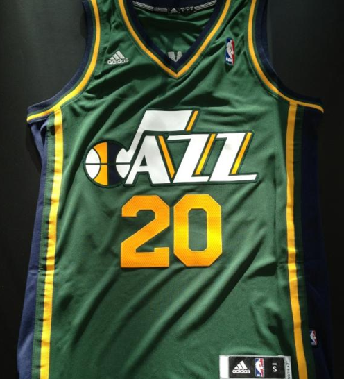
Nobody needs copper. Another team's alternate shouldn't factor into your own primaries. Purple and light blue look great together and both colors have history in Utah.
The black seems unneccessary but in the NBA most teams have a black set so whatever.
-
2
-
-
3 hours ago, buckeye said:
As most would expect, Ohio State is once again bringing out what should be their full-time unis for the playoff.
I guess using this as the Playoff look is better than the alternative universe where they wear these every week but go with the blackouts in big games.
-
5
-
-
Ohio State and Georgia only met once before in the 1993 Citrus Bowl. Had trouble finding a quality photo, but the game highlights are below.
As noted, the uniform matchup will be flipped, but not a ton of difference between the designs since then.
-
1
-
-
7 hours ago, Chawls said:
@infrared41 To your point about the Saints, I’ve been texting any of my friends who will listen all week about why the Saints need to go back to their original shade of gold. I did a somewhat quick edit on my phone...
What app?
-
19 minutes ago, LA Fakers+ LA Snippers said:
Agreed, they absolutely rule.
-
2
-
 1
1
-


:no_upscale()/cdn.vox-cdn.com/uploads/chorus_image/image/68653808/1295895879.0.jpg)


2023 World Baseball Classic
in Sports Logo News
Posted
The US cap logo is atrociously outdated. An interlocking US would look so much better. I saw a version of something like that years ago but can't find it now.
Of course, I don't think anything can match the beauty of the DR's cap (either version). Though I've always been fond of Mexico's as well.