


TaylorMade
-
Posts
968 -
Joined
-
Last visited
Posts posted by TaylorMade
-
-
FWIW, the Sounders' schedule release is all Twin Peaks inspired. There's a red tree at the very end of the video.
-
Having Seattle look like the Broncos is certainly a choice.
-
 2
2
-
 2
2
-
-
-
2 hours ago, VampyrRabbit said:
When was this announced? In the team statement, it was announced that -
That implied that the colours could be changed. Though that was back in February.
https://ws.onehub.com/files/kdcqmlfp
Slide 15.
QuoteOur name is Seattle Sounders FC and our colors are - and should remain- eternal blue, forever green.
-
On 11/17/2022 at 11:26 AM, upperV03 said:
I’ve said it before and I’ll say it again: just ditch the rave green. The crest absolutely is in need of an update (it was the moment it was revealed, tbh), but the rave green is the worst part of their brand IMO. I’d say it’s probably the worst primary color in MLS, or at least bottom-2 with Nashville. Could be as simple as tweaking it to make it more of a true lime green like the Seahawks (still bad, but not puke-colored bad), changing it to something in between the Seahawks’ green and Austin FC’s gorgeous green, or a radical change like moving to city flag teal like @Digby mentioned.
They've already said the name and colors are off limits
-
-
5 hours ago, IceCap said:
They're referencing airport carpet. AIRPORT CARPET!
The PDX carpet design is a highly regarded thing among Portlanders and there have been people asking for a jersey like this for a while.
-
5
-
1
-
 1
1
-
-
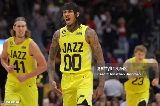
No City jersey for Utah, eh?
-
4 hours ago, pelicanfan said:
infamous jerseys debuted last night.

they look ridiculous but i’d be lying if i said i didnt want to see them wear these more. they’re just so funny to look at.
Why is JAZZ so much lower on Clarkson's jersey compared to Olynyk's and Markanen's?
-
3
-
-
1 hour ago, DEAD! said:
But not until after this coming season which happens to be when the sponsorship deal ends.
That's... how renewals work...
-
NBA: "Almost every team loses money every year."
NBA teams: "Check out this new court we're going to play on for 3 whole games this season!"-
11
-
-
7 hours ago, NH4 said:
Now these are the amazing Warriors uniforms instead of the bland navy ones.
The C under the Nike logo looks so bad and just further hammers home how bad the ads are.
-
6
-
-
28 minutes ago, TenaciousG said:
I thought the minimalist era was going to end someday but Nike just loves rolling out professional practice jerseys (Cleveland, Utah)
Both Cleveland and Utah rookies in that photo shoot are wearing the Summer League uniforms, for some reason
-
-
3 hours ago, Captain Invader said:
I read in a cleveland.com article / interview with the young guy the Cavs hired for the head of branding, that the new uniforms are not going to have any trim on the outside of the shoulders.
He also said the 'C' would not be their main visual identity (I take it that means the new CAVS wordmark will take that spot). He also mentioned he did not want a bunch of secondary logos mucking up the brand (my words).
My guess is the new unis are going to be rather simplistic. (Hopefully not to the likes of Utah).You can see in the video that @CitizenTino posted that the jerseys have no trim.
-
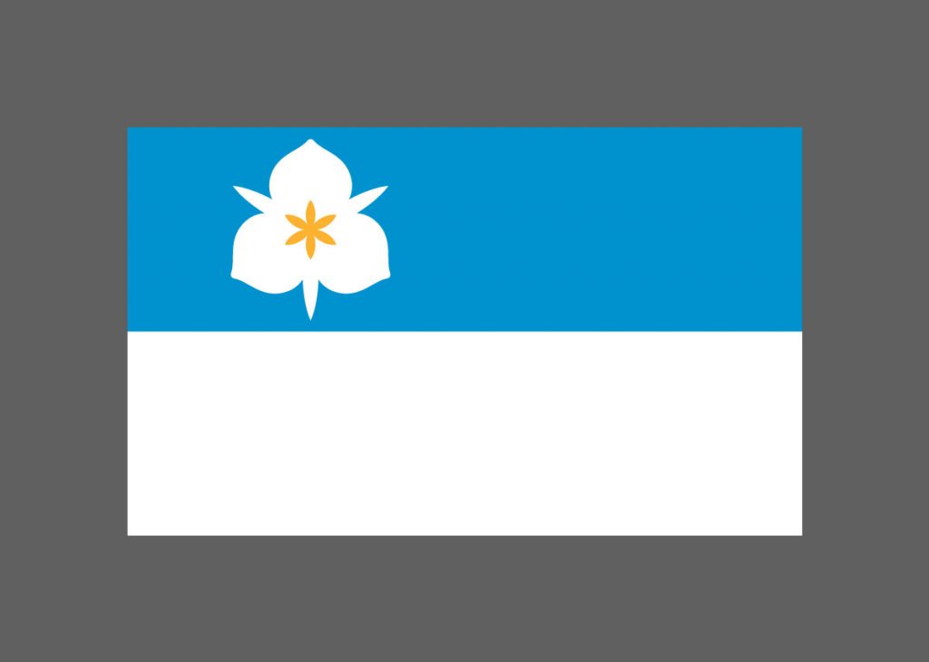
2 hours ago, kimball said:
Nah. I could see MAYBE a City Edition, but even then nobody knows (or cares) what the SLC flag looks like here in Utah. If you're going to build a sports brand or alternate jersey around a city or state flag it should be somewhat iconic or recognizable outside the state. That's why it works for Colorado, Chicago and Arizona (to name a few).
I mean, OKC's identity is built around the flag there and who could tell me what that looks like?
-
Could have built a pretty decent brand around SLC's flag
-
3
-
 1
1
-
-
2 minutes ago, Carolingian Steamroller said:
Midnight blue.Ah. I admittedly pay less attention to baseball than any other sport and I remember Jay-Z saying he wanted to make the Nets' brand as iconic as the Yankees so I made an assumption.
-
1
-
-
9 minutes ago, Carolingian Steamroller said:
Indeed, the Nets are the only team in the Big Four of North American sports to wear strictly black and white like Juventus or Siena.
The Yankees?
-
3
-
-
New logo finally hit NBA Media Central. No secondary logos.
-
1
-
3
-
 4
4
-
-
21 hours ago, LA Fakers+ LA Snippers said:
Cleveland needs to unveil their new uniforms soon, right? The draft is next week, and you have to give the players ceremonial jerseys when you sign them.
You have to?
-
1
-
-
22 minutes ago, Survival79 said:


This isn't even the right font.
-
2
-
-
-
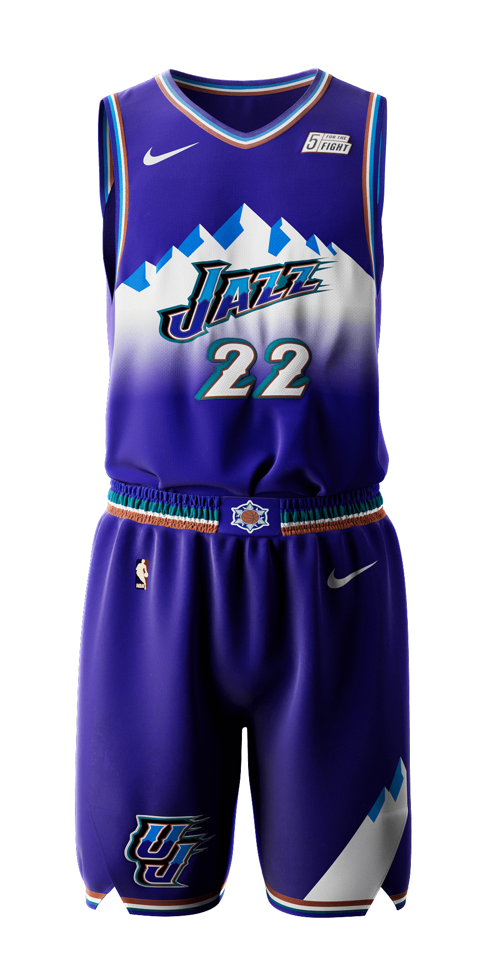
19 minutes ago, Foxxtrot44 said:
Well now there's a ring of mountains on the J-Note statue
To me, this just confirms the Stockton/Malone era throwbacks
-
2
-


MLS kits 2023
in Sports Logo News
Posted
I mean, there's also an entire exhibit dedicated to him at the Museum of Pop Culture, the largest collection in the world. Plus he's buried in Renton.