


MDGP
-
Posts
1,893 -
Joined
-
Last visited
-
Days Won
1
Posts posted by MDGP
-
-
Unless there was a change that hasn't been noted in the college football thread, looks like EA got the logos wrong on Notre Dame's sleeves.

-
Chiefs: There are only so many ways I can talk about the 30s being a time of experimentation before it starts getting stale. During the time period two variations of stripes came to the forefront to join the triple stripe: the northwestern stripe, and the double stripe. By and large the northwestern stripe won out, and the double stripe would disappear for awhile, never gaining the same popularity of its three striped cousins upon reappearing. For the Chiefs I wanted to try something a bit different from reality be combining the two ideas together, resulting in a double stripe with one thicker stripe on top and one thinner stripe below. I actually like the outcome a lot, and think that even though this stripe didn't actually exist, it fits pretty well next to real designs of the era. The helmet takes a novel approach to the old school triple stripe look (Think Michigan but without the wings, it was a very common variation). Here, the middle stripe extends all the way to the back, but the other stripes are cut off right about where a helmet wing would stop. I also added two more stripes on either side of the helmet that are cut off as well. Those who are familiar with my old concepts may recognize this as a similar design to the "arrow hitting target" I did a few years ago for Kansas City.
Broncos: Side panels were extremely popular during the 1930s and 40s, so it only seemed right that the team who revived the side panel look during the 90s and 2000s would get an old school version. This one isn't much more than a recolor of the Philadelphia Eagles look from the era, but this is in line with so many teams wearing the same template with different colors (or the same colors even).
Raiders: The Raiders are obviously famous for their iconic black and silver color scheme, however their original scheme. However, I decided I wanted to try an idea for this match up inspired by the Los Angeles Rams and Dallas Cowboys, who both famously did not wear their famous secondary color for a period of years. The Raiders look takes inspiration from the team's original black and yellow look, removing all traces of yellow to create a very stark, clean look that fits the raiders well.
Chargers: For the chargers I decided to go with Royal Blue and White. While Navy blue would've fit the NFL better during that era, teams in college and the CFL were wearing a lighter shade of blue at the time, so this look isn't particularly out of place in the grand scheme of the sport. Rather than go with a simple triple stripe, I experimented with creating a proto-bolt design on the sleeve, turning the middle stripe into a lightning bolt, echoing the Chargers' famous shoulder stripes. The helmet also features a proto-bolt idea, with a bolt extending from the front of the helmet similar to the Eagles' wing helmet.
-
 3
3
-
 1
1
-
-
Alright, back to the Buffalo Bills' least favorite division, the NFC East! The AFC South was all concepts last time, so we're gonna start off with a real one today.
Commanders: As I've noted before, the 1930s experienced arguably the biggest boom in experimentation of the football jersey, for good and for bad. The era set the modern standard for the football uniform, but also whatever the the hell Boston (pre-relocation) was wearing. The original version featured a native american head logo on the chest. Because I wanted to follow modern NFL numbering rules and in general wanted to avoid the whole controversy in general, that was replaced with yellow front numbers to match the back numbers. Otherwise, this jersey is a faithful representation of one of the team's 1933 jerseys, featuring two yellow and black sleeve stripes with mismatching socks stripes (two yellow stripes). I'll never understand what teams were going for with the helmet design other than it feels a lot like when people new to concepts just use the fill tool to color different panels on a jersey, but it is what it is and it stays.
Giants: The Giants are known for their simple blue uniforms these days, but early on they had no real idea what they wanted to look like. This jersey is an anachronistic take on the team's 1929-1930 jerseys. Those jerseys were entirely blue on the front with a white back and circular brown leather patches on the sides of the torso. However, I decided that by making the front white and leaving the shoulders and sides blue, the look could take on a pretty solid away jersey. The brown side panels remain alongside brown pants and a faux leather helmet. And to top it all off, the socks are red with a white and blue triple stripe, because cohesion just wasn't a thing anyone seemed to care about back in the day.
Cowboys: If the 1930s were a time of experimentation, the 1920s were a time of trying to actually figure out what the hell a uniform was in the first place. One of the less common, but certainly prevalent designs was the horizontal half and half jersey. These jerseys looked exactly like they sounded, the top half was one color (usually white) and the bottom half was a different color. Luckily, the modern jersey actually works pretty well to incorporate that design style while not looking at all out of place. I've demonstrated this idea on the cowboys. Here, the top of of the jersey is silver, covering the sleeves, shoulder yoke, and collar, while the bottom half is navy blue. It also wasn't uncommon for jerseys of the time to include superfluous stripes as well, so I added a white stripe between the two halves. Because this was an early 20s design, both the helmet and pants are a faux leather brown.
Eagles: The Philadelphia Eagles are one of the oldest teams having existed almost since the league's founding... Almost. That decade period before the Eagles were officially founded gave me the opportunity to do a concept for the Eagles. During the earliest days of the league, teams sometimes went the hockey route and slapped a logo on the chest. One of those teams was the Columbus Panhandlers, who wore a keystone on their chest. This design seemed like the perfect fit for a team actually from the keystone state (the panhandlers were a team of rail workers working on the panhandle railroad owned by a Pennsylvania rail company, so it actually makes sense). I also had to bring back the Eagles' iconic original color scheme by depicting a light blue keystone on a yellow jersey. Within the keystone, the front number is depicted in white, and the back number is depicted in blue. While the original keystone logo was small, I needed to increase its size in order to fit a number on the front as well (similar to the packers' circle jersey). Small, numerous sleeve and sock stripes were also common during the era, so the sleeves and socks both feature blue stripes on a yellow background. Finally, the pants are a darker faux leather brown paired with a yellow helmet.
-
2
-
-
23 hours ago, mcrosby said:
Great stuff here. I've gotta hurry up with my series before you beat me to all these great ideas.
Hey, thanks! I've been following your series (haven't had the chance to really sit down and write out C+C for it yet, so get ready for a single post about 10 teams at some point, haha) and I've definitely like what I've seen so far (particularly the Ravens throwback), and am definitely excited to see where you go with the remaining teams.
22 hours ago, logo-maker said:For your Indianapolis Colts concept, I feel like it's a missed opportunity to turn the horse shoe on the helmet sideways to create a 'C' on the front or is that too on the nose.
I actually didn't go with the sideways C for a few reasons. First, I honestly have never liked any of the C-horseshoe concepts I've seen in the past. To me it comes across like adding extra meaning to a logo that doesn't need it while also ignoring that the U arrangement has its own historical meaning with superstition and luck. The second reason is that kind of easter egg style of design wasn't at all prevalent during that time period. The popular style of art during the earliest years of the NFL wasn't remotely what it was today; team logos were much closer to lithographs and heraldic crests than anything we think of as modern logos. Teams were more likely to be depicted like this:
And where teams did have more simplified logos, they tended to be really simple about it. Logos with hidden features or meaning within a meaning really didn't become prevalent until corporate design started taking over during the 1960s and 1970s. That's where you start to see the boom of teams like the Colt 45s, the Whalers, the Flames, etc. start to incorporate those elements a lot more. So going with a C-style horseshoe felt too anachronistic to me.
-
1
-
-
Today we head back to the AFC South
Texans: One of the things that can get lost in these types of concept series is the fact that it was very common to see plain jerseys during the 20s-40s. The Texans, until about two weeks ago, have always had a very traditional uniform, so they seemed like a perfect candidate to simplify even more, sporting a plain navy blue jersey with plain white pants and plain navy blue socks. The helmet holds all the design details, featuring red bull horns that would act as a slight precursor to the Rams' and Eagles' helmets and a lone white star on the front of the helmet. There weren't any pro teams in the late 40s who sported a from helmet logo, but there had been teams in previous season who did sport one, so it's plausible that a team might try to revive the idea.
Jaguars: The Jaguars sport a pretty traditional 1940s look with albeit with an nontraditional color. Here, the look uses a black-teal-black northwestern stripe on the sleeves with teal numbers. While white jerseys were still relatively rare at the time, the teams that did wear white almost always wore socks matching the number colors, so here the socks are teal with a white-black-white northwestern stripe. Hey, remember when the Jaguars wore the ugliest helmet in NFL history with the harsh split gold and black gradient? Well in this world that helmet was a callback to the team's classic look of the 1940s! This type of two-tone helmet featuring a sort of circle of color on the sides with a different color top was worn by the Philadelphia Eagles throughout the 1940s.
Titans: The Tennessee titans own the double blue look in the NFL, which is why thanks to wanton mismanagement, the currently barely wear one of the colors. I really wanted to focus on emphasizing the double blue, giving both colors a chance to stand out, much like the Titans of the 90s-2010s. Here, they sport a powder blue jersey with a thick double stripe that had been word on a few occasions by a few teams. The look was never a staple, but it showed up enough that I felt comfortable using it. I debated going with white pants, but ultimately chose brown leather to further emphasize the late 20s early 30s look I was going for. Finally, the helmet features a Navy and Light Blue variation of the Michigan helmet with the stripes being cut off about halfway down the helmet, a design choice that was not uncommon at the time.
Colts: This is the second and final jersey inspired by the original AFL of this series. American Football was still figuring out its aesthetic during the 1920s and early 1930s, and as a result, there were some pretty loud designs mixed in with what would eventually become the aesthetic we know and love today. I wanted to use the colts to show that variety in one package. First, the jersey features blue raglan sleeves with contrasting white sleeve stripes. This takes its cues from teams like the sleeves of the Green Bay Packers, the Rochester Tigers, and the New York (football) Yankees. The blue pants were inspired by the rapid shift from brown to color pants by teams like the Cincinnati (football) Reds, Brooklyn (football) Dodgers, and the St. Louis Gunners. By 1940, color/white pants were the standard, and only Green Bay and Washington would wear brown leather style pants through the 40s. Finally, the helmet once again is inspired by the helmets of original AFL teams. This felt fitting as the Colts were the first team in NFL history to place their logo on the sides of their helmet (I am not including the Rams or Eagles helmet designs as logos).
-
3
-
-
9 minutes ago, Haz_Matt said:
"All mountains look the same"
Those are Utah mountains, though both states have mountains in the Rocky range, they're not the same
I dunno, man. They look pretty damn similar
-
1
-
-
Packers: The 1933 Green Bay Packers were very good... against everyone not named the Chicago Bears and New York Giants. The Packers were a combined 5-2-1 against other teams but a dismal 0-5 against the two NFL Championship Game participants. While this season is on the whole pretty forgettable, I chose this jersey for the specific reason that this jersey matchup actually happened twice during that season, and I'm a sucker for throwback games featuring actual matchups. The look is simple, a plain navy blue jersey with yellow numbers, tan leather pants, and a faux leather helmet sporting a design reminiscent of blue spokes (think the bruins logo) on a yellow background. This jersey is modeled by 7 time first team all-pro, two time NFL champion, and NFL/College Football Hall of Famer, Clarke Hinkle.
Bears: This Bears jersey was worn for exactly one season, and only 4 times overall. So why did I pick this jersey? I chose it because this was the jersey worn during the Bears' victory in the first ever NFL Championship game, and such important football history deserves to be remembered. The jersey features the traditional bears road sleeve striping pattern, three separated blue-orange-blue stripes, but with orange block numerals. The fabled Bears' orange pants make an appearance as well, paired with navy blue socks with three thin orange stripes. Finally, the look is rounded out with a blue and orange version of the Michigan/Princeton helmet. It wouldn't truly be a Bears design from the 1930s if it were modeled by anybody but Bronko Nagurski.
Vikings: We're back in the 50s for this Vikings design inspired by the prevalence of home jersey designs with no white during the era (Packers, Steelers, Lions, etc.), and the potential that the Vikings color rush jerseys didn't live up to. Here, they wear a purple jersey with yellow numbers and yellow northwestern stripes, acting as a predecessor to their 1960s jerseys. The pants are plain yellow and paired with socks that match the sleeve design. Helmet logos were almost non-existent in 1954, only the Baltimore Colts featured a traditional logo on the back of their helmets. However, the Eagles and Rams had their famous wings and horns, so I took inspiration from those designs with the Vikings traditional horned helmets. This design features a simple yellow horn across the side of the purple helmet, extending to the facemask area, similar to the eagles wing design.
Lions: Our next jersey celebrates a strange quirk of 1950s jersey designs. The Lions were not unaccustomed to a white jersey with blue northwestern stripes and numbers over silver pants with a silver helmet. This was the team's basic look (with variation) for about 4 decades starting in the late 1950s. However, the Lions did wear this jersey for a single game during the 1954 season due to a clash of blues. And during that game some players wore silver helmets while others wore gold. What was the purpose behind this? Well, it was an manufacturing error. The helmets were in fact originally silver, but after being used for multiple years, either the plastic or a resin covering the plastic turned yellow, a very common phenomenon in both materials. However, the raised center stripe was made from a different material, and did not show this effect. This caused the helmets to appear gold with silver stripes down the center. Ultimately, the team would fix the helmets within a few years, and the Lions would not need to wear white until after said fix was made. Because I enjoy this quirk, the Lions are outfitted with a gold helmet and silver stripe. The jersey is modeled by 3 time NFL champion and one of the early greats of the secondary, Jack Christiansen.
-
4
-
-
15 hours ago, fortunat1 said:
So glad that I found this series. I love all of the jerseys so far, as well as the idea behind it all. I always appreciated the usage of shapes and patterns in place of logos on football uniforms, as well as old school brown pants, so this thread has quickly become a favorite of mine.
The Dolphins, Seahawks, and Ravens stick out as favorites so far. I look forward to seeing how you continue the series, as you've been able to do so much with vintage/traditional designs.
Thanks for the comment, fortunat, I'm glad you're enjoying the series! Miami is probably my favorite of the ones I've unveiled so far as well. Though, I've been trying to balance unique and traditional designs, so there are a few waiting in the wings I think can give it a run for its money.
-
Back to the AFC East and through our first cycle of the league!
Dolphins: The early 1930s marked the tail end and eventual death of the leather patches on football jerseys. For this jersey Miami uses the chevron design previously used by the Steelers and Bears. However, this uses only two vertical bars, creating an M on the chest. The helmet continues my altering of the traditional helmet wing style, depicting a sunburst similar to the one that has graced the Dolphins' logo since their inception.
Bills: You know the Bills' terrible 2000s uniforms? As it turns out, there's an actual historical equivalent of these jerseys worn by the New York Giants. Everything from those 2000s jerseys is here, multiple blues, a shoulder yoke, a red side panel that doesn't match the pants. The only real difference is the helmet, which takes on the red streak from the team's logo as an extended front helmet wing.
Patriots: The Patriots design is inspired by the famous New England flag that has been flown since before the revolution. To depict this, the jersey is depicted in red monochrome with contrasting white sleeves. The helmet features a design not inspired by the national football league, but rather the American Football League of the 1936-37 seasons (it took 4 tries to create an AFL that actually worked). The Boston Shamrocks and the Brooklyn/Rochester Tigers both wore a small logo on the front of the helmet within a contrasting helmet wing. Here, I depicted the green pine tree as seen on the New England flag.
Jets: The Jets whole concept depicts a prior history in which the New York Titans wore green prior to their blue and gold jerseys. These feature a pretty simple 1930s jersey, with a simple white jersey with contrasting shoulder yokes and butt stripes with barber poll socks. The helmet is anacronysm depicting a double helmet stripe inspired by the Dartmouth Big Green's iconic helmet, which itself would not be worn until 1964. As I noted before, I reserve the right to ignore the rules at my discretion (I believe I only did that for the Jets).
-
2
-
1
-
-
-
Lots of real throwbacks today in the NFC West.
49ers: You know the famous 49ers throwback that the team wore in Super Bowl XXIX and recently brought back? It, like many of the throwbacks from the NFL's 75th anniversary, is inaccurate due to the league not changing teams' primary helmets. In actuality, the team wore red helmets with a silver stripe. Honestly, it's amazing the Niners ever wore this as a throwback. The original jerseys were worn only during the 1955 season in which the Niners went 4-8 and finished 5th in the NFL West. The jersey is modeled here by Hall of Fame QB Y.A. Tittle.Rams: The Rams are synonymous with shoulder stripes, having worn at least one jersey with them every season since 1962. These are the jerseys that started it all. Worn for only two seasons before the Rams' experiment with blue and white, they feature blue-yellow-blue UCLA stripes with matching stripes on white pants. This looks is incredibly underrated and would still make a fantastic look for the team today. The jersey is modeled by The Secretary of Defense, Deacon Jones.
Cardinals: The Arizona Cardinals are the NFL's oldest franchise and one of two charter members that still exist, so naturally they're going to feature jerseys from the earliest days of the league. The jersey for this matchup is based on the team's second ever uniform paired with their socks from the version of the jersey worn in 1927. This jersey featured three large cream stripes on the sleeves and a similar striping patter on the socks, with an added 4th stripe. The original jersey also featured the team's wishbone C logo on the sleeve cuff. Due to constraints of modern templates, this small feature has been removed. Paddy Driscoll, the NFL's original triple threat, models this jersey.
Seahawks: Our only concept jersey of the day has the Seahawks in a double blue color scheme inspired by the team's 2000s jerseys. Thin stripes on both the chest and sleeves were pretty common during the earliest days of the league, so I placed 6 on the chest and 3 on each sleeve as an homage to Seattle's 12th man. Half of these stripes are Navy blue while the other half are steel blue, inspired by the Frankford Yellow Jackets' asymmetrical stripes worn during the 1926 and 1927 seasons. Finally, while a vest majority of teams during the era wore naturally colored leather helmets and pants, several teams wore dyed gear including the Green Bay Packers, who wore similar blue color pants in 1927 and 1928.
-
1
-
2
-
-
I am not letting this series die, damnit! Thanks to lessons learned doing my college hockey redesign series, I've actually made sure that got everything fully prepped and it's just about posting the actual designs, so this time we're actually getting it done!
Today we're moving back up to the AFC North for two wildly different eras of design.
Bengals: Everyone definitely loved and didn't despise those 1930s striped Steelers throwbacks (to be fair I genuinely loved them) so naturally everyone will want to see the Bengals do a similar thing. The Steelers, however, were not the first team to use hoops on their jerseys, as they were somewhat widespread during the 1920s as well. The concept is simple, tigers have black and orange stripes, so the jersey is entirely black and orange stripes. Unlike the Steelers numbers, there's enough contrast for white numbers with black outlines.
Browns: The Browns jersey takes its inspiration from several designs from the 1920s. The chest features a triangle, a nod to the Dayton Triangles who featured the shape on their chests, as well as a nod to the rock and roll hall of fame, famous for its pyramid shape and located right next door to Cleveland Browns Stadium. The sleeves take inspiration from the Cardinals sleeve stripes and logo from the era. This also features an homage to the famous <=B=> logo by depicting the C on the sleeves as a vertical football with the two stripes running through it. Finally, the jersey includes plain brown pants inspired by the darker leather pants color that some teams wore at the time.
Ravens: The Ravens take on a traditional 1960s NFL look featuring a purple helmet and jersey with white pants. I initially thought of black for the helmet, but in my research I discovered that only one team in the NFL or AFL wore a helmet that could be considered darker than the team's dark jersey during that era, the Denver Broncos. And even then it's debatable whether that color blue can be considered darker. Therefore, the purple helmet was used. The helmet features a logo inspired by the Ravens' original shield shape, but flipped sideways to form a B reminiscent of the Packers' iconic G logo. The jersey and socks feature a traditional triple stripe, and the pants have a single black stripe in honor of the Ravens' actual first jersey featuring a single white stripe on the pants. This stripe is somewhat anachronistic, as almost every team by this point had triple stripes on the pants, but Washington did have a single stripe at the time, so it wouldn't be out of the realm of possibility.
Steelers: The Steelers actually existed, so they get their real road jersey from 1963-1965. There's not much to say about these jerseys, the most notable feature being the contrasting yellow sleeves with a black northwestern stripe. This was also during the brief period in which the Steelers did not wear yellow pants. As with the other real throwbacks, this jersey is modeled by Hall of Fame full back John Henry Johnson.
-
6
-
2
-
 1
1
-
-
23 hours ago, Haz_Matt said:
I haven't seen any "iconic" or non "bush/minor league" names suggested by the people dumping on the rumored options either
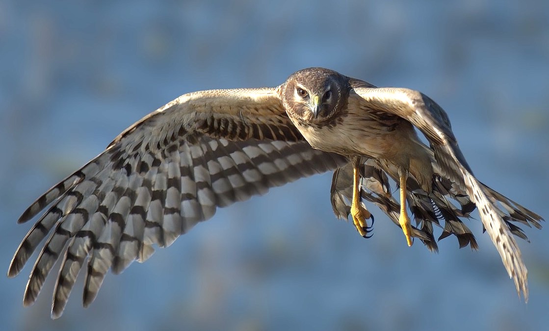
The Harriers. A bird of prey native to the area that conveys the old tropes of speed and toughness. And it's also the name of a military jet for the ever important "sports iz WAAAAARRRR" and military fetish crowds. To top it all off, it's a legit cool looking bird.
-
6
-
-
20 hours ago, rfraser85 said:
I don't know about sales for U-H, but if the NFL did nothing, how many other college teams may try to do something like this? One imitator may not be a problem, but the potential for cumulative damage may be worth taking action.
That said, I agree that shutting everything down may be excessive. The Iowa Hawkeyes have been using Steelers look-alike uniforms for decades, so there may be a middle ground somewhere.
Trademark law isn't like copyright where you retain the right no matter if you choose to defend it or not. Under US trademark law you are required to vigorously protect your trademark or you lose the right to challenge in the future. That itself can lead to the loss of the trademark and/or total genericization of the mark.
-
6
-
-
16 hours ago, FiddySicks said:
Oh great. These are all terrible. And you know that the very worst one of them all, Yetis, is ABSOLUTELY going to win in a landslide.
This league is a perpetually unserious joke.
Seriously, it's baffling. "Utah Yeti it's almost a rhyme hehehehehehe." What are you people, kindergartners?
-
4
-
 1
1
-
-
Penn State had a weird period where the basketball programs added light blue to the color scheme, making them look like Villanova and UNC.
-
3 hours ago, sky1324 said:
I feel like the whole reason 5280 is such a big deal because it's exactly one mile above sea level. Sure, some cities are higher, but none are perfect like Denver.
Except that almost nowhere in Denver is actually 5280 feet. But I guess "5280 feet at the 13th step of city hall and maybe the 4th highest row at Coors Field, they won't actually let us survey it" doesn't have the same ring to it.
-
7
-
-
6 minutes ago, RyanMcD29 said:
Hey now, they're also great at lacrosse!
But otherwise yes, rest of your point sums it up
Haha, I had a feeling someone was going to point out a smaller D1 sport they were good at
-
13 minutes ago, JustABallCoach said:
Locally the H-Town alts have near unanimous praise, so it matches what I've seen and heard.
Maybe. But I've also heard that with basically every single uniform unveil on this site.
Fact of the matter is, jersey sales always skyrocket right after an unveil because people want the new jersey. The actual popularity of a jersey is never measured by first day sales, but by how long the jersey sticks around. If these are still the jersey in 25 years it means the sales are strong enough where they don't feel the need to change.
But history has repeatedly shown that most of these jerseys that are supposedly the next big thing disappear after 5-7 years. Seattle's the main exception and that almost certainly is paired with the team having its best stretch with those uniforms.
-
1
-
2
-
-
7 minutes ago, JustABallCoach said:
Love the deceptive phrasing here by using sold out incorrectly. This also isn't actually impressive. They said the exact same thing with the terrible 2015 Browns jerseys too as though it meant anything other than fans will buy new jerseys.
-
2
-
2
-
-
11 minutes ago, spartacat_12 said:
College teams don't carry the same importance in hockey as they do in basketball. If you did a poll of NHL fans asking them if they know what the University of Denver teams are called I think most of them would draw a blank.
Yeah, I think the premise that they're the [insert power 5 school nickname] of college hockey is the issue. Denver's really more like a Villanova or Gonzaga just with more national titles. They're phenomenal at one sport but not at all present in the top levels of D1 at anything else, while UConn, Duke, and UNC are all power 5 schools. I'm not sure I'd trust the average fan to know what Nova or Zags' mascot despite both being hyper generic.
Honestly, it really all comes down to the fact that football is the truly important sport for fan knowledge. The top level FBS schools are the ones everyone knows and everyone else is a crapshoot.
-
1
-
-
On 4/19/2024 at 1:38 PM, spartacat_12 said:
Thank god it's plural at least.
Is every single NHL team from now on going to have a "regional" nickname that has literally nothing to do with the region?
And before anyone jumps in and says it is regional, the Yeti myth has nothing to do with the American mountain region, it's not the same as bigfoot/sasquatch. It would be like a team calling themselves the Utah Himalayan Brown Bears because they're a bear so they're the basically same thing as a Grizzly.
-
7 minutes ago, Maroon said:
In fact, even showing your pen work with the paths helps me a lot, as I didn't create the "S" (or any of the letters) by creating a path that crosses over itself - I made an outline and then made another shape for the internal gaps. You make a really good point about the inner loop and outer loop. Now that you've explained your process and the need to make inner curves at least be generally the same as the outer curves, you can tell that the "S" has an inner shape is disconnected with the outer curve of the letter.
There are actually some benefits to doing it the way you mention in the bolded part (I honestly do it both ways depending on the circumstances), but when drawing the loops that way it just requires a bit more care and attention to get right.
Oh, I forgot to mention earlier, the advice with the flowing vertexes doesn't necessarily apply to the letter E. I've found in some cases having the letter flow works well, but in others you will actually want a corner in there. This is mostly just a stylistic decision that will depend on the rest of the script.
-
1
-
-
Man, this is the first time in awhile where the "it looks like an XFL/group of 5 college/high school/video game create a team" comments are actually right on the money.
-
8
-


 - A bear standing while holding a football SportsLogos.Net")
 - A green an white eagle holding a football while taking off SportsLogos.Net")


The Lost History of the NFL: A Throwback Concept Series
in Concepts
Posted
Things have been a little too down to earth, let's get weird with it today.
Buccaneers: The Buccaneers brand takes much of its inspiration from Spanish privateers of the 1600s. The jersey features an orange chest stripe on a red jersey, inspired by spain's yellow and red flag. One of the great things about their pewter helmets and pants is that they translate perfectly to faux leather pants and helmets.
Carolina: It's been a while since I've used the old school leather strips design on a team. Carolina features these strips in light blue, arranged in a manner to form a crown, based on Charlotte's nickname, the Queen City, and logo, a crown. While the original version of this jersey would've been all light blue, the modern version includes a black front number to improve visibility as well as incorporate the Panthers' other primary color. The helmet design features panther ears on each side of the helmet in place of an old school wings. While a panther is famously black, I decided to go with white ears, as in many cases actual animal colors were completely ignores (see: Detroit Lions, Philadelphia Eagles). Finally, there's been a lot of dark brown for pants, but there was actually some variation during the earliest days of the game, with some teams opting for a more tan color for their pants.
Saints: They're not going to get more over the top than this one from here on out. The Saints take most of inspiration not from American Football, but from Rugby. More specifically I wanted a design inspired by Harlequins' four quarter jersey design. Functionally, this wouldn't be entirely out of the realm of possibility in the NFL, as multiple teams wore horizontally halved jerseys and at least one team wore a vertically halved jerseys. I just combined the two ideas for quadrants. Here, the saints pair the traditional gold and black with green and purple for a full mardi gras color scheme. The bottom left quadrant contains purple, the top right quadrant green, and the other two quadrants black. The numbers are Clarendon in gold and feature shoulder numbers, a purposeful anachronism (I don't know why, but I've always enjoyed throwback mistakes like the 94-95 49ers). The helmet features a wing style inspired by the famous three pronged jester hats, each colored in purple, black, and green respectively on the gold helmet.
Falcons: The Falcons bring us back down to earth with a considerably more traditional design. Pairing shoulder yokes and sleeve stripes wasn't uncommon in the 1920s, and I felt combining the two would work with the Falcons' color scheme. The jersey features a red shoulder yoke with red sleeves contrasting the white jersey. On the sleeves is an alternating black, white, and red sleeve pattern that, if the sleeves were long like during the actual era, would repeat to the sleeve cuff. The socks while also red, feature a different stripe pattern with black and red stripes eventually meeting the black, white, red stripe pattern at the bottom of the sock. Both the helmet and pants are very traditional to the era; the pants are a light tan while the helmet is painted with black on top and red on the bottom.