


henburg
-
Posts
1,047 -
Joined
-
Last visited
-
Days Won
2
Posts posted by henburg
-
-
I think that the only chrome helmet setup that even kinda works is LA, and those would still look 100x better if they were simply a metallic sliver finish.
I'd much prefer more teams to try a matte finish like what the Coyotes opted into with their third jerseys. Would fit most teams' jerseys better and still adds a really nice elevated touch to the uniform

-
 13
13
-
-
1 hour ago, tBBP said:
Two things:
There was a much different approach to design in the 60s when the original Falcons logo debuted. I'm not sure if it was originally meant to imply an F or not, but the now-current logo certainly was intended to, well, "strongly imply" the F. Speaking of, I don't see a problem in "implying" certain elements, but there are instances where it becomes obvious and thus kinda ruins the whole thing. Like this:
It's the difference between connotative and denotative design. When it's connotative, it's nicely built in (and in the grand visual hierarchy, it may be one of the last things the eye picks up). When it denotative, it's done on purpose, often starting from that point and working backwards (which is what I believe happened with the above Wolves example; that tree in the fur is way too obvious. Matthew Wolff did a great job in fixing that with the current Wolves logo.)
Now, for the second thing. That Grizzlies logo was originally designed while the club was still in Vancouver, so of course Memphis wouldn't have any kind connection to it. That said, their now-current and to me vastly inferior alternate logo does imply an M:
You'd have to look very hard to see it if you didn't already know it was there, but the top three claws are what imply the M. (Thus, it's connotative; it connotes, or projects the idea of, an M.) For reference, here's the preceding version(s) of that claw-ball mark:
This raises a whole other line of questioning, whether "sanitizing" that logo (my words, but pretty much the same thing Tampa did with the current Jolly Roger logo as compared to the pre-2013 version) just to be clever and imply the M was really worth sacrificing the superior dynamism of the previous version(s). But that's what they did, and that's what we got.
Design. Decisions, decisions....
This is a great breakdown of something I think that can be seen a lot in new logo designs. I think that everybody loves meaning behind design decisions and wants great storytelling to help sell their ideas, but going too far with it can come at the cost of a better and simpler idea. The logo that the Browns ended up picking for the Dawg Pound is a great example of this problem I think. The design is mostly fine, but it has some odd visual aspects simply because the designer wanted to create something that had as much local symbolism in it as possible rather than something that simply portrays a dog well.
There are some instances that incorporate the symbolism pretty naturally, like the helmet stripe that nearly all of the concepts featured. However, did the dog really need an unnatural, lumpy highlight in its ear that can sort of be skewed to look like Ohio? Or the weird helmet shape over the right eye? We're losing sight of the point and making the form take a backseat to every idea of what Cleveland is that you could possibly think of.
For the Falcons and Eagles, I see those as sort of happy design coincidences. If you see an F or an E in those logos then that is like a fun easter egg for the viewer, but it's definitely not what the logo aims to depict. To compare them to something like the Bengals B logo that is literally just a letterform with a texture is not accurate.
-
4
-
 2
2
-
-
1 hour ago, Brian E said:
i know i had brought up the jets a couple of weeks ago. currently, all jets jerseys in the current design are on sale on NFL Shop and Jets Shop. the legacy jerseys are not...
That guy must have confused Tennessee with the old New York Titans...
-
 1
1
-
-
I would be very skeptical about anything that mentions the Titans considering there hasn't even been inklings of a rumor until now, but I would certainly be open to a change

-
1
-
-
These are really great, I love the update in particular. I know that you're trying to emulate the original Roughnecks jerseys with the small notch where the side panels meet the sleeves, but I think that if you lined them up then this concept would be pretty much perfect. I always interpreted that as an imperfection in the original template rather than a design feature.
-
1
-
-
2 hours ago, oldschoolvikings said:
It all just reminds me of time on here when we were discussing a new NBA city-whatever uniform, and someone decided that I was being intentionally obtuse because I said I didn’t know that apparently every third street in Atlanta is named Peachtree.
But in truth I really didn’t know that. But much much more importantly I didn’t… and don’t… care what local significance Peachtree has. Because once again, it’s stupid.
So yes, I know how many feet are in a mile. But the very idea of sticking it on the uniform of a national brand sports team makes me want to;
A. Play dumb to not give them the satisfaction, and…
B. Punch them in the face for being way less clever than they think they are.
Thinking it's dumb is fine, I agree that placing "5280" on a Broncos uniform would be dumb. That said, feigning obliviousness toward generally well known cultural facts does not reflect well on that point.
For the record, you were called obtuse because outside of claiming to be unaware of Georgia's status as the Peach state, your exact argument was "I would have no idea which team this uniform belongs to" referring to a uniform with Hawks logos on it.-
5
-
-
3 hours ago, HopewellJones said:
The away looks:
White-Blue-Blue
White-Maize-White
White-White-Blue
Michigan in any of these combos against Washington in Gold-Purple-Gold would've been a fantastic visual matchup, one of the best in recent years. Funny how both teams ended up fumbling their combos and taking all of the vibrant colors out of the matchup.
-
1
-
-
I am really concerned about what the potential new Lions' uniforms will look like considering their recent fixation with the blank pants and monochrome combos. Their current set is great and I just feel confident that any change will be for the worse.
-
12
-
-
2 hours ago, fouhy12 said:
The Michigan mannequin at media day is wearing all blue. I'm guessing this is what Michigan wears Monday night. They wore this combo for the first time under the Jordan brand back in 2021... against Washington in a blowout win at home under the lights.
I suspect this is the matchup we're getting:
It's not the worst monochrome combo out there, but what a shame really. I was already rooting for Washington and this makes it easier
-
3
-
 1
1
-
-
10 hours ago, MDGP said:
A revival of the name of a failed football league not actually associated with the original failed football league created by combining the revival of the name of failed football league not actually associated with the original failed football league with the revival of a name of a failed football league league no longer associated with the original failed football league.
Brilliant stuff.
I would dare to say that most average people don't remember or had even heard of the original UFL. The name also makes sense here at least.
-
3
-
-
!!!
-
24
-
1
-
-
10 hours ago, Lights Out said:
It's the Titans that are the problem here. Their whole brand from day one has been squatting on the Oilers' colors so Houston can't have them. It'd be a different story if they had kept the Oilers brand, but when they became the Titans, they should have changed the colors more drastically than they did.
I think it's an odd angle to phrase it as "squatting on the Oilers colors" when it was the Oilers organization itself that just incorporated navy blue and silver into their existing color scheme after a couple of seasons in their new home. Sure, the Titans current looks sucks, but that doesn't give the Texans a right to encroach on their brand. The Texans have now had decades to establish something memorable and new on their own, and while they have a great logo, the brand as a whole remains stale. It just feels super desperate and misguided for them to now try and backtrack to tap into this nostalgia.
-
5
-
-
1 hour ago, JustABallCoach said:from The Texans twitter today. Hopefully new colors
This is literally just the Titans color scheme. I just think it's so weird that people seem to want for them to rebrand to be more similar to one of their division rivals.
-
8
-
-
12 hours ago, Haz_Matt said:
Who is actually watching any of this garbage? Lol
.
-
5
-
3
-
 1
1
-
-
How can you not love this?
-
9
-
2
-
 7
7
-
-
7 minutes ago, chcarlson23 said:
The dark helmets with the white jerseys are often way too top heavy, and it seems to pull your eyes away from the players hands, feet, and/or breezers, and up to the head.
And especially in the case of the Hurricanes and the Leafs (And even the Avs who have done it apparently) their looks are pretty balanced between the set, so the helmet just kinda needs to fade into the background. The bright cherry red of the Canes, and deep Royal blue really stand out, and not necessarily in a good way. Like I said, they just need to fade into the background, otherwise it blocks the uniform really oddly. I think it could work much better for both teams if their sweaters were a little different. A shoulder yoke for one, would be easier on the eyes for both, and I think even the Canes would need a darker, almost maroon/burgundy shade of red, so it wasn’t so jarring.
I think colored helmets can work, but they have to be planned for the design of the uniforms, otherwise they’re just a little tacky and too out there. It would be like players wearing team-colored skates. Sure it might match the team colors, but it certainly wouldn’t look good…
Interesting insight, your points remind me a lot of some of the arguments I see surrounding grey facemasks in football. Some people prefer the neutral look almost like it's not a part of the uniform at all, whereas others see the grey having the opposite effect and sticking out. Speaking for myself here, I don't see the pieces of the uniform in the same way that you do, and I find that in many cases the white helmet actually sticks out more simply because it throws the uniform color balance off in many cases.
Looking at the Canes and Leafs specifically, to me the colored helmets paired with the white really just feel right, like the uniform could have looked that way all along if not for helmets being standardized in the way that they were initially.
-
1
-
-
Allowing teams to wear colored helmets on the road is a huge win. "It's always been done that way" is almost never a good reason to keep doing something. I mean just look at the difference between these two looks-
I mean the copycat Rangers script still stinks, but what was really generic before instantly becomes much more interesting and balanced. Of course some teams will look better with the traditional white helmets, and I imagine that those wont experiment too much even after this ruling, but I feel good that it will greatly benefit a lot of teams with dull road looks.
-
11
-
8
-
-
11 hours ago, ruttep said:
This was just posted on the week-by-week thread, but the red helmet with the navy color rush, along with the tweet containing emojis in a significantly lighter shade of blue, must be hinting at something.
Edit: it has been brought to my attention that that is just the standard blue emoji.
Give me this combo with white or red pants and that would be a great new base for a new Texans look. The blue pants make this lame though.
-
1
-
1
-
-
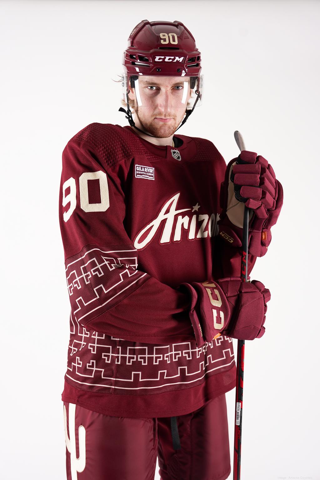
16 hours ago, elliott said:
Apologies if this has been talked about in this thread -- I have not seen anything about this, but it would appear that the Coyotes have new red helmets this season.
Tonight is the first time that the red alternates have been worn this season. The helmets have a matte finish (which I can't recall seeing in the NHL before? Anyone know??)
Last season, I am pretty sure there was just the normal "glossy" helmet finish.
Personally I kind of like it as something different in the league , and the matte finish plays off of the muted tones of the jersey.
The matte helmets are sweet, really complements the look. I hope that NHL teams continue to play with helmet finishes and color combos, its such an otherwise ignored part of the uniform in most sets and now even moreso in many cases due to team branding being subbed out for a random corporate logo.
-
2
-
-
3 hours ago, deltarich87 said:
Kings City Edition uniforms
I feel really underwhelmed by these. The red trim around the wordmark feels busy and disjointed with the silver trim being used everywhere else on the uniform. Not too bad, but too disconnected for me.
-
1
-
1
-
-
2 hours ago, B-Rich said:
And to think their NWSL counterparts have this absolute BEAUT:
Is there any reason they cant simply share this identity with the NWSL club? It's perfect
-
5
-
-
The Creamsicles are perfect in their current form, as a charming switch-up throwback look.
I also think that yesterday was the best that those uniforms have ever looked, the modern matte materials really enhance the colors and help them pop more than they ever have.
-
17
-
-
1 hour ago, jc... said:
You are correct and I will die on this hill. Earl Campbell doesn't give a
 about Nashville. Never even played in Nashville. The player and team history is in Houston.
I've never seen an Oilers alum recognize the Texans as the successor of the Oilers franchise over the Titans. I can understand the bad feelings about all of this, but the Titans have been honoring the Oilers for years and it just feels odd as a fan of the team to read so many people who seem to be only taking issue with this now.
https://www.tennesseetitans.com/news/oilers-great-earl-campbell-pays-visit-to-titans
"By all means I support the Titans, even though they are not in Houston any more. … A lot takes place in life and at some point you have to get over it. Even though the franchise moved, they are in Tennessee and they're the Tennessee Titans, it's still the organization I used to play for, and the Adams family."
-
1
-
1
-
 1
1
-
-
I saw that the Houston Rockets changed their profile picture to this for a couple of days before reverting back to the normal primary logo. It's likely nothing, but does anybody have insight as to what this is?
It feels like branding for an app
-
6
-


/cdn.vox-cdn.com/uploads/chorus_image/image/69846419/1339753839.0.jpg)


/cdn.vox-cdn.com/uploads/chorus_image/image/71815796/1245928658.0.jpg)


 about Nashville. Never even played in Nashville. The player and team history is in Houston.


2024 NFL Changes
in Sports Logo News
Posted
Titans official reporter says no new uniforms coming this year. I could still see perhaps some minor tweak that most people wouldn't notice being behind the sources saying otherwise, but that likely ends that rumor.