


henburg
-
Posts
1,047 -
Joined
-
Last visited
-
Days Won
2
Posts posted by henburg
-
-
Adidas has begun transitioning to the wordmark-less logo, this can be seen on all of their new soccer shirts as well. I guess since the contract expires after this season, they're simply opting to leave it alone.
-
 6
6
-
-
9 hours ago, fouhy12 said:
Got our first look at the Bruins centennial jerseys on the ice on Sunday, and it went exactly as I expected it would. In still images, these uniforms look really good. The gold pops nicely, and it clearly looks like the Bruins despite the differences. On TV, though, the gold gets super washed out and it looks more like a franchise whose colors are black and silver than black and yellow. This is one of the issues unique to hockey, too. Football, baseball, and basketball are played on a backdrop with a more neutral brightness, while hockey is on a white background that washes out colors on TV. So, when you swap out yellow for metallic gold on small stripes, it really makes a difference.
The new logo at center ice does look awesome, though. But why is the centennial logo only on one of the shoulders?

It's a fine uniform and I love the new logo, but that gold being somewhere between flat and metallic just throws the whole thing off for me. I get why they thought a metallic touch to the gold would be a cool tie-in for the Centennial Anniversary, but it's not right for the Bruins.
-
27 minutes ago, tBBP said:
Wellp, the plot thickens...
I'm not sure whether this should go here or in the SiG forum, I definitely ain't finna start a new thread on this, and mods can feel free to MOD EDIT this completely out of the conversation, BUTTT...the Washington former Football Team formerly known as the R-words name and identity plot drama just took on yet another level of uh-oh.
Just a little bit of a snippet:
(Spoiler alert: George Soros' name pops up in this drama.)
Now, I will say this, having traveled all lower 48 states and 49 of 50 and having seen/known this myself with my own eyes/experience: there were and are plenty of tribes in the upper midwest, mainly in North Dakota, Oklahoma, and Montana, who embraced the former Chief White Calf-inspired logo, just based on that fact that a/ I saw some indigenous wearing the merch and b/me asking them about it. (Shoot, somewhere in I believe Oklahoma was a Native hihh school whose athletic nickname was, in fact, the R—well, that.) That said, support/dissent of the name/identity varied from tribe to tribe, and sometimes even within tribes/Native ingroups, as evidenced by the number of Lakota who nearly chewed my head off for me daring to wear my Florida State Chief Osceola hoodie my first few times traveling/working and eventually living up in South Dakota...which just about all of them thought was the Washington Re—well, them, until I explained it was for Florida State. Didn't make a difference to many, which is why I eventually quit wearing anything Chief Osceola-related up there out of respect to them, once I heard and understood their perspective on the Re—umm, that controversy.
That said, obviously as is reported in the link above, there's always been dissenting views of the controversy, and the story should also serve as further evidence that no one body speaks nor should try to speak/spin the narrative for an entirely of a particular population—and that "special interest politics" abound even amongst the Indigenous peoples of this nation (then again that's also been going on since even before the confederation became a "nation". Anyway, so there's another perspective out there is all, and coupled with Harris' reported abhorrence of the current Commanders identity, perhaps this may further fuel the flames of change in DC??
At the end of the day they will not go back to R*******, it's a slur by definition and Josh Harris said as much recently-
"Obviously, I grew up in D.C. and I was there during the glory years, so I understand why fans love the former name," Harris said.
"But look, there was a portion of our fanbase that felt disrespected by the former name," Harris continued. "Sports are supposed to bring people together and not be a distraction. I don't want distractions ... I thought it was important that we end the conversation."
Like you point out, one Native American group saying otherwise is just that, one group amongst a diverse group of people with opinions to the contrary. I don't think it's really worth discussing anymore.
-
3
-
 2
2
-
-
1 hour ago, chcarlson23 said:
Wild make the North Stars look their third officially. I love the State of Hockey patch!
The captains’ patches are a nice touch tooThe Captain's patch is a fun idea, but it really competes with the primary logo and largest sponsor patch in the league for your attention. That said, these colors are lightyears better than the green and red.
-
1
-
 1
1
-
-
These new Cardinals uniforms just stink, they're both boring and ugly at the same time. I don't miss the piping at all, but what a missed opportunity to not create something that's good.
-
12
-
 1
1
-
-
Your growth as a designer is clear from looking through this thread, really great stuff. The league branding is a big improvement in particular
-
 1
1
-
-
The entire argument is dumb because technically, no, the Denver Nuggets didn't play every single team in the world last year, but there is also no doubt that they are the best team in the world. They are even lead by International talent with Jokic from Serbia and Jamal Murray from Canada. Arguing that they are not "World Champions" is technically true, but it's just a semantic argument at the end of the day. Would people really want the Nuggets to have played an International Champions Tournament after winning the Larry O'Brien trophy to prove their worth of holding an unofficial label? It would be a tremendous waste of time for everybody involved.
10 hours ago, JTernup said:Its like saying World War 2 wasn’t really a world war because Yemen wasn’t involved.
This is a perfect metaphor for this discussion. I think a lot of international posters I've seen around the internet are conflating some NBA teams labeling themselves World Champions as a typical sign of American arrogance, and while we are generally arrogant people when it comes to our self perception within the world, this is not an example of that.
-
8
-
-
3 hours ago, CaliforniaGlowin said:


Not sure how to feel about these to be honest. I am a huge fan of the original Smokey grey alternates and as a whole I think that this works pretty well (albeit worse than the original). Still, there's a mismash of elements with the smokey mountains remaining on the helmet while only the dark grey is present throughout the rest of the uniform. The face mask change was necessary I guess with it being black before, but I am not sure that the vintage grey was the right way to go either. Overall, streamlining the colors would go a long way.
-
 1
1
-
-
19 minutes ago, DCarp1231 said:
Davidson has a new logo
I had grown to like the (now) old Davidson look, but this new Wildcat is really awesome, such a perfect illustration. I do kind of wish that we could see it with a red diamond behind it to help give it a bit more of that local connection, but that probably wouldn't work as well with the new 3/4 perspective on head obscuring the original reference.
-
 1
1
-
-
I don't think that the inspiration of lakes for that Timberwolves uniform is really the issue, if anybody can embrace that it is the Land of 10,000 Lakes. The problem is that it is such a literal representation of that concept, it looks like somebody searched a Stock website for "water" and put one of the first results on a blank white template. It feels very corporate rather than natural.
-
4
-
1
-
-
18 minutes ago, Froob said:
Is bruins logo change permanent? Much needed if so.
No, it is only meant to last this season according to the team. It's a pretty unprecedented move in pro sports to only adopt a look for 1 year, but I honestly could see them rolling with it full time in the near future if it is as well received as I think it will be this season.
-
2
-
-
I dig the Americans, feels like sort of a missed opportunity to not have the wings on the helmet rather than the A though
-
3
-
-
I don't necessarily think that the Bears should completely phase out the wishbone C, but I do think this looks pretty awesome in a vacuum. At the very least, it could work pretty well on a new alternate helmet.
-
11
-
1
-
 1
1
-
2
-
-
25 minutes ago, MJWalker45 said:
If they change their alt helmets after giving Cleveland hell for it, I'll laugh my backside off.
I feel like the only way this improves the look is if there is some kind of orange dropshadow to the stripes on the helmet as well.
I actually think that I prefer this look to what they did last year with bringing back the old color rush jerseys to pair with it. The stripes will match up much better, and you were still getting the little pops of orange on last year's version with the logos and accessories, but now in this set they will feel more intentional and well balanced.
I also just prefer their proprietary number font to the block numbers, heightens the whole thing a lot whereas the block numbers felt more generic/collegiate to me.
-
3
-
-
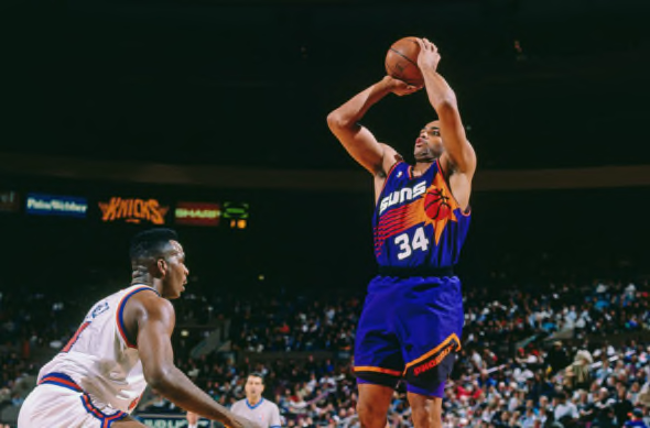
10 hours ago, JuicedSportsNow said:
New:
For context. This was the look the Suns introduced in the mid 2010s
And the 90s Sunbursts
The Suns new uniforms certainly look nice, but there's something about the incorporation of black in the original Sunburst set that feels better to me than this new emphasis on white. I think that balance of Purple, Orange, and then Black is really what feels the most like the Suns to me, and all of these other sets since have just come a little bit short in trying to get that color balance right.
-
1
-
-
20 hours ago, DJT said:
these are fine. Don’t care for “crescent city”
The Pelicans just play it way too safe with their brand in general. I literally thought this was a new uniform for their G-League affiliate at first glance when scrolling past it. The side stripe is kinda interesting, but everything else is just boring.
-
4
-
-
I think that the back and forth on who the Oilers identity rightfully belongs to is not very productive. In an ideal world, maybe the Oilers stay in Houston and maintain this set forever and the Titans are the expansion franchise, but that is not the world that we live in, and it's been nearly 30 years since all of that happened. Don't get me wrong, the Titans deserve scrutiny for hiding this look for so long and letting the identity stray to where it currently is with navy blue and silver being the dominant colors in the current set, but it's not as if the connection is just now being brought up out of nowhere. Significant numbers of Oilers fans became Titans fans when they moved to Nashville and have maintained that allegiance since, the team has been hosting "Homecoming" games for Oilers players and coaches for years, and the merch has been popular here for a long time before now. Prominent Oilers like Warren Moon, Earl Campbell, and Billy "White Shoes" Johnson have also aligned themselves with the Titans organization over the Texans. I get that the relationship will never be the same with this identity as it was in Houston, but it's far from baseless.
-
3
-
-
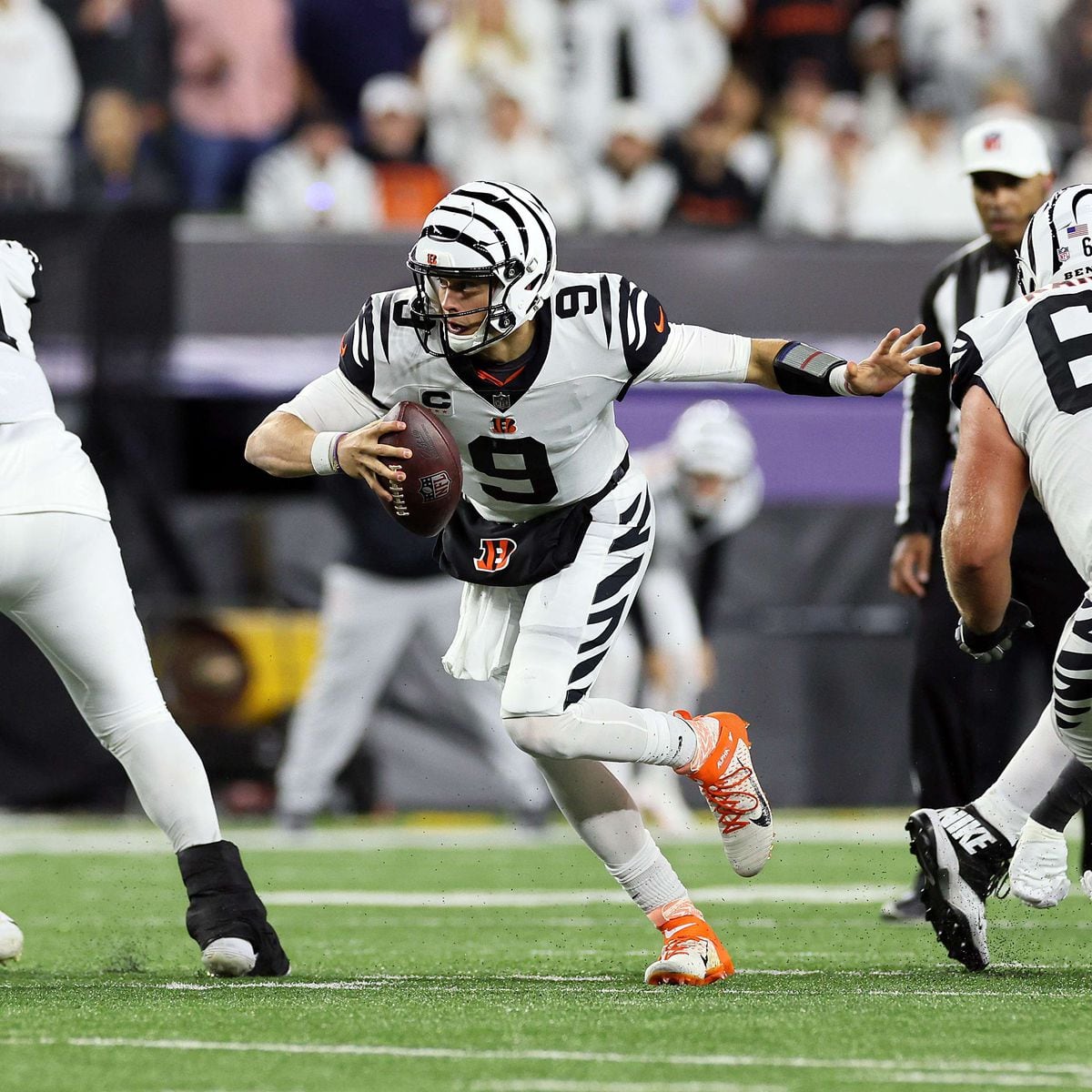
I think it would be better for Washington to stick with Commanders at this point, feels like a really big ask to get the public to remember and commit to a new nickname for the 3rd time. The name "Commanders" has never really been the issue anyway, it's really just the uniforms that make it stink. I could get on a board with a visual rebrand that commits more to the visual tradition of the team, but the name is not unsalvageable.
-
8
-
1
-
-
This Colts uniform could (generous use here) maybe work if the helmet were blue to create a full committal to monochrome, but even then it just doesn't look or feel right for the Colts. The heathered texture is terrible and just makes me think of cheap athleisure clothes from Target or something, and while that secondary logo is solid, placing it there makes every player look like a captain. Between all of that and branding it as the "Indiana Nights" alternate (which sounds hilarious as an outsider), and the whole thing just falls really flat for me.
Ironically, one of the reasons that I was so excited for the removal of the one helmet rule was because I thought it would help us avoid these terrible monochrome uniforms with different color helmet combos, but the Lions and now Colts have proven that some teams just like that look I guess

-
2
-
-
I'm surprised by how much I enjoy these Vikings throwbacks. They're not a radical change from what they've worn throughout their history, but the slightly darker shade of purple that matches perfectly between the helmet and jersey just hits all the right notes for me. Funny enough, that is probably the first time that you can really say that in their entire uniform history as well. Additionally, I also think that this simplified viking horn looks a lot better than the current, more illustrative version. Their current look is good, but there are a lot of details from these that I think that they could bring into that design to make the definitive Vikings look.
-
2
-
-
10 minutes ago, Brave-Bird 08 said:
I know you likely misspoke but want to use this as an opportunity to remind everyone of these beauties.
No you're totally right, I completely spaced and forgot about these hahaha
The reason I came up with that was because I was specifically thinking of the most classic iteration that everybody is expecting, but honestly, who knows what the team ends up releasing...
I really hope they just do the right thing and adapt these faithfully, but I could potentially see them putting a slight twist on it and having the Tennessee Oilers patch on the jersey like the team wore while it first was playing in the state-
-
5
-
-
The Bucs wore the creamsicles within the past few years, but we have not seen Oilers uniforms on a football field since the team rebranded to Titans in 1999. I don't think it will crash anything since new releases don't even tend to do that these days, but there are plenty of reasons to be excited about that.
-
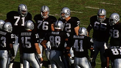
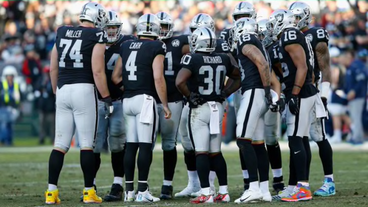
2 hours ago, the admiral said:
There's no way the Raiders are wearing the same pants they used to wear. They were much more shimmery in the past.
Also, the kooky shoes are far more of an affront to the Raider aesthetic than any change in pants fabric.
I mean, to be fair, the difference in lighting for those two photos you selected is pretty significant. I am not sure if the Raiders have retained the older pants manufacturer or not, but they look more shimmery to me than a team like the Panthers currently wear-
VS
-
10
-
-
I definitely prefer Nike's matte finish fabric 9 out of 10 times to the Reebok dazzle fabric, but there are definite exceptions, and specifically teams with metallic colors have suffered since the switch. The Saints metallic gold becoming more of a khaki color immediately comes to mind for me.
-
14
-


/cdn.vox-cdn.com/uploads/chorus_asset/file/23828759/FXof3BuVsAEtuHY.jpeg)

:format(webp)/cdn.vox-cdn.com/uploads/chorus_image/image/38885768/176638849.0.0.jpg)


NFL 2023 Changes
in Sports Logo News
Posted
I actually feel that the Colts is the worst case, the combo is completely unbalanced and feels totally wrong for them. At the very least, the Commanders and Jets have incorporated black into their main uniform sets and the alternates are a true monochrome. And no, the black Nike swooshes do not work the same way for the Colts.
I'd even argue that those Jets uniforms are not that bad and not a true case of BFBS