


BigBubba
-
Posts
5,014 -
Joined
-
Last visited
-
Days Won
7
Posts posted by BigBubba
-
-
Would hating the Orioles new black and white hats be an unpopular opinion?
I wouldn't say so. I always feel like I'm in the minority when I say I like them.
Two unpopular opinions of mine:
- I hate the Nats' curly "W" logo. It has to be among the worst cap logos in the majors in my opinion.
- I had a mini-rant about this before, but I hate how it looks when the button doesn't match the bill on a baseball cap. It just sticks out way too much to me, even if the cap logo is the same colour (like with the Mets and Giants).
-
they took pictures themselves anyway . you bought what you saw on sites


i mean http://www.weiketrade.com
This is so amazing.

Too many teams play it safe these days with boring, generic, straight numbers. I love how they tilted them. It's really innovative.
-
1. These are terrible logos:


(Note that I'm referring to that specific "NY" monogram)
2. The Astros' current cap logo is actually looks pretty good:

-
Crappy grammar and a love for Chinese knock-offs. He's like some bizarre hybrid between loooooooogodud and cody21.
-
^What? That logo is treated like a god around these parts.
-
Nut sure if this is necessarily unpopular, but I think the Rangers are the only team who should use a diagonal script. The one above was just unnecessary and would've been one of my favourite sets in hockey history had they just put the robo-pen on the front.
-
Right after I wrote that, someone reminded me that these still are two different leagues with their own distinct histories (even though that's been somewhat conflated in recent years), and thus it should be celebrated when you are crowned league champion. For that reason, I've changed my mind on that.
-
These are the best uniforms in the MLB right now. (orioles photo)
That's not an unpopular opinion. Those are awesome.
Yeah, I would say "the happy bird logo is terrible and I liked the previous bird" is the unpopular opinion. That is my opinion, so I submit it. Though I do like pretty much everything about the rest of the uniform.
He didn't just say he liked them, though. He said they were the best in the majors, which is pretty unpopular.
I actually really like the white front-paneled cap, which is an unpopular opinion its self.
-
This wasn't that great of a set, even after the toning down of green. The only thing I really like are the scripts, which didn't even look great in those colours. I've never got why people say this is the best set they've ever worn. Another unpopular opinion: I really like their current set, with the exception of the colours (a lot of people seem to be vice-versa).
This was nothing special. I don't really think it's bad, but I don't get all the love it gets around here:

This is my favourite old-school Leafs logo:

-
This one takes some close inspection to spot any differences. Clearly better than anything legit the NHL has ever produced. (If you look very carefully, you might be able to spot a slight mistake)

Hmmm...

The lest sleeve is missing a number!

-
Didn't see this posted here, 1973 WHA Whalers:
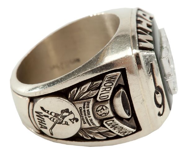
World Champions? World?
^And a division championship ring? Really?
-
I especially love the patches:


-
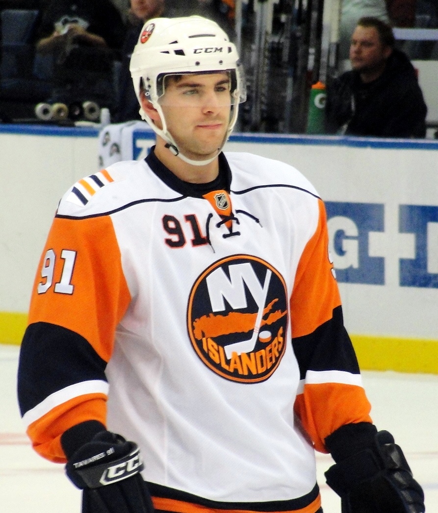
Right team, wrong jersey:
John Tavares
Dominik Hasek
.jpg)
Gary Carter

-
So let me get this straight - Glendale would rather mortage the very skeleton of their city's infrastructure in order to keep the Phoenix Coyotes around?
I just don't get it. I don't understand how any Coyotes fan can defend this.
Just give it a few pages. Soon we'll have the Coyotes faithful in here demanding proof for our "ludicrous" claims that Glendale is literally selling itself to keep this team.
This will be because they would not have read the past ten pages (that contain such proof) because they "couldn't bring themselves to read pages of totally not fact-based Coyotes bashing."

You're just jealous that the Coyotes had a better season than the Leafs!

or
Why do you hate Shane Doan?
or
Its a Phoenix thing, you wouldn't understand!
You're just Canadian hockey supremacists, that's all! You can't stand to have less than 30 teams in Canada! You're just jealous that the US has more teams than Canada! Let me guess, we have to move the Rangers and Red Wings too? Don't tell me that's not the same thing!!1!!!!11
-
I've seen a lot of love for the Devils' retro uniforms they wear around St. Patrick's Day and the desire for them to be alternates. I don't really like them enough for them to be full time alts, and quite frankly I'd rather see the Devils with a black alternate full time. It'll never happen on Lou's watch, but if a team could pull off a black alternate well and without anyone crying BFBS, it's the Devils
The Devils current set is already the very definition of BFBS. They tossed out a unique colour scheme, that perfectly represented the area, and replaced it with something bland and safe. If they hadn't won 3 cups, I'd be a huge proponent for Green coming back full time.
I disagree. Black and red are your absolute typical "devil" colours. Don't get me wrong - I liked the green and red, but this wasn't a case of BFBS.
-
Change the striping on the home to match the road and this look is perfect.
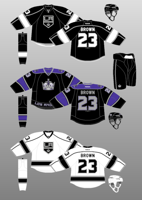
The one thing that drove me mad about that throwback was the white stripe down the pants. It looked so out-of-place. My ideal look for the Kings would be this:
- The current road with a matching home (i.e. with matching hem stripes)
- Put a recoloured 2000s crown logo on instead of the home plate logo
- Use the Dionne-era jersey as the third, except change the pants stripe
-
No thank you.

-
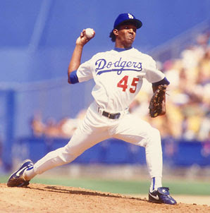
Pedro Martinez:

-
- I think the "Minnesota" script is the only good thing about the Twins' identity
- I thought the Twins looked good in road pinstripes
- I hate both the curly "W" and the "DC" logo
- The Nats have never had a great identity. The original set was OK, but their current set sucks.
-
I think that these look terrible:
-
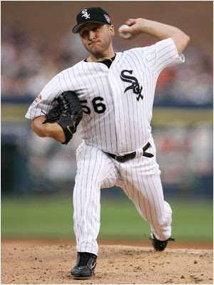
Didn't know players got these:

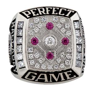
What entity purchases these and chooses the design (MLB or the AL/NL)?
I don't know, but if I had to guess, I'd say that it's a gift from MLB (i.e. not the team). The conferences leagues are run by the same commish anyways.
-
Didn't know players got these:
-
if the coyotes dont move, who do you think it will be.
The Maple Leafs will move to Saskatoon.
Ehh, I'm hearing Moosejaw.
-
Jeff Carter & Mike Richards - Philadelphia Flyers
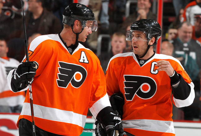
How so? They each spent six years there. In 10 years, maybe. Now? No. That's what I think of whenever I hear their names.

Unpopular Opinions
in Sports Logo General Discussion
Posted
I don't post about the NFL here, so I'm not sure if this is unpopular, but I think the Broncos were much better off with navy at home as opposed to orange.
This one I know is unpopular: the LeBron-era Cavaliers set wasn't all that good, and their current set is they best they've ever worn.